Dark Mode
Discover how to create a compelling brand kit for your business through our practical guide with real life examples.


Updated: February 5, 2025
A brand kit is an important document containing all your brand’s visual assets and directions on how to use them.
It helps you achieve consistency across the marketing channels and helps your partners and brand affiliates avoid ambiguity when using your branded elements.
Keep reading to learn more about how to create a brand kit with real-life examples.
What Does A Brand Kit Include?
A brand kit is a collection of the elements that make up the visual identity of your brand.
It includes your logo, typography, color palette and imagery, such as icons and sample collateral.
Logo
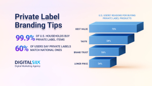
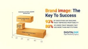
Your logo is the main element of your visual identity, with 75% of consumers believing that the “look and feel” of a logo can make or break a company.
When adding your logo to your brand kit, include the different variations, from different shapes and sizes for various marketing collateral, to different colors, depending on the appropriate background for your logo.
Color Palette
Your audience associates your brand with your brand colors and colors themselves have the power to evoke an emotional reaction.
Considering that colors influence 85% of the purchasing decision for shoppers, make sure your brand is associated with a color that evokes an emotion aligned with your business.
When including your brand colors in your brand kit, give your brand affiliates or external partners clear directions on what your colors are and how to properly use them in different contexts.
Typeface
Consistent typeface and fonts are directly related to how your audience perceives your brand.
While typeface refers to a set of one or more fonts that share a consistent theme and style (Times New Roman, Helvetica), font refers to the specific type, style and size of a typeface (Times New Roman 12p, bold).
Typeface is essential in your brand kit as it provides the directions on text that accompanies your visual elements.
When including in your brand kit, you want to think about:
- The font you will use
- The color of the text
- The spacing between the letters
- Which text color to use against which background
Brand Kit vs. Brand Guide
While a brand kit refers to the collection of visual elements that comprise your brand’s identity, a brand guide is a more comprehensive document that defines the use of your brand elements.
Aside from having the information and elements that go into the brand kit, a guide also includes details such as the brand’s tone of voice, messaging guidelines, values and more.
How To Create A Brand Kit
To create a brand kit, you first need to define your values, mission and vision.
This will allow you create logos, choose typeface and create a visual identity that aligns with what your company stands for while resonating with your target audience.
Have a branding project?
We deliver custom branding solutions. Request a Quote
We deliver custom branding solutions. Request a Quote
Step #1: Know Your Brand’s Story
Your brand story is the foundation of your brand elements.
After defining your story, you will be equipped to develop a unique messaging and visual identity that best aligns with what you do.
From there, you can design and develop your specific brand elements, aligning them with what your company stands for and specific business goals.
Step #2: Define Your Logo Iterations
Depending on your marketing campaign, you might need to use different iterations of your logo.
For example, if your logo consists of an icon and text, some marketing efforts won’t allow you to use both; maybe there’s not enough room for both logo and text in the image or maybe the background of your image doesn’t allow for the text to be readable.
In such instances, your brand kit needs to include smaller versions of your logo or instructions on how to utilize a part of your logo, such as the icon, in marketing campaigns.
Step #3: Determine The Supporting Visual Elements
Supporting visual elements include imagery that will go on your website or different marketing channels, such as color palette, icons, illustrations or graphics that reinforce the message of your brand.
Defining these elements and their proper use is another facet of a brand kit that helps you drive brand recognition and helps tell your audience who you are.
Step #4: Determine Your Typeface
Determine the right font, size and spacing of your brand’s written content.
Additionally, you want to include layout options and how your typeface will be used across online and offline channels in marketing collateral.
Do you have a branding project? We provide custom quotes.
Request a Quote
Top Brand Kit Examples
Our team at Digital Silk includes award-winning designers and leading brand strategists.
We’ve put together some of the best brand kit examples to pull inspiration from.
These real-life examples will give you a clearer picture of what elements to include in your brand kit and how to give you real-life examples of how to properly define brand kit elements
Google is one of the most recognizable names in the world and the same goes for the company’s color palette.
Google’s signature colors are one of the company’s most recognizable brand elements.

Google provided its partners and individuals who received permission to use the company’s logo with a brand kit consisting of the company’s brand elements along with directions on how to use them.

From there, Google goes on to define how to include the visual elements properly, starting with the notion that you should not change the company’s logo, its colors or any of the company’s supporting brand elements.

Netflix
Netflix is a global streaming company that offers movies and TV shows to viewers.
To partners and brand affiliates, Netflix provides its Company Assets which include its brand elements. Most notably, it includes the two most recognizable brand elements of Netflix: its logo and the signature letter “N.”

Aside from the elements themselves, brand affiliates can also read further instructions on how to use them appropriately across channels, including the colors and clearing space.
However, Netflix doesn’t leave it at just that: instead, the company provides a comprehensive brand guideline that outlines how to properly use its brand elements across channels.

Slack
Slack, a business communication app, offers its partners and affiliates brand guidelines with all the company’s visual elements, along with mission, tone and specific directions on how to use the branded elements.
Within the guidelines, the company also includes a section on visual identity, which would fall under the content of a brand kit.
Given that Slack uses a larger logo and a smaller one, the company’s brand guidelines give precise instructions on which logo to use depending on the size of the image.

The company also goes on to define which logo to use on which background.

Spotify
Spotify, an audio service platform, also provides a media kit package for affiliates and partners that will use the company’s branded elements.
A media kit is more comprehensive and goes beyond the visual identity included in a brand kit.
It can also include information about the company, contact information, product or service information and any information that the company wishes to relay about themselves to the members of the press.
The company does so through its Press Center page, where interested parties can find Spotify brand elements and how to use them.
Spotify specifies that its logo consists of an icon and a wordmark and highlights when and how to use logos in marketing campaigns.

The company also provides an overview of how to use its colors, explaining that the light green color, which is the color of Spotify’s logo, should only be used with the official logo and that it should only ever be used on a white or black background.

Shopify
Shopify is another great example of a company that provides its brand affiliates with its brand elements and instructions on how to properly use them.
When going to Shopify’s Brand Assets page, you’ll find the company’s primary and supporting logos, along with instances on when to use which.
Shopify also highlights a section on the use of their Monotone black and white logos, stressing the importance of adding the gap or spacing within the bag when using the company’s black or white logo, as opposed to the primary green.

Why Use A Brand Kit?
A brand kit is a useful tool to offer your employees and external partners.
From new hires to seasoned veterans of your business, every individual employed at your company can refer to the brand kit to choose and create assets for consistent marketing engagement across different channels.
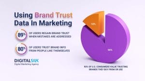
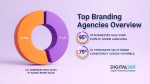
This consistency directly translates into value: companies with consistent branding increase revenue by 33%.
If you are partnering with an external company, providing them with a kit is an easy way to ensure that your brand is correctly represented and that your visual elements are consistently used in marketing campaigns and promotional materials.
This includes social media posts, business cards and promotional materials, among others.
Take Apple, for example.
The tech giant provided a document on Apple Identity Guidelines to its channel affiliates and Apple-certified individuals.
The document outlines how Apple uses a variation of a Myriad font, and how the company’s logo — the signature apple — can only be used on a black or white background, but never on cluttered images or patterned backgrounds.
Take a look at some of Apple’s guidelines below.

Explore Branding Services At Digital Silk
If you have a branding project, we have the expertise to bring it to life.
At Digital Silk, we are dedicated to growing brands online and delivering measurable results for our clients.
We operate with complete ownership and transparency, ensuring we treat every project as our own while maintaining your valuable input into the growth of your brand.
Our branding services include:
If you have a branding project and require a brand kit or a more comprehensive brand guide, contact our team or call us at (800) 206-9413 to get a custom quote for your project.
Request A Quote For Your Branding Project
Tell us about your branding goals and let our experts give you a custom proposal
"*" indicates required fields