Dark Mode
Share
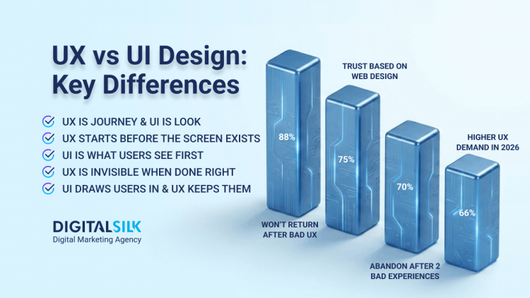
Nearly half of consumers judge a company's credibility on web design alone, so the right trends matter. See which web design trends to embrace, which to avoid and how leading brands apply them.


Published: June 9, 2023
Did you know that nearly half of consumers will judge a website’s credibility based solely on a design layout?
At Digital Silk, we understand the importance of crafting a website that utilizes the latest web design trends to engage and connect with your target audience.
We’re here to help you navigate the dynamic landscape of web design by exploring the most influential trends to follow, trends to avoid and the top examples to find inspiration from.
Whether you’re looking for guidance on enhancing user engagement on your own or searching for a conversion-first custom web design company, this comprehensive guide is here to empower you in making informed decisions for your business website.
Let’s dive into the world of web design trends!
Have a web design project?
Digital Silk builds custom websites. Request A Quote
Digital Silk builds custom websites. Request A Quote
2025 Web Design Trends To Follow
Not long ago, the magazine-style layout was a trend in web design that went beyond newspaper websites like The New York Times and nested in other industries including business and tech.
While this trend has since gone out of style, the eleven below are gaining speed.
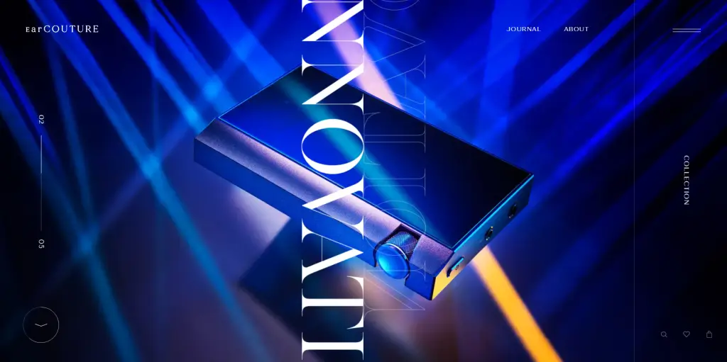
1. Dark Mode
Dark mode in web design refers to a design choice where the background and user interface elements of a website or application are primarily displayed in dark colors, such as black or dark gray.
The concept of dark mode in web design has a rich history that dates back to the early days of computing. While computers in the 1970s already had a default dark background, the evolution of technology has paved the way for the dark mode to become a prominent design choice.
Dark mode gained momentum in the 2010s as advancements in screen technology allowed for more precise backlighting and the development of organic light-emitting diode (OLED) screens. Major companies like Apple, Microsoft and Google embraced dark mode, inspiring others to follow suit.
Choosing a dark mode design for your website can have the following benefits:
- It enhances readability
- It minimizes eye strain by reducing the emission of blue light, which can be harmful to your eyes
- It saves battery life, particularly on devices with OLED screens, as the dark pixels consume less power
While Dark Mode doesn’t provide a universal solution to all digital-related issues, it offers users the flexibility to personalize their displays and enjoy a more comfortable experience.

2. Minimalism
Minimalism in web design is a style that focuses on simplicity and stripping away unnecessary elements to emphasize the most important aspects of a website.
It is characterized by a clean and uncluttered aesthetic, often utilizing muted color palettes, ample white space and a flat graphic interface. The primary goal of minimalist web design is to provide visitors with a more focused user experience.
Minimalistic web design can be a good fit for you if you are operating in industries such as art, photography, architecture or fashion, where you need to add a touch of elegance and want your work to speak for itself.
3. Liquid Animation
Liquid animation refers to movements on the screen that simulate the flowing and rippling characteristics of water, adding a realistic and visually engaging element to the web design.
Where can you use liquid animation on your website?
- In hover states: Making the elements on a webpage respond with fluid movements when the user hovers over them
- In videos or rolling animations: Designing the motion of objects or graphics to imitate the behavior of liquid
- In scrolling interactions: Incorporating liquid animations in tugs and pulls of the mouse or touch gestures to simulate the feeling of spinning in an aquarium or underwater environment
- In background or foreground elements of a design: Making the animated blobs or shapes to move across the screen
- In typography: Applying liquid animations to text elements, such as headings or titles, to bring a sense of playfulness to the typography without interfering with the readability
When incorporating this type of animation into your web design, it’s crucial to consider the following two factors:
- Animation purpose: Using animated web design content solely for the sake of it may add energy to your website, but it’s unlikely to yield tangible results. This is why it’s best to have a clear purpose for using the liquid animation style, whether it’s to boost sales, increase newsletter subscriptions or any other specific goal.
- Company branding: Just like any other design element on your website, ensure that the liquid animation style and color combinations effectively highlight and promote your company branding. It’s important to evaluate whether this animation style aligns well with your brand identity and voice.
4. Color Gradient Style
Color gradients in web design refer to smooth transitions between two or more colors, creating a visual effect that adds depth, interest and an aesthetic appeal to websites. Gradients are achieved by blending and transitioning colors in a gradual manner, either in a linear or radial form.
Linear gradients involve a transition that occurs in a straight line from one color to another, while radial gradients radiate from a central point outward, creating a circular or elliptical effect.
Choosing a color gradient style for your website comes with many benefits, including:
- Enhanced visual interest: Gradients can add visual interest to your web pages by creating a journey from one color to another or from shade to tint. Even subtle gradients can enhance the overall appeal of your website.
- Highlighted typography: Gradient typography, especially when placed on dark backgrounds, can add a dynamic element to your website’s textual elements, making them stand out and guiding your users’ attention to the important messages you want to convey.
- A touch of surrealism: Gradient shapes or scattered color gradients can introduce surreal elements to web design, enhancing the artistic and creative aspects of a website.
5. Neo-Brutalism
Neo-Brutalism in web design is a unique and emerging trend that takes inspiration from the architectural style of Brutalism.
Brutalism, derived from the French phrase “béton brut,” meaning raw concrete, was a popular architectural style in the 1950s. It was characterized by the use of bare concrete, steel and modular elements.
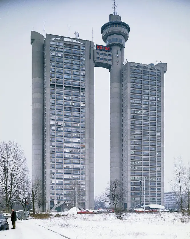
[Source: rentastan]
Brutalism in web design emphasizes flat design and stripped-down user interface (UI) elements, showcasing raw details without fancy design layers.
Neo-Brutalism goes a step further and challenges the norms of user experience (UX) and user interface (UI) design by adopting an anti-design style and embracing unconventional elements.
It features unusual background color themes without gradients, atypical typography and what some may consider “ugly” design elements. It rejects traditional UX/UI components in favor of a fearless and distinctive approach to color palettes.
The use of clashing colors is a defining characteristic of Neo-Brutalism, where two colors may have similarities in certain aspects but do not harmonize well due to differences in hue or brightness.
The future of Neo-Brutalism in web design holds the potential to create strong brand identities and deliver memorable user experiences as this radical design approach leaves no heads unturned. However, it is important to balance the impact of Neo-Brutalism with traditional UX/UI design methods to ensure an optimal user experience.
Neo-Brutalism in web design is a bold style that may not be suitable for every project or brand.
Here are some situations when you might want to consider using Neo-Brutalism in web design:
- If you’re running a creative agency, an art gallery or any other art-oriented business.
- If you’re creating a website that represents a punk rock band, a skateboard company, an underground culture magazine or any other type of business that revolves around rebellious and non-conformist attitudes.
6. Custom Illustrations
Custom illustrations in web design refer to unique and personalized visual elements that are created specifically for a brand or website.
There are various illustration styles, including animation, caricature, hyperrealism, cartoon, fantasy, infographics, photorealism and conceptual illustrations.
By integrating custom illustrations into your web design, you can create a unique online presence, tailor your messaging and reinforce your brand identity.
These types of illustrations can also be a great tool for fluid storytelling, visualizing complex data, creating an emotional appeal and improving your brand’s memorability.
Once you set up your preferred illustrations, you can then use them across your other online platforms or offline materials like your product packaging design.
There are many different types of custom illustrations you can incorporate into your web design, including:
- Brand mascot: A custom illustration of a character or mascot that represents and embodies your brand’s identity. This mascot can become a recognizable and relatable figure for your audience.
- Custom brand illustrations: Unique illustrations created to represent the brand’s values, services or products that can be used throughout the website to enhance the brand experience.
- Storybook illustrations: Illustrations that tell a story, adding a narrative touch to your website design. They can be used to guide your users through a website or to illustrate specific features or processes.
- Custom line art: Simplistic and minimalistic illustrations created by using clean lines and shapes. Line art can add elegance and sophistication to your website design.
- Product Illustrations: Detailed and accurate illustrations showcasing specific products or features.
7. Accessibility
Accessibility in web design refers to the practice of creating websites that allow people with disabilities to have a seamless user experience.
Simply put, accessibility in web design ensures equal access and opportunity for people with auditory, cognitive, neurological, physical, speech and visual impairments to perceive, navigate and browse a website effectively.
It is estimated that there are 1.3 billion people worldwide that have some form of disability. So, it’s safe to say that optimizing your website for accessibility can help you further expand your reach.
Here is what you can do to ensure your website is accessible to people with various impairments:
- Add alt text to images: Include descriptive alt text for all your informative images to help users with visual disabilities understand their meaning. For decorative images, leave the alt text empty to indicate that the image is not essential for understanding the content.
- Maintain heading hierarchy: Use heading tags in a hierarchical manner to provide structure and ensure screen readers can interpret the content accurately. Reserve “H1” for the main title and follow with “H2”, “H3” and so on, for subheadings.
- Use an accessible color palette: Optimize color contrast and choose complementary colors to ensure readability for users with visual impairments. Use a contrast checker tool, such as WebAIM, to verify that your color combinations meet accessibility standards.
- Provide alternatives for audio and video content: Include transcripts for audio content and captions for videos to make them accessible to users who are visually impaired, deaf or hard of hearing.
- Make content easy to understand: Use clear and concise language without excessive jargon or technical terms. Ensure your content is easily understandable by a wide range of users, including those with cognitive disabilities or limited language proficiency.
- Provide keyboard functionality: Ensure users can navigate and interact with your website using only a keyboard as shown in the video below.
8. Parallax Scrolling
The concept of parallax scrolling is based on the optical illusion where the human eye perceives objects that are closer as larger and those farther away as smaller.
Parallax scrolling creates a 3D effect by moving the background of the website at a slower pace than the foreground as the user scrolls. This creates a sense of depth and immersion, making the browsing experience more dynamic and engaging.
9. Micro-Animations
Micro-animations are small, subtle animations designed to catch the user’s attention and drive engagement.
There are several reasons to use micro animations in web design:
- They add depth and detail to the design
- They allow you to create a more immersive experience for your users
- They can be designed to convey emotions
- They can highlight interactive content on your website to enhance intuitive navigation on your website
- Most importantly, they can provide subtle feedback to your visitors
Some of the most popular types of micro-animations include:
- Toggle switches: Micro-animations in toggle switches provide visual feedback when the switch is toggled on or off. This might be a smooth sliding motion, color change or other animated effects.
- Progress bars: Micro-animations can be used to show progress or indicate loading time through animated progress bars or symbols. These animations can provide a sense of activity and keep users engaged during waiting periods.
- Hover effects on buttons: Adding micro-animations to buttons can create interactive and engaging experiences. When users hover over buttons, animations like scaling, color change or subtle motion effects can be used to provide visual feedback.
10. Micro-Interactions
Micro-interactions in web design are small, website animations that provide visual feedback and enhance the user experience by displaying changes more clearly. They are designed to support the user and communicate important information nonverbally.
There are two types of micro-interactions: User-triggered and system-triggered.
Add interactive elements to your website.
Speak with our experts. Set Up A Consultation
Speak with our experts. Set Up A Consultation
1. User-Triggered
These interactions respond to specific user actions and provide visual feedback or perform a specific function. User-triggered micro-interactions in web design can be in the form of:
- Scrollbar: Provides visual feedback to the user when changing the location within a page.
- Pull-to-refresh animation: Gives visual feedback to a user action, indicating the process of content refreshing
- Swipe animation: Provides visual feedback to indicate that a user has swiped an element, such as a carousel or slider
2. System-Triggered
System-triggered micro-interactions are initiated by the system or the application itself based on certain predefined conditions or events.
Some examples of system-triggered micro-interactions in web design include:
- Notifications: When a new message or notification arrives, the system triggers a micro-interaction, such as displaying a notification badge or a pop-up alert to inform the user.
- Progress Indicators: When a task is being processed in the background, the system triggers a progress bar or a loading spinner to visually indicate the level of progress to the user.
11. Dynamic Cursor
Dynamic cursors in web design refer to the use of customized cursor effects that go beyond the default mouse pointer.
They can be used to indicate certain actions, draw attention to specific elements or create a unique and engaging browsing experience.
The dynamic cursor design solutions are nearly endless. Examples include:
- Flashlight cursor: A cursor with a flashlight effect that illuminates different elements on the page.
- Distort cursor: A cursor that distorts the background as users move around the webpage.
- Arrow cursor: A cursor effect that guides the user’s scrolling actions by indicating the direction they can navigate a website.
- Trailing cursor: A trailing cursor effect that leaves a trail behind the cursor as users move around the page.
- Animated icon cursor: A cursor that changes to an animated icon when hovering over clickable elements, differentiating them from the background.
Web Design Trends To Avoid
The world’s first website was introduced in 1991 by Tim Berners-Lee. This website had one purpose only and that was to explain how to use the world wide web (W3). Design-wise, the first website didn’t offer anything but a white background and around 20 lines of text. Today, of course, a website like that would be on a list with the worst of them.
While web design has certainly come a long way since then, there are still some design trends that are hanging around and shouldn’t be! We put together a list of the top trends to avoid.
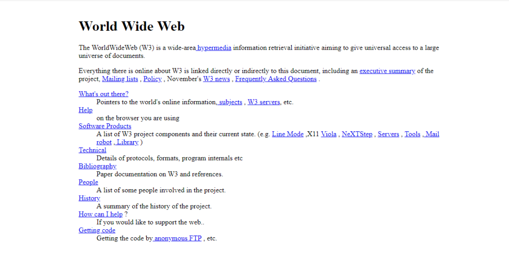
[Source: info.cern.ch]
1. Inconsistent Typography
Typography is an essential aspect of UI design. It affects how easily your visitors can read and understand the content on your website.
Inconsistent typography in web design refers to the lack of uniformity or cohesion in the selection, arrangement and presentation of typographic elements across different pages or sections of a website.
It occurs when there are significant variations in fonts, font sizes, line spacing, alignment and other typographic attributes throughout the website, leading to a disjointed and unprofessional overall appearance.
Inconsistent typography can make your design look cluttered and unprofessional and create accessibility issues for users with visual impairments.
To ensure your typography is consistent and easy to read and understand:
- Use up to three different fonts
- Opt for Google-friendly fonts such as Roboto, PT Sans and Comic Sans.
- Aim for around 60 characters per line for a good reading experience on desktop, and 30-40 characters per line for mobile devices
- Avoid all caps for large amounts of text
- Avoid using the same or similar colors for text and background
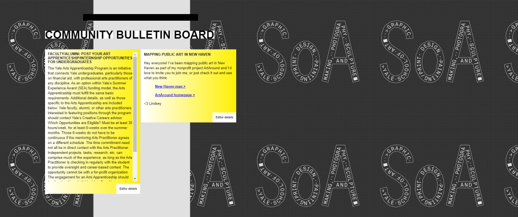
[Source: Yale School of Art]
2. Over-Complicated Navigation
On-page experience is one of Google’s ranking factors and your website’s navigation is one of the key aspects that affect the visitor experience.
Simply put, you want your visitors to find the information they need easily and without having to wander aimlessly around your web pages.
Here are some of the best practices for intuitive navigation design:
- Use clear and consistent labels: Use descriptive labels (such as buttons, links, form fields and navigation menus) that accurately represent the content or functionality of the linked page. Avoid using jargon or ambiguous terms that might confuse visitors.
- Apply logical organization: Group related items together and use clear headings and subheadings to provide a visual hierarchy.
- Implement visual design elements: Highlight active or selected links to provide visual feedback to users about their current location.
- Conduct user testing: Test your navigation with real users to identify any confusion or difficulties users may encounter while navigating your website.
Check out our ultimate website navigation guide for a more detailed look at best practices for SEO and user engagement.
Also, you can have a look at one of our case studies to see how Digital Silk helped one of the clients increase engagement by 63% through design and SEO.
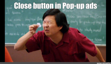
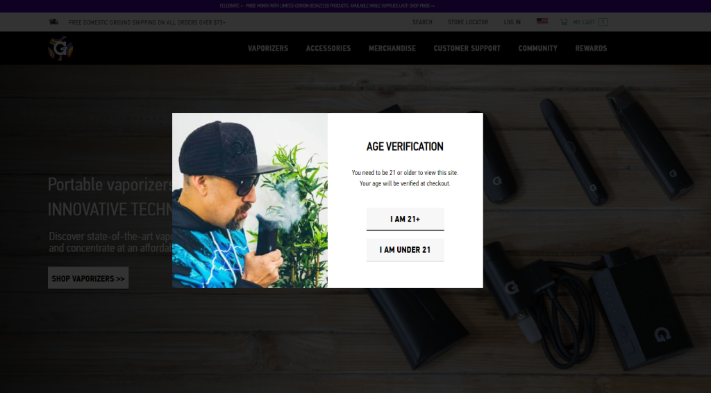
3. Annoying Pop-Ups
Pop-ups can be extremely annoying for users. They can cover the content or the entire screen, interrupting the user’s browsing experience.
Pop-ups are also associated with intrusive advertising and spam. Overusing or displaying them on every page can give the impression that your website is spammy, thus compromising your visitors’ trust and engagement.
Pop-ups can be particularly problematic on mobile devices, where screen space is limited. They can be difficult to close, negatively impacting the user experience and potentially leading to increased bounce rates.
There are, however, situations in which pop-ups can be used effectively, such as:
- Conveying important announcements
- Encouraging email subscriptions
- Requesting age verification
- Verifying cookie consent
- Promoting limited-time offers
If you do choose to include pop-ups in your web design, here are some of the best practices to follow:
- Choose colors that create contrast and focus on important elements while maintaining consistency with your branding.
- Simplify your message and design, focusing on one main value proposition and a clear call-to-action.
- Ensure that your pop-ups seamlessly blend with your website’s overall theme and use elements that are consistent with your brand’s style.
- Set a duration for your pop-ups to ensure they are not overly intrusive and make them close automatically after a certain period.
- Provide something valuable to users in exchange for their information or actions.
- Test different variations of your pop-ups to optimize their effectiveness and improve user experience.
4. Autoplay Videos
Autoplay videos are generally considered damaging to web design due to several reasons:
- They can significantly slow down the loading time of your webpage as they require a large amount of bandwidth to load, adding extra data that needs to be fetched before the page can render correctly.
- The moving images make it harder for your users to locate and focus on relevant content, thus increasing the mental effort needed for completing tasks.
- Homepage autoplay videos can shift the focus from the primary calls-to-action (CTAs) on your page.
While there can be exceptions, such as slow-moving videos that don’t distract your visitors’ attention from CTAs, autoplay videos on homepages are generally deemed unnecessary and potentially harmful to the overall user experience.
If you want to play it safe, manual play videos might be a better option. By offering videos with an optional play button, you provide a less intrusive experience for website visitors.
Unlike autoplay videos with sudden audio, which can catch users off guard or play while they’re at work for example (oops), manually played videos give your user the choice to engage instead of trying to force it.
5. Excessive Use Of Stock Images
Our next web design trend that’s overused but shouldn’t be is the excessive use of stock photos. Stock images in web design can have several negative effects:
- Lack of originality: Stock photos are widely used, and chances are your competitors are using them too. This makes it difficult for you to stand out and create a unique visual identity for your business.
- Inconsistency: Stock photos may not accurately represent your business concept or convey the intended message.
- Limited creative control and customization: Stock photos come with limited editing and manipulation options. You have little control over elements like brightness, cropping or other adjustments.
- Lack of value: Stock photos often fail to add genuine value to your brand. They can appear generic, lacking the authenticity and uniqueness that helps to build a strong connection with your target audience.
Alternative options you can explore include using illustrations or custom visual elements that align with your brand identity.
Choose the best trends for your website.
Work with our experts. Schedule A Consultation!
Work with our experts. Schedule A Consultation!
Web Design Trends In Action, From Our Digital Silk Kitchen
Digital Silk is a complete web design agency, specializing in growing brands online. From branding and digital strategy to custom web design and mobile app development, our in-house team consists of top digital experts across the board.
Take a look at some of the best web design trends in action below, straight from our design kitchen!
1. Liquid Animation & Dark Mode: Studenglass
Glass hookah brand Studenglass offers website visitors a high-end experience to match their premium products. Our design team used two of the web design trends above for this custom site: dark mode and liquid animation.
Instead of the optional toggle switch that many websites implement to increase accessibility, our designers went all out with the dark mode approach to add an exclusive look and feel to the website, catering to the target market.
When it comes to animation, the liquid effect below offers an engaging cool factor that keeps visitors on page and brings the product to life.
2. Micro-Animations: Budda Brands
Buddha Brands is a food and beverage company that sells plant-based snacks and beverages as a healthier snacking alternative.
Targeted towards a young, busy and active audience who are looking for ways to improve their diet and overall health, we used a playful design for Budda Brands’ website to connect with the upbeat personality of their target market.
Our design team added custom micro-animations to correspond with the youthful and energetic spirit of their customers and used a colorful palette to display their wide variety of products.
3. Parallax Scrolling: FieldEdge
FieldEdge offers software solutions for businesses in HVAC, plumbing, electrical and similar industries.
To effectively engage website visitors while showcasing the key features of the brand’s offering, we implemented parallax scrolling into FieldEdge’s website to create a dynamic user experience.
As you scroll through the home page, the website elements dance on your screen, grabbing your attention and your focus.
We used ample white space to complement this trend, which ensures that the animation is beneficial instead of distracting.
4. Micro-Interactions: Rollink
Premium collapsible luggage brand Rollink markets to an audience who loves to travel and to do so in style.
The brand’s personality is bright, colorful and energetic — and our web design team created a custom website to match, using vibrant colors and micro-interactions.
While a small detail (thus the name), micro-interactions like the hover effect below increase user engagement.
5. Custom Illustrations: Welch’s Fruit Snacks
Welch’s Fruit Snacks likely needs no introduction. We opted for another vibrant design to match this brand’s playful personality and used custom illustrations to bring Welch’s Fruit Snacks to life.
From mouthwatering 3D illustrations to a unique scrolling feature that allows the fruit snacks to move across the screen, these custom additions offer a fun and engaging browsing experience for website visitors.
How To Choose A Web Design Agency For A Custom Project
Implementing these website design trends requires the skill of experts. But when it comes to finding the right partner for your project, the decision can be tough.
Here are our top tips on how to choose an agency partner:
1. Set Your Goals
Clearly define what you want to achieve with your website by answering the following questions:
- What is the purpose of my website? Determine whether your website is meant to generate sales, showcase your portfolio, provide information or serve any other specific purpose.
- Who is my target audience? Identify your target audience’s demographics, interests and preferences to tailor your website design and content accordingly.
- What key actions do I want visitors to take on my website? Define your CTAs. Decide if you want your visitors to make a purchase, fill out a contact form, subscribe to a newsletter, engage with your content, etc.
- What unique features or functionalities should my website have? Consider any specific features or functionalities that are essential for achieving your goals. Will you need an eCommerce platform for online sales, a blog integration to share valuable content or a customer review section?
For more information, visit our comprehensive guide for website planning.
2. Define Your Budget
Determine how much you are willing to invest in your website design and development. Consider the long-term value of your website and allocate a budget that aligns with your goals.
Keep in mind that how much a website costs can vary widely based on the complexity of the project and the expertise of the agency.
3. Conduct Thorough Research
Once you know what kind of website you need and how much you are willing to spend on your project, it’s time to start exploring your options.
For example, if you live in the Big Apple, don’t just search for web design companies.
Instead, seek a web design company based in New York. The reason for this is that they would understand the needs of the local businesses much better than a company operating from Washington, D.C.
To do this:
- Search an agency directory like DesignRush to narrow down potential partners
- Examine agency websites and review portfolios of their work.
- Look at ratings and reviews
- Schedule a meeting with your top choices
4. Ask The Right Questions
In each meeting, ask the following questions to help you narrow down your choice:
- Can you share your portfolio and customer feedback?
- Can you share your case studies?
- What industries have you worked with?
- What kind of services do you offer?
- Who will be in charge of my project?
Tap Into The Latest Web Design Trends With Digital Silk
Stay ahead of the curve with the latest web design trends and create an exceptional user experience for your website visitors with Digital Silk.
Our in-house team consists of leading designers, developers, branding experts, copywriters and more. We’ll conduct industry, competitor and market research to design a custom solution for your brand that attracts and engages your target audience.
At Digital Silk, we offer:
- Expertise: Our team consists of seasoned digital professionals who also act as consultants to provide guidance throughout your project.
- Transparency: We value transparent partnerships with our clients. From weekly check-ins to regular reports and timeline updates, you’ll always know exactly where your project stands.
- Customized solutions: We recognize that every brand is unique and cookie-cutter solutions won’t cut it. Our web design specialists will work closely with you to understand your needs and design tailored solutions that align with your brand identity, target audience and goals.
- Ongoing support: We pride ourselves on establishing long-term partnerships with our clients. Our dedicated support team is always ready to assist you.
Request a quote today to embark on a journey of innovation and stay at the forefront of web design trends. Build a custom website with our experts at Digital Silk!
Request A Quote For Your Website Project
Tell us about your website goals and let our experts give you a custom proposal
"*" indicates required fields