Dark Mode
Share
UX and UI decide whether visitors stay or leave — but the jargon can be baffling. This glossary breaks down 50+ UI/UX terms so you can brief designers and shape your site with confidence.

Published: April 28, 2023
Both user experience (UX) and user interface (UI) sit at the forefront of digital customer satisfaction, making them a crucial aspect of website design.
But what are the most important UI/UX terms you need to know when designing your website?
As a UX/UI design agency, we work with businesses like yours to help them navigate their UX and UI design projects with ease. Splitting UX and UI into two categories, our easy-to-follow glossary will help you knock your next design out of the park.
From wireframing to accessibility, we’ll cover everything you need to know when you engage in your website design project. Let’s dive in!
Have a UX/UI web design project?
Digital Silk designs high-end website UX/UI. Request a quote
Digital Silk designs high-end website UX/UI. Request a quote
UX Terms Used In Web Design
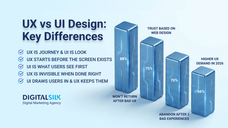
Did you know that one in three customers will cut ties with a brand they love after just one bad experience?
Here is the list of 27 UX terms to help you get started on your website creation journey with confidence and build a highly engaging user experience:
1. User Experience (UX)
UX in web design refers to the overall experience a user has while interacting with a website. It explains how easily visitors browse your website and how they feel while using it – if they find it accessible, functional, and visually pleasing.
2. Website KPIs
Website key performance indicators (KPIs) are metrics that show how successful a website is in achieving its goals.
Some examples include:
- Conversion rate: How many of your visitors have completed a desired action.
- Time on page: How long users remain on a single webpage.
- Bounce rate: How many people left your website before they had taken any action.
3. User Research
User Research is a UX term that describes the process of collecting information and creating a clear image of the user persona.
Web designers conduct user research to examine the goals, preferences, and pain points of your target audience to identify opportunities for boosting the overall user experience on your website.
4. User Journey
In simple terms, the user journey is the sequence of steps a user takes to complete a task or achieve a goal on a website, including the touchpoints they interact with along the way.
It contains all the steps your visitors take to complete the desired action – from the discovery of your website, entry point, and navigation to content consumption, interaction, and ultimate conversion.
Plan a seamless user journey with our experts.
Set up a consultation. Request A Consultation
Set up a consultation. Request A Consultation
5. Information Architecture (IA)
IA is a document that provides an operational blueprint of how a website functions from the user point of view. In simple terms, it shows the organization and structure of information on a website.
The goal of information architecture is to create user-friendly and intuitive navigation paths that enable visitors to easily find and access the information they are looking for on your website.
6. Sitemap
A sitemap is a UX term that refers to the visual representation of the website’s layout, or framework. It shows both the hierarchy of pages and their relationships to each other.
You can picture a sitemap as a family tree where your home page branches into other pages, creating a clear layout of your website’s structure.
7. User-Centered Design (UCD)
A user-centered design refers to the web design approach that puts the needs and behaviors of users upfront and involves them in the design process. Its goal is to create more effective and user-friendly products.
To put it simply, UCD is not about what you think your website should look and feel, it’s about what your users want to see and how they want to interact with it.
8. A/B Testing
A/B testing, also known as split testing, is a method of comparing two different versions of a web page to see which performs better in terms of user engagement, user experience or conversion rates.
For example, imagine you have two designed pages that differentiate in button colors, images, pricing models and so on. The aim is to measure them against each other to see which one generates more clicks.
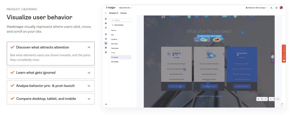
9. Heatmaps
In web design, heatmaps act as a visual representation of user behavior on a webpage. They track what elements users interact with the most when they browse a website.
You can use heat maps to identify the areas (buttons, links, and so on) users tend to click on more frequently than others. You can then use this information to optimize your content so that you put important elements, such as your call-to-action (CTA) on your page’s “hot spots”.
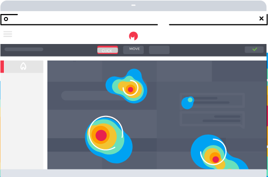
[Source: hotjar]
10. Accessibility
Accessibility in web design is the practice of adding various elements, such as keyboard navigation or video captioning, that help people with disabilities have a better user experience while browsing a website.
For instance, you can ensure that all images on your website have descriptive alt text so that visually impaired users can understand the image’s context or subtitle your videos for people with hearing disabilities.
See the full video guide on web accessibility form our Digital Silk expert.
11. Image Optimization
Image optimization is a term in both UI and UX that describes the process of reducing the file size of images on a website without sacrificing image quality (UI).
On the other hand, image optimization directly impacts user experience in two ways:
- Optimizing the image size contributes to loading speed optimization.
- Optimizing your image’s alt tag and description improves accessibility as it allows users with low vision to consume your content.
12. Rapid Prototyping
Rapid prototyping in web design is the process of creating a quick, basic version of a website and refining it on the go.
Designers start by creating a basic wireframe or mockup for your website layout and design. After which, they will test the website with users to identify areas for improvement before submitting the final design.
13. User Feedback
In relation to UX, user feedback is data and opinions received from customers and users about a website’s usability.
Designers typically gather user feedback through surveys and user testing. The goal is to identify aspects of your website that can be improved to better meet the needs of your target audience.
14. Interaction Design
Interaction design involves the process of creating a user interface that is intuitive and easy to use, allowing visitors to navigate and interact with the website in a way that feels natural to them.
Interaction design can help usability and engagement for your target audience, which helps metrics like time on page as well as increasing conversions.
15. Visual Design
Visual design is a UX term that describes the aesthetic or visual aspects of the website design. It includes the use of color, typography, imagery, layout, iconography.
When you decide on your website’s visual design, you need to choose design elements that are not only functional and user-friendly but also visually appealing and reflective of your brand’s identity and core values.
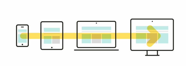
16. Responsive Design
Responsive design refers to a design approach that ensures a website adjusts its layout and content to fit different screen sizes and resolutions, providing a seamless user experience on any device.
Whether your users visit a website on a desktop computer, tablet or mobile phone, your website’s layout and content should automatically adjust to fit the smaller screen size and offer the same user experience.
17. Adaptive Design
Adaptive design is a UX term that describes a design approach that uses pre-established layouts for specific screen sizes, providing a custom user experience for each device.
For instance, your website might have one layout for desktop users, another layout for tablet users, and a third layout for mobile phone users. Each layout is specifically designed to provide the best possible user experience on the given device.
18. Mobile-First Design
Mobile-first design refers to a design approach that prioritizes designing a website for the smallest screen size first, before progressively scaling up the layout for larger screens.
Let’s say you need a web design service for your restaurant. A mobile-first design would prioritize creating a menu and location information to be easily spotted and accessible on mobile devices. At the same time, a website layout for your desktop visitors would include additional pages and features.
19. Micro-Interactions
Micro-interactions occur when a user interacts with a website or hovers above certain design elements.
On your website, you can use micro-interactions that provide feedback, and visual cues or come in the form of simple animations to enhance user engagement.
20. Website Content Strategy
Content strategy in web design refers to the process of planning, creating, publishing, and managing content that meets business objectives and provides value to the target audience.
For instance, a blog section on your website will provide helpful and informative content related to your products or services. As a result, you will establish your brand as an authority in your field and ultimately drive more traffic to your website.
Need a web content strategy?
Speak with our experts. Schedule A Consultation
Speak with our experts. Schedule A Consultation
21. Gamification
Gamification refers to the process of incorporating game-like elements into a non-game context, such as a website. Its main goal is to engage users and encourage specific behaviors or actions.
Gamification is a fun and popular, way to interact with your visitors. Google for instance, even uses it just for fun. Try typing “do a barrel roll” in Google’s search query and you will experience gamification first-hand.
22. Behavioral Design
Behavioral design is a UX term that describes the practice of designing web elements that influence or encourage specific behaviors in users. It uses basic principles of human psychology to guide user actions toward desired outcomes.
For instance, you can ask a web designer to place the primary CTA button in a notable location on your website to encourage your visitors to take specific action, such as signing up for a newsletter or purchasing a product.
23. Progressive Disclosure
Progressive disclosure is a design technique where information is presented in a sequence. It shows the most important or relevant information first and reveals additional information when needed.
The most popular example of progressive disclosure in web design is a dropdown menu that displays additional options only when the user clicks on it.
[Source: Designrush]
24. Design System
A design system is a UX term that describes a collection of reusable components that are used for building websites.
You can think of a design system as a guidebook or a manual for developing websites, much like a “recipe book” is for cooking delicious meals.
25. Cognitive Walkthrough
A cognitive walkthrough in web design is a usability testing method that involves going through a user’s thought process as they interact with a website.
A participant is guided through a series of tasks on a website while being asked to verbalize their thoughts and feelings. The goal is to find usability pain points and fix them.
26. Low-Fidelity Wireframe
A low-fidelity wireframe is a simple outline of a website’s layout and design. It is usually created using basic shapes and placeholders.
You can think of a low-fidelity wireframe as a rough draft or blueprint that helps designers plan how the website or app will look and work. It’s a quick and easy way to explore different design ideas before investing time and resources into building a fully functional prototype.
27. High-Fidelity Wireframe
A high-fidelity wireframe describes a detailed and realistic visual representation of a website’s design and functionality.
Unlike low-fidelity wireframing, high-fidelity wireframing includes using advanced tools for creating more detailed digital mockups with images, icons, and text content.
Designers use high-fidelity wireframes to test and refine the user experience and give you a better idea of what the final product will look and feel like.
Discover more web design terms in our complete web terms glossary.
Have a web design project?
Work with our design experts. Set Up A Consultation
Work with our design experts. Set Up A Consultation
UI Terms Used In Web Design
From grid systems and layouts to motion graphics and iconography, here are 31 essential UI terms to help you better understand web development language:
28. User Interface (UI)
User interface refers to the visual aspects of a website that users interact with.
Web designers will aim to improve UI through the use of visual design elements such as buttons, menus, toggles and animations.
29. Landing Page Design
Landing page design is a UI term that describes the process of creating a web page that is specifically designed to encourage visitors to take a desired action, such as making a purchase or filling out a form.
Let’s say you run an eCommerce business. You would need a landing page that promotes a specific product, offers detailed product information, and displays a notable “Add to Cart” button that encourages your users to take the desired action (buy your product).

30. Composition
Composition refers to the arrangement of visual elements, such as images, text and whitespace, on a webpage.
The idea is to use contrasting colors, fonts, and so on, to draw attention to specific elements on a page. For instance, designers can use a bold color for your CTA buttons to make them stand out and encourage your users to click.
31. Grid System
A grid system is a UI term that describes a framework of horizontal and vertical lines used for guiding the placement of elements on a page. By using a grid system, designers create a sense of visual order and consistency.
Web designers can create grid systems for product listings, aligning product images and information along a grid to make it easier for your visitors to browse and compare your products.
32. Graphic Design
Graphic design is the process of creating visual content using typography, images, infographics and other visual elements on a website.
When you build a website for your business, designers will use graphic design elements to communicate your message and convey your brand’s identity through logos, icons, and illustrations.
33. Layout
In relation to UI and web design, layout describes the arrangement of visual elements on a webpage, including text, images, buttons and so on.
The main goal of an effective layout is to help guide your users’ attention toward the important information or an element on your website.
34. Whitespace
Whitespace, also known as negative space, refers to the empty spaces around the design elements on a webpage.
When used properly, whitespace helps create a sense of balance and harmony in a layout and makes the overall website design more visually appealing.
For example, if you have a large amount of text on your website, you will use whitespace to create generous margins around text blocks to make it easier for your visitors to read or skim it for important information.
[Source: mediamaxnetwork]
35. Contrast
Contrast is a UI term that describes the degree of difference between two elements in a design. It is typically used to draw attention to important elements such as headlines or CTAs, making them stand out from the rest of the page.
For example, using a bright color on a certain element against a dark background will help guide your visitors’ attention to important aspects of your website.
[Source: gpen]
36. Color Theory
Color theory in web design refers to understanding how colors work together to create a cohesive and visually appealing design.
An important aspect of color theory is color psychology, where different colors are used to affect human emotions. For example:
- Yellow symbolizes happiness, warmth and creativity.
- Blue depicts trust, loyalty and competence.
- Red stands for strength, love and energy.
- Green manifests nature, freshness and quality.
37. Typography
Typography refers to the design and arrangement of text on a page, including the selection of fonts, sizes, colors and spacing.
For example, you can use a larger font size for headlines and a smaller font size for body text to create visual contrast and make the content easier to read or skim.
38. Iconography
Iconography refers to the use of icons or symbols to represent concepts or actions in a design. Its main purpose is to improve user experience and make it easier for users to navigate the site.
For example, you can use a magnifying glass icon to represent a search function or a shopping cart icon to represent a checkout process. This helps your users quickly identify and understand the different features of your website.

[Source: NewDevRev]
39. Motion Graphics
Motion graphics refers to the use of animation, video and other dynamic elements to create engaging and interactive website experiences.
For instance, you can include animated icons instead of static ones or have a custom cursor that changes depending on the users’ actions to add a unique and playful element to your website and increase user engagement.
40. Navigation Design
Navigation design describes the process of designing and organizing the layout of a website’s navigation system. Its main goal is to make it easy for users to find what they are looking for.
Some of the best practices of navigation design you can apply to your website include:
- Clear labels
- Grouping related content together
- Providing a search function (the feature that allows your users to search for specific content on your website by simply typing the keywords or phrases in a search query).

[Source: powr2]
41. Menu Design
Menu design refers to the visual and functional design of a website’s menus – the lists of content categories or features, grouped together with visual styling that differs from the rest of the design.
A well-designed menu is easy to use, has clear and concise labels, offers a logical grouping of menu items, and provides visual cues that help your visitors better understand the hierarchy of your content.

[Source: crawlsf]
42. Drop-Down Menu
A drop-down menu is a type of website menu that expands to give more information when the users interact with it. Its main purpose is to organize large amounts of content, declutter, and create an intuitive hierarchical structure.
When your visitor clicks or hovers over the element, a list of options “drop-down” from the menu. For instance, your website might have a dropdown menu for “Shoes”, with submenus for “Athletics”, “Casual” and “Heels”. This helps you present multiple choices clearly and concisely to your website users.
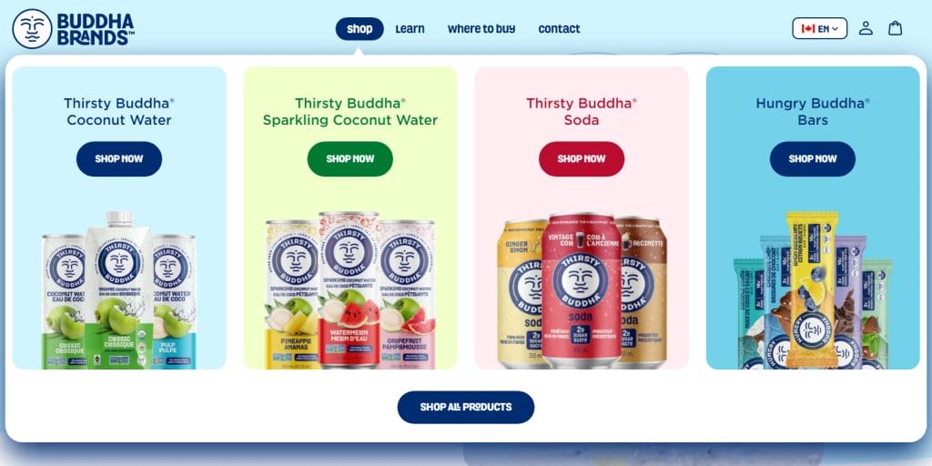
[Source: buddhabrands]
43. Button Design
Button design refers to the visual and functional design of buttons on a website.
Some of the best practices of button design include using clear labels, providing visual feedback when the button is clicked or hovered over and making sure the buttons are clickable on different screen sizes.
It is important to pay attention to your buttons’ design as they are often the primary way the users interact with your website.

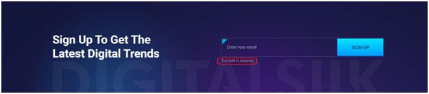
44. Input Fields
Input fields are web design elements that allow users to submit information through a website. They serve to collect user data, perform a search, or enable online transactions. Input fields should be designed in a way that makes it clear to users what information they need to enter and in what format.
For example, your date input field should include an example format for your visitors to follow, whileour email input field should include validation that ensures your users entered a valid email address.
45. Radio Buttons
Radio buttons refer to a set of options that allow users to choose only one option from the available choices. They are often used in forms or surveys to let users make a single selection from a list of mutually exclusive options.
Let’s say you run an eCommerce website. Radio buttons will allow your visitors to choose only one payment method from multiple choices, such as paying with a credit card, PayPal or bank transfer.
46. Checkboxes
Unlike radio buttons, checkboxes are user interface elements that allow users to select one or more options from a list of predefined options.
For example, you can have a checkbox that asks your visitors to select their interests from a list of options such as reading, sports, cooking and traveling.
47. Toggle Switches
Toggle switches are graphical user interface elements that allow users to turn a setting on or off with a single click.
You can use toggle switches on your website to allow your users to switch between dark and light mode, sound off and on, notifications off and on and so on.
48. Steppers
Steppers are user interface elements that allow users to increase or decrease a certain value by clicking on arrows or buttons.
For example, you can use a stepper on your website to let your visitors select the number of items they want to buy.
49. Tooltips
Tooltips refer to web elements that display additional information or context when a user hovers over or clicks on a specific element. They are usually used to provide more information about a feature, explain a term, or give instructions on how to use a particular function.
For example, you can use a tooltip on a button if you want to provide a brief description of what will happen when your visitors click on a specific button.
50. Feedback Message
A feedback message is a UI term that describes providing information to the user about the status or outcome of their action.
For instance, you can create a feedback message that appears after a user submits a form on your website to let them know if the form was successfully submitted or if there are any errors that need to be corrected.
51. Loading Indicators
Loading indicators refer to the user interface elements that show the visitors that the website is loading content or performing an action.
Their main purpose is to reassure the user that the system is working properly. This way your users will know that your website hasn’t frozen or crushed.
Loading indicators helps the users know when a page is performing a certain action.
52. Progress Bar
A progress bar is a UI term that describes a visual element on a website that shows users the status of a process or task, usually filling up gradually as the task is completed.
A flat design will bring clarity while reducing loading times.
53. Call-To-Action (CTA)
A call-to-action is a statement or button on a website that encourages users to take a specific action, such as making a purchase, signing up for a newsletter or filling out a form.
Your CTA should be attention-grabbing, concise, and relevant to your business goals. It should also be strategically placed throughout your website to ensure you don’t miss any conversion opportunities.

54. Flat Design
Flat design is a design approach that emphasizes minimalism and simplicity, using clean lines, two-dimensional illustrations and flat colors to create a modern and sleek look.
The main benefit of a flat design is that it brings clarity while reducing loading times as well.
[Source: buddhabrands]
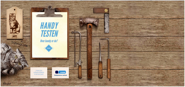
55. Skeuomorphic Design
Skeuomorphic design is a UI term that describes the use of realistic textures and visual elements in web design that mimic real-world objects.
Even though a skeuomorphic design is currently considered outdated, its main purpose was to bridge the gap between the digital interface and the physical world and showcase your product more realistically.
[Source: handytesten]
56. Visual Consistency
Visual consistency refers to maintaining a cohesive look and feel throughout a website’s design. It includes the use of consistent colors, fonts and imagery.
Applying visual consistency on each page of your website can help you reinforce your brand’s image and identity.
57. Website Style Guide
A website style guide is a set of established rules and guidelines that govern the visual and functional aspects of a website. It outlines the typography, color palette, layout, imagery and other design elements to ensure consistency and brand cohesion across the site.
UX Tech Glossary: UX Terminology & Brands
Here is the list of some of the most popular brands used to enhance UX in web design:
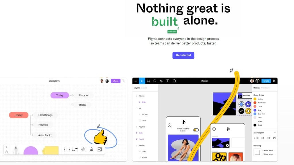
1. Figma (High-Fidelity Wireframes)
Figma is one of the most popular UX design tools used for collaborative work and creating high-fidelity wireframes, a comprehensive visual representation of a website’s design and functionality
Figma comes with an online whiteboard tool, called FigJam, used for sketching out ideas, mapping user journeys, and collaborating with team members, all while using the audio chat feature for communication in real time.
Some of its other features include:
- Team libraries
- Audio conversations
- Advanced animations and drawing tools
- Sketch Import
- Content management
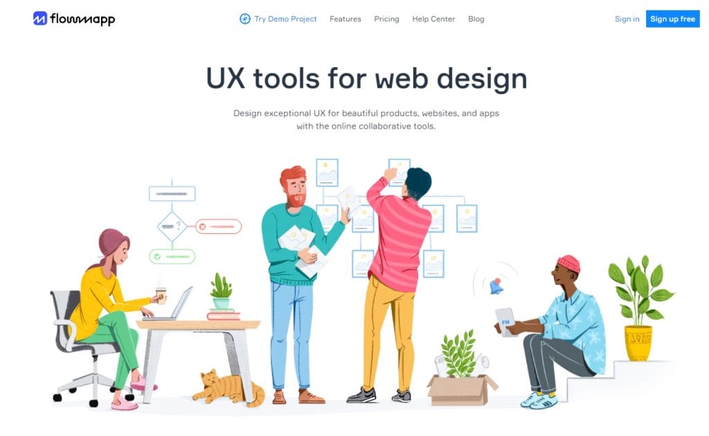
2. Flowmap (Sitemaps)
FlowMapp is one of the best UX tools used for creating sitemaps, a visual representation of the website framework, user flow diagrams and other forms of graphic illustrations.
It comes with collaboration and sharing capabilities that make it easy for teams to collaborate, share feedback and quickly iterate on UX design projects.
Its other important features are:
- Cloud storage
- Drag and drop pages
- SSL security
- Various integration options
- Project activity
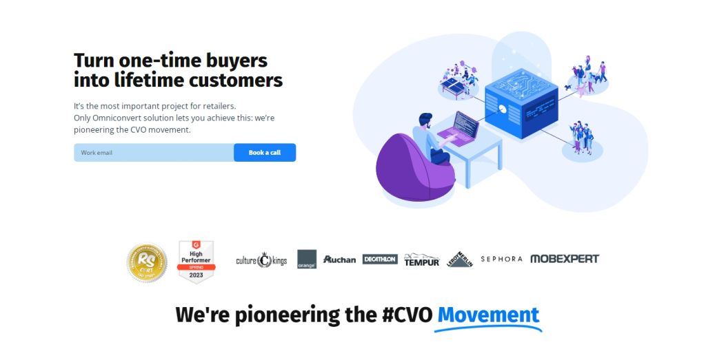
3. Omnicovert (Conversion Rate Optimization)
Omniconvert is a data-driven UX software that offers advanced user segmentation and optimized customized journeys. Its main focus is on conversion rate optimization, an essential website KPI.
Omniconvert comes with an easy-to-use visual editor and advanced targeting options to simplify the testing process.
Its key features include:
- Web personalization
- Website testing for multiple devices
- Advanced segmentation and targeting
- Advanced tracking and reporting
- Data audit
4. HotJar (Heatmapping)
HotJar is an insights tool used for gathering user analysis by tracking user behaviors and journeys through a website.
A key enabler in heatmapping, a technique used to understand where users interact most on a webpage, HotJar supports web designers in pinpointing navigation pain points and opportunities.
Some of its main features are:
- User behavior visualization
- Targeted surveys creation
- Session recordings
- Customized feedback
- Trigger Survey
UI Tools To Know When Designing Your Website
Here is a list of four essential UI brands used in many web design projects.
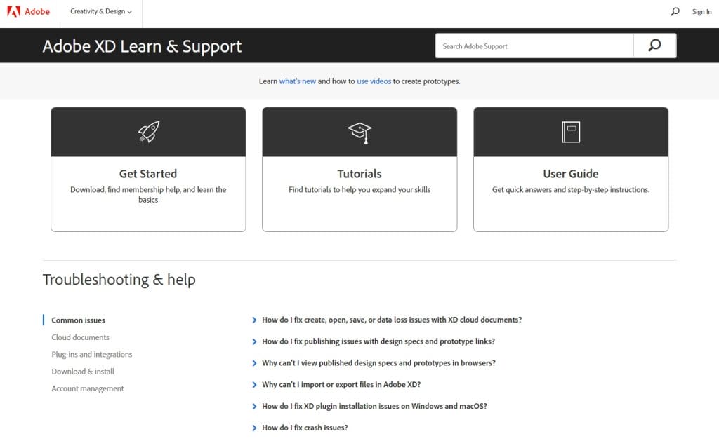
1. Adobe XD (Buttons And Navigation Design)
Adobe XD is a tool that allows designers to reuse common elements like buttons and navigation and keep them in sync throughout the entire design.
Some of its main features are:
- Drag and drop editor tool
- UI kits
- Voce prototyping
- 3D object transformations
- Artboards and smart guides
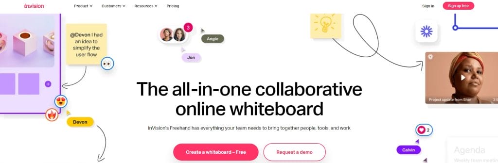
2. InVision Studio (Motion Graphics)
InVision Studio is a UI tool equipped with all kinds of features for creating flawless motion graphics such as animations, drawings, wireframing, and prototyping.
It offers an intuitive vector-based drawing tool, an infinite canvas, as well as an array of rapid prototyping features, and pre-built animations.
Its other important features include:
- Adaptive layout
- Mobile device mirroring
- Smart-swipe transitions
- Shared component libraries with real-time syncing
- Timeline editing
3. Mockplus DT (Visual Consistency)
Mockplus DT It is a non-coding prototyping tool, that comes with a drag-and-drop interface, a broad selection of pre-designed UI components and icons, optimized for visual consistency – a clean and cohesive website look.
It is a web-based design tool capable of quick and effortless creation of interactive UI designs for web, mobile, and desktop applications.
Some of its other key features are:
- UI library
- Reusable assets
- Drag and drop builder
- Auto generation of design assets and visual specs
- Prototype preview and testing
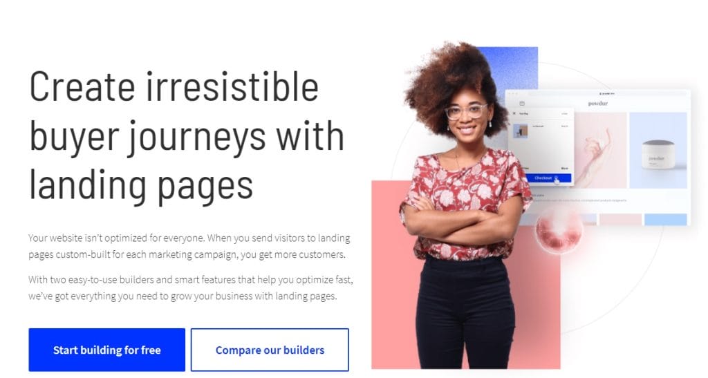
4. Unbounce (Landing Page)
Unbounce is a smart, user-friendly tool, specialized for designing website landing pages, – pages that are designed to encourage the users to take the desired action.
It uses AI to recommend page improvements in real time and comes with a design assistant that suggests industry-specific templates to its users.
Its other key features include:
- Insights copy
- Grid builder
- Copy assistant
- Built-in Google fonts
- Direct domain publishing
Learn More About UI/UX Terms & Design Your Website With Our Experts
At Digital Silk, our team specializes in UX and UI design, ensuring your website not only looks good but also provides an intuitive and engaging experience for your users.
We approach every project with a client-centric mindset, tailoring our design strategies to meet the unique needs of your business and target audience.
Whether you need a brand-new custom website or a redesign of an existing one, we will work closely with you to understand your requirements and provide customized solutions that align with your business goals.
Use your newfound knowledge of UI/UX terms together with our expert designers. Some of our web design services include:
- Creative web design
- Custom web design
- Mobile-first web design
- Minimalist web design
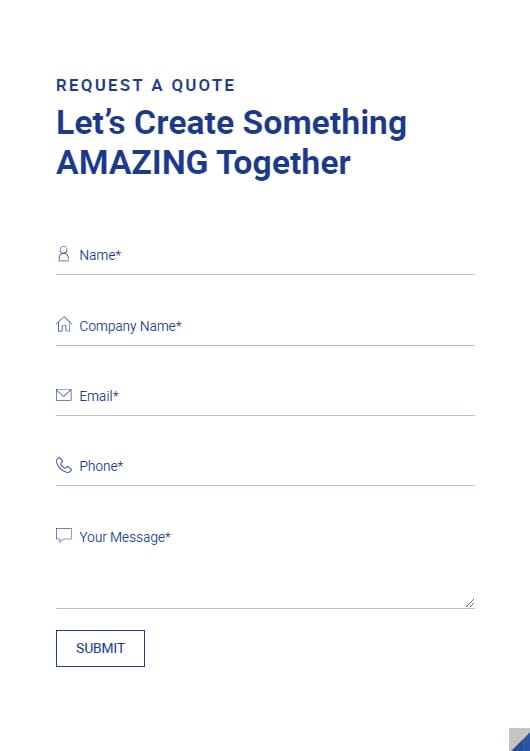
Call us at (800) 206-9413 or complete our Request a Quote form to receive a free consultation and start your website project today.
Request A Quote For Your UX/UI Website Project
Tell us about your website goals and let our experts give you a custom proposal
"*" indicates required fields