Dark Mode
Find 21 web design tips to maximize your website's conversions. Learn expert-approved strategies to improve usability and engagement.

Updated: January 14, 2026
Web Design Tips: Key Highlights
-
UI improvements depend on structure: Consistency, simplicity, hierarchy, grids, mobile-first layouts and legible typography keep pages easy to move through.
-
UX improvements are guided by behavior: Research, personas, journey mapping, accessibility, micro-interactions, progressive disclosure and A/B testing improve how the experience performs in real use.
-
Brand consistency must be built in: Foundations, style guides, strategic color use and predictable logo placement help maintain recognition across every page.
Why does one website turn steady demand into revenue while another loses momentum before value ever registers?
Engagement-focused UI improvements can raise conversion rates by around 200%, while UX enhancements have been shown to drive increases closer to 400%, directly affecting how many visitors turn into leads or buyers.
In 2026, rising acquisition costs and thinner attention margins leave little room for pages that distract, confuse or slow the path to action.
In this post, you’ll find 21 useful web design tips that shape page structure, interactions and visual cues to support engagement through conversion.
Web Design Tips For UI Optimization
User interface (UI) is a web design term that refers to the visual and interactive elements that visitors engage with while browsing a website or application.
It encompasses the layout, design and presentation of on-screen elements such as buttons, menus, forms and icons, to create a seamless and intuitive user experience:

Let’s explore some of the top UI web design tips that can help you create engaging experiences:
1. Apply Visual Consistency
Visual consistency in web design refers to the deliberate and harmonious use of the same design elements, such as colors, typography, spacing, layouts and imagery throughout a website.
It ensures that all pages and components within a site maintain a cohesive and uniform appearance, creating a sense of familiarity and predictability for visitors.
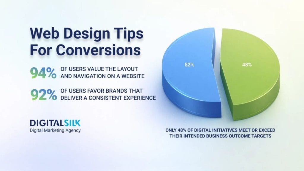
With 92% of consumers favoring brands that deliver a consistent experience, visual consistency helps meet an expectation most users already bring with them.
Here’s how to follow the best practices for achieving visual consistency:
- Choose a limited color palette: Opt for three colors as a base and use them same consistently throughout your website
- Select a few fonts: Try using no more than three fonts for headings, subheadings and body text
- Apply a consistent style to images: Ensure your images follow the same style, whether that’s through filters, color adjustments or framing techniques
- Implement consistent design for all icons and graphics: For instance, if you are using a minimalist icon style, ensure it remains the same across all sections of your website, such as navigation, services and features
- Maintain a consistent approach to image placement: Use the same sizing and alignment for all of the pictures on your website
- Keep a uniform style and appearance for UI elements: Elements like forms, tabs or accordions should have a uniform style and appearance to help your visitors recognize and understand them intuitively

Have a custom web design project?
2. Keep It Simple
Simplicity in web design refers to the deliberate removal of unnecessary elements, complexities and distractions from a website’s design, content and functionality, resulting in a clean, intuitive and efficient user experience.
When pages become crowded or visually overwhelming, performance drops sharply, with conversion rates falling by as much as 95% on cluttered layouts.
Simpler layouts give primary actions visual priority, reduce cognitive load and make it immediately clear where attention should go next.
Here is how to achieve simplicity in web design:
- Avoid irrelevant information: Excessive pop-ups, complex animations or unnecessary links can confuse or distract your users
- Highlight core aspects of the page: Elements such as calls-to-action (CTAs), section headings or key buttons should be easy to spot and guide your visitors toward their goals
- Simplify repetitive tasks: For instance, use standard icons for actions like “Save,” “Undo,” or “Delete,” as users have learned to associate these icons with specific actions
- Reduce the number of choices: The fewer choices you present to your users, the easier it is for them to follow a clear path
3. Design With Hierarchy In Mind
Visual hierarchy refers to the arrangement of graphic elements based on their importance, using principles like size, color or contrast to influence how your visitors interact with a website.
Here is how to design with hierarchy in mind:
- Consider reading patterns: Recognize reading patterns based on cultural norms (e.g., left-to-right for Western languages, right-to-left for others) and design pages accordingly. Put the most important content at the top and on the left side.
- Leverage size for emphasis: Highlight essential elements by making them larger, which will capture more attention.
- Use color and contrast: Employ color and contrast to direct the eyes toward important elements on your website.
- Group elements for unity: Group related elements through proximity and repetition to signify their connection and importance.
An example of design with hierarchy in mind: Our design solution for Blue Ridge Partners, a consulting company for accelerating revenue growth, follows the best practices for visual hierarchy.
From color contrast to emphasizing important elements by using larger fonts to grouping related components close together, this website was designed with hierarchy in mind.
4. Use Grid Systems
A grid system in web design organizes elements on a webpage using columns and rows to ensure a clear hierarchy, easy navigation and an aesthetically pleasing design.
To use a grid system in web design:
- Choose the right grid: A simple blog might benefit from a basic column grid, while an eCommerce site could require a more dynamic grid system for flexibility.
- Use responsive grids: Responsive grids distribute content using percentages, adapting the layout to different screen sizes without distorting dimensions.
- Honor the rule of thirds: Apply the rule of thirds by dividing the webpage into nine equal parts with two vertical and two horizontal lines. Place important elements along these lines to naturally draw attention and influence the visitor’s navigation.
5. Opt For Mobile-First Design
With nearly 45.82% of internet traffic in the U.S. originating from mobile phones, prioritizing mobile-first design emerges as a strategic imperative.
Here’s how to effectively apply the mobile-first approach:
- Identify user needs: Begin by understanding what mobile users expect from your product. For instance, in the case of a restaurant website, users might prioritize operating hours, location and contact details.
- Apply responsive progression: Start with smaller screens in mind and display only the most essential elements. As screen size increases, progressively enhance the design by adding more features or details.
- Prioritize content: Prioritize and display the most important elements prominently to meet the visitor’s immediate needs. This may include concise headlines, critical information and clear calls to action.
- Test your design: Conduct tests on different devices and browsers under real conditions to ensure it performs optimally across various devices and browsers. Platforms like BrowserStack and Responsive Checker can help you verify how your design appears on various devices and browsers.

Looking to design a new website?
6. Create Intuitive Navigation
Intuitive navigation refers to the design and arrangement of navigation elements within a website or app in a way that is easily understandable and user-friendly.
It aims to guide your users throughout the website, enabling them to find the information they’re looking for and perform tasks with minimal effort and confusion.
For 94% of users, layout and navigation matter more than any other site feature, which makes intuitive structure a baseline expectation rather than a differentiator.
Here is how to create intuitive navigation:
- Use straightforward and descriptive labels: Don’t use jargon or overly creative terms that might confuse visitors
- Group related and similar items together: Use categories and subcategories to organize your content
- Implement a hierarchical structure: Use headings and subheadings to establish a clear information hierarchy
- Utilize visual cues: Visual cues like color, icons and typography can help you differentiate between navigation sections and highlight important links
- Apply responsive and adaptable navigation: Ensure your navigation design fits various screen sizes and devices
- Test your navigation: Conduct tests with actual users to identify usability issues
- Continuously monitor user behavior: Always keep an eye on the user behavior and adapt the navigation based on analytics and user insights
An example of intuitive navigation: Our design for G Pen, an online platform for selling high-end vaporizers, offers intuitive navigation that includes drop-down menus with clear labels and images that make the user journey extremely easy.
This approach ensures that their customers can quickly find the products they’re looking for, explore product details effortlessly and have a seamless shopping experience.
7. Ensure Legibility
Legibility in web design refers to the ease with which individual letters and numbers can be distinguished and recognized by visitors.
Typeface selection, font sizing, spacing and contrast directly affect how users interpret content on screen.
Poor contrast alone accounts for roughly 79.1% of accessibility failures, showing how often legibility breaks down when visual design overlooks real reading conditions.
To achieve legibility in web design:
- Opt for simple, web-friendly fonts: Stay away from overly decorative or complex typefaces and go with web-safe fonts and modern typefaces like sans-serif fonts (Arial, Helvetica, etc.)
- Make your fonts easily readable: Set a minimum font size of around 16 pixels for body text to ensure readability
- Use fonts to enhance visual hierarchy: Increase font size for headings, subheadings and other important text elements to create a visual hierarchy
- Use appropriate line spacing: Use line spacing of at least a space-and-a-half within paragraphs to prevent text from appearing crowded
- Ensure a high contrast between text and background colors: Dark text on a light background or vice versa usually provides better legibility
- Conduct user testing: Gather feedback from users to identify any potential issues and make necessary adjustments
8. Follow CTA Best Practices
Creating effective call-to-action (CTA) buttons is crucial for driving user engagement and conversions on your website.
The best strategies to help you craft compelling CTAs include:
- Use contrasting colors: Opt for ideally two colors that are significantly different from each other in terms of hue, brightness or saturation to grab your users’ attention. Even a single high-contrast element, such as a red call-to-action, has been shown to increase conversions by roughly 34%.
- Position your CTA strategically: Place your CTAs where eyes are naturally drawn, such as near headings, subheadings or relevant content
- Leave plenty of space: Ensure you have a substantial empty space around the CTA to prevent it from blending into other elements on your website
- Craft actionable and concise text: Use strong verbs for your CTAs that convey urgency and action, such as “Get started,” “Download now” or “Sign up today”
- Incorporate urgency or time-sensitive phrases: Use words like “limited time offer, ” “exclusive,” “last chance,” etc.
- Place social proof or testimonials near your CTAs: This will help you build trust and credibility and will encourage your users to convert
Design a high-converting website today.
9. Follow Color & Contrast Best Practices
Prioritize color contrast to enhance readability, emphasize content hierarchy and cater to visitors with different vision abilities.
Best practices for color and contrast optimization include:
- Apply color contrast: Opt for a clear distinction between foreground and background colors to ensure easy readability.
- Check your color contrast level: Use online color contrast checkers like WebAIM‘s tool to assess your color combinations and ensure they meet accessibility standards.
- Optimize saturation and brightness: Highly saturated colors can strain the eyes. Opt for a balance between saturation and brightness for optimal visibility.
- Test across different environments: Evaluate your website’s contrast in various lighting conditions to ensure readability in both bright and dim settings.
- Understand the emotional impact: Choose a palette that aligns with your website’s purpose and desired user experience. For instance, black is for prestige, blue is for calmness, etc.
- Limit the use of multiple bright colors: Excessive use of bright colors can overwhelm your users or create visual confusion
An example of color and contrast best practices: Digital Silk’s design solution for Boston Materials’ homepage shows how deliberate contrast between dark backgrounds, light typography and accent colors improves legibility and visual hierarchy.
With a color palette of soft pinkish-beige, deep shades of blue and vibrant yellow, their website looks clean and inviting.

The typpography, interface elements and calls to action maintain clear separation from their backgrounds, allowing hierarchy and navigation to stay clear as the layout shifts.
10. Use Whitespace
Whitespace, also known as negative space, refers to the empty or unoccupied areas that don’t contain any visual or design elements such as text, images, or graphics.
White space provides breathing room between different elements, enhancing readability, guiding user focus and improving overall user experience.
Best practices for using white space in web design include:
- Adjust the amount of white space around different elements: For instance, you would use less white space between lines of text than you would between two paragraphs
- Avoid excessive empty spaces: Strike a balance that enhances content focus without making the site feel empty or unclear
- Use whitespace to guide your visitor’s attention: Emphasize important elements on your website, such as your CTAs, by providing sufficient empty areas around those elements, creating visual emphasis and clarity
An example of whitespace usage best practices: Our design solution for Field Edge, a field service management software provider, comes with plenty of whitespace that separates all elements on their website for better visibility.

This approach allows their visitors to focus on the messaging and key features without distractions, enhancing user experience and making it easier to understand the company’s unique value proposition.

Want to grow your brand online?
Web Design Tips For UX Optimization
Now that we have covered the UI aspect of web design, let’s move on to UX.
User experience (UX) in web design refers to the overall quality and satisfaction that visitors experience when interacting with a website.
It encompasses factors such as ease of navigation, accessibility, usability, aesthetics and the overall emotional and functional impact of the website on your users.

Keep reading to find the best tips for UX for crafting a website optimized for user experience, straight from our experts.
11. Conduct Audience Research
Audience research in web design is essential for understanding the preferences, pain points and behaviors of your target demographic, enabling you to tailor your design, content and functionality to effectively engage and cater to their specific requirements.
To research your audience:
- Send out online surveys and questionnaires: Use platforms like Wufoo, Typeform or Google Forms
- Create focus groups: Define objectives, recruit diverse participants and record sessions for analysis
- Track analytics: Analytics tools like Google Analytics or Hotjar, can help you gain insights on user behavior, click patterns and popular features
By identifying visitor needs, tailoring your content and optimizing functionality, you can create a website that truly connects with your audience, ultimately leading to better engagement and conversions.
12. Create User Personas
Your website doesn’t have to appeal to everyone, but instead, it should focus on potential customer, which is where a user persona comes in.
This is a fictional representation of an ideal customer, constructed based on user research to encapsulate their needs, goals and behavior patterns.
Below is an example of what this fictional persona would look like for a fitness company:

To define your signature user persona that guides your strategy, follow these tips:
- Create a fictional character name
- Choose an image to visually represent the persona’s appearance
- Specify the persona’s age, gender, ethnicity and education level
- Define the persona group they belong to, such as working moms, students, professionals, etc.
- Describe their job role, industry, level of experience and income level
- Outline the physical setting where the persona interacts with your product
- Identify their pain points, challenges and reasons for using your product
- Include details about their preferred activities, hobbies and lifestyle choices
- Define the primary objective the persona aims to accomplish using your product
- Describe how they use your product to achieve their end goal
- Narrate the steps they take and the challenges they may face
13. Map Out The User Journey
Mapping out user journeys helps you identify pain points, optimize the user experience, and align design decisions with user needs and goals by providing a visual representation of the entire user interaction process.
You will end up with the series of steps or interactions that a visitor takes while navigating your website, the touchpoints they encounter and the overall experience they have as they interact with different elements on your website.
With 73% of people citing customer experience as a deciding factor in what they buy, mapping each step becomes a direct way to address what influences purchase behavior.
Here’s a step-by-step guide on how to effectively map out a user journey:
- Define user goals: Identify the primary goals or tasks that visitors want to accomplish on your website. This could be making a purchase, signing up for a service, or finding information.
- Outline the journey: Start by listing the main touchpoints or steps the visitor will go through to achieve their goal. These could include landing on the homepage, browsing products, adding items to the cart and checking out.
- Visualize the flow: Use a flowchart or diagramming tool to create a visual representation of the user journey.
- Include decision points: Consider where your visitors might make decisions or choices along the way. For example, at a product selection stage, they might choose different options or quantities.
- Mobile and desktop views: Consider how the user journey might differ on mobile devices compared to desktops. Map out separate flows if necessary to ensure that your website or app provides a seamless experience across all devices.
Here is how a typical user journey might look for browsing an eCommerce website:
- A user lands on the homepage
- They explore product categories
- A specific product page is opened
- The product is added to the cart
- The cart is reviewed and checkout begins
- Shipping and payment details are entered
- The order is reviewed and confirmed
- An order confirmation page appears

Tell us about your web design project.
14. Design For Accessibility
According to the World Health Organization, around 1.3 billion people, or 16% of the total population, live with some type of physical or mental disability.
The goal of accessibility is to ensure that all users, regardless of their physical or cognitive capabilities, can perceive, navigate, interact with and comprehend online content effectively and independently.
Unfortunately, 88% of websites still fall short of current accessibility standards, which leaves a significant portion of users excluded from basic interactions and content.
Best practices for designing an accessible website include:
- Include descriptive ALT text for images: Descriptive ALT text makes content understandable for screen readers. Adding captions to videos and audio content provides information to non-audio users.
- Ensure color contrast and readability: These aid those with color blindness and other visual impairments.
- Implement keyboard navigation options: Keyboard navigation enables visually impaired visitors to navigate your website with ease.
- Test your website for accessibility: Always look for ways to improve your website accessibility, using tools such as Experte or Accessibility Checker.
Check out our custom video below to discover more details on designing for accessibility.
15. Use Micro-Interactions
Micro-interactions in web design refer to subtle, small-scale animations, visual cues or responses triggered by a visitor’s actions or input.
Just as a doorbell’s chime confirms to a visitor that they’ve successfully alerted someone inside, micro-interactions validate user actions on a website.
Types of micro-interactions you can use in web design include:
- Navigational: Aid user movement on a website, e.g., smooth scrolling and collapsible menus, enhancing transitions and usability
- Feedback: Immediate visual responses to actions like button animations. They confirm actions and keep users informed
- Form: Support visitors during form inputs, offering real-time validation and progress indicators
- Loading: Visual cues during load times, such as spinners, help manage expectations and maintain engagement
- Sound: Auditory feedback like button clicks and notifications, adding depth to interactions.
- Notification: Alerts visitors of new updates or messages with badges, popups, or vibrations
An example of micro-interactions in web design: Our web design for Do Forms, a mobile forms solution for data collection and more, comes with a variety of micro animations that enhance user engagement and offer valuable visual cues.
16. Present Information Progressively
Progressive disclosure in web design is the approach of gradually revealing information or options, starting with essential elements and progressively presenting more advanced or detailed choices, thereby creating a smoother and less overwhelming user experience.
Best practices for progressive disclosure in web design include:
- Prioritize the most important information: Place the most important and frequently needed information on your website first
- Use visual cues: Provide clear contextual cues that suggest there’s more information available, such as using expandable sections or icons
- Give power to your users: Allow your users to control when and how they access additional information, giving them a sense of empowerment
Take Magellan Jets, a private jet rental provider, where the site guides users step by step toward the end goal of signing up for a customized jet card.

It starts with an introduction to a company’s main selling point, followed by the different options a potential client can choose from and ends with a fill-out form that completes the user’s journey.
17. Conduct A/B Testing
A/B testing, also known as split testing, can help you compare two versions of a webpage or an element to determine which one performs better based on user engagement and predefined metrics.
To conduct A/B testing, use the following strategies:
- Focus on testing elements that directly influence your website’s key objectives, such as high-traffic pages or lead-generation forms.
- Ensure your sample size is statistically significant to obtain reliable results. Tools like A/B Tasty’s sample size calculator can assist in determining the right number of visitors needed for your test.
- Verify the reliability of your data using statistical significance tools, like Visual Website Optimizer (VWO), to validate that test results are not mere chance occurrences.
- Formulate a clear hypothesis that outlines what you intend to test, why it’s important, and the expected changes in outcomes after implementing variations.
- Determine the appropriate test duration based on the number of variants and expected conversions to ensure reliable and actionable results.
- Focus on testing a single element to accurately identify its impact on user behavior, avoiding confounding variables.
- Limit the number of variations being tested simultaneously (between 2 and 4) to balance test duration and efficiency.
The image below shows a simple A/B test in action, where traffic is split between two page variations and the difference in conversion rates makes the winner clear:

Web Design Tips For Branding Consistency
If you were to remove a logo, company name and all text from a web page, would you still know what the website is all about?
A well-crafted website should visually communicate the brand’s identity and its offerings through its design elements, color palette, imagery and overall user interface.
This seamless integration of design and branding ensures that even without explicit identifiers, visitors can intuitively grasp the website’s purpose, creating a cohesive and memorable user experience.
18. Start With Your Brand Foundations
“Get the Brand Foundations Right” in web design entails meticulously crafting and integrating key elements that define your brand’s identity and value proposition.
While roughly 95% of companies have some form of brand guidelines, only about 25% actively enforce them across digital touchpoints.
Without clear application, the visual identity, tone and structure tend to drift, which is why data-driven brand foundations need to translate into consistent design systems rather than documentation alone.
Your brand foundations should include the following elements:
- Mission: Set a clear mission statement to help your visitors quickly understand what your brand stands for and its purpose.
- Vision: Incorporate your brand’s vision into design elements to give your potential clients insight into where your brand is headed. This fosters a sense of anticipation and aspiration, creating a more engaging user experience.
- Values: Provide insight into your brand’s values to establish authenticity and trust while creating a stronger emotional connection, fostering loyalty and differentiation in a competitive market.
Here’s how Starbucks communicates its mission statement to its customers:

19. Create A Style Guide
A style guide is a comprehensive document that outlines and defines the visual and design elements that collectively create a cohesive and consistent brand identity for a website.
It provides detailed instructions, specifications and guidelines for various elements, including colors, typography, layouts, imagery, icons, buttons, forms and more.
By following the guidelines outlined in the style guide, design teams can maintain consistency, streamline collaboration and effectively communicate the brand’s visual identity to both internal team members and external stakeholders.
Below is an example of a brand style guide created by Digital Silk:

20. Use Brand Colors Strategically
Using brand colors strategically refers to the deliberate and thoughtful application of your signature palette throughout your online presence to create a consistent and visually appealing user experience.
To incorporate your branding colors seamlessly into your web design:
- Choose primary color palette: Select a primary palette that consists of one or two main hues that represent your brand, which you can use for important elements like headlines, buttons and call-to-action (CTA) buttons.
- Research color psychology: Ensure the combinations you choose align with the message you want to convey. For example, blue is often associated with trust and professionalism, while red can evoke excitement and urgency.
- Choose a secondary color palette: To add depth and variety to your design, create a complementary, secondary palette that you can use for backgrounds, borders and other less prominent design elements.
- Apply them consistently: Ensure that your selected brand colors are used consistently across all your web pages and content.
21. Position Your Logo Thoughtfully
Most visitors instinctively look to the left-hand corner of a website for the logo and expect the click on the logo to lead them to the homepage.
Adhering to this best practice ensures a seamless user experience. Deviating from it, on the other hand, may lead to frustration and a potential loss of visitors to your website.

Generate more leads through your website.
Common Web Design Mistakes To Avoid
Now that we have covered what you should do, let’s dive into the four most common web design mistakes experts make that you should avoid.
1. Prioritizing Aesthetics Over User Experience
A visually appealing design alone cannot guarantee seamless and efficient interaction.
Even though aesthetics certainly plays a crucial role in creating a memorable first impression, your web design should complement the user experience, not overshadow it.
With 66% of US users preferring to spend time on websites they perceive as beautiful and well-designed, aesthetics often set the hook, while usability determines how long that attention lasts.
2. Failing To Invest In Custom Web Design Solutions
While templates might seem cost-effective and convenient, custom website development provides greater long-term value and results.
That expectation is reflected at the organizational level, where 93% of companies say a seamless user experience plays an important role in remaining competitive, something off-the-shelf templates rarely support at scale.
Here’s why choosing a custom web design is an investment, not an expense:
- A template limits your ability to stand out, while a custom design enables you to present your business as reliable, professional and distinctive.
- Custom design grants you the autonomy to make necessary changes whenever you need to, ensuring your website aligns with evolving business goals and user expectations. Templates often confine you to fixed solutions.
- Custom design offers enhanced security, safeguarding customer data and building trust. The custom code is less accessible to hackers compared to generic templates, making your website less vulnerable to attacks.
3. Using Features That Hurt Conversion Rate
Some website features can hurt conversion rates, deterring users from taking desired actions.
Across enterprise digital initiatives, only about 48% of them meet or exceed their intended business outcome targets, which highlights how often the “more features” approach fails to translate into better performance.
When website functionality adds complexity without supporting user intent, conversion rates tend to suffer.
Common website features that can hurt your conversion rates include:
- Complex navigation: Cluttered menus make finding content hard
- Slow loading speed: Users expect fast load times; delays increase bounces
- Excessive pop-ups: Can annoy users despite potential benefits for lead capture
- Autoplay videos: Can be disruptive, users should choose when to engage
- Complicated forms: Can deter actions like sign-ups or purchases
- Poorly written content: Muddled or error-filled content diminishes trust
- Complicated checkout process: Increases chances of cart abandonment
4. Failing To Communicate Your Unique Value Proposition
Failing to communicate your unique value proposition (UVP) means your website doesn’t effectively convey what sets you apart from competitors and why visitors should choose your products or services.
When a UVP is poorly communicated or absent, it can lead to confusion, lack of differentiation and reduced engagement or conversions.
To convey your UVP effectively:
- Craft clear messaging: Develop concise and compelling content that clearly articulates your unique benefits
- Apply visuals: Use visuals, such as images and videos, to complement and reinforce your UVP
- Opt for a customer-centric approach: Frame the UVP around addressing your customer needs and pain points

Need to redesign your website?
Create Your Custom Website With Digital Silk
The design, functionality and user experience your website offers directly influence customer perception and trust in your brand.
At Digital Silk, we understand the critical role that your web design plays in your brand’s visibility.
Our experts leverage industry insights, expert craftsmanship and cutting-edge technology to create custom websites that not only resonate with your target audience but also foster brand growth and engagement.
As a professional web design agency, our services include:
Contact our team, call us at (800) 206-9413 or fill in the Request a Quote form below to schedule a free, custom consultation.
Request A Quote For Your Web Design Project
Tell us about your goals and let our experts give you a custom proposal.
"*" indicates required fields