As a business owner, you know how important it is to give your audience what they want.
This applies to websites, too.
27% of US online shoppers say they have abandoned an order due to a long or too complicated checkout process
Users don’t want to mine your site to find what they are looking for; they want to strike gold right away.
In this website navigation guide, we’ll cover the different types of web navigation, provide examples of effective navigation design, highlight best practices and walk you through the process of creating an effective navigation system.
But before we go any further, let’s go back to basics.
Digital Silk builds custom websites. Request A Quote
What Is Website Navigation?
Website navigation describes the way users find areas of a website and complete desired actions through a website’s structure and organization.
It involves the use of menus, buttons, links, and other design elements that help users navigate through the different pages and sections of the website.
While you may have heard the terms website navigation, user journey, sitemap and menu used interchangeably, they are not the same thing.
Let’s explore these terms in more detail!
Website Navigation vs. User Journey
Website navigation refers to the design and layout of menus, links, and other elements that enable users to move between pages, access different sections of the website, and complete desired actions.
User journey, on the other hand, refers to the path a user takes as they interact with your website, from their first visit to their ultimate conversion.
Let’s say you have an e-commerce website. The user journey would typically involve a user finding your website through search engines or some other channel, accessing your website, browsing your products, adding items to the cart, and eventually checking out.
At the same time, the elements of website navigation allow the user to find the products they’re looking for, add them to their cart, and complete the checkout process.
Website Navigation vs. Sitemap
Website navigation includes the elements visitors use to move through your website, while a sitemap is a visual representation of the website’s navigation system and its overall structure.
More specifically, a sitemap is a document that contains information about the pages, videos, and other files on your website, as well as their relationships with one another.
The sitemap is an important element of your website as it helps Google crawl your website more efficiently and effectively and provides it with valuable details about the pages and files that you consider important.
Website Navigation vs. Menu
A menu is a navigation element that typically appears as a list or dropdown of links that allow users to access specific pages or sections of a website. Meanwhile, website navigation is the element facilitated by the menu feature.
Menus are usually located at the top or side of a webpage and provide a quick and easy way for users to navigate to the most important sections of the website.
Find these terms and more in our complete website terminology glossary.
Our experts can help. Set Up A Consultation
Website Navigation Types
Website navigation comes in many types and forms, but some of the most common are:
1. Global Navigation
Global navigation in web design refers to the main navigation menu or bar that appears on every page of a website, providing access to the primary sections or categories of the website.
It is typically located at the top of the page and includes links to essential pages, such as the homepage, about us, contact, and so on. It provides users with a consistent method of finding and accessing information on a website, allowing them to navigate through the website quickly.

[Source: Amazon]
2. Local Navigation
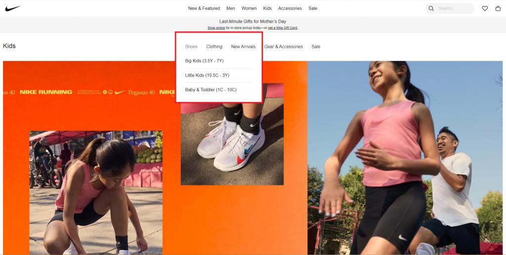
Local navigation refers to the navigation menu that appears within a specific section or page of a website. It provides access to related content within that section or page and is typically located under the header or in the sidebar of a web page.
Local navigation helps users navigate and find information more easily within a specific region of the website, without having to return to the main navigation menu.
[Source: Nike]
3. Contextual Navigation
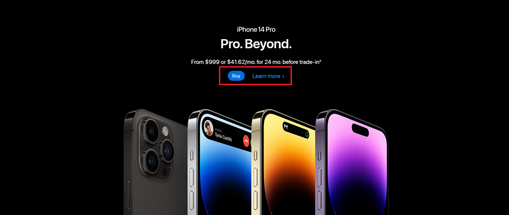
Contextual navigation allows users to navigate different sections of a website and is typically located within the body of the page.
It often comes in the form of an instruction or call-to-action (CTA) button such as “Back”, “Next”, “Read More”, “Buy” or “Previous”.
[Source: Apple]
4. Sequential Navigation
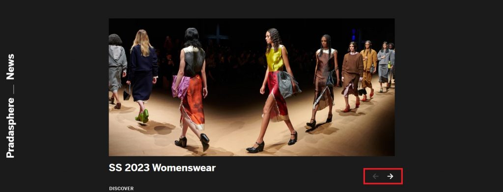
Much like contextual navigation, sequential navigation also serves to navigate the users to different sections of the website. The only difference is that it is placed at the bottom of the content pages
It typically comes in the form of “Next” or “Previous” buttons, but it can also be displayed in simple arrows pointing to the next or previous web page.
[Source: Prada]
5. Search Navigation
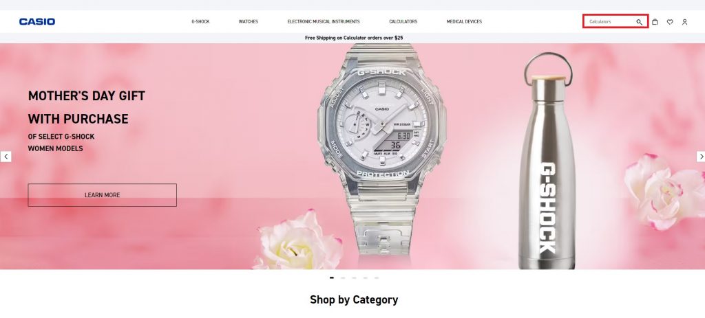
Search navigation refers to a type of website navigation that enables users to explore a website’s content through the use of search functionality. This type of navigation allows users to enter keywords or phrases into a search box, and the website will return a list of results relevant to their query.
It typically comes in the shape of a magnifying glass button and can be found on the top right corner of the global navigation.
[Source: Casio]
6. Faceted Navigation
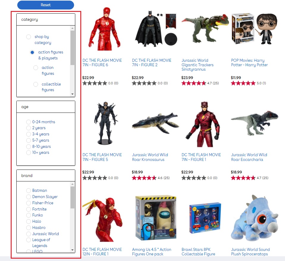
Faceted navigation refers to a type of user interface design that enables users to filter and narrow down search results or browse through a website’s content by selecting various criteria or attributes.
Faceted navigation typically comes in the form of a sidebar or panel that displays various filters or facets, such as product categories, price ranges, sizes, brands, colors, and so on. Users can then select one or more facets to refine their search results and browse through the items that match their selected criteria.
[Source: ToysRUs]
7. Off-Canvas Navigation
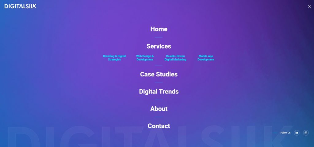
Off-canvas navigation is a type of website navigation where the navigation menu is hidden off-screen until the user activates it by clicking on it or hovering above it. When activated, it slides into view from the side of the screen, partially or fully covering the main content.
Off-canvas navigation is typically used on mobile devices or smaller screens where space is limited, but it can also be used in web design as a way to declutter the design layout and give a website neat and clean look.
Website Navigation Design Types
Different from the specific navigation types listed above, navigation design types refer to the wider structure or layout of a website’s navigation.
When it comes to navigation design, we can differentiate between the following most common types:
1. Horizontal Navigation
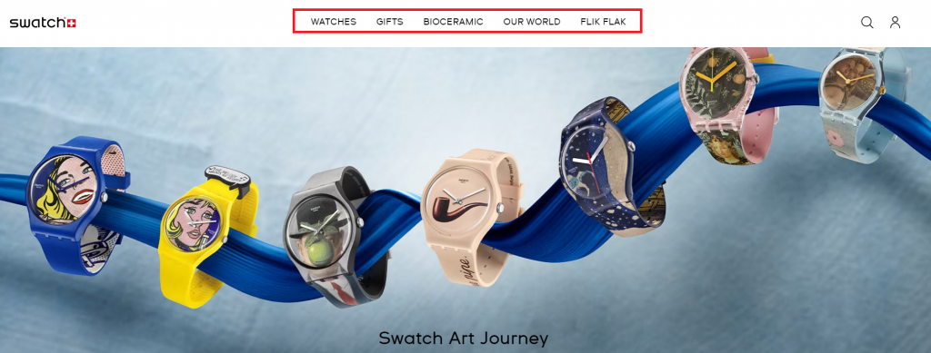
Horizontal navigation refers to a design layout where the menu or navigation bar is placed horizontally beneath the website header, across the top of a web page.
It lists major pages in a row format and is widely used on websites because the users are accustomed to its form and because it offers seamless integration with full-width images in the page body.
[Source: swatch]
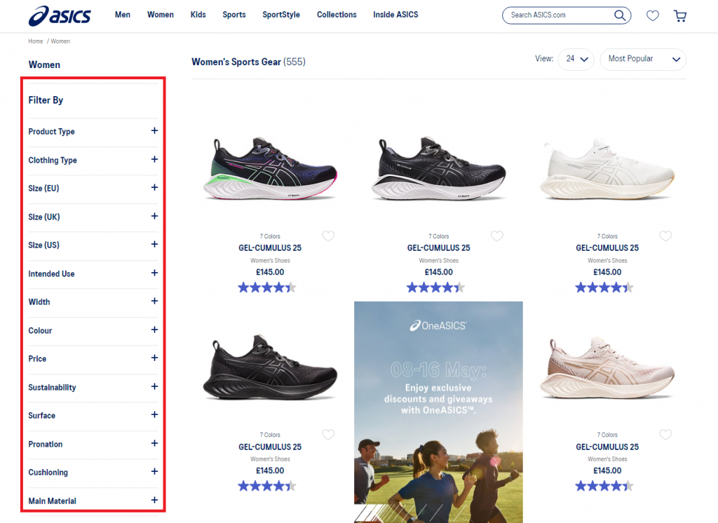
2. Vertical Navigation
Vertical navigation, also known as sidebar navigation, refers to a design arrangement where the menu or navigation bar is laid vertically on the left or right side of a web page and contains links to other web pages in the column format.
Although vertical navigation takes up a lot more space on the web page than horizontal navigation, it is still a good choice for websites that have numerous top-level links to display at once.
[Source: asics]
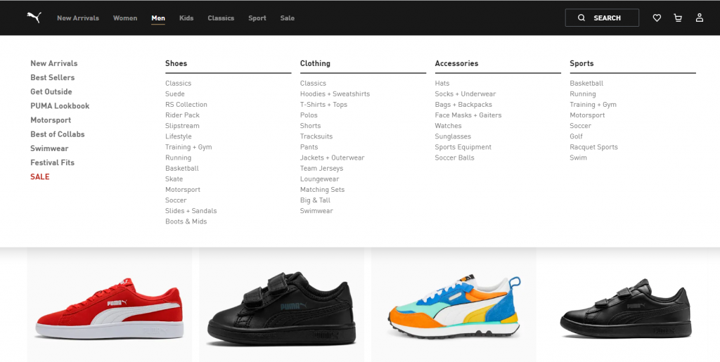
3. Dropdown Navigation
Dropdown navigation, also known as a dropdown menu, is a type of user interface element that allows users to navigate through a website by selecting options from a list that appears when a user clicks or hovers over a specific button or link.
Dropdown navigations are often used to organize large amounts of information and they often come with submenus that appear as additional options within a main menu.
[Source: puma]
4. Hamburger Navigation
Hamburger navigation, also known as hamburger menu, is a user interface element that typically appears as three horizontal lines stacked on top of each other, resembling a hamburger. It is commonly located in the top right or left corner of a website’s header or navigation bar.
Upon clicking on the hamburger menu icon, a dropdown menu or slide-out panel appears, thus revealing the website’s navigation options.

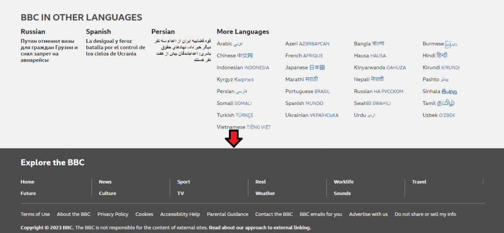
5. Footer Navigation
Footer navigation is a type of website navigation design that appears at the bottom of a webpage. It typically includes links to pages such as the home page, about us, contact us, and other relevant sections of the website.
It can also include links to social media profiles, copyright information, terms and conditions, and other legal disclaimers.
[Source: BBC]
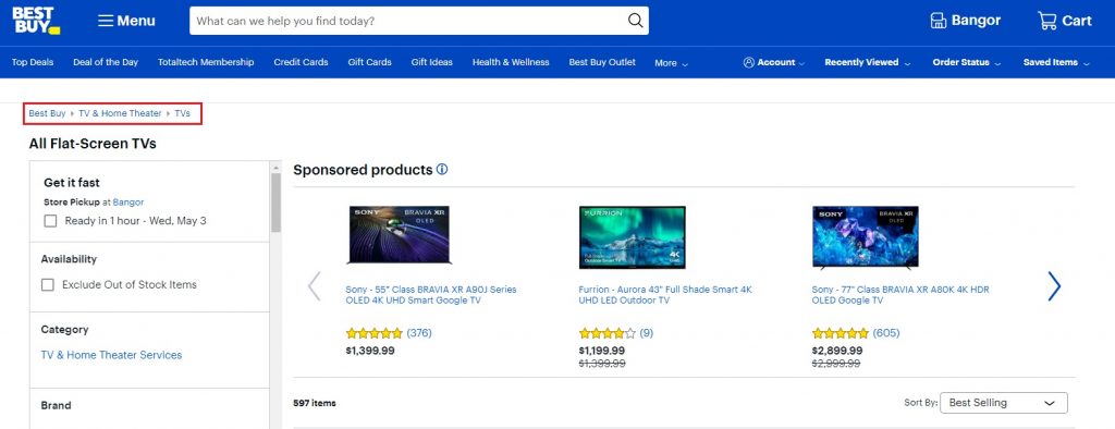
6. Breadcrumbs Navigation
Breadcrumbs navigation refers to a website navigation design that shows users the steps or path they have taken to arrive at their current location within a website.
It typically appears near the top of a webpage and consists of a series of links separated by arrows or other similar symbols.
[Source: BestBuy]
The Website Navigation Design Process
Next, take a look at our three key steps of the website navigation process to streamline your next web design project:
1. Make A List Of All Webpages
The first step in the navigation design process is to implement a content audit of your website’s information, grouping similar pages together in clusters.
For this purpose, you can use a tool, such as Mural, to help you organize your list in the form of sticky notes, index cards, and so on.
2. Get Familiar With Levels Of Navigation
Once you list all your pages, you’ll need to organize them according to their level of importance. This is where levels of navigation step in.
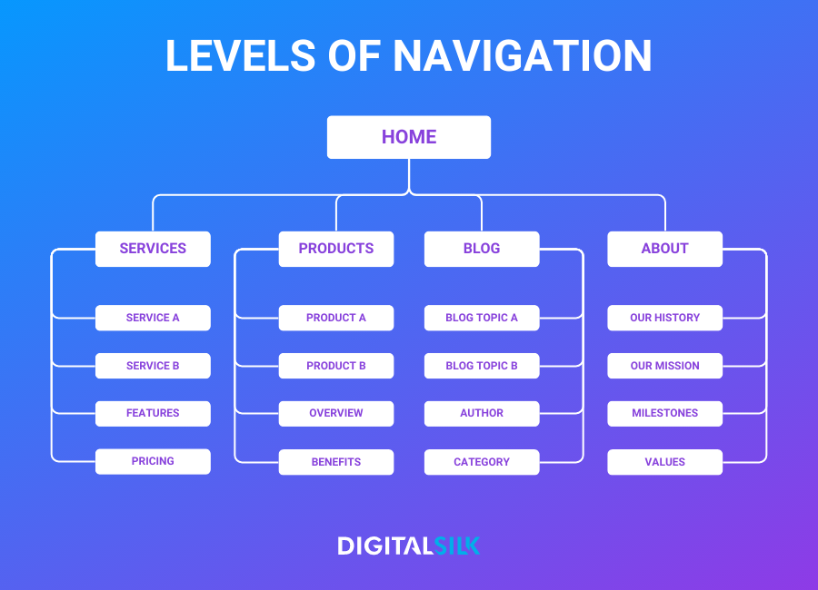
Levels of navigation refer to the different layers of navigation menus and links arranged according to their level of importance.
We can typically differentiate between four levels of navigation, that would look similar to this example below:
- Level 1: Home
- Level 2: Services, Products, Blog, About
- Level 3: Service1, Product 1, Blog Topic, Our Mission
- Level 4: Features, Overview, Author, Milestones
3. Test Your Website Navigation!
The final stage in the website navigation process is testing. Its main purpose is to identify potential issues and areas for improvement, such as confusing labels or hidden pages, and make data-driven decisions to optimize the user flow on the website.
There are several ways to test website navigation, including:
- Usability testing: observing users as they navigate the website, and gathering feedback on their experience, including any difficulties they encountered and suggestions for improvement.
- A/B testing: testing two different versions of the website’s navigation structure against each other. The aim is to determine which one is more effective in achieving the set goals.
- Card sorting: asking users to sort cards with different page titles into categories. This helps the designers understand how users categorize and prioritize information on the website.
- Tree testing: presenting users with a simplified version of the website’s navigation structure and asking them to find specific information. This type of navigation testing helps with evaluating the effectiveness of the navigation labels and overall hierarchy.
Website Navigation Best Practices
A confusing user journey can damage your digital experience. In fact, 88% of online customers say they wouldn’t return to a website following a bad user experience.
That’s why it’s important to know and follow these five best practices for website navigation:
1. Keep It Simple
Simple navigation allows users to quickly and easily find what they are searching for. If there are too many options or the navigation is too complex, users will experience difficulty locating the information they need.
By keeping the navigation menu intuitive and straightforward, users can focus on the most important aspects of your website and complete their desired actions faster.
2. Prioritize Visibility
Making website navigation that is not visible can lead to a negative user experience and harm your brand’s reputation and credibility.
To ensure this doesn’t happen to you, follow these five best practices for optimizing your website navigation for visibility:
- Use legible, easy-to-read fonts
- Use contrasting colors for better visibility
- Place the navigation menu at the top of the page
- Keep the navigation menu consistent through every page on your website
- Create a visual separation between the navigation and the website content
- Incorporate headings in your “mega menu” to help categorize the links and make it easier for users to scan
3. Use Clear, Descriptive Labels
Your users should know immediately what to expect when clicking on a navigation menu item. This is why it’s important to incorporate descriptive labels for each menu item.
4. Limit Button Use To CTAs
Using buttons for every menu item can make the navigation seem cluttered. By reserving buttons for CTAs only, the navigation remains simple and easy to use, which is crucial for providing a positive user experience.
This approach also ensures that important CTAs are emphasized and receive the attention they deserve, potentially leading to increased conversion rates. In menu design, buttons should be held for primary calls to action, such as “Contact Us” or “Request a Quote.”

5. Optimize Your Navigation For Mobile Users
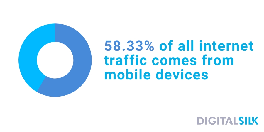
Optimizing site navigation for mobile devices is a crucial aspect of the website design process, given that 58.33% of all internet traffic comes from mobile devices.
For your mobile users, you should ensure that the links are big enough on mobile devices, and menus that are thumb-friendly to allow your users easy tapping and navigation.
Must-See Website Navigation Examples Form Digital Silk’s Design Kitchen
Digital Silk is a full-service agency specializing in growing brands online and creating custom digital solutions. From strategic branding and custom web design to UI/UX design solutions, mobile app development, and digital strategy, we have everything covered.
We want to present you with five examples of website navigation created by our professional web design team to help you better envision ideas for your web design endeavor.
1. CrawlSF
CrawSF is an event platform for various fun events featured in the San Francisco area.
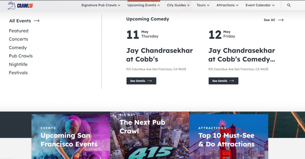
We designed a website navigation for this event platform that displays all important information quickly and easily.
If you hover above the “Upcoming Events” section in their main navigation bar, you’ll get instant information about the happenings in San Francisco in the nearest future.
There’s no roaming around and all labels are designed to be succinct, so you’ll know exactly what you will see when you click on them or hover above them.
2. G Pen
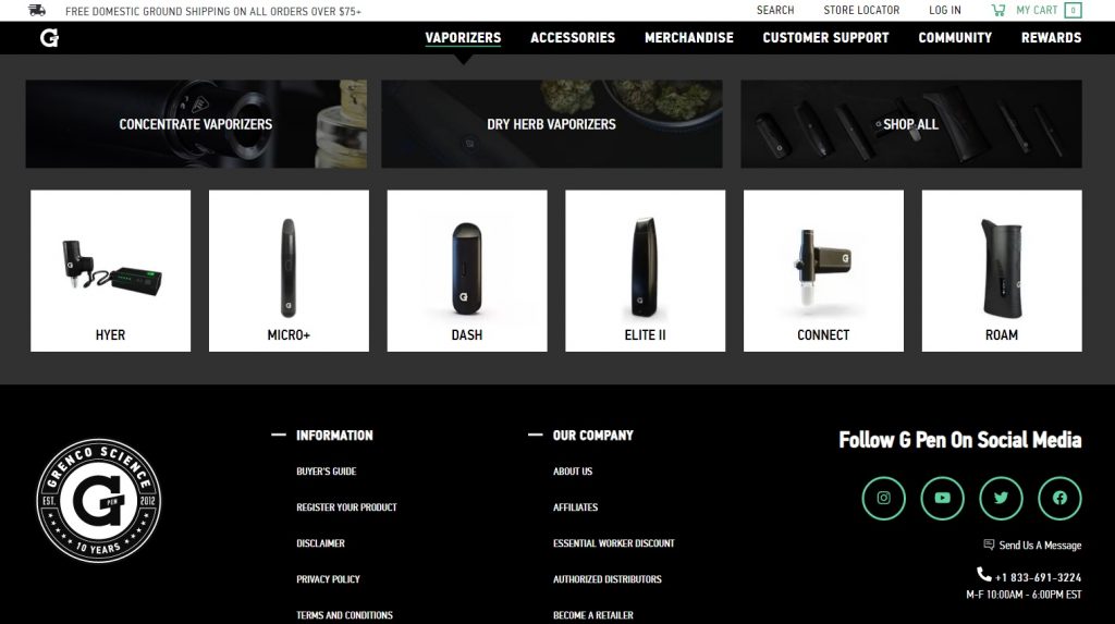
G Pen is an eCommerce platform for selling vaporizers and related equipment. Our website navigation design solution for G Pen displays their product categories and subcategories almost immediately.
If you hover above the “Vaporizers” section on their main navigation bar, you’ll immediately see their main products categorized and sub-categorized.
This type of website navigation allows their users to get to the wanted information directly and without confusion.
3. Sobo&Sobo
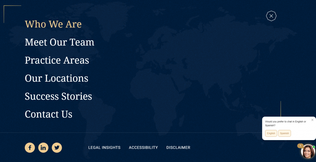
Sobo&Sobo is a legal firm, specializing in personal injury law. We went for a minimalistic design approach for their business website that only displays important information and CTAs on their landing page.
Upon clicking on the “Hamburger” menu, you’ll reveal the six options for further website navigation, where you’ll find their contact information, practice areas and so on.
Another user-friendly feature on the Sobo&Sobo website is a virtual assistant that follows your journey and offers to help in two languages – English and Spanish.
Their navigation design is extremely simple and easy to use and removes any obstacles and distractions for users looking for personal injury law services.
4. American University in Bulgaria
American University in Bulgaria offers American-style education to students across Central and Eastern Europe.
We decided to use a hamburger menu to create an easy-to-spot “Apply now” CTA in the main navigation bar.


5. Bang&Olufsen
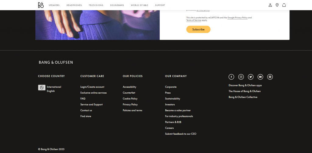
Bang&Olufsen is a company that produces and sells speakers and other related products. For their landing, product and checkout page designs, we used whitespace to improve visibility and keep their layout neat and clean.
To avoid cluttering the main navigation, we added a footer menu at the bottom of the landing page that displays all additional information such as links to social accounts, contact info, FAQ section, and so on.
Design An Effective Website Navigation With Digital Silk
Our web design experts at Digital Silk can help you make your website navigation consistent, user-friendly and intuitive.
With decades of industry experience, our team of web designers and developers knows how to design navigation menus that draw clicks and display the most important information on your website to ensure you don’t miss out on any conversion opportunities.
Partner with us on your website navigation project to receive:
- Expertise: Our team of web design experts is specialized in determining the key pain points in your website navigation and finding the best solutions to meet your users’ needs.
- Proactive approach: We will conduct various audits to test your website navigation and optimize it for usability and visibility.
- Customized solutions: Our team of web design specialists will come up with solutions tailored to your business needs.
- Ongoing support: We will ensure you have our support whenever you encounter any problems with your website navigation or simply want to present us with some of your ideas and plans.
Request a quote today and start creating meaningful user journeys with your website navigation!
"*" indicates required fields


