Dark Mode
Share
Visitors decide in seconds whether your site feels like a safe bet or a needless risk. Explore 10 surprising examples of bad website design — and the mistakes to avoid on your own site.


Updated: January 9, 2026
Examples Of Bad Website Design: Key Highlights
-
Most design mistakes are predictable: Issues like visual clutter, weak hierarchy and vague messaging follow repeat patterns that are easy to identify and correct early.
-
Performance directly impacts revenue: Slow load times, poor responsiveness and content-heavy pages increase bounce rates while weakening SEO and lead generation.
-
Make the next step obvious: High-performing websites guide users with clear sequencing, scannable structure and consistent navigation across pages.
Your website is where prospects decide, in a few seconds, whether your company feels like a safe bet or a needless risk.
When the experience is confusing, slow or dated, visitors don’t “think it over” later, as they can easily hit the back button and explore other options.
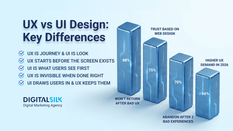
With 80% of users saying they want to browse websites that actually hold their attention, design becomes the gatekeeper between curiosity and exit.
This article breaks down 10 examples of bad website design and the specific mistakes behind them, so you can spot the warning signs early and fix what’s costing you revenue and credibility.
10 Examples Of Bad Website Design
With over 1.36 billion websites competing for attention online, your site competes alongside the best digital experiences available today, setting a higher bar for loading speed, usability and trust from the first click.
The good news is that most failures follow the same predictable patterns, which makes them easy to spot and correct before they turn into lost leads and higher acquisition costs.
Here are 10 bad website design examples that highlight where companies go wrong and what to fix before those missteps start dragging on growth:
1. Ford
What went wrong: Fragmented messaging and an outdated layout
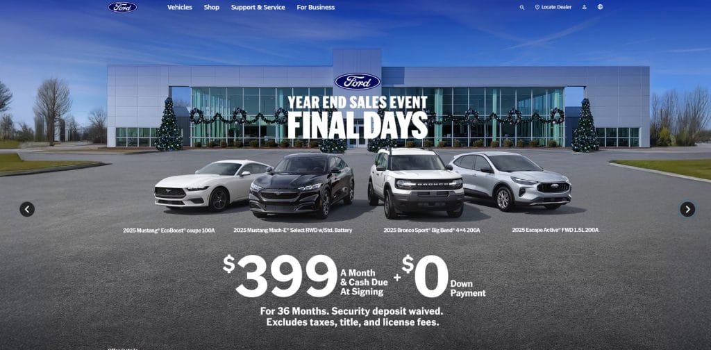
Despite being one of the most recognizable automotive brands in the world, Ford’s homepage feels cluttered and poorly organized, with multiple calls-to-action (CTAs) and promotional messages placed at the same visual level.
Oversized promotional blocks appear alongside dense text sections with minimal spacing, which makes website scanning harder than it needs to be.
The narrow layout across some sections compresses the content on larger screens, which results in a dated feel rather than a responsive one.
The messaging hops between sales events, brand storytelling and navigation prompts without a clear hierarchy, leaving users to determine priorities themselves.
Have a website design project in mind?
2. Goodreads
What went wrong: Overloaded content and weak visual hierarchy
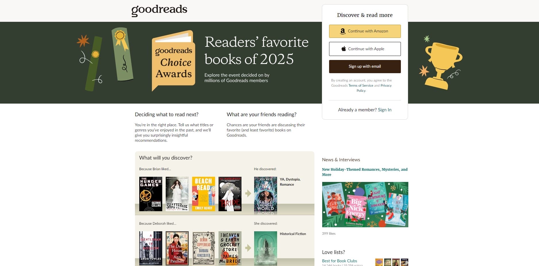
Goodreads tries to serve every audience and every action on a single page, which leaves the experience feeling busy and hard to navigate.
The homepage stacks awards promotions, sign-up prompts, recommendations, news, genre lists and community features into one continuous flow, with little separation or prioritization.
Text-heavy sections dominate the page, relying on small typography and minimal spacing that demand sustained reading instead of quick orientation.
Primary actions like creating an account or exploring recommendations appear alongside long lists of secondary links, so nothing stands out as the obvious next click.
3. The Daily Mail
What went wrong: Cluttered interface and outdated UI
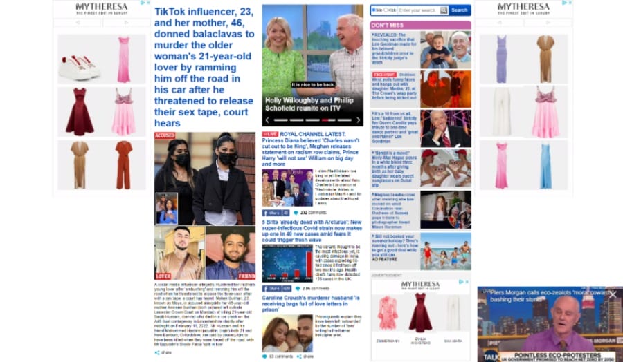
Similar to their articles’ sensationalist headlines, The Daily Mail’s website is a hot mess.
While the news website is trying to aim for a newspaper or tabloid layout, the overall website design just appears to be cluttered.
The Daily Mail’s homepage doesn’t have enough white space or a clear visual hierarchy, as it features a plethora of articles, images and ads, which can make it challenging to navigate.
Blocks of text are sticking together, with both big and small font sizes spread out across the page.
The site relies on advertising revenue, which can lead to a large number of ads being displayed as a distracting element for most users.
4. Swarovski
What went wrong: Poor contrast and accessibility, invonsistent visual language
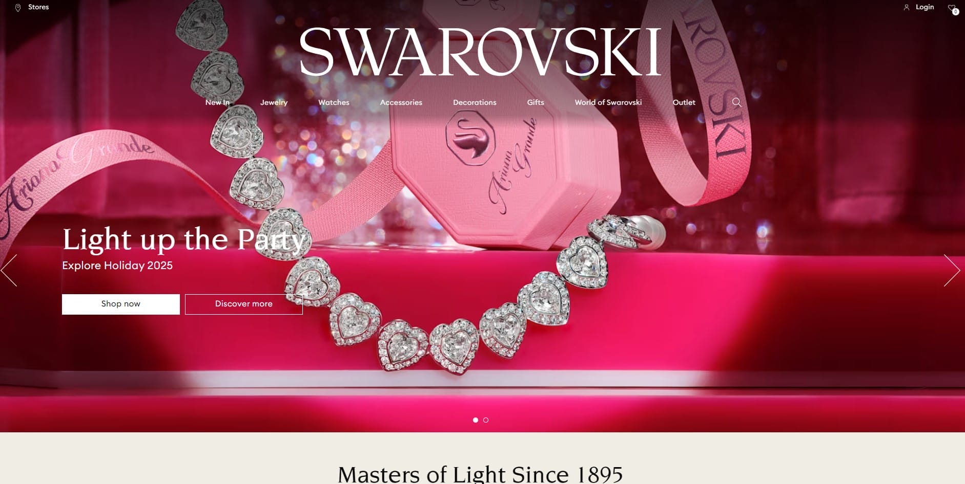
Swarovski’s homepage relies on high-impact imagery, but inconsistent spacing, layering and alignment cause the visuals and text to overlap unevenly across sections.
Product photography, lifestyle shots and editorial modules switch styles abruptly, which breaks continuity and makes the experience feel closer to a collection of independent seller pages than a single, cohesive brand.
The site’s color usage shows uneven contrast, with saturated pinks, neutrals and metallic tones placed side by side without enough separation to support readability or visual flow.
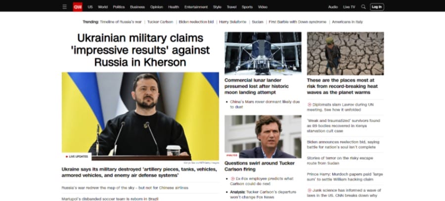
5. CNN
What went wrong: Slow loading speed and an overwhelming page layout
Consider slow load time as a major drawback for any website, since 21% of desktop users leave websites that have a three-second delay in loading time.
On average, websites load their main page content in 1.3 seconds, so use that to benchmark your site’s performance.
CNN is designed to display a wide range of content, such as images, videos and text, but unfortunately, the page is content-heavy and takes longer to load.
Aside from increasing high bounce rates, slow loading times can also negatively impact search engine optimization (SEO) by reducing the site’s ranking in search engine results pages (SERPs).
CNN’s cluttered page also damages readability and user experience, especially with its wide text container on single posts.
CNN’s wide text containers make the content difficult to skim and appear overwhelming to the user.
6. Yale School Of Art
What went wrong: Inconsistent branding and readability issues
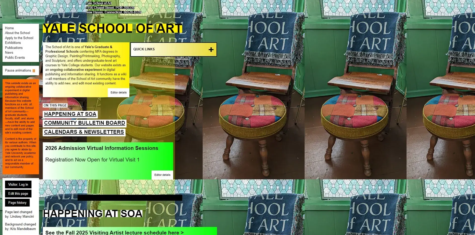
Yale School of Art’s homepage prioritizes visual experimentation and unconventional web design practices, but it creates avoidable usability problems.
As users scroll, the content column on the left moves while the background image remains fixed, creating an unusual interaction pattern that draws attention away from the content itself.
Pair that with a mishmash of inconsistent font sizes and color-rich graphics, then you have a unique web design that you can truly call your own.
The font is too small, the text is hardly readable and the inconsistent application of fade effects and borders can be visually distracting for users.
Ultimately, their site looks like it’s stuck in the early 2000s with its aesthetic.

Does your website perform well?
7. Lipton
What went wrong: Visual overload and inconsistent structure
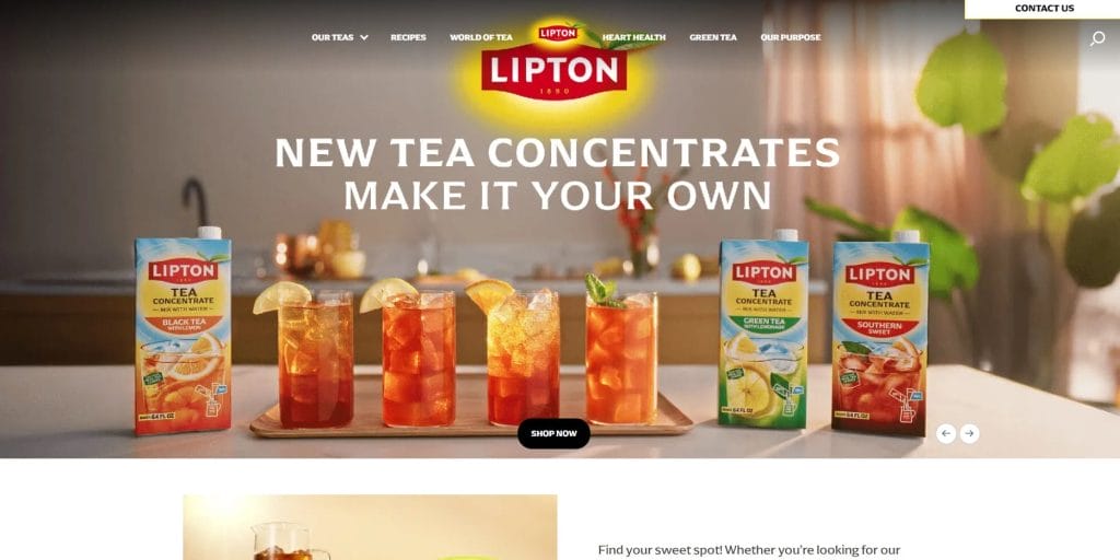
Lipton uses bold color large product imagery and rotating sections throughout the page, but the sections don’t build a clear reading order beyond the opening hero.
As users scroll, repeated headers and promotional blocks interrupt the natural flow, making it harder to skim and understand how sections relate to one another.
Dense paragraphs appear next to product imagery without enough spacing or typographic contrast, which forces prolonged reading where scanning would normally suffice.
The footer reinforces the issue by spreading links, legal copy and social icons across a wide area with little grouping or hierarchy.
8. Ling’s Cars
What went wrong: Visual chaos that hinders usability
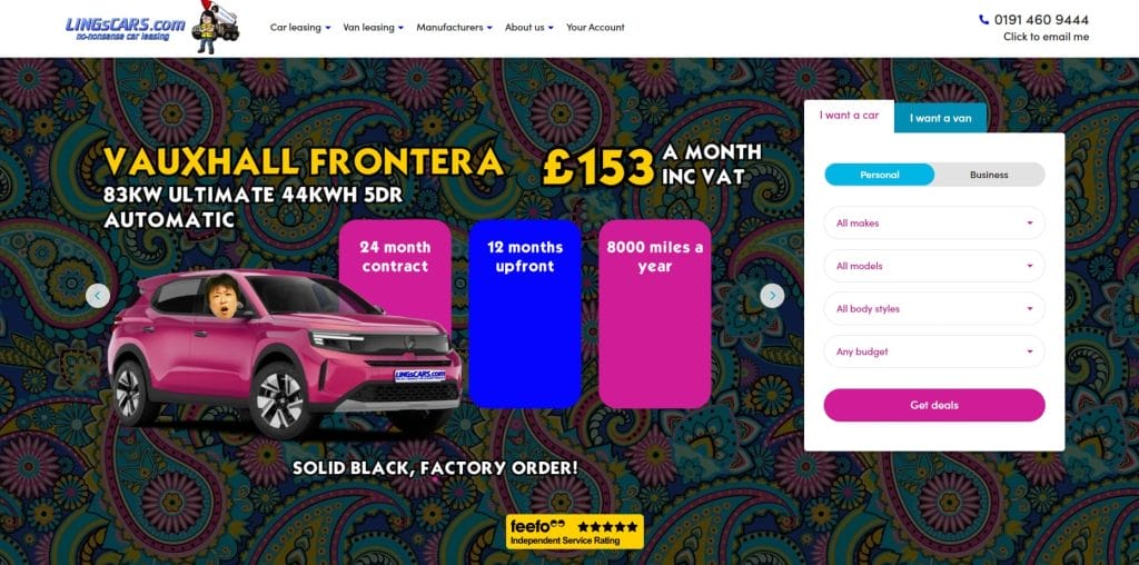
Ling’s Cars embraces shock value to boost memorability, but the execution sacrifices usability and trust along the way.
The homepage layers vibrant background patterns, oversized typography, bright color blocks and cartoon graphics into a single viewport, leaving no clear separation between primary actions, supporting details and decorative elements.
Key information like pricing, contract terms and mileage details competes with novelty elements, which makes comparison harder and slows decision-making.
As users scroll, the experience changes abruptly between dense promotional sections, sparse logo grids and highly decorative panels, creating a disjointed user interface.
9. Arngren
What went wrong: Too much information with no clear order
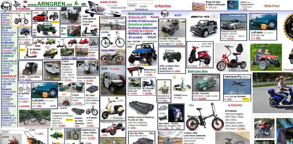
Among the examples of bad website design, Arngren’s website crams products, prices, categories and links into a single uninterrupted canvas, so the page never gives the eye a clean place to start.
Items from completely different categories appear side by side across the entire site, which makes browsing feel like digging through a cluttered storage room instead of browsing online.
Image sizes, borders and text styles vary from block to block, which makes it difficult for users to scan or compare options.
The navigation blends into the product pile rather than standing apart, which slows orientation before anyone can narrow down what they want.
10. Suzanne Collins
What went wrong: Outdated structure that hides key updates
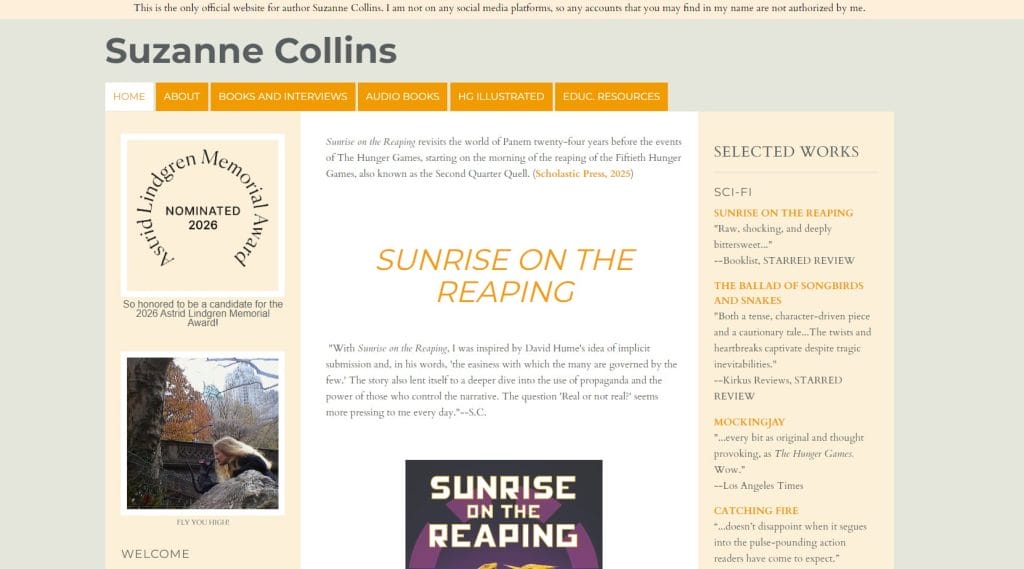
At first glance, Suzanne Collins’ site presents itself as informational, but the rigid, column-heavy layout makes it hard to spot the newest or most important updates.
New releases, awards and announcements appear deep within long stretches of text, sidebars and links that pull attention in multiple directions at once.
Consistent typography and spacing across nearly every section reduce contrast between headline sections and supporting content.
For an author with Suzanne Collins’ reach, the experience feels more like a static archive than a site built to spotlight timely work and current relevance.

Want to update your site’s design?
Digital Silk’s User-Friendly Website Design Examples
Digital Silk is a professional web design agency that creates data-driven, conversion-focused and engagement-ready websites for businesses across all industries.
Some of our more recent web design projects include:
1. Clear Blue Insurance Group
Digital Silk redesigned Clear Blue Insurance Group’s website to better reflect the credibility of a leading insurance provider and support growth.
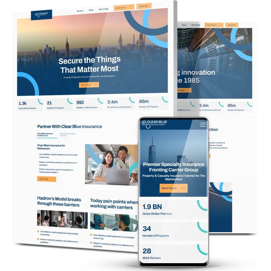
The new experience organized complex offerings into clearer pathways, so carriers, MGAs and partners can find the right programs faster.
The navigation was simplified across programs and partnerships, reducing time-to-information and making the site easier to use on mobile.
Our team streamlined the content into a more consistent structure and tone, cutting down on overly technical messaging and improving readability.
2. Steel City Glass
Steel City Glass had decades of craftsmanship and a reputation built through referrals, but their outdated Elementor site didn’t reflect that credibility or convert new demand.
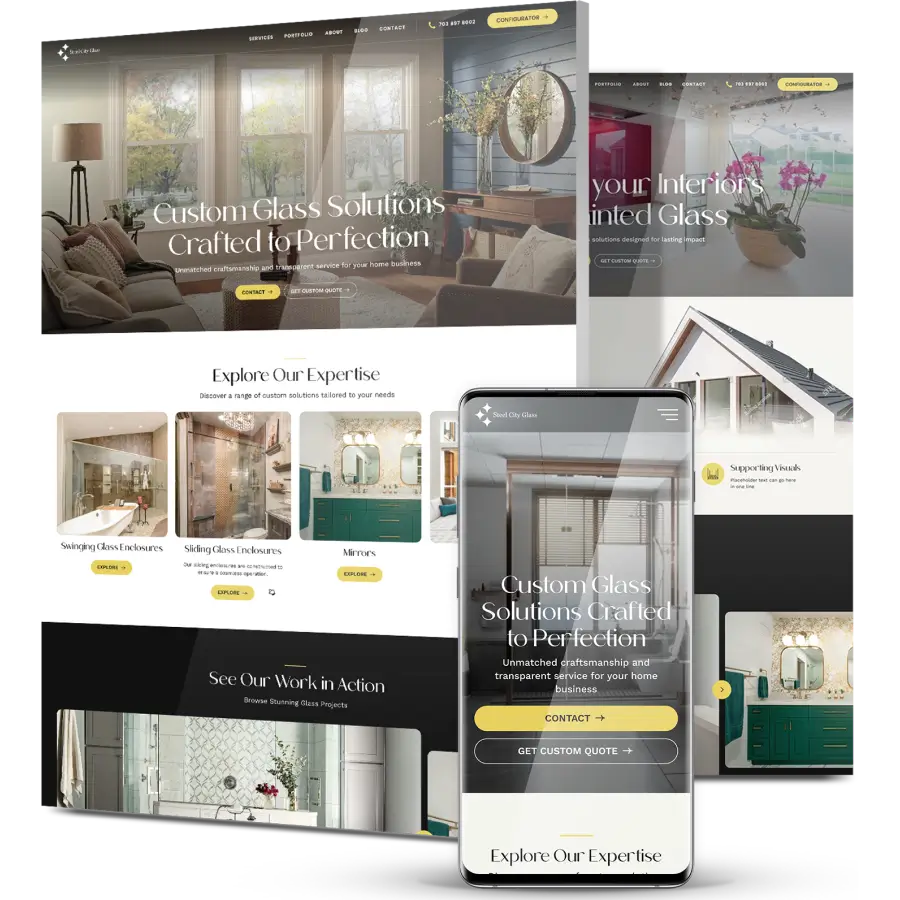
Digital Silk rebuilt the experience on WordPress with refreshed branding, cleaner user journeys and clearer separation for homeowners versus commercial buyers, so each audience could find the proof points that mattered to them.
Our experts also added lead-driving tools like a glass calculator and an interactive quote system, helping prospects self-serve and request pricing without back-and-forth.
Within six months of launch, the new site delivered an 820% jump in views, a 933% rise in engaged sessions, and a 45% increase in average engagement time from organic search.
3. Harlem School Of The Arts
Harlem School of the Arts needed a website that matched the energy of its programs while making it easier for students, parents and donors to take action.
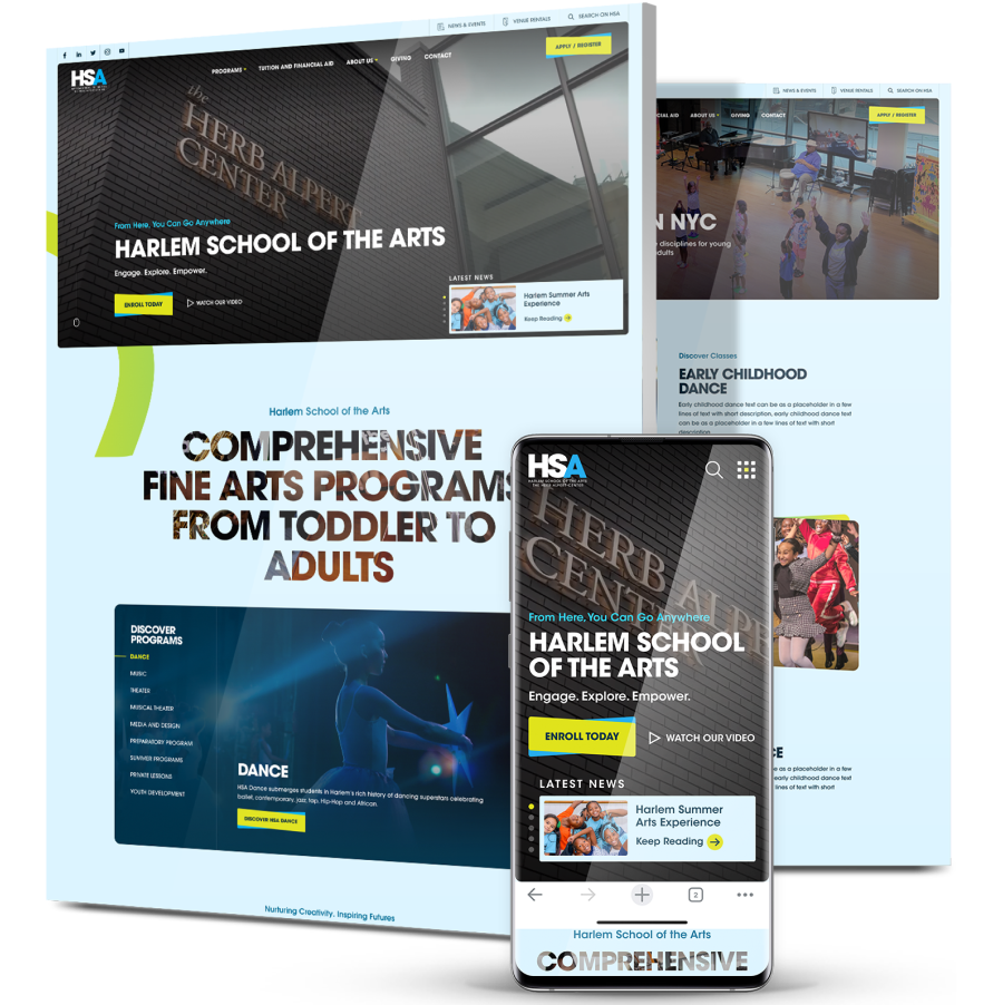
Digital Silk built a vibrant, mobile-first platform with clearer navigation around programs and events, along with an SEO-driven structure designed to expand reach.
The result was a more engaging experience that removed friction from key journeys and better reflected HSA’s legacy and mission.
Within 90 days of launch, the site attracted 13K+ new users, tripled engagement and increased organic traffic by 43%.

Need to generate more leads through web design?
What Makes A Bad Website Design?
With 91% of businesses saying their website generates more revenue than any other channel, bad website design creates hesitation, increases drop-offs and leaves revenue on the table.
There are several common mistakes that businesses make, including:
1. Slow Loading Speed
Loading speed refers to the amount of time it takes for your webpage to fully load and display its content.
Below is an example of Ford’s loading speed via PageSpeed Insights, which shows poor results across a few categories:
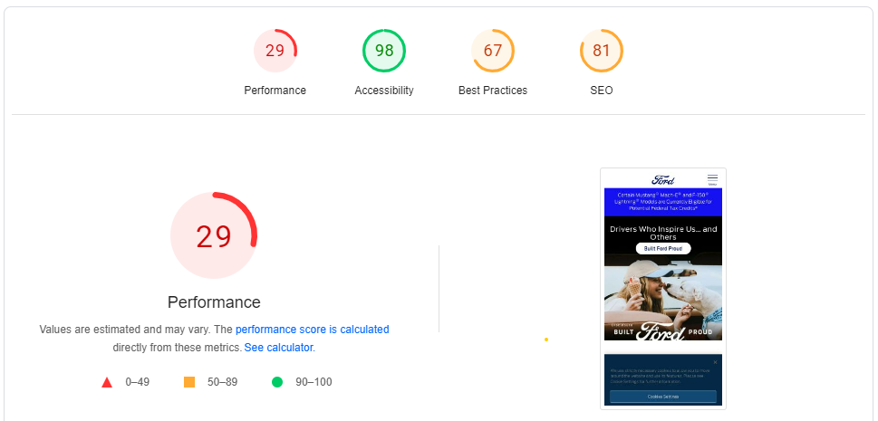
Factors that contribute to slow loading time include large file sizes, excessive flash content and too many ads.
Since this is one of Google’s top 20 ranking factors, prioritizing cross-device performance and smooth, uninterrupted interaction directly affects how the site is discovered, used and trusted.
2. Non-Responsive Web Design
Responsive web design ensures that your website displays and renders across all devices and screen sizes.
This requires designing and coding the website using fluid grids, images and media queries, to adapt and respond to different screen sizes, resolutions and orientations.
A non-responsive web design occurs when the site’s design, layout and functionality are not optimized for different screens and devices.
Since nearly 58.66% of all internet users access websites via mobile devices, responsiveness is one of the pillars of core web vitals.
In other words, if your website doesn’t display well on mobile devices (or across devices in general), not only will it have little to no chance of ranking on top of Google SERPs, but you’ll miss out on growing your leads and conversions.
3. Complex Navigation
Navigation, also known as a website menu, refers to the structure and organization of your website’s links to other web pages, usually internal site pages.
Intuitive navigation helps your users find the information and assets they need to build trust and confidence to convert.
he problem is that many sites fall short here: 58% of desktop websites and 67% of mobile websites deliver homepage and category navigation performance rated from mediocre to poor, which reflects how often users struggle to move through basic site structures.
Complex navigationoften takes the form of a disorganized website structure, with bloated menus, unclear labels and multi-step conversion journeys.
4. Lack Of Clear CTAs
From “Subscribe to our newsletter” to “Contact us”, call-to-action (CTA) buttons help guide your user to relevant information and conversion points.
Clear and effective CTA messaging sets your user’s expectations and allows them to understand what exactly is behind the click.
For instance, Tiffany & Co.’s homepage has visible CTAs with actionable messaging:
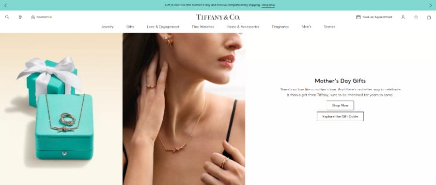
The “Shop Now” and “Explore the Gift Guide” CTAs explain clearly that each click will satisfy different user intentions.
They also speak to users at two separate points of the conversion funnel, ensuring a strong user experience for all visitors.
5. Vague Messaging
From landing page headers to CTAs, messaging refers to how your website communicates your brand’s purpose and offering.
Effective messaging is paramount to educating target audiences on your offering and unique value proposition, building trust and boosting user engagement and conversions.
Vague messaging, on the other hand, refers to content that fails to communicate your offering.
Here is Accenture’s messaging, for example:
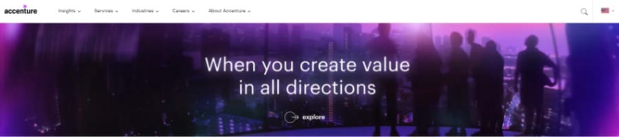
Right above the fold, their pulsating messaging is a poor example of a slider function, with users expected to wait to find out the remainder of the heading.
In addition, a vague CTA gives the user little insight into what lies behind the click.
Can you guess what landing page is behind the “explore” CTA?
Believe it or not, an About page!
6. Cluttered Interface
A cluttered interface refers to a website layout that is visually overwhelming and disorganized, due to excessive use of design elements, such as images and text.
This web design mistake can also be the result of trying to cram too much information onto a single web page, leading to a lack of visual hierarchy and making it difficult for your user to prioritize and focus on important elements.
This can also hurt performance, as cluttered pages can reduce conversion rates by as much as 95%, because visitors hesitate when they can’t quickly identify the next step.
Cluttered layouts can also weaken perceived quality, since the experience appears messy even when the product or service is premium.
7. Inaccessibility
According to recent estimates from the World Health Organization, more than 1.3 billion people around the globe live with some form of disability.
Website accessibility is a set of best practices that ensures all users, including those with disabilities, can access, navigate and interact with your website.
This inclusive approach removes barriers that might prevent people with various impairments, such as visual, auditory, cognitive, or motor disabilities, from using your website.
Unfortunately, 94.8% of homepages contain detectable WCAG 2 accessibility failures and about 79% of those issues are tied to low-contrast text, which points to how common basic readability problems still are.
Poor contrast between text and background makes content difficult to read for users with low vision or color blindness and reduces readability across screens and lighting conditions.
8. Malfunctioning Features & Functionality
When your website malfunctions, it means that there is an error or problem with the website’s functionality or performance.
This can lead to issues such as slow loading times, broken links, error messages, or your website not loading at all.
Website malfunctions can stem from coding errors, server problems, plugin or extension conflicts, security breaches, or issues with your website’s hosting service.
What High-Performing Websites Do Differently
High-performing websites focus on reducing hesitation and making progress feel natural from the first interaction.
Use the following principles to understand what separates sites that convert consistently from those that stall decision-making:
- Make the next step obvious: Key pages answer one question first: what happens next? Clear sequencing guides movement without forcing visitors to stop and interpret intent.
- Prioritize comprehension before persuasion: Headlines, layouts, and structure help visitors understand the offering quickly before asking for commitment. This shortens the distance between interest and action without rushing decisions.
- Design for scanning, not reading: Content is structured so meaning comes through in seconds, with spacing and grouping that support fast orientation. Deeper explanations stay available without slowing momentum.
- Align visuals with purpose: Imagery, color, and typography reinforce the message rather than competing with it. Each visual element supports understanding or directs attention.
- Treat consistency as a trust signal: Navigation patterns, interaction behavior, and page layouts remain predictable across the site. Familiarity reduces mental effort and helps visitors browse more easily.
Looking to design a high-performing website?
Redesign Your Website With Digital Silk
Knowing the latest examples of bad web design can help you reach theoretical conclusions, but applying them practcally into your own website requires a strategic approach and careful execution.
Digital Silk’s team of web consultants, award-winning designers and expert developers works with businesses of all backgrounds to plan and create industry-leading websites.
As a custom web design company, we specialize in:
- Custom web development
- WordPress web design
- Shopify web design
- Magento web design
- Branding services
- Digital marketing
Contact our team, call us at (800) 206-9413 or fill in the Request a Quote form below to schedule a consultation.
Request A Quote For Your Website Project
Tell us about your website goals and let our experts give you a custom proposal
"*" indicates required fields