
-
Font pairings influence how easily people scan, read and stay oriented once real content enters the page.
-
Many popular font combinations hold up in mockups but struggle as pages grow and layouts adapt.
-
Knowing where a font pairing works and where it falls apart matters more than the pairing itself.
55% of first impressions for branding are visual.
Most people zero in on your logo, color palette, imagery, graphic elements and typography before even reading your content or learning about your products or services.
Typography often gets less attention than those other elements, even though it sets expectations about tone and scale almost immediately.
That initial signal influences how easily people follow a page once real content comes into view.
Font pairs affects how that experience unfolds.
Some combinations support reading and navigation across devices and content lengths. Others look polished in isolation but start to break down as pages grow and layouts adapt.
This guide focuses on the best font pairs that hold up in real branding systems. Each example explains where a pairing works, where it tends to fall apart and what to use instead when it does.
20 Best Font Pairs & Combinations
Users typically only read 28% of written content on websites, which means typography carries more weight than most brands expect.
Headlines, body copy and spacing all need to work together to help people grasp information quickly without slowing them down.
Font pairings influence how easily that happens.
Some combinations support scanning and longer reading sessions, while others create visual drag once real content and layouts come into play.
The 20 font pairings below were selected for how they perform in live branding systems, balancing readability, hierarchy and visual tone across different use cases.
| FONT PAIR | BEST USED FOR | WHERE IT STRUGGLES | OVERALL TONE |
| Montserrat + Roboto Slab | Content-heavy sites, SaaS, B2B platforms | Brands relying on strong personality | Structured, neutral |
| League Spartan + Libre Baskerville | Marketing sites with clear sectioning | Mobile layouts with tight vertical space | Direct, editorial |
| Norwester + Alegreya Sans | Campaign pages, creative brands | Long-form pages | Bold, stylized |
| Century Gothic + PT Serif | Professional services, established brands | Small text sizes on low-res screens | Clean, balanced |
| Julius Sans One + Archivo Narrow | Minimalist layouts, visual brands | Long reading sessions | Light, modern |
| Sacramento + Playfair Display | Lifestyle, hospitality, food | Content-dense or multilingual sites | Decorative, refined |
| Montserrat + Source Sans Pro | Scalable brand systems, SaaS | Brands seeking distinct typography | Clean, predictable |
| Yellowtail + Open Sans | Short promotional pages | Formal or enterprise environments | Playful, casual |
| Cinzel + Quattrocento | Luxury, heritage brands | Fast-paced interfaces | Classical, formal |
| Pacifico + Quicksand | Travel, food, community brands | Serious or regulated industries | Relaxed, friendly |
| Helvetica Now + Garamond | Editorial platforms, publishing | Tight, space-sensitive interfaces | Authoritative, traditional |
| Rye + Lora | Story-driven or niche brands | Corporate or conservative sectors | Vintage-inspired |
| Parisienne + Lora | Fashion, beauty, premium lifestyle | Navigation-heavy sites | Elegant, expressive |
| Open Sans + Open Sans Condensed | Large content ecosystems | Brands needing visual distinction | Functional, restrained |
| Fira Sans + Montserrat | Product-led companies, SaaS | Emotion-led brand narratives | Modern, practical |
| Sifonn + Bebas Neue | Hero-driven landing pages | Long-form content | Impactful, assertive |
| Gotham + Open Sans | Media, consumer brands | Brands seeking unique fonts | Familiar, approachable |
| Poppins + Inter | Tech brands with a human tone | Formal or traditional sectors | Friendly, contemporary |
| Red Hat Display + Avenir | Technology and infrastructure brands | Narrative-heavy marketing | Precise, modern |
| Satisfy + Cerebri Sans | Campaigns, creative branding moments | Persistent navigation or long pages | Expressive, contrasting |
1. Montserrat Bold And Roboto Slab

Sans Serif fonts offer optimal readability for both large and fine print, with clean and modern edges and elegant simplicity.
Montserrat Bold handles headlines well when hierarchy needs to be obvious and predictable, while Roboto Slab brings contrast without visual noise, which helps longer pages stay readable.
When this works
This pairing fits B2B sites, SaaS platforms and editorial layouts where scanning matters more expressive or decorative type.
When this fails
It can feel generic for brands that rely on personality or narrative tone to differentiate.
What to use instead
If the brand needs more character, swap Roboto Slab for a serif with sharper modulation such as Libre Baskerville.
")
2. League Spartan And Libre Baskerville

League Spartan is a strong, structured, geometric typeface that looks professional, attractive and refined in headings and sub-headings.
Libre Baskerville contrasts this boldness with its slim, elegant and curved serifs for a more subtle body composition.
When this works
Marketing sites with defined sections and clear messaging blocks.
When this fails
On mobile-first products, Spartan’s weight can dominate too much vertical space.
What to use instead
Reduce headline weight or move to a narrower sans serif when vertical economy matters.
3. Norwester And Alegreya Sans

A somewhat unexpected but sophisticated font pairing, Norwester and Alegreya Sans combine contemporary and vintage styles.
Norwester is a condensed, bold sans serif font with a retro feel, while Alegreya Sans keeps the body text neutral and easy to follow.
When this works
Campaign pages, creative brands and short-form storytelling.
When this fails
Dense content pages or documentation where condensed headings reduce legibility.
What to use instead
Use Norwester selectively and switch to a wider sans serif for repeated headings.
4. Century Gothic And PT Serif

Century Gothic combines contemporary and classic elements in a sleek, geometric typeface that exudes simplicity and elegance.
Combined with a versatile and easy-to-read font like PT Serif, you get a timeless and effective pairing with crisp and clean lines.
Maroon 5 uses Century Gothic for the band’s remix album Title and Response.

Mithunder flaunts the PT Serif font for his The Garden album:

Balans Studio uses this font pair on its home page design to showcase a futuristic and creatively charged brand image.

When this works
Brands balancing innovation with stability such as professional services or established consumer brands.
When this fails
Small text sizes can suffer on lower-resolution displays.
What to use instead
Increase body size or replace PT Serif with a slab serif for digital environments.
5. Julius Sans One And Archivio Narrow

Julius Sans One immediately draws users’ attention to its fine-line structure and elongated form, making it highly effective in heading copy.
For the body, you can combine it with a minimalist and easily legible Sans Serif font like Archivio Narrow to balance the wide spacing and create a striking dissonance.
When this works
Minimalist brands and layouts with strong visual rhythm.
When this fails
Long reading sessions where narrow body text slows pace.
What to use instead
Use a standard-width sans serif for articles and reserve Archivo for navigation.
6. Sacramento And Playfair Display

Handwritten fonts add visual interest and personality to your branding strategy, thanks to their creative and playful designs.
Sacramento’s unique and elegant calligraphy pairs well with Playfair Display, which is a classic serif font with refined curves and thin lines that restores order.
When this works
Lifestyle brands, hospitality and food where tone matters more than volume.
When this fails
Large content libraries or multilingual sites where scripts reduce consistency.
What to use instead
Limit Sacramento to accents and use a neutral serif for primary headings.
7. Montserrat And Source Sans Pro

Next on the list of fonts that go well together is a charming and minimalist duo with a clean and structured composition for optimal balance and hierarchy.
Both fonts are predictable and adaptable, which makes them easy to deploy across platforms.
You can see Montserrat and Source Sans Pro in action on Glow Skincare and Beauty’s home page, with the former used in headings and the latter for body text.

When this works
Scaling brands that need consistency across web, product and marketing.
When this fails
Brands that need a more distinctive voice.
What to use instead
Introduce a display serif for headlines while keeping Source Sans Pro for body text.
8. Yellowtail And Open Sans Bold

Yellowtail is a fat-brush display font with a playful and approachable feel that contrasts nicely with the somewhat more basic Open Sans typeface for a more professional twist.
Despite being quite different in style, these fonts complement each other seamlessly and create an eye-catching contrast for impactful branding.
When this works
Short promotional pages and lifestyle campaigns.
When this fails
Enterprise sites where tone must remain restrained.
What to use instead
Replace Yellowtail with a geometric display sans serif for a more controlled feel.
9. Cinzel And Quattrocento

A so-called Mediterranean font combination, Cinzel and Quattrocento are inspired by classic Roman typography, with strong vertical lines and accent edges.
Cinzel offers a more modern take on classic letterforms, while Quattrocento boasts a bold and more impactful feel.
When this works
Luxury, heritage and culture-driven brands.
When this fails
Fast-paced interfaces where ornate forms slow scanning.
What to use instead
Use Cinzel sparingly and pair with a neutral sans serif for body content.
10. Pacifico And Quicksand

Taking the tropical and delightfully playful route, the Pacifico and Quicksand font pairing adds more dimension and character to all branding mediums.
It’s a match made in design heaven for food or travel-related brands since it evokes a sense of adventure and laid-back fun.
When this works
Travel, food and community-driven brands.
When this fails
Serious products or regulated industries.
What to use instead
Use Pacifico only in branding elements and keep content text neutral.
")
11. Helvetica Now And Garamond

The Neo-Grotesque Sans Serif font Helvetica Now has a somewhat rigid and pre-defined structure that pairs well with the somewhat arched Garamond typeface that introduces warmth and familiarity.
Their similar yet distinct styles create a well-structured and cohesive typography that evokes reliability and professionalism.
The Dare uses Helvetica for their latest album What’s Wrong With New York?:

Meanwhile, the movie Parasite features the tagline ”Misplaced Familyhood” on its poster with Garamond:

When this works
Editorial brands, publishing and high-content platforms.
When this fails
Interfaces requiring tight spatial efficiency.
What to use instead
Use Helvetica throughout and introduce serif contrast through layout rather than type.
12. Rye And Lora

Next up is a vintage-looking pair that embraces nostalgic and easily recognizable designs.
Rye features signature pointed details and curved edges, while Lora offers a more subtle, neutral vibe.
When this works
Story-driven brands and niche markets.
When this fails
Corporate environments where tone must remain neutral.
What to use instead
Replace Rye with a slab serif to keep character without nostalgia.
13. Parisienne And Lora

Parisienne embraces gentle, soothing details and curved lines for its calligraphic design, including elegant, thin lines and connecting letters.
Lora balances this free-flowing style with its structured, more rigid design that complements the more playful Parisienne nature.
When this works
Fashion, beauty and premium lifestyle branding.
When this fails
Navigation heavy sites or mobile-dense layouts.
What to use instead
Restrict Parisienne to logos and accents.
14. Open Sans And Open Sans Condensed

This font pairing offers a signature contrast between a classic serif typeface and an ultra-compressed condensed style.
Despite being in the same family, both fonts boast signature features and distinct styles, often used in promotional materials and publications.
Metro Los Angeles is a prime example of the Scala font in play, with clean and crisp lines, minimalistic details and modern vibes.

When this works
Large content ecosystems and multi-channel brands.
When this fails
Brands seeking a distinct visual signature.
What to use instead
Introduce a display font for headlines only.
15. Fira Sans And Montserrat

Fira Sans is a contemporary Sans Serif with a minimalist and easily readable design. It easily adapts to different screen sizes and promotional mediums thanks to its versatile and user-friendly nature.
When combined with Montserrat, the pair achieves a harmonious balance of modernity and elegance.
The European University of Technology makes fantastic use of the Fira Sans font in its promotional materials:

When this works
Product-led companies and SaaS platforms.
When this fails
Brands requiring emotional tone.
What to use instead
Add a serif headline font for contrast.
")
16. Sifonn And Bebas Neue

Sifonn is a bold and visually striking typeface that imposes a sense of authority and professionalism.
In contrast, Bebas Neue has a slimmer and more compact design that complements Sifonn’s more demanding presence.
For instance, the Anning-Johnson Company flaunts the Bebas Neue font across its website body content, while Sifonn is prominently displayed across the main hero section.

When this works
Landing pages and hero-driven layouts.
When this fails
Long-form content where visual fatigue sets in.
What to use instead
Limit Sifonn to primary statements only.
17. Gotham And Open Sans

Gotam is a geometric Sans Serif font with clean and strong lines, while Open Sans provides optimal legibility and a friendly, approachable tone.
The movie Free Guy features the Gotham font on its main theatrical poster:

When this works
Media, entertainment and consumer brands.
When this fails
Brands seeking differentiation through typography.
What to use instead
Swap Open Sans for a serif to add contrast.
18. Poppins And Inter

Poppins is gaining traction lately in the branding and design industry due to its upbeat, positive and inviting look.
It pairs well with toned-down scripts like Inter to balance the playful side with a more serious undertone.
For instance, AI Build uses this font pairing to convey a tech-forward and innovative personality while focusing on readability.

When this works
Tech brands with a human tone.
When this fails
Formal industries where playfulness feels misplaced.
What to use instead
Reduce Poppins usage to headings only.
19. Red Hat Display And Avenir
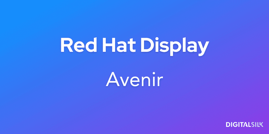
Red Hat Display is a versatile and contemporary script with neat lines and sharp edges.
Avenir adds to that somewhat futuristic feel with its sharp corners and even proportions.
Raw Cereal uses this combination to illustrate its creative and immersive staging solutions for artists and bands.

When this works
Technology and infrastructure-driven brands.
When this fails
Story-led marketing where expression matters.
What to use instead
Introduce a serif for narrative sections.
20. Satisfy And Cerebri Sans

Rounding off the list is perhaps one of the best Canva font pairs in terms of creativity and unique appeal.
Satisfy brings some curved sexiness into the mix, contrasted by Cerebri Sans’ more grounded and structured appearance.
When this works
Campaigns and creative branding moments.
When this fails
Persistent navigation and content-heavy environments.
What to use instead
Use Satisfy sparingly and keep core typography neutral.
Digital Silk’s Approach To Font Pairing
As an end-to-end web design and branding agency, Digital Silk treats typography as part of the system, not an isolated design layer.
Pairings are selected based on how they behave across layouts, devices and content types.
Our goal is consistency that holds up as brands grow.
Best Wire And Cable

Our client Best Wire and Cable is a national commercial wire and cable industry player, backed by a certified and qualified team of experts.
Their logo tells the story of many colors, cables and lengths, while their typography reflects the brand’s reliable and client-centric approach.
We selected Red Hat Display as a primary headline font and Inter as a secondary, body copy typeface.
We opted for these fonts because they pair well with the main logotype style and deliver an approachable, friendly and readable effect.
Mintera

Next, Mintera sells refurbished home improvement products through their eCommerce website.
We paired the Sora font with the logomark to convey a human touch thanks to its clear and crisp lines that evoke instant credibility.
We selected this font because it works well as both headline and body copy and serves the overall brand identity by facilitating a cohesive and instantly recognizable design language.
")
How To Select The Right Font Combinations For Your Brand
68% of businesses see brand consistency as a significant contributor to revenue growth.
Sifting through trendy font combinations is only the first step in creating visually appealing and impactful strategies.
You need to ensure consistency across all channels and marketing touchpoints to get your message across.
To do this, you should consider several fundamental typography aspects and compare them to your brand guidelines, identity and vision:
1. Consider Proportions And Weight
While you can resize the fonts, you may notice asymmetrical proportions when you place them side by side.
To mitigate the differences, make sure the X heights of both options are similar or complementary.
Regarding font weight or thickness, opt for a heavier typeface for headings and titles and a lighter one for the main body text.
This can give your content a balanced and cohesive dimension and prevent one from overpowering the other.
With this in mind, some of the pairings to avoid would include Helvetica and Times New Roman, Arial and Garamond or Comic Sans and Courrier New.
2. Rely On Font Superfamilies
Superfamilies are groups of fonts that share similar design traits and work well together.
This is particularly useful for businesses with multiple subsidiaries or services that may require different font styles but still need to maintain brand consistency.
Most well-known superfamilies include serif and sans-serif fonts variations, such as Helvetica and Garamond, so you can have a cohesive set for various applications.
However, some combinations may have a more jarring effect than others, including Futura and Palatino, Optima and Bodoni, or Univers and Libre Baskerville, so it’s best to steer clear of such pairings.
3. Combine Contrasting Typefaces
A typeface is an umbrella term that encompasses width, weight, slant, serif or sans-serif attributes.
If you use similar typefaces, such as Arial and Helvetica, both being Sans Serif fonts, they can unexpectedly clash and result in a confusing layout.
Instead, try pairing contrasting typefaces to create visual interest and hierarchy in your design.
For example, you could pair a bold, geometric Sans Serif font with a more ornate, serif font to create contrast and balance on the page.
While contrasting typefaces can add visual interest, this can sometimes result in conflicting design elements. Pair examples include script or cursive fonts with heavy, bold typefaces, or modern and traditional fonts.
The Importance Of Visual Hierarchy In Typography
Visual hierarchy is an essential element of your branding strategy and UI/UX design.
It involves arranging content on websites and physical marketing materials in a way that guides the reader’s attention in a particular order, starting with the most important elements first and then moving on to the less critical ones.
For example, many logos feature the brand name as the largest element to enforce recognition, memorability and recall, with a sub-headline or tagline underneath to describe the signature values and messaging.
The same tactic applies to supporting branding materials, such as printed brochures or business cards.
You can arrange headlines, slogans and pull-out quotes in a certain order to guide the reader on the information journey.
This way, you can control how long users stay on each element and what information they process first, so they perceive your branding strategy in its original order.
Since it takes 2.6 seconds for users’ eyes to focus on key areas of your webpage, you should use visual hierarchy to prioritize what actions you want them to take.
Take Avis for example.
The red accents and bold typography on its webpage direct the viewers’ eyes to the car selection form and call-to-action button, encouraging them to book a rental.

Choose Appropriate Font Pairings With Digital Silk
Selecting a font for your website and branding materials is more than just a simple design choice. A typeface symbolizes your brand’s values and personality and influences how consumers perceive your business.
The wrong font can send mixed branding messages, confuse audiences and deter potential customers.
At Digital Silk, we understand typography’s subtle nuances and its fundamental role in the overall branding strategy.
Our experienced digital strategists, award-winning designers and research-backed branding efforts can help you customize your digital footprint and attract the right audiences.
As an end-to-end digital marketing agency, our services include:
- Branding services
- Logo and graphic design
- Custom web design
- Custom web development
- eCommerce development
We take full ownership of every project, provide transparent communication and deliver tangible results.
Contact our team, call us at (800) 206-9413 or fill in the Request a Quote form below to schedule a consultation.
"*" indicates required fields


