background_1
Background Gradient
Beckway

Fueling B2B Growth Through Digital Strategy

  • Beckway, a private equity operations firm, needed a modern digital platform to clearly communicate its value, showcase professionalism and support scalable growth across industries.
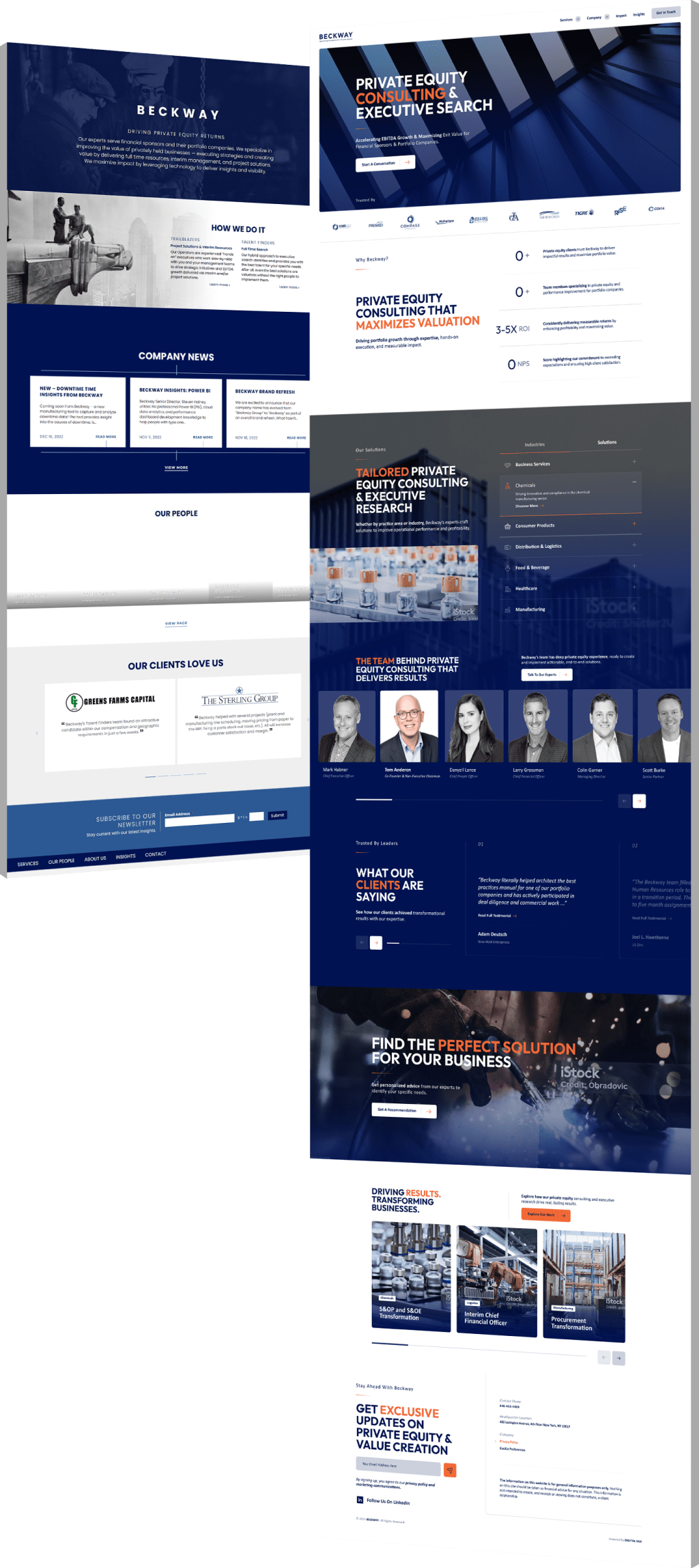
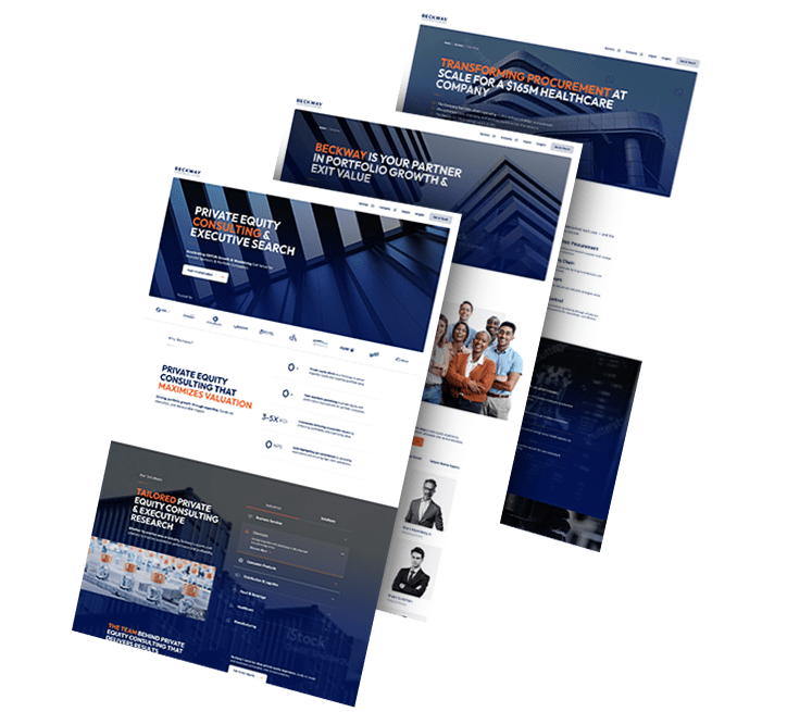
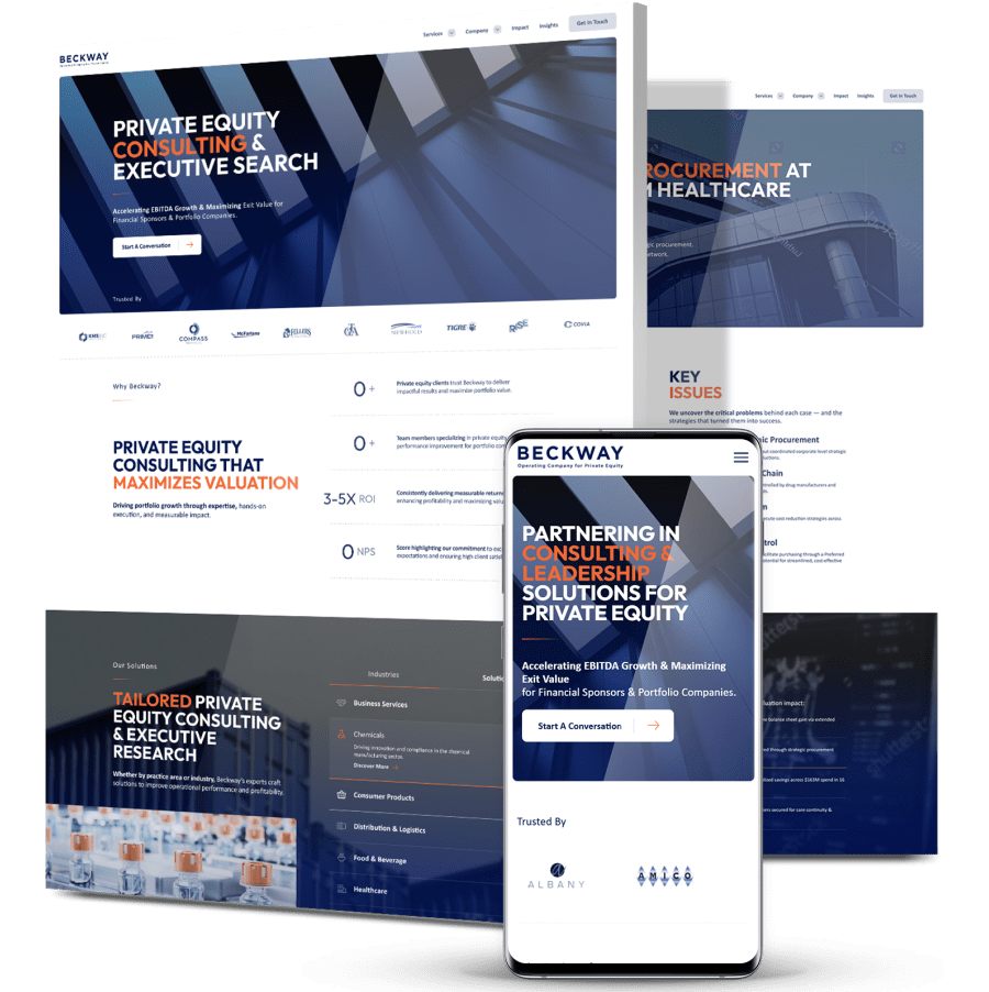
  • Digital Silk redesigned the site with a simplified six-page structure, sticky mega menu, modular content blocks and brand-aligned visuals, all optimized for a sophisticated B2B audience.
  • The result: a future-ready platform that improved conversion readiness, unlocked new upsell opportunities and positioned Beckway as a trusted growth partner.
design

The Challenge

Before launch, the Beckway website suffered from several issues
that limited user engagement and undermined conversion potential.

stacked_3

Outdated Design

The previous site lacked visual clarity, hierarchy and modern functionality, making it difficult for users to navigate or understand Beckway’s offerings.

No Conversion Funnel

Without calls-to-action or a clear user journey, visitors were given no guided path to learn more or get in touch.

Overloaded Content

Long, dense pages buried key information and failed to capture user interest, leading to high drop-off rates and low engagement.

background_2

THE SOLUTION

Working closely with Beckway’s leadership team, Digital Silk implemented
a holistic solution that combined strategic content restructuring with modern design.

  • Content Restructure

    The site was simplified and refined into six core landing pages, aligning content with the needs of different stakeholders and guiding users through clear funnels.

  • Modern UX

    A sticky mega menu, scannable layouts and modular sections for services, bios and case studies made information easy to find. Responsive design ensured a seamless experience across devices.

  • Brand Integration

    Beckway’s existing brand guidelines were applied across a clean, scalable design system, reinforcing trust and professionalism.

  • Case Study Framework

    A flexible storytelling module was introduced to highlight success stories. The strong early reception led the client to expand this feature after launch.

  • Ongoing Partnership

    Impressed by the strategic value of the launch, Beckway signed on for hosting and maintenance services, trusting Digital Silk to manage the site long-term.

3_pages_flip

The Results

The redesigned website delivered immediate improvements in both user experience and business outcomes:

Simplified navigation

from dense, unclear paths to a clean six-page structure with intuitive flow.

Upsell success

client opted into case study expansion and hosting & maintenance post-launch.

Improved conversion readiness

with CTAs, streamlined messaging and a mobile-first layout.

Stronger foundation for growth

enabling future campaign efforts and scalable engagement.

Request a Quote For Your Project
before and after arrow image
before_after
CLICK TO VIEW MORE Hide

Featured Case Studies

Explore Our Case Studies & See How Digital Silk Grows Brands Online.
Golden Gate Bridge
--image:1

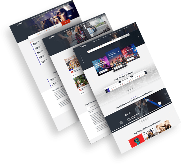
Bringing Local Culture To Life Through Brand Identity

CrawlSF needed a fresh identity that matched its immersive, city-based event experiences.

A modern logo and expressive visual language helped capture the brand’s local energy and appeal to a younger, experience-driven audience.

The rebrand elevated CrawlSF’s position in the event space and provided a strong foundation for future campaigns.

opto-branding portfolio-bcg-min
--image:1

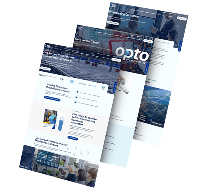
Establishing A Modern Brand For Operational Efficiency

KPI Solutions wanted a new identity that better aligned with its shift toward innovative logistics technologies.

The rename to OPTO, supported by sleek visuals and a forward-thinking brand system, introduced a more agile and future-ready image.

This transformation helped distinguish the company in a highly competitive B2B market.

ds-capixa-branding portfolio-bcg
--image:1

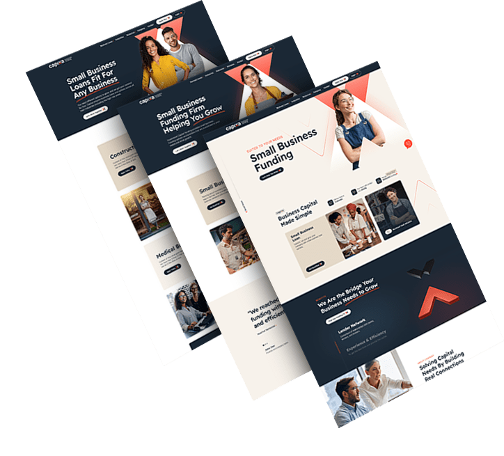
Creating A Lending Brand With Simplicity And Strength

Capixa aimed to connect with small business owners through a brand that felt both empowering and easy to trust.

The identity combined bold typography, a vibrant palette and human-centered messaging to stand out in the fintech landscape.

The result was a brand that delivered clarity, confidence and market differentiation from day one.

ds-branding portfolio-frontier auto parts-bcg (2)
--image:1

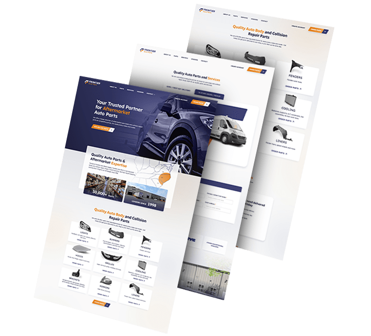
Rebuilding A Brand Around Consistency And Trust

Frontier Auto Parts set out to unify its brand across physical assets and build stronger visual recognition.

The updated logo and extended identity system added cohesion across uniforms, vehicle fleets and retail signage.

This refresh supported the company’s growth and reinforced its long-standing reputation for reliability.

load more examples