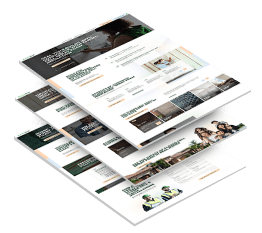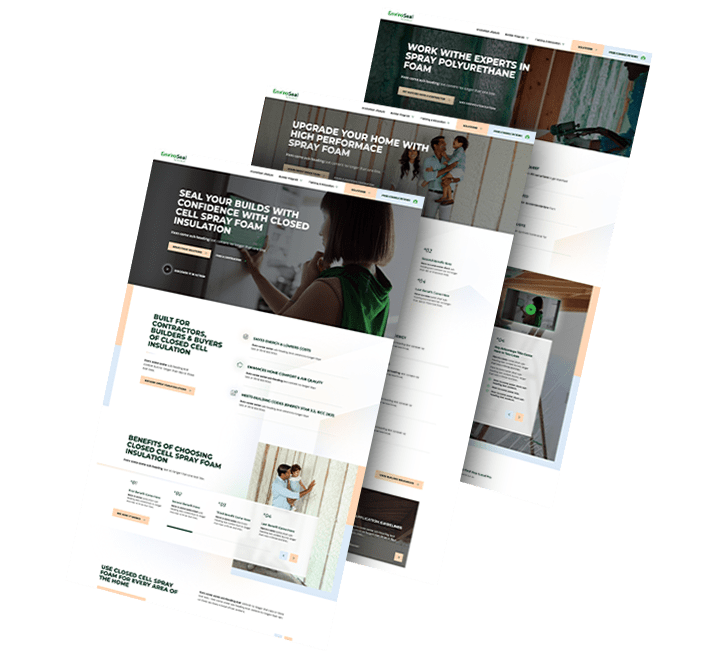

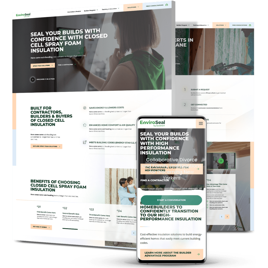
EnviroSeal: Launching A Consumer-Friendly Spray Foam Brand
- EnviroSeal, a spray foam insulation brand by Quadrant Performance Materials, needed a standalone website to launch a more approachable, consumer-friendly brand while supporting contractor and home builder growth.
- Digital Silk delivered brand strategy, visual identity, and a custom WordPress website designed to build trust across multiple audiences, support future marketing initiatives, and scale with the brand’s growth.
- Within three months of launch, views increased by ~4.4x, users increased by ~15.1x and engaged sessions increased by ~7.9x.
Featured Case Studies


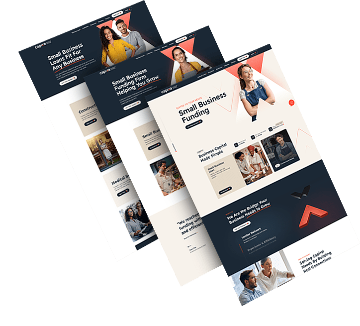
Capixa: A Fintech Identity Built On Trust
Capixa entered the market with a mission to empower small businesses through accessible funding. Its brand needed to convey authority without losing approachability.
A memorable name, confident typography and a focused color system create a visual presence rooted in clarity and strength. Messaging reinforces transparency, helping build credibility from the start.
The identity now positions Capixa as a grounded, future-ready partner for small businesses.


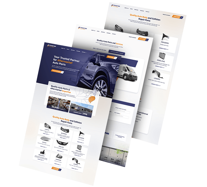
Frontier Auto Parts: Driving Recognition Through Cohesion
With rapid growth across retail and fleet operations, Frontier Auto Parts required a unified brand system that extended its presence both on the road and in-store.
Bold geometric forms and a clean visual language convey speed and reliability, while consistent touchpoints, from vehicles to signage, enhance brand recognition.
This cohesive identity ensures Frontier is instantly recognizable and primed for expansion.

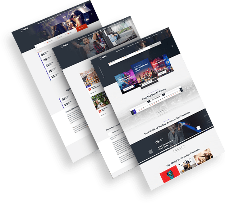
CrawlSF: A Fresh Look For San Francisco’s Nightlife Icon
CrawlSF has long been synonymous with unforgettable local experiences, but its brand needed a refresh to capture a new generation of audiences.
Playful typography, energetic colors, and a flexible logo system channel the city’s dynamic spirit. Messaging aligns with its promise to let people “Experience Francisco Like a Local.”
The updated identity deepens emotional connection, inviting both loyal fans and newcomers to engage with the brand.


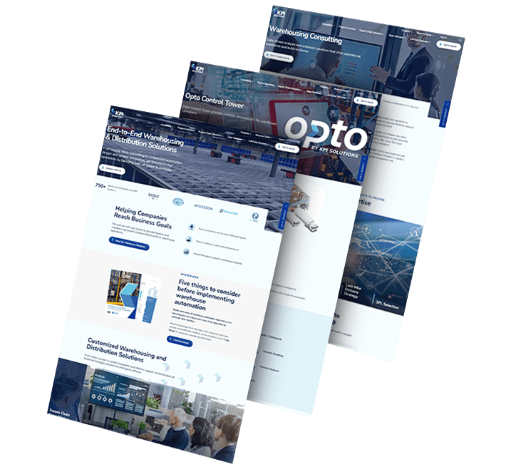
Opto: Reframing Innovation In Warehouse Technology
As KPI Solutions pivoted toward scalable automation and advanced logistics, the brand evolved into Opto, a name and identity designed for agility and growth.
A streamlined logotype, modular system and bold visual cues signal clarity, efficiency and innovation. The identity communicates both speed and scalability in a competitive market.
The rebrand positions Opto as a forward-moving force in warehouse technology and logistics innovation.


