background_1
Background Gradient
H2 Compliance

Rebuilding A Unified Brand Experience For A 157% Organic Growth Surge

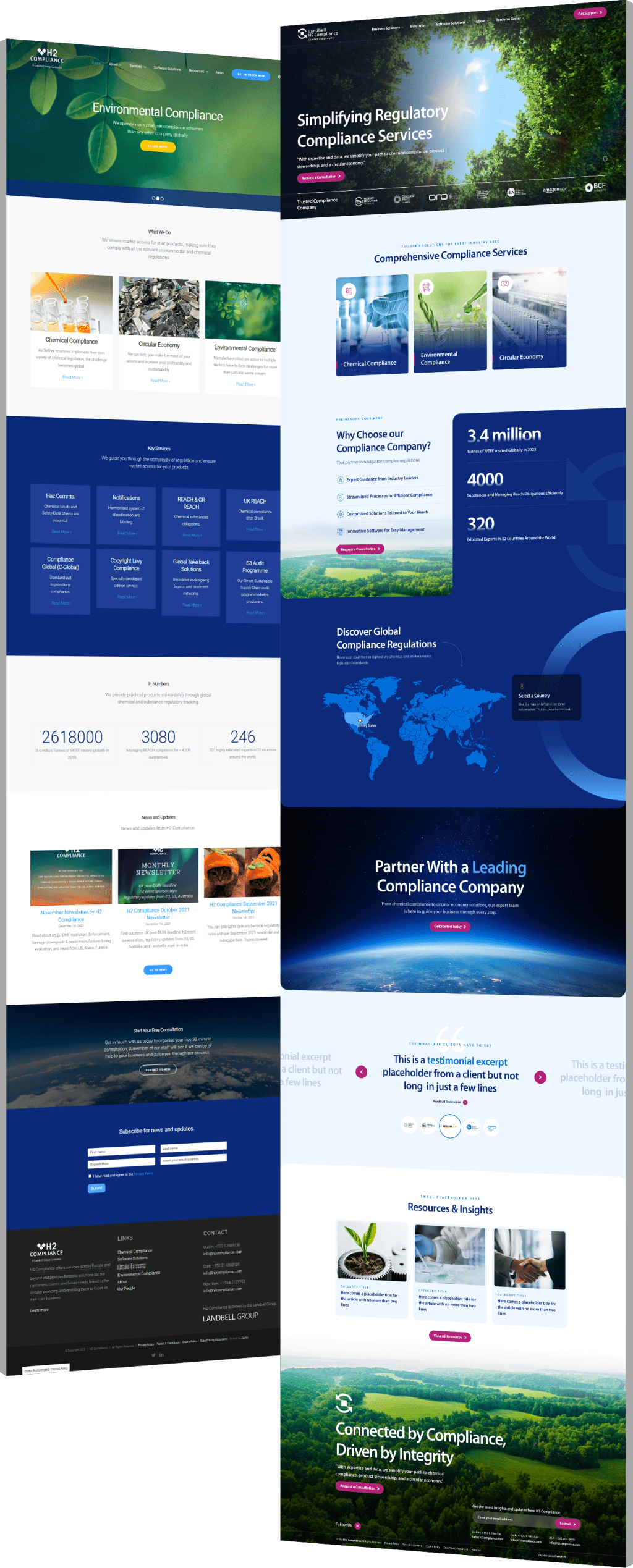
  • H2 Compliance, part of the global Landbell Group, needed a website that clearly reflected its three core sectors: chemical, environmental and circular economy compliance, while reducing bounce rates and helping launch a new SaaS solution.
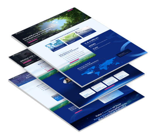
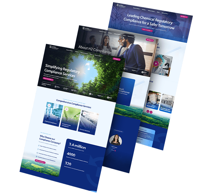
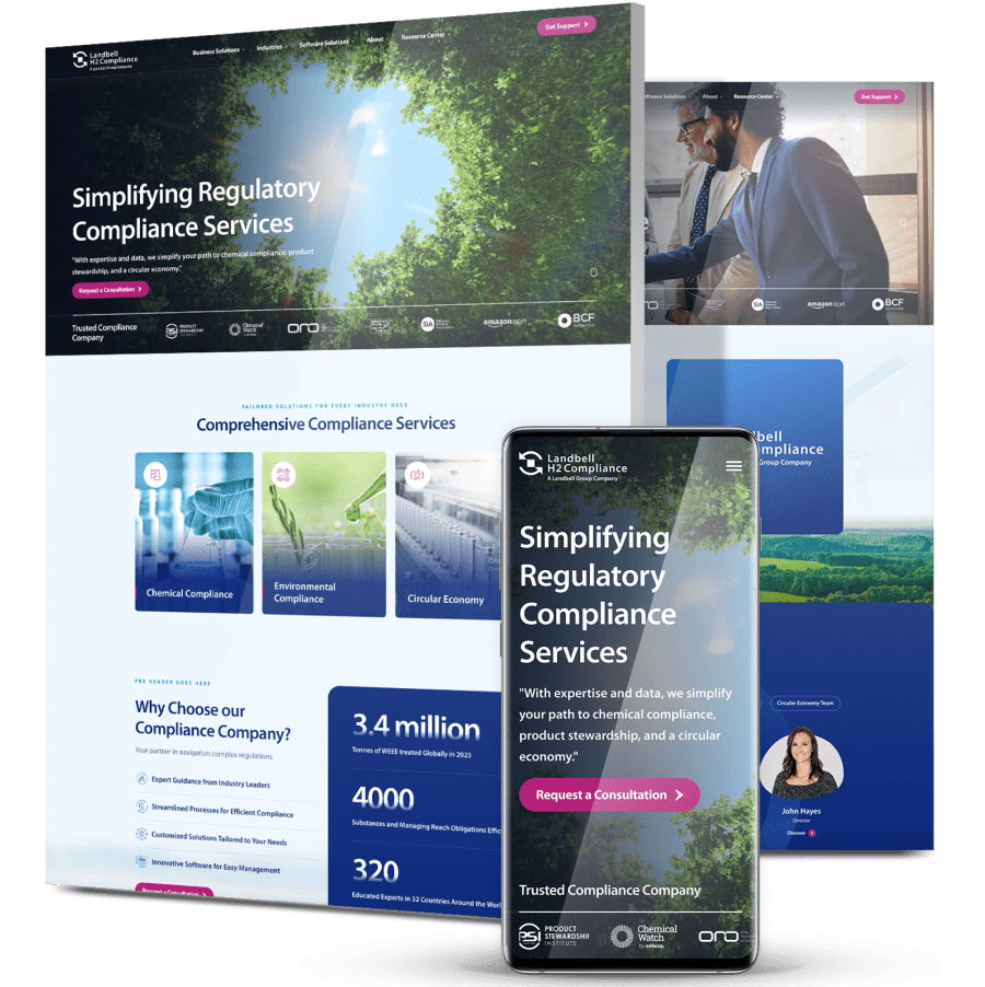
  • Digital Silk redesigned the site on WordPress with a clean, modern look, organized content by sector, simplified the messaging, added an interactive compliance map and optimized everything for search and user experience.
  • Just weeks after launch, organic traffic jumped +157.68%, engagement time increased +9.87% and views per session rose +11.5%.
new_design

The Challenge

H2 Compliance needed a website that could grow with the brand and that
clearly communicated their services, supported lead generation and reflected their role as a trusted player in regulatory consulting.

stacked_3

Lack Of Sector Clarity

The site didn’t clearly explain H2 Compliance’s three core sectors: chemical, environmental and circular economy, making it harder for users to understand their value.

Overly Technical Content

Heavy, jargon-filled language made it difficult for non-specialist audiences to engage, even when the services were relevant to them.

Generic Visuals

Stock photos and outdated design elements failed to capture the team’s credibility, mission or real-world impact.

High Bounce Rate

With bounce rates hovering near 80%, the site wasn’t doing enough to hold users’ attention or guide them to take action.

No Funnel For SaaS Launch

With a major SaaS rollout on the horizon, the site lacked the structure and messaging needed to drive product awareness and conversions.

background_2

THE SOLUTION

To address the issues, Digital Silk collaborated directly with
stakeholders across all service divisions, aligning business goals with user needs through strategy, design and development.

  • Sector-Based Architecture

    Created dedicated service pages for chemical, environmental and circular economy compliance, each with tailored messaging, visuals and CTAs.

  • Refined Visual Identity

    Built a sleek, modern interface using real team photography and software product visuals, following brand guidelines while elevating aesthetics.

  • User-Centric Messaging

    Rewrote dense regulatory content to make it more digestible, without losing technical credibility, making the offering more accessible to non-specialist visitors.

  • SEO & Lead Optimization

    Implemented SEO best practices and placed high-converting CTAs on strategic pages, particularly those tied to the upcoming SaaS launch.

  • Custom WordPress Build

    Developed a fully custom WordPress site to provide flexibility for internal teams to manage updates, with no compromise on speed or design quality.

  • Interactive Compliance Map

    Integrated a dynamic tool allowing users to instantly explore chemical regulations by country, enhancing engagement and positioning the brand as a resource hub.

  • Humanized Brand Story

    Revamped the About section with team photos and transparent, approachable copy, distinguishing H2 Compliance from competitors with cold, corporate tones.

3_pages_flip

The Results

The new site launched on April 15, 2025, and quickly delivered tangible performance improvements:

Organic traffic increased

157.68 %

from improved SEO, faster page loads and clearer service structure.

Engagement time per session grew

9.87 %

as simplified messaging and layout kept users exploring longer.

Views per session rose

11.5 %

thanks to streamlined navigation and targeted CTAs.

Request a Quote For Your Project
before and after arrow image
before_after
CLICK TO VIEW MORE Hide

Featured Case Studies

Explore Our Case Studies & See How Digital Silk Grows Brands Online.
ds-capixa-branding portfolio-bcg
--image:1

Building A Bold Identity For A Fintech Challenger

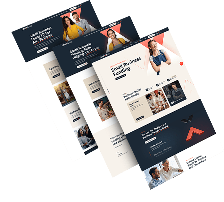
Capixa, a startup offering small business funding, sought a compelling brand to match its ambitious growth plans.

A catchy new name, modern logo, and a clean visual language were developed to signal simplicity and trust.

The refreshed identity now communicates approachability and financial confidence to a broad customer base.

ds-branding portfolio-frontier auto parts-bcg (2)
--image:1

Crafting A Cohesive Look For A Parts Supplier

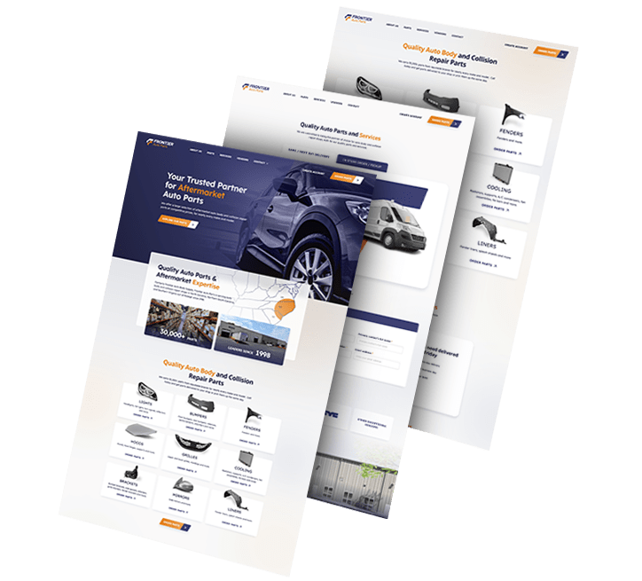
We rebranded automotive company Frontier Auto Parts, crafting a strong, distinctive identity that drives associations of efficiency and reliability.

Our team crafted branded assets to boost recognition across touchpoints.

Wall graphics, employee uniforms, van design and even stationery were designed to align with the new branding efforts.

Golden Gate Bridge
--image:1

Refreshing A Local Brand With Global Appeal

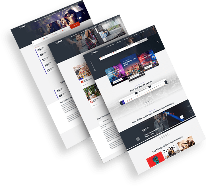
CrawlSF, a San Francisco-based event company, looked to modernize its identity to support expansion and deepen local ties.

Visuals and messaging were aligned to its “Experience Francisco Like a Local” promise, with a flexible logo system and engaging assets.

The result is a fun, dynamic brand that’s now more relevant to both tourists and long-time locals.

opto-branding portfolio-bcg-min
--image:1

Repositioning For Growth In Warehouse Tech

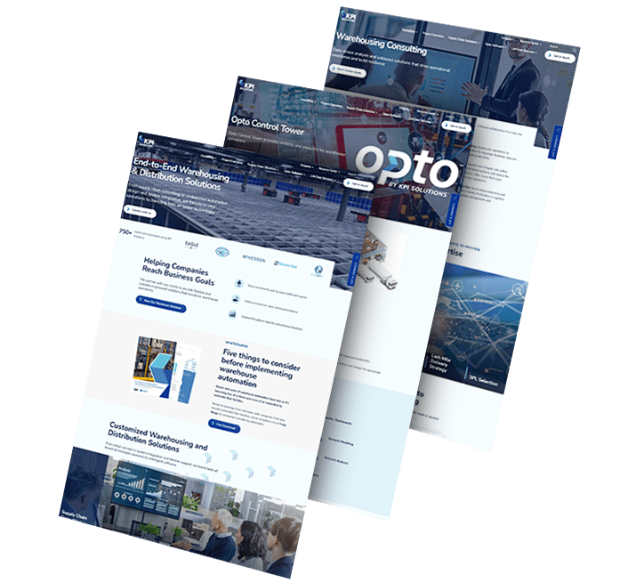
KPI Solutions reintroduced itself as Opto to reflect a shift toward scalable warehouse automation and operational innovation.

A bold name, custom logo and modular visual identity set the tone for this next chapter in its evolution.

The rebrand enhanced industry perception and created a platform for future marketing and digital expansion.

load more examples