backgorund_1
Background Gradient
Helinet Aviation

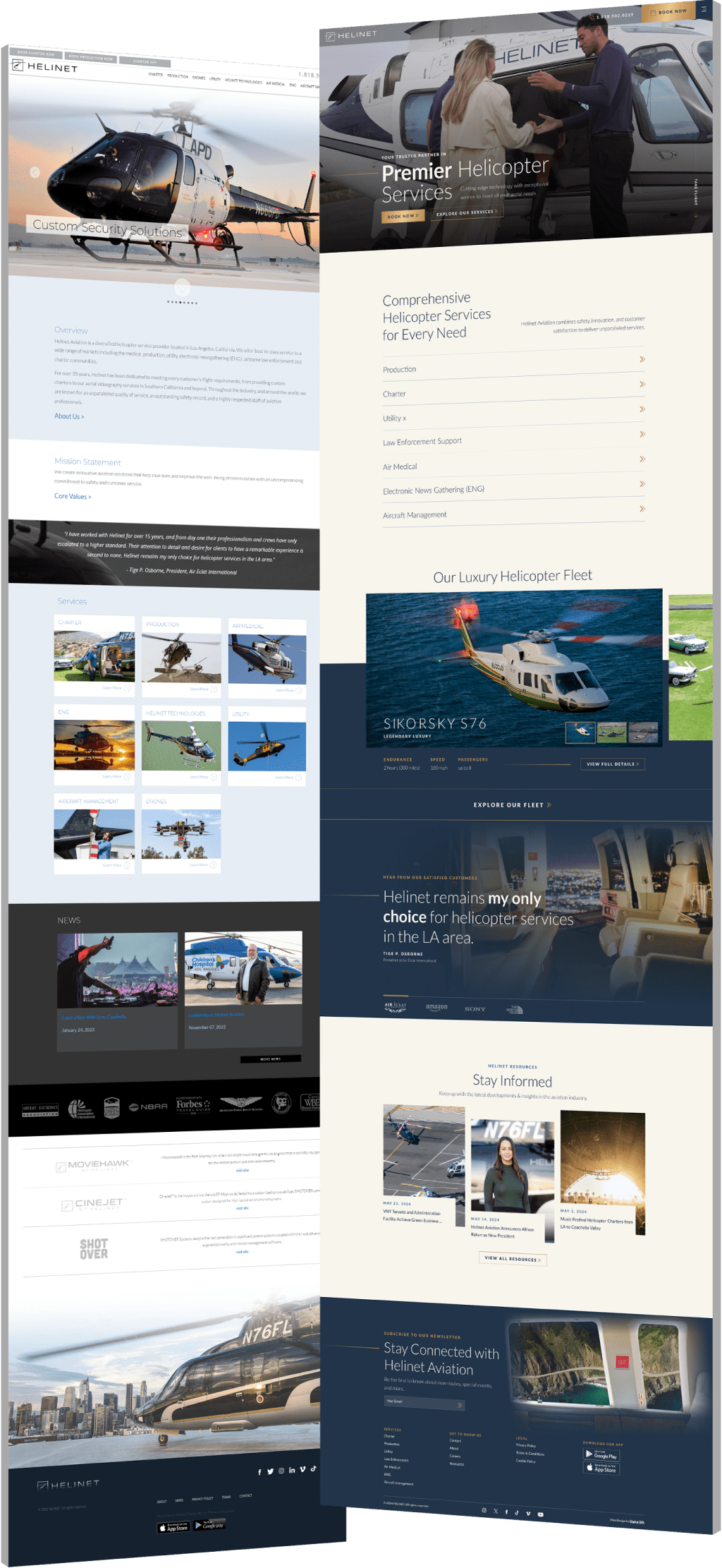
Elevating A Legacy Brand With A Modern Digital Experience

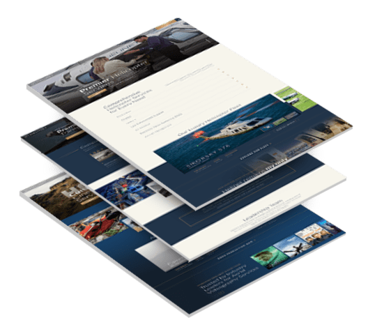
  • Helinet needed a site that matched the sophistication of its aviation services and supported growth across multiple business lines.
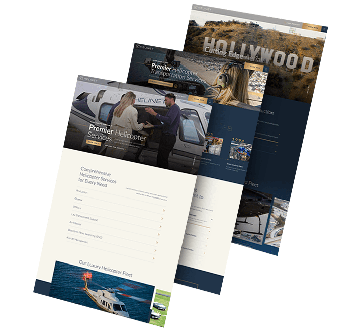
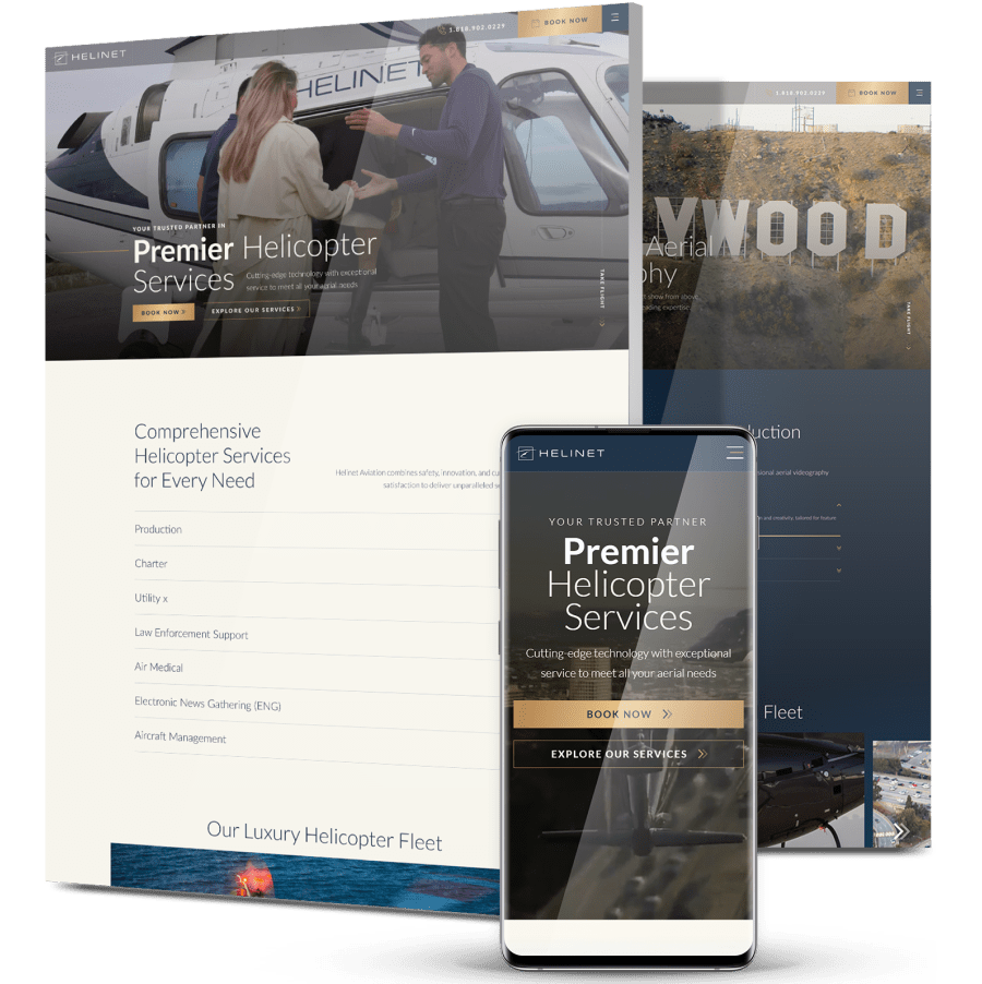
  • Digital Silk delivered a high-end redesign with tailored UX, visual storytelling and simplified lead funnels built for long-term scalability.
  • Since launch, engagement rate rose +31.1%, conversions increased +152% and average engagement time jumped +31.36%.
new_design

The Challenge

Helinet Aviation needed a modern digital presence that reflected its premium brand
and supported growth across diverse service areas.

stacked_3

Outdated User Experience

The design no longer resonated with Helinet’s high-profile clientele, especially luxury and enterprise users.

Fragmented Messaging

Each service area lacked tailored storytelling, making it harder to communicate value across charter, production and medical operations.

Weak SEO & Lead Capture

Limited optimization and technical constraints reduced organic visibility and site performance.

Complex Navigation

Overcrowded menus and scattered CTAs made it difficult for users to find relevant information or convert.

Restrictive CMS

The ExpressionEngine backend limited scalability and made it hard to manage content updates.

backgorund_2

THE SOLUTION

Digital Silk designed a custom site that combined luxury branding
with functionality built for engagement, conversion and scale.

  • Tailored UX Architecture

    Each service vertical, including Charter, Production, ENG, Utility, Air Medical, Helinet Technologies and Aircraft Management, received a custom layout and user journey.

  • Immersive Visual Storytelling

    We integrated a 15–20 second splash video on the homepage and strategically embedded high-quality visual assets across key pages.

  • Conversion-Focused Design

    Simplified lead forms and CTAs streamlined inquiries, especially for Charter and Production services.

  • Luxury-Inspired UI

    We introduced motion, modular content blocks and clean navigation to align with the high-end expectations of Helinet’s audience.

  • CMS Overhaul

    Migrated the site to a modern, flexible CMS, reducing technical debt and enabling easier updates and scalability.

  • SEO-Ready Framework

    The rebuild included schema markup, optimized page speed and structured content for long-term visibility.

  • Ongoing Support

    We provided a post-launch roadmap for future design updates, performance monitoring and campaign integration.

3_pages_flip

The Results

The site launched on April 12, 2025, and within weeks, performance surged across all key metrics:

Engagement rate increased

31.1 %

with users exploring more content across service lines.

Engaged sessions per user grew

50.1 %

as optimized journeys kept visitors more active and invested.

Average engagement time rose

31.36 %

driven by video integration and improved UX.

Organic traffic climbed

21 %

thanks to stronger technical SEO and better content structure.

Contact form conversions jumped

152 %

following simplified lead capture and strategic CTA placement.

Request a Quote For Your Project
before and after arrow image
before_after
CLICK TO VIEW MORE Hide

Featured Case Studies

Explore Our Case Studies & See How Digital Silk Grows Brands Online.
ds-capixa-branding portfolio-bcg
--image:1

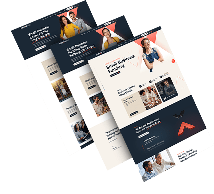
Building A Bold Identity For A Fintech Challenger

Capixa, a startup offering small business funding, sought a compelling brand to match its ambitious growth plans.

A catchy new name, modern logo, and a clean visual language were developed to signal simplicity and trust.

The refreshed identity now communicates approachability and financial confidence to a broad customer base.

ds-branding portfolio-frontier auto parts-bcg (2)
--image:1

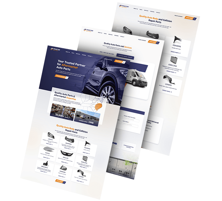
Crafting A Cohesive Look For A Parts Supplier

We rebranded automotive company Frontier Auto Parts, crafting a strong, distinctive identity that drives associations of efficiency and reliability.

Our team crafted branded assets to boost recognition across touchpoints.

Wall graphics, employee uniforms, van design and even stationery were designed to align with the new branding efforts.

Golden Gate Bridge
--image:1

Refreshing A Local Brand With Global Appeal

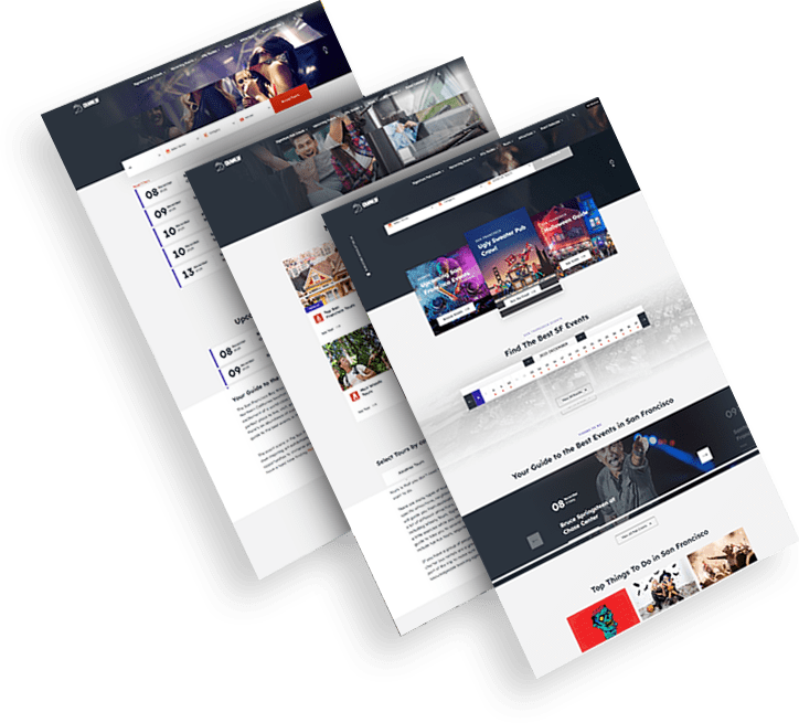
CrawlSF, a San Francisco-based event company, looked to modernize its identity to support expansion and deepen local ties.

Visuals and messaging were aligned to its “Experience Francisco Like a Local” promise, with a flexible logo system and engaging assets.

The result is a fun, dynamic brand that’s now more relevant to both tourists and long-time locals.

opto-branding portfolio-bcg-min
--image:1

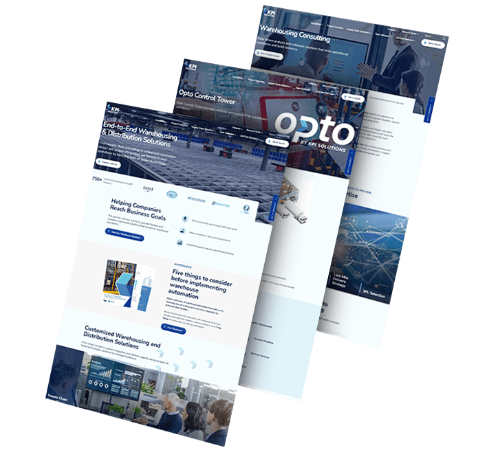
Repositioning For Growth In Warehouse Tech

KPI Solutions reintroduced itself as Opto to reflect a shift toward scalable warehouse automation and operational innovation.

A bold name, custom logo and modular visual identity set the tone for this next chapter in its evolution.

The rebrand enhanced industry perception and created a platform for future marketing and digital expansion.

load more examples