

JUISE MOBILITY
Building The Case For Infrastructure In A Market That Has None
-
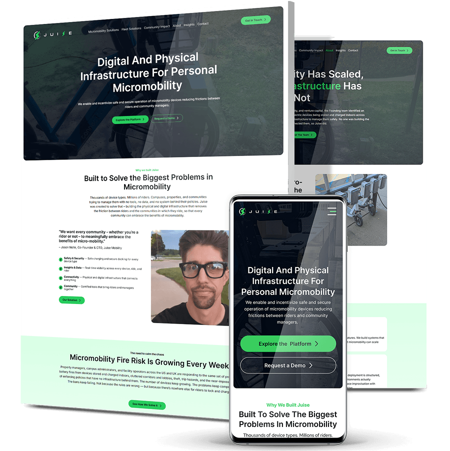
Juise Mobility builds connected charging, docking and locking infrastructure for e-bikes and e-scooters, but its website read like a hardware catalog, said nothing about the IoT platform underneath, and addressed a campus risk manager and a venture investor in exactly the same voice.
-
Digital Silk mapped the competitive messaging landscape, found every direct rival crowded into the same “safety and order” territory, and rebuilt the site around a larger argument: millions of privately owned devices are entering properties with nowhere safe to charge, and that gap is an infrastructure problem.
-
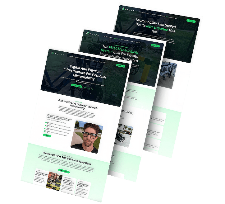
The new site leads with the market gap, backs it with third-party evidence, and splits into dedicated Micromobility Solutions, Fleet Solutions and Community Impact paths, replacing generic “Learn more” links with intent-specific calls to action.


The Challenge
Juise had built genuinely differentiated technology. Its website described a catalog of hardware.
A Platform Business Presented As A Product Catalog
The site led with charging stations, docks and lockers — useful products, but nothing a competitor couldn’t claim. The connectivity platform underneath, the thing that actually separated Juise, went effectively uncommunicated.
One Message For Every Buyer
Juise sells to campus administrators, property developers, hospitality and resort operators, private fleet operators, municipal programs and investors. The site treated all of them identically. A facilities director worried about dorm-room battery fires and an investor sizing up platform scalability were reading the same page.
Undifferentiated In A Crowded Message Space
Competitive mapping showed that direct competitors clustered in safety and order, while larger platforms owned integration and impact. Juise sat in the safety camp alongside its direct rivals, saying what they said.
No Evidence Behind The Claims
Thin credibility signals and generic “Learn more” links gave no audience — however qualified — a reason to start a conversation.
An Architecture That Buried Every Use Case
A single dense homepage carried the entire offering, leaving each audience to hunt for the part of the business relevant to them.

The Solution
Digital Silk started with the market rather than the website. Mapping where competitors had already planted their messaging showed which ground was still open, and a shift in the market itself showed where Juise should stand.
-
Competitive Message Mapping
We plotted the category’s messaging territory and found it unevenly occupied: direct competitors clustered in safety and order, larger platforms holding integration and impact. The exercise made Juise’s undifferentiated position visible and identified the space no one had claimed. -
Repositioning Around The Infrastructure Gap
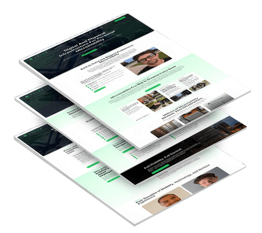
Instead of competing on safety messaging, we made the structural problem the argument: millions of privately owned devices, zero infrastructure. Bans fail not because the rules are wrong, but because riders have nowhere else to charge. We built the platform story on four pillars — safety, data, connectivity and community — so the site explains what Juise is, not just what it sells. -
Audience Paths & A New Information Architecture
We split one dense homepage into dedicated Micromobility Solutions, Fleet Solutions and Community Impact sections, routing campuses and properties managing privately owned devices separately from operators running shared fleets. Generic “Learn more” links gave way to calls to action matched to intent: Explore the Platform, Request a Demo, Talk to an Expert. -
An Evidence-Led, Credibility-Forward Redesign
We replaced the dark, hardware-catalog aesthetic with a cleaner layout built around outcomes and proof rather than product shots. Third-party evidence carries the argument: UL Standards research on e-mobility fires, a lawsuit alleging $1.6M in battery-fire damage, and a dorm fire at San Diego State. -
Keyword Research & Content Planning
We ran keyword research and content planning against the new structure so the site launched with SEO-ready copy rather than retrofitting search later.
The Results
Juise now argues for a category rather than a product:
-
A Category Positionthat moves Juise out of the crowded safety-messaging lane and into the infrastructure gap no competitor had claimed
-
3 Solution Pathsin place of one overloaded homepage, so a campus, a fleet operator and a community each land on their own case
-
Conversion Pathsthat replaced generic “Learn more” links with calls to action matched to where each visitor actually is in their decision
-
Third-Party Evidencebehind the argument, from UL Standards fire research to a lawsuit alleging $1.6M in battery-fire property damage
Our Custom Web Design Portfolio
1,000+ Completed Projects
Explore our case studies & see how we grow brands online.
Sorellis’ Brand Launch From The Ground Up
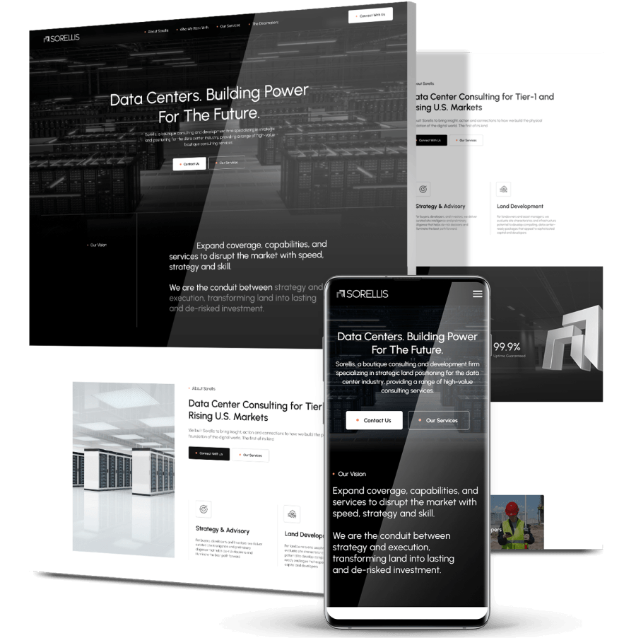
Sorellis is the brand we created for Decillion, a female-led data center advisory firm entering a high-trust market with no name, no logo, no messaging and no room for a weak first impression.
We built the brand as a connected system: the Sorellis name itself, a full logo suite, messaging architecture covering mission through UVP, personas for both sides of the deal chain, and a brand book documenting color, typography, photography and layout.
Sorellis entered the market with a high-trust landing page that guides visitors by stakeholder type and routes contact inquiries accordingly, communicating credibility and differentiation from day one.
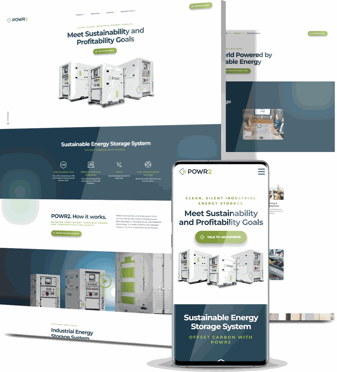
POWR2’s Market-Education Redesign
POWR2 makes portable energy storage systems in a segment still establishing itself in the US, which meant its website had to educate the market before it could sell to it — and the existing platform converted poorly.
We delivered a custom redesign built around large visuals and streamlined navigation, improved mobile responsiveness and load speed, added an interactive 3D model, and mapped clear conversion paths anchored by “Talk To An Advisor” CTAs.
Within six months, organic traffic rose 80% and total traffic rose 77%.
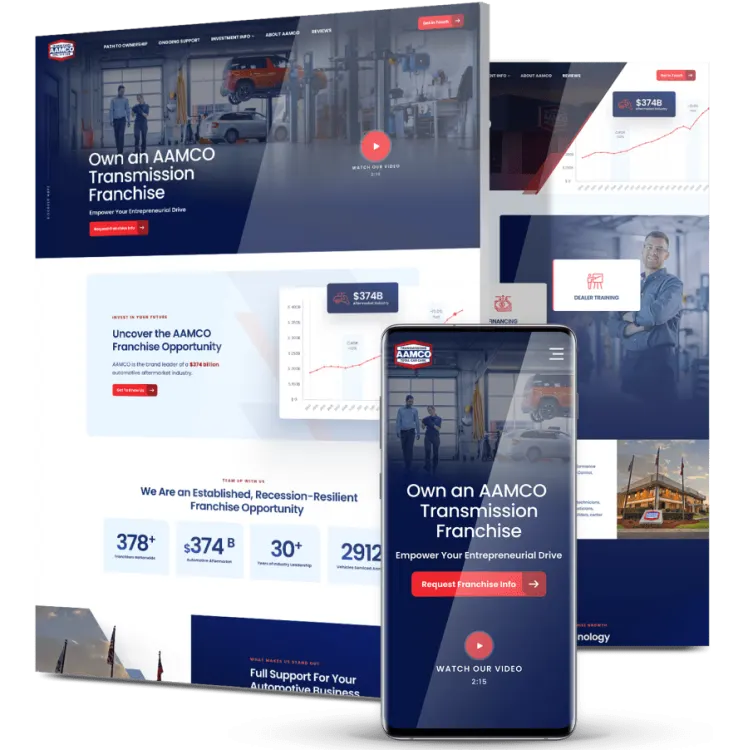
AAMCO’s Qualified-Lead Franchise Site
AAMCO has franchised since the early 1960s, but its franchise site’s confusing structure produced unqualified leads, and six decades of heritage carried a perception of being behind on technology.
We invested heavily in information architecture to present franchise benefits and investment costs as a concise visual narrative, wrote every page against relevant keywords, and optimized design and code for mobile and accessibility.
Shortly after launch, form conversion rate rose 120.8% and views per session rose 12.1%.
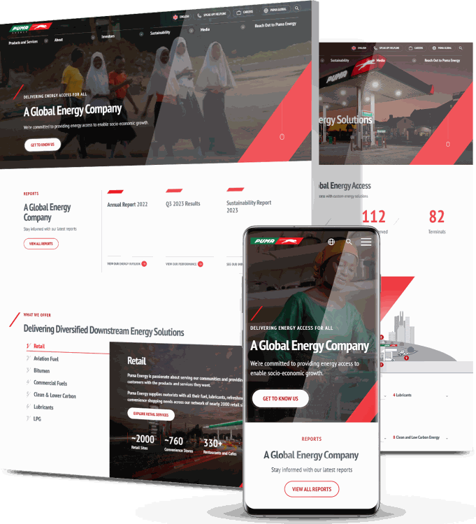
Puma Energy’s B2B And B2C Split
Puma Energy’s website didn’t match its brand, wasn’t built for mobile, and served both B2B and B2C audiences through a single undifferentiated journey.
We overhauled the design with considered typography, vibrant color and custom graphics, built separate user journey flows for each audience segment, made the layout fully responsive, and ran keyword research and optimization across the site.
Three weeks after launch, website visitors were up 27%, direct traffic up 32.1% and user engagement up 63%.
Get The Latest Web Design
Insights Delivered To Your Inbox
Insights Delivered To Your Inbox
"*" indicates required fields
Take The Smart Road To
Digitizing Your Business Growth
Start a conversation with us
"*" indicates required fields