background_1
Background Gradient
Procom Services

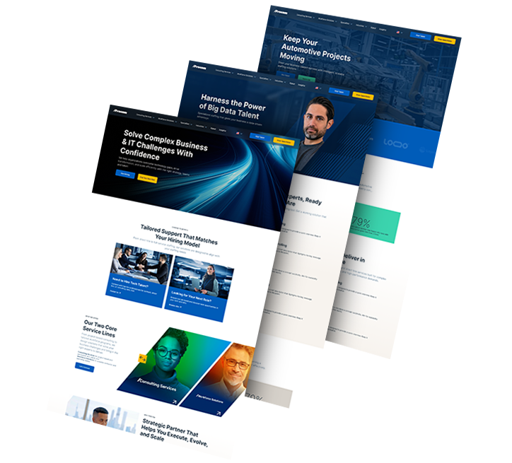
Procom Services: A Scalable Website For Global Growth

  • Procom Services needed a website that made its service lines easy to understand and accessible to international audiences, since the old site wasn’t clearly organized and lacked languages users needed.
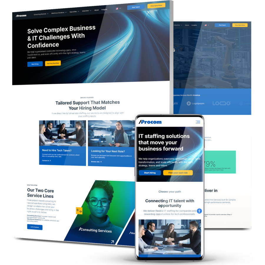
  • Digital Silk designed and built a multilingual, conversion-focused platform with clearer service architecture, optimized user flows and stronger technical performance.
  • After launch, the new experience drove higher engagement with a 12.45% rise in views per active user, 22.69% longer engagement time and 16.28% longer sessions.
design

The Challenge

Procom Services’ previous website lacked clarity and multilingual support,
making it difficult for users to understand its services and reducing global engagement.

3_stacked

Unclear Service Structure

Users struggled to distinguish between service categories and offerings, limiting understanding of Procom’s full capabilities and reducing conversions.

Limited Global Reach

Without multilingual support, international users couldn’t easily access or understand Procom’s services, restricting global visibility and engagement.

Outdated Architecture

An outdated CMS and limited analytics made it difficult to track performance or update content efficiently, slowing marketing responsiveness.

Lack Of Optimization

Slow page speeds and minimal SEO limited visibility in search and reduced overall site performance.

background_2

THE SOLUTION

Digital Silk created a multilingual, conversion-focused digital platform
designed to simplify navigation, improve clarity and boost engagement through data-driven design.

  • Simplified Service Architecture

    Redesigned categorization clearly organized services and sub-services, helping users find relevant solutions quickly.

  • Multilingual Experience

    Full translation and localization opened the site to international audiences, improving accessibility and reach.

  • Optimized User Flows

    Streamlined navigation and optimized CTAs guided users toward key actions and increased conversions.

  • Performance & SEO Enhancements

    Technical updates improved load speed, metadata and keyword targeting to boost organic visibility.

  • Scalable CMS Setup

    A flexible CMS now enables the internal team to easily manage content, add new languages and support future campaigns.

3_pages

The Results

Launched in August 2025, the new website delivered measurable engagement growth and improved user clarity:

Website engagement up by

12.45 %

as clearer navigation helped users explore more content.

Average engagement time up by

22.69 %

as optimized flows kept visitors active longer.

Session duration up by

16.28 %

with faster performance and a multilingual experience.

Request a Quote For Your Project
before and after arrow image
before_after
CLICK TO VIEW MORE Hide
Our Custom Web Design Portfolio

1000+ Completed Projects

Explore Our Case Studies & See How Digital Silk Grows Brands Online.
Featured
background_2
--image:1

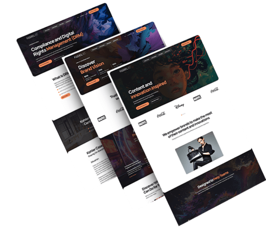
Simplifying AI Rights Management For Every User

FADEL needed a platform that could clearly communicate its AI-driven rights management system to diverse audiences.

Streamlined layouts and focused messaging turned complex information into an intuitive experience, supported by a flexible architecture built for scale.

Since launch, the new site has attracted steady qualified traffic and continues to contribute to business growth.

Five people stand next to each other smiling
--image:1

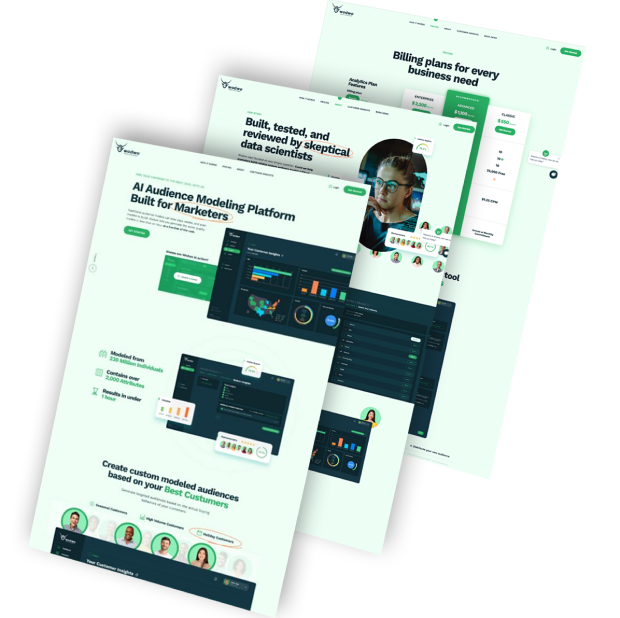
Designing A Smarter Experience For AI Modeling

Wodwo wanted a digital platform that made its advanced AI modeling tools accessible and easy to explore.

Interactive dashboards and a responsive chatbot empower users to analyze data in real time, while the simplified interface keeps navigation clear and efficient.

The result is a smooth, intuitive experience that makes complex modeling feel effortless.

ds-capixa-branding portfolio-bcg
--image:1

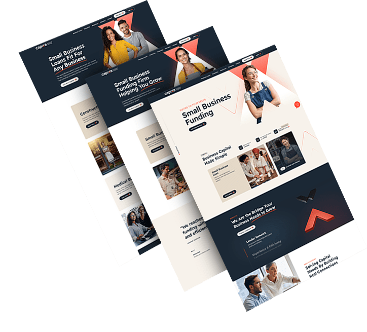
Building A Brand Small Businesses Can Trust

Capixa needed a modern identity that felt credible yet approachable for small business owners seeking funding.

Distinct naming, clean visuals and direct messaging built instant trust and positioned the brand as a reliable growth partner.

The refreshed identity now helps Capixa stand out as a transparent and supportive lender.

opto-branding portfolio-bcg-min
--image:1

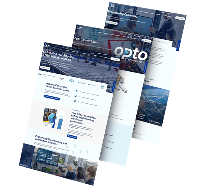
Fueling Innovation With A Scalable Digital Ecosystem

OPTO was born from KPI Solutions’ rebrand, marking a bold step toward innovation in warehouse automation.

Strategic product storytelling, user-centered design and clear conversion paths turned the new website into a true growth platform.

Enhanced UX and SEO continue to drive organic visibility and user engagement.

load more examples