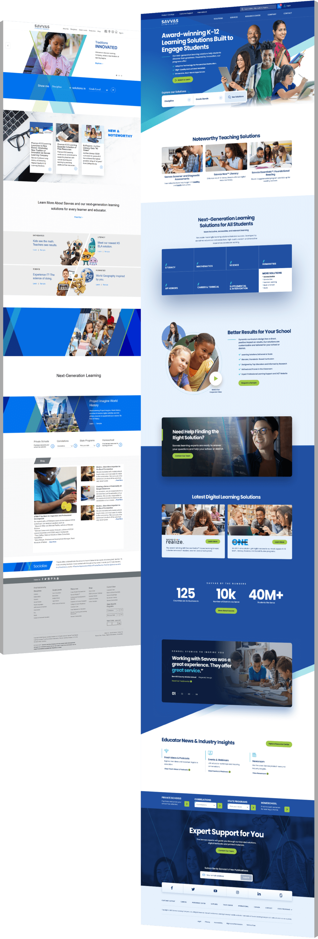
Background image of children learning for Savvas Learning Company
Background Gradient
Savvas Learning Company Usability Testing Development Case Study

Redesigning And Enhancing The Online Customer And Technical Support Flow

  • Savvas Learning Company was looking to re-design their online Customer and Technical Support flow.
  • We changed the flow architecture and concentrated on user tasks, rather than user roles. We changed the starting point of the flow from “Who you are?” to “What do you want to do?”
  • The result: Improved customer experience and a more intuitive platform
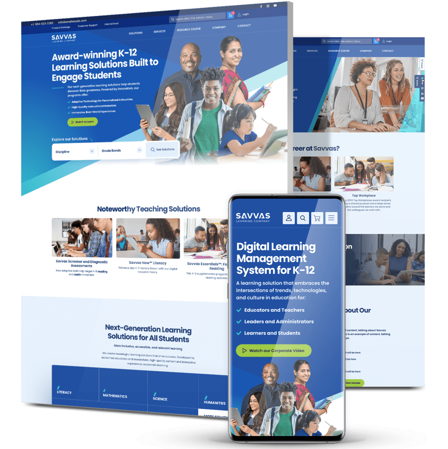
Savvas website collage

The Challenge

Savvas Learning Company needed to re-design their online Customer and Technical Support flow

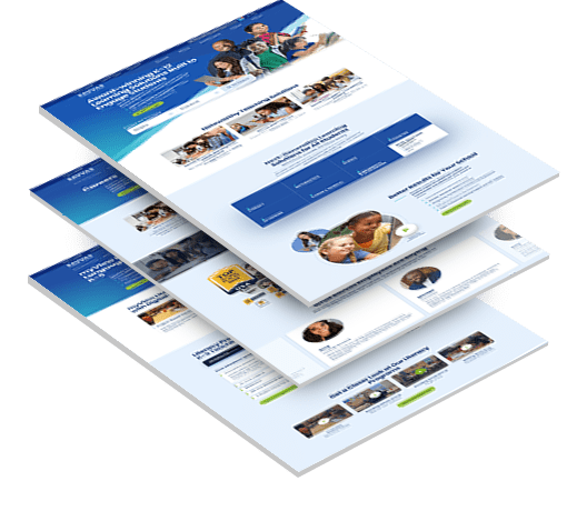
Three stacked images from the Savvas' website.

Complex User Path

Savvas Learning Company, a leader in education, required a complete overhaul of their intricate user flow to enhance usability and efficiency.

Diverse Target Audiences

We needed to create an improved user experience that catered to various target audiences, each with unique navigation paths and needs.

Too Many Steps for Goal Achievement

The primary objective was to minimize the number of steps users needed to take to reach their goals, and provide them with a more intuitive and efficient experience.

Children with their teacher learning in class

THE SOLUTION

Digital Silk developed a custom solution that simplifies the user journey and streamlines site navigation

Some of our deliverables included:
  • Task-Oriented User Flows

    Digital Silk restructured the site’s architecture to focus on user tasks rather than user roles. The starting point shifted from “Who are you?” to “What do you want to do?”

  • Testing The New Architecture

    To ensure quick and successful task completions, Digital Silk collaborated with Savvas Learning Company to test the new flow during the design phase. The aim of proactive testing was to optimize the user experience before updating the website.

  • Interactive Prototype

    Digital Silk developed an interactive prototype based on the revised flows and defined six scenarios for testing with target audiences, including teachers and school administrators.

  • Remote Testing

    Savvas organized remote testing sessions with 11 participants. During these sessions, success rates and the ease of use of the prototype were monitored.

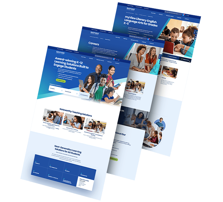
three stacked images form Savvas website

The Results

User-Centered Redesign

that significantly enhances the user flow.

Customer & Techical Support Flow

that’s intuitive, efficient and better meets the needs of its users

Exellent Prototype Performance

with the target audience successfully completing most tasks.

Request a Quote For Your Project
before and after arrow image
BA_Savvas
Click here to view more Hide

Featured Case Studies

Explore Our Case Studies & See How Digital Silk Grows Brands Online.
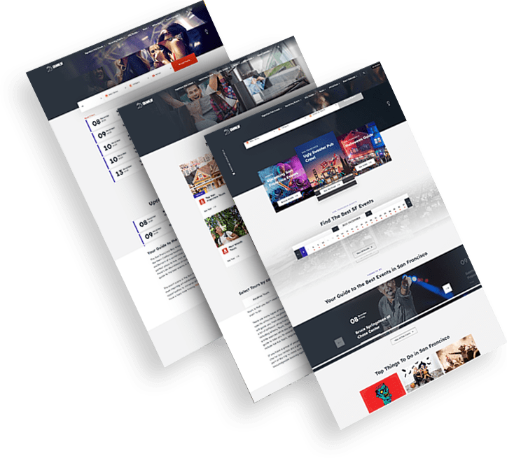
Golden Gate Bridge
--image:1
Bringing Local Culture To Life Through Brand Identity

CrawlSF needed a fresh identity that matched its immersive, city-based event experiences.

A modern logo and expressive visual language helped capture the brand’s local energy and appeal to a younger, experience-driven audience.

The rebrand elevated CrawlSF’s position in the event space and provided a strong foundation for future campaigns.

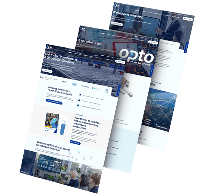
opto-branding portfolio-bcg-min
--image:1
Establishing A Modern Brand For Operational Efficiency

KPI Solutions wanted a new identity that better aligned with its shift toward innovative logistics technologies.

The rename to OPTO, supported by sleek visuals and a forward-thinking brand system, introduced a more agile and future-ready image.

This transformation helped distinguish the company in a highly competitive B2B market.

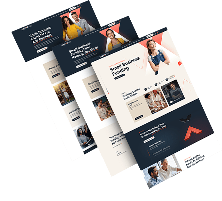
ds-capixa-branding portfolio-bcg
--image:1
Creating A Lending Brand With Simplicity And Strength

Capixa aimed to connect with small business owners through a brand that felt both empowering and easy to trust.

The identity combined bold typography, a vibrant palette and human-centered messaging to stand out in the fintech landscape.

The result was a brand that delivered clarity, confidence and market differentiation from day one.

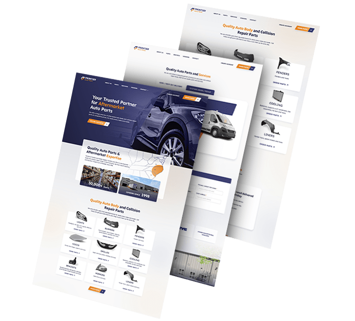
ds-branding portfolio-frontier auto parts-bcg (2)
--image:1
Rebuilding A Brand Around Consistency And Trust

Frontier Auto Parts set out to unify its brand across physical assets and build stronger visual recognition.

The updated logo and extended identity system added cohesion across uniforms, vehicle fleets and retail signage.

This refresh supported the company’s growth and reinforced its long-standing reputation for reliability.

load more examples