background_1
Background Gradient
Vacation Homes Of Key West

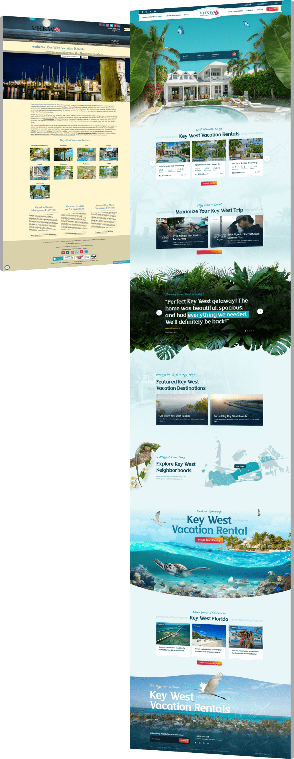
A CRO-Led Redesign That Drove Engagement & Bookings

  • Vacation Homes of Key West, a boutique vacation rental company in Florida, needed a website that reduced friction in the booking journey and encouraged deeper mobile engagement.
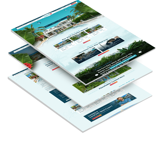
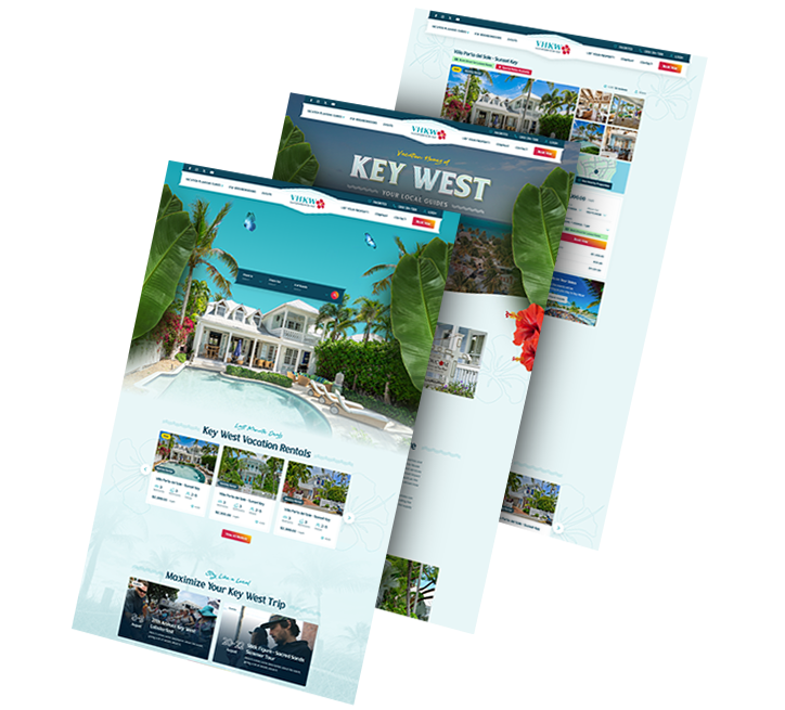
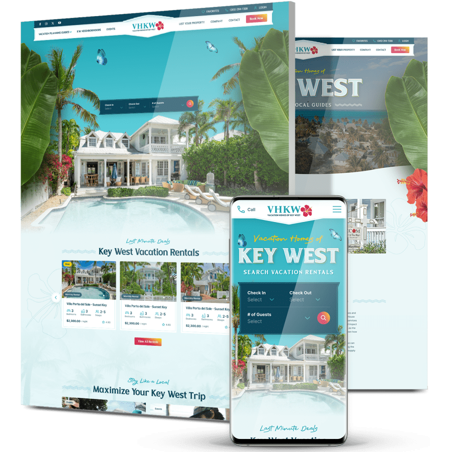
  • Digital Silk optimized the user experience by clarifying property information, improving mobile UI and aligning the design with top vacation platforms to build trust and boost conversions.
  • Following the March 2025 CRO implementation, the site saw a 1602% increase in average engagement time, a 17.47% boost in engagement rate and a 5.18% rise in engaged sessions — key indicators of improved UX and booking interest.
showcase_slide

The Challenge

Vacation Homes of Key West needed a modern, conversion-driven
site to reflect their premium rentals and streamline mobile bookings
.

3_stacked

Unclear Booking Flow

The booking journey spanned five separate modal screens, lacked a progress indicator and left users uncertain about reservation confirmation, support availability and payment security.

Inconsistent Mobile Experience

Despite strong mobile traffic, the experience felt fragmented. Key elements like CTAs, filters and calendars weren’t fully optimized for touch, limiting engagement.

Low Engagement With Property Details

While 66% of users viewed property images, only:

– 28% read descriptions
– 12% checked amenities
– 10% viewed reviews
– 2% clicked “Book”

This indicated a misalignment between content presentation and what guests needed to feel confident booking.

background_2

THE SOLUTION

Digital Silk delivered an optimized website focused on mobile performance,
content clarity and a seamless reservation journey, tailored to how today’s travelers explore and book vacation rentals.

  • Mobile-Optimized Booking Flow

    We restructured the booking experience to reduce complexity and increase clarity on mobile.

    Improvements included persistent CTAs, simplified navigation and tap-friendly filters, helping users progress with fewer drop-offs.

  • Content Designed For Confidence

    Property pages were reworked to present information more clearly and intuitively.

    We grouped amenities, descriptions and house rules into digestible sections, making it easier for guests to evaluate options and feel confident in their choices.

  • Streamlined, Trust-Centered UX

    The new design emphasized transparency and guidance throughout the booking process.

    We added visual cues like progress indicators and early visibility of policies and support, building user trust and reducing hesitation.

  • Benchmarked User Experience

    Inspired by leading rental platforms, we introduced familiar, proven UX patterns that align with guest expectations — from image-forward layouts to structured listing panels — while preserving VHKW’s boutique brand feel.

3_pages_flip

The Results

VHKW’s redesigned site led to measurable user engagement
improvements within two months of launch (Mar–May 2025).

Increased average engagement time by

1.6 K %

a major indicator of deeper browsing and booking consideration

Improved engagement rate by

17.47 %

reflecting better UX and content alignment

Saw a

5.18 %

increase in engaged sessions

Request a Quote For Your Project
before and after arrow image
before_and_after
CLICK TO VIEW MORE Hide

Featured Case Studies

Explore Our Case Studies & See How Digital Silk Grows Brands Online.
ds-capixa-branding portfolio-bcg
--image:1
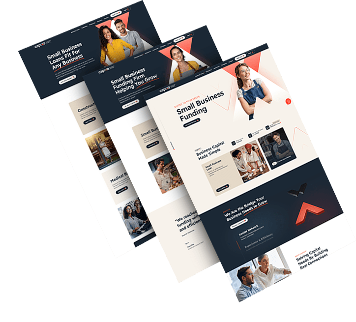
Building A Trustworthy Fintech Brand From The Ground Up

Capixa needed a standout brand to gain traction in the competitive small business lending space.

We crafted a distinctive name and visual identity to communicate clarity, reliability and growth potential.

The brand now resonates with its audience, supporting trust and long-term customer relationships.

ds-branding portfolio-frontier auto parts-bcg (2)
--image:1
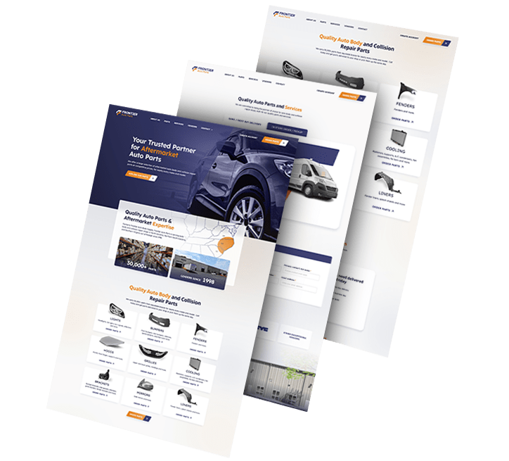
A Unified Identity That Signals Strength

Frontier Auto Parts wanted to modernize its brand while reinforcing its core values of dependability and speed.

We designed a visual system applied across uniforms, fleet vehicles and business materials for consistent presence.

The rebrand elevated customer trust and helped streamline internal and external communications.
Golden Gate Bridge
--image:1
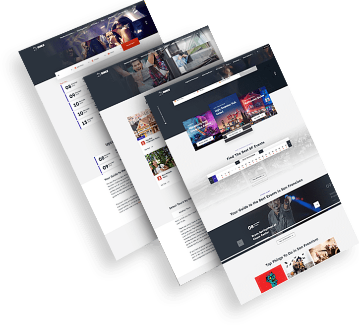
Expressing Local Culture Through Modern Branding

CrawlSF needed a refreshed identity to match its vibrant, community-driven events in San Francisco.

We delivered a logo and messaging system that reflected the brand’s promise of local, immersive experiences.

The revitalized brand drives stronger recognition and deepens audience engagement.

opto-branding portfolio-bcg-min
--image:1
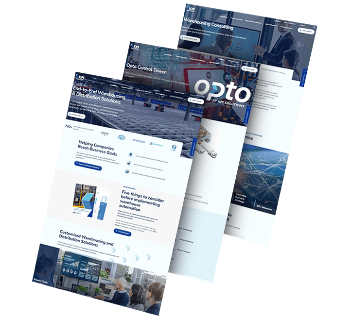
Repositioning For Next-Gen Logistics

KPI Solutions needed to reposition itself for growth in the evolving warehouse automation market.

We developed a bold new name — OPTO — and a flexible brand system to convey innovation and technical sophistication.

The transformation set the stage for future expansion and sharper market positioning.

load more examples