background_1
Background Gradient
VarData

Repositioning A Legacy Reseller For Modern B2B Growth

  • VarData needed a brand and website that reflected its 20+ years of industry expertise and positioned it as a relationship-driven B2B partner, not just a product supplier.
  • Digital Silk delivered a full brand refresh and lead-focused website, with improved messaging, modern design and a flexible CMS built for long-term scalability.
  • Post-launch, VarData now has a stronger brand presence, improved conversion structure and a digital platform ready to support future eCommerce growth.

design

The Challenge

Despite a strong reputation in the industry, VarData’s digital presence
felt outdated and product-heavy, creating disconnect between how the company operated and how it was perceived online.

stacked_3 40

Misaligned Perception

The homepage focused heavily on products, leading users to see VarData as an eCommerce company rather than a solutions partner.

Outdated Branding

The logo lacked polish and consistency, with no formal brand guidelines in place.

Weak Digital Engagement

The website failed to drive qualified leads or convey the company’s 20+ years of credibility.

No Marketing Infrastructure

There was no clear funnel, no SEO foundation and no consistent messaging to support B2B growth.

background_2

THE SOLUTION

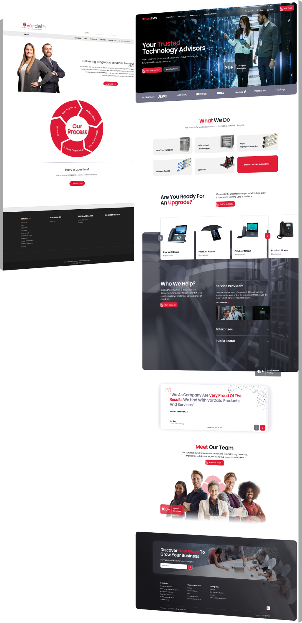
Digital Silk delivered a full rebrand and lead-focused website
to better reflect VarData’s expertise and support scalable B2B engagement.

  • Strategic Brand Foundation

    A refined logo, visual identity system and focused brand strategy clarified VarData’s value and elevated perception.

  • Modern Standard Website

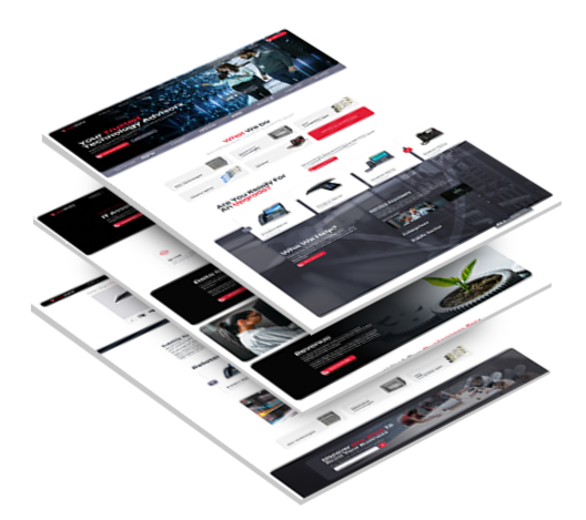
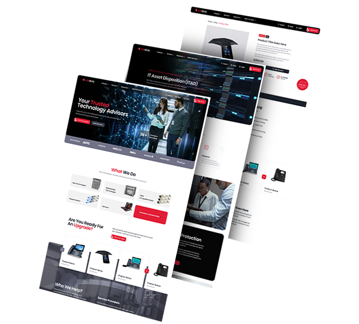
    A clean, conversion-oriented website with six custom landing pages guided users through clear service pathways.

  • Professional Visual Design

    Updated colors, typography and imagery aligned the brand with industry authority and enterprise expectations.

  • Clear Messaging & SEO Structure

    A defined value proposition and improved content hierarchy laid the foundation for organic visibility and trust.

  • Flexible CMS Setup

    An easy-to-manage backend empowered the VarData team to update content without technical overhead.

3_pages_flip

The Results

The new brand system and website redefined VarData’s digital presence and positioned the company for confident B2B expansion.

Stronger brand presence

that speaks to enterprise buyers and reinforces trust.

Lead-focused structure

now supports qualified engagement and future e-commerce scalability.

More professional look and tone

set VarData apart from hybrid resellers and industry competitors.

Scalable architecture

supports long-term marketing growth and business development.

Request a Quote For Your Project
before and after arrow image
before_after
CLICK TO VIEW MORE Hide

Featured Case Studies

Explore Our Case Studies & See How Digital Silk Grows Brands Online.
ds-capixa-branding portfolio-bcg
--image:1

Developing A Distinctive Fintech Brand To Inspire Confidence

Capixa, a startup offering small business funding, sought a compelling brand to match its ambitious growth plans.

A memorable new name, streamlined logo and clean visual system were introduced to communicate simplicity and build trust.

The updated identity now reflects financial confidence and approachability for a broad and growing customer base.

ds-branding portfolio-frontier auto parts-bcg (2)
--image:1

Establishing A Strong Visual Identity For An Auto Supplier

Frontier Auto Parts, an automotive company, needed a bold brand identity that conveyed reliability and operational efficiency.

Branded visuals were thoughtfully created to strengthen recognition across all customer and internal touchpoints.

Wall graphics, uniforms, vehicle branding and print materials were unified to reinforce the refreshed visual direction.

Golden Gate Bridge
--image:1

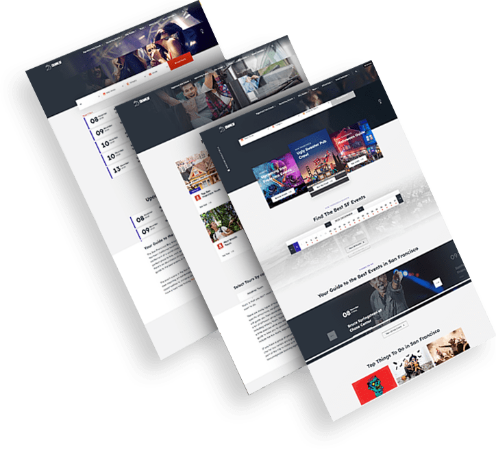
Evolving A Local Event Brand To Reach A Wider Audience

CrawlSF, a San Francisco-based event company, looked to modernize its identity to support expansion and deepen local ties.

Brand visuals and messaging were anchored in the “Experience Francisco Like a Local” theme using a flexible logo system and vibrant assets.

The result is a lively, dynamic identity that now resonates more deeply with both visiting tourists and longtime residents.

opto-branding portfolio-bcg-min
--image:1

Transforming A Legacy Provider Into A Future-Ready Brand

KPI Solutions reintroduced itself as Opto to reflect a shift toward scalable warehouse automation and operational innovation.

A bold new name, distinctive logo and modular design system were crafted to align with the company’s evolving vision.

The rebrand strengthened market presence and created a foundation for future digital growth and marketing initiatives.

load more examples