Modals In Web Design: Key Highlights
-
Modals act as experience control points. Their timing and restraint directly affect performance, trust and perception during high-intent moments.
-
Only five use cases justify interruption. Outside compliance, confirmation, media inspection, workflow steps and intent-driven promotion, modals often cause harm.
-
Restraint drives results. Governed use creates steadier experiences, while overuse signals urgency and weakens confidence.
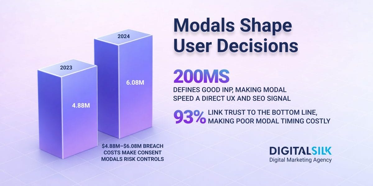
Google recommends keeping Interaction to Next Paint under 200 milliseconds for a good user experience.
That matters because modals appear at moments when users are deciding whether to continue, confirm or leave. Each one pauses the experience and demands action, often during high-intent interactions.
In 2026, modals are no longer a minor interface choice. They are a control point that can either support progress or quietly undermine trust and performance.
Google is explicit about the risk. Intrusive dialogs that block content or interrupt access too early can frustrate users and may negatively affect search performance, which is why less disruptive patterns are often preferred.
This article breaks down:
- Where different types of modals earn their interruption
- Where they fail in practice
- How to choose alternatives that protect both performance and perception.
Types of Modals in Web Design
Each type of modal introduces a different level of interruption and expectation.
Breaking them down by function clarifies which moments justify blocking interaction and which do not.
1. Informational & Compliance Modals
In PwC’s 2024 consumer research, 83% of respondents said data protection is a top driver of trust, so compliance modals should stay narrowly focused on consent.
Informational and compliance modals exist to create a formal pause before access continues.
Their role is acknowledgement, not engagement or persuasion.
They signal that the user is about to cross a boundary that carries legal, regulatory or policy weight.
These modals are commonly used for:
- Privacy disclosures
- Data usage notices
- Age restrictions
- Mandatory terms
Interaction is required. Progress depends on an explicit action, which creates a clear record and limits ambiguity later.
Because they block access by design, these modals carry a higher expectation of restraint. Adding optional messaging at this point often damages trust at the very first interaction.
When This Works
When acknowledgement is genuinely required and the message stays tightly scoped.
When This Fails
When compliance modals are used to push optional messages or mixed with promotions.
This pattern shows up often on large eCommerce sites where consent dialogs are overloaded with offers, leading to early exits and skepticism right away.
What To Choose Instead
If the message is optional, a persistent banner or inline notice keeps it visible without blocking access.
Inline disclosure patterns expand content directly within the page rather than interrupting it.
They provide additional context, detail or clarification while allowing users to continue interacting with surrounding elements.
Because they do not block access or trap focus, inline patterns are better suited for optional information and early-stage exploration.
Real-World Example
Nike presents a blocking consent modal on first visit to address regional privacy rules.
The message stays focused on consent and does not compete with promotions or lead capture.
The rest of the screen darkens and becomes blurry and the user cannot perform any other action on the website until they interact with the modal.

Digital Silk’s Example
GPen, another one of Digital Silk’s clients, produces vapes.
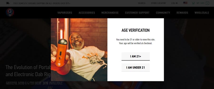
Their highly regulated product is exclusively for individuals over 21, and upon visiting GPen’s websites, users must input their age in an immediate alert to access the page.
Executive Implication
Blocking interaction is justified here, but only within narrow limits.
IBM’s 2024 Cost of a Data Breach Report puts the average global breach cost at $4.88 million, up from $4.45 million in 2023.
For financial services, the figure rises to $6.08 million, i.e., 22% higher than the global average.
In this context, explicit consent and security checkpoints are risk-control mechanism that reduces legal exposure, compliance ambiguity and downstream cost.
2. Promotional & Lead Generation Modals
65% of customers stopped buying from a brand due to high prices, so if a user is still evaluating value, an early lead-gen modal can feel like the brand is asking before earning.
Promotional and lead generation modals aim to convert existing interest into action, most often email sign-ups, account creation or offer redemption.
Their effectiveness depends entirely on timing.
These modals are not meant to introduce the brand or explain value.
They formalize interest that is already present.
If you show them too early, you may interrupt the evaluation. And if you show them too late, you might miss momentum.
Because interaction is optional, the interruption must feel relevant.
When the value exchange feels generic or disconnected from what the user is doing, the modal feels self-serving.
When This Works
When users have already engaged and the offer aligns with what they are viewing.
When This Fails
When triggered on page load or before interest is established.
Across large retail and content sites, early promotional modals often correlate with higher bounce rates on search landings where users are still assessing relevance.
What To Choose Instead
Early in the journey, inline Call-to-Action (CTA) buttons or non-blocking banners allow evaluation to continue while still drawing attention.
Tradeoffs
Promotional modals favor faster lead capture.
The cost is higher interruption risk and possible search impact.
Brands that accept this tradeoff usually apply strict timing and frequency limits.
Real-World Example
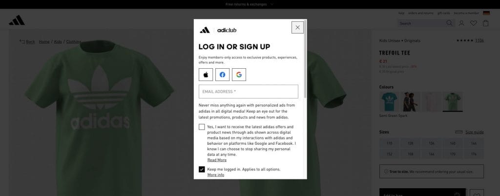
Adidas surfaces membership sign-up modals after users engage with products.
The benefit is clear, the timing follows interaction and exit is obvious.
Executive Implication
Promotional modals should follow intent rather than attempt to create it.
3. Confirmation & Decision Modals
Confirmation and decision modals exist to prevent irreversible mistakes when consequences matter.
Their role is protective. They intentionally slow the user down before a point of no return.
These modals are common for:
- Account deletion
- Subscription cancellation
- Payment submission or changes that cannot be easily undone
In these moments, interruptions are expected because they reduce risk for both the user and the business.
The effectiveness of confirmation and decision modals depends on plain language.
If consequences are vague, the pause loses its value.
When This Works
When consequences are stated plainly and the interruption reinforces understanding.
When This Fails
When messages are unclear or multiple actions are combined, creating confusion rather than reassurance.
What To Choose Instead
For low-impact or reversible actions, inline confirmations often provide enough reassurance without blocking progress.
Real-World Example
Subscription platforms routinely restate cancellation effects in a confirmation modal before proceeding.
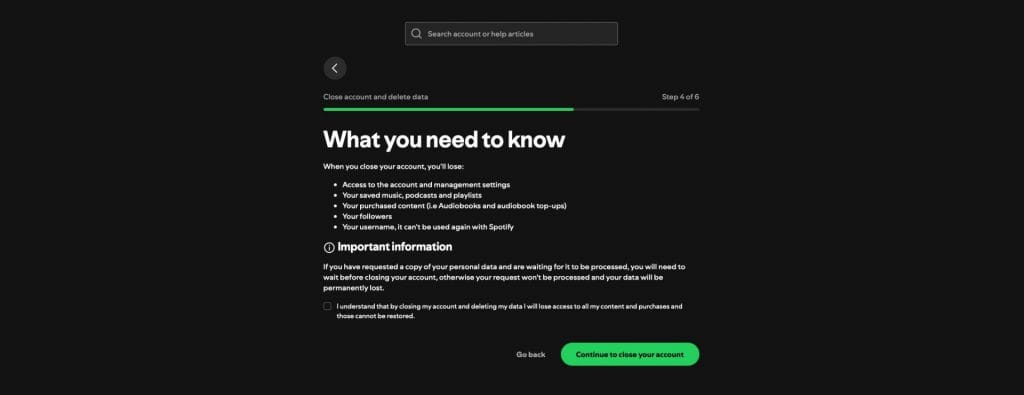
Spotify pauses account cancellation with a dedicated confirmation step that clearly restates what access will be lost and when the change takes effect.
Whether implemented as a modal or a full-page interruption, the principle is the same: progress stops until consequences are understood.
Executive Implication
This is one of the most defensible uses of modals, reducing errors and downstream support costs.
4. Media & Content Display Modals
Media and content display modals exist to preserve context while allowing closer inspection.
Their goal is continuity.
They prevent unnecessary navigation that would break focus during evaluation.
These modals are commonly used for:
- Image zoom
- Video playback
- Detailed specifications or supporting content that adds depth without replacing the main task
Speed and stability are non-negotiable.
Delays, layout shifts or loss of position break the continuity the modal is meant to preserve.
When This Works
When users need extra detail without losing their place.
When This Fails
When modals load slowly, shift layout or return users to a different scroll position.
This often shows up on image-heavy product pages where performance has been neglected.
What To Choose Instead
If performance cannot be guaranteed, on-page detail sections offer a steadier alternative.
Moreover, media and content display modals are often implemented as lightbox-style overlays for images and video.
These overlays enlarge visual content, disable background interaction and allow users to inspect details without leaving the current page.
When implemented well, lightbox modals feel immediate and reversible, supporting evaluation without breaking momentum.
Real-World Example
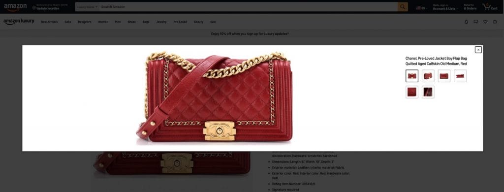
Amazon uses image lightbox modals on product pages to allow customers to inspect photos in detail without leaving the product context.
The modal overlays the page, disables background interaction and returns users to the same position after closing, supporting evaluation without disrupting the purchase journey.
Digital Silk’s Example
For our client, doForms, we implemented modals for their Video Library which includes how-to’s, testimonials and webinars.
Clicking on any video triggers a modal that enlarges the video for a full screen viewing experience, allowing users to focus solely on the content.
Executive Implication
These modals should feel effortless in use. Any noticeable interruption lowers perceived quality.
5. Multi-Step Workflow Modals
Multi-step workflow modals guide users through short, contained processes.
Their role is to break tasks into manageable steps without turning them into full navigation flows.
They are often used for:
- Onboarding
- Preference selection
- Configuration
- Setup tasks that require input but do not warrant permanent page changes
Scope is the limiting factor.
These modals work only when progress is visible and the end is easy to anticipate.
When This Works
When each step is focused, limited and clearly advances the task.
When This Fails
When workflows grow long or progress becomes hard to gauge, often leading to abandonment.
What To Choose Instead
Longer or ongoing processes are better handled on dedicated pages with save-state support.
Real-World Example
Some workflows are intentionally gated rather than overlaid.
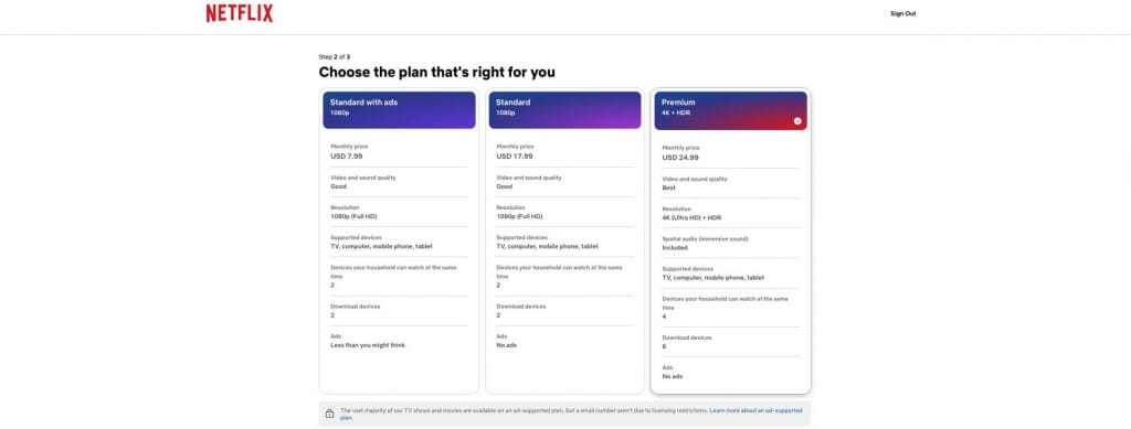
Netflix pauses access with a step-by-step setup flow that requires users to complete plan and profile selections before proceeding.
Each step blocks progress, advances sequentially and ends once required input is captured.
While implemented as a page-level flow rather than a dialog overlay, the interruption logic mirrors that of a well-designed multi-step modal.
Executive Implication
Workflow modals should remain temporary.
Growing complexity is the signal to move to a page-based flow.
Benefits Of Modals In Web Design
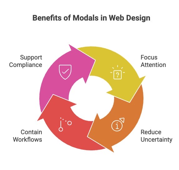
Used within clear limits, modals shape attention and behavior at moments where interruption serves a purpose rather than creating friction.
Focused Attention At Points Of Commitment
Certain actions naturally introduce hesitation. Submitting payment, changing account settings, or confirming sensitive information all require confidence before proceeding. A modal creates a deliberate pause that signals importance and narrows focus to the task at hand.
When aligned with intent, this pause reduces uncertainty and supports completion. When misaligned, it becomes an obstacle. The benefit comes from timing, not visibility.
Contained Workflows Without Context Loss
Some interactions require validation, additional detail, or a short sequence of steps to complete. Handling these within a modal allows users to finish the task without being pulled away from the page they are already engaged with.
This containment helps preserve momentum, particularly in evaluation and configuration scenarios, where unnecessary navigation increases abandonment. The modal acts as a temporary extension of the page rather than a detour.
Compliance & Risk Control Through Explicit Action
Consent collection, policy acknowledgment, and age verification require explicit user action. Modals provide a controlled environment that prevents accidental bypass and creates a clear record of acknowledgment.
In these cases, interruption is not a usability compromise. It is the mechanism that enforces responsibility and reduces legal or operational risk.
Modals Vs. Pop-Ups: Why The Difference Matters
Although the terms “modals” and “pop-ups” are sometimes used interchangeably due to their similarities, they are not the same.
Both appear on the page and bring the user’s attention to specific information or action that needs to be taken.
However, there is an important difference between the two.
While pop-ups appear on the page and focus the visitor’s attention on specific information, they don’t disable other elements of the page and the user is free to disregard the pop-up and continue browsing.
On the other hand, modals require the visitors’ immediate attention, by disabling the rest of the page.
They use visual cues of blurring, darkening or otherwise indicating to the user that they can’t interact with the page until they interact with the modal first.
Blocking interaction transfers control to the brand. Any delay or poor timing is felt immediately.
For enterprise sites, modals should be reserved for moments where interruption is justified.
Pop-ups and banners are better suited for lower-stakes prompts.
When To Use Modals In Web Design
Because modals interrupt the experience and take control away from the page, their use should always be intentional.
They are appropriate when explicit acknowledgement is required, such as consent, policy acceptance, age verification or security confirmation.
Allowing progress without response in these cases introduces legal, operational or trust risk.
They are also appropriate for irreversible or high-impact actions.
Before deleting an account, canceling a subscription or submitting payment, users benefit from a clear pause that restates consequences.
Another valid case is when context must be preserved.
Media previews, product inspection and short workflow steps often perform better when users can stay on the page they are already engaged with.
Problems appear when modals are used outside these boundaries.
Optional promotions, early interruptions before interest is established or situations where lighter patterns would work better are better handled with banners, inline components or dedicated sections.
This approach aligns with Google’s page experience guidance, which discourages blocking access without clear need.
| Situation | Why Use A Modal | Risk If Misused | Use This Instead |
| Required acknowledgement (consent, policies, age, security) | Forces explicit confirmation before access continues | Legal, operational or trust exposure if bypassed | N/A — blocking is justified |
| Irreversible actions (deletion, cancellation, payment) | Pauses progress and restates consequences | Confusion if outcomes are unclear | Confusion if outcomes are unclear |
| Context-sensitive inspection (media, product details, short steps) | Allows deeper review without losing page context | Disruption if slow or unstable | On-page sections when performance is uncertain |
| Optional or promotional messages | A modal adds pressure where choice should remain open | Blocking control is disproportionate to impact | Banners or inline CTAs |
| Early exploration (no intent shown) | Interrupts before users decide relevance | Perceived urgency without value | Progressive disclosure |
| Low-stakes interactions | Blocking control is disproportionate to impact | Unnecessary friction and delay | Non-blocking UI patterns |
How Modal Use Shapes Brand Perception
PwC’s 2024 trust survey found 93% of business executives agree that building and maintaining trust improves the bottom line, which is why aggressive, early blocking modals can create measurable business risk.
Because modals interrupt flow, they carry more perceptual weight than most interface patterns.
When one appears, the brand takes control and asks the user to pause and respond. That moment influences how restraint, intent and reliability are felt.
Limited, consistent use signals discipline.
Users learn that interruptions appear only at meaningful moments like consent, confirmation or task completion.
Heavy use signals urgency driven by internal priorities, especially when optional messages block access early.
Modal behavior also affects perceived speed.
Even when metrics are acceptable, repeated interruptions make an experience feel slower and less composed.
On search landings, this can erode trust before value is clear.
Brands that manage modals carefully tend to feel steadier and more dependable when it matters most. Those that do not often feel reactive, even if the rest of the interface looks polished.
How To Use Modals In Web Design
Interaction to Next Paint replaced First Input Delay as a Core Web Vital in 2024.
Modals introduce multiple interactions in quick succession. If any step lags, the page feels slow even when load times are acceptable.
Google’s 2025 QuintoAndar case study shows the impact of improving interaction performance. After reducing INP by 80%, the company reported a 36% year-over-year increase in conversions.
In practice, this means modals must stay lightweight, predictable and measured against interaction responsiveness.
Below are our recommendations on how to design modal windows:
- Keep them concise: Don’t confuse your readers with unnecessary words. Include the title of the modal and then use direct language to inform the reader of why it appeared and what’s its purpose (to notify, gather data, showcase your product or service, etc.).
- Use visual cues: Darken all other elements of the page. Deactivate other features of your site until the modal is engaged with.
- Use modals infrequently: Modals are disruptive in nature. Make sure to only use them when your page requires it and make the text on the modal relevant to your visitor, otherwise you will risk them leaving your page in frustration.
- Enable users to close the modal: Make sure your visitor can “exit” the modal by clicking on the “x” in the top right corner. Alternatively, offer your users the option to click on an “exit” button within the modal or remove the modal if the visitors press any of darkened elements of the page.
Accessibility matters just as much. Focus should stay within the dialog and users should not move focus outside it without closing the modal.
MDN notes that aria-modal=”true” signals modality but does not enforce behavior on its own.
Modals In Web Design FAQ
Question #1: What is the difference between a dialog box and a modal?
A dialog box is a generic term for a small window that appears on the screen to prompt the user for input or to convey information.
It can include various UI elements like buttons, text fields and checkboxes.
A modal, on the other hand, is a specific type of dialog box that requires user interaction before allowing further actions on the main interface.
Question #2: What is the difference between a tooltip and a pop-up?
A tooltip is a small piece of contextual information that appears when a user hovers over or clicks on a specific element.
It provides additional details about the element’s function or purpose.
Question #3: What are interstitial modals?
Interstitial modals are window dialogues that appear overlaying a piece of content for a set duration of time.
After the set timeframe passes, the user can access the content on the page.
Question #4: Are modals bad for SEO?
They can be when they block content unnecessarily or interrupt access too early. Google recommends avoiding intrusive interstitials outside legal necessity.
Question #5: Should every site use modals?
No. Modals should be used selectively and only where interruption is justified.
Build More Intentional Digital Experiences With Digital Silk
Effective digital experiences are shaped by restraint as much as innovation.
Modals, when governed with intention, help guide users through moments that require focus, confirmation or trust without disrupting the broader journey.
Brands that approach interaction design deliberately create experiences that feel composed, reliable, and respectful of user attention.
Over time, that discipline builds confidence at moments where it matters most.
Digital Silk designs and builds high-performance websites with experience governance at the core. Our approach aligns design, development and strategy to help organizations support conversion, protect performance, and reinforce trust across every interaction.
As an end-to-end digital agency, our services include:
- Customized web design and development
- Brand strategy and digital branding
- Technical and on-page SEO
- Paid media and performance marketing
- Conversion-focused UX and CRO
Contact our team, call us at (800) 206-9413 or fill in the Request a Quote form below to schedule a consultation.
"*" indicates required fields


