In 2021, mobile phones generated 54% of website traffic worldwide.
With the continuous growth of mobile users, having a responsive website that functions on smaller screens, with the same efficiency and speed as the desktop version is a must-have.
Enter responsive web design.
What is a responsive web design, exactly? We’re here to explain.
We’ll walk you through all you need to know about responsive web design, including how it works, key benefits and examples from top brands!
Digital Silk builds responsive websites. Request A Quote
What Is Responsive Web Design?
Responsive web design is a modern take on web design that allows web pages to accurately display and render the same experience across all screen sizes and devices.
From desktops and laptops to smartphones and smart TVs, responsive website design allows your website to naturally adapt to any screen.
Responsive Web Design vs. Mobile-First Design
Responsive web design and mobile-first design are often confused for one another, but they’re in fact two different concepts.
A responsive web design is created for larger devices such as desktops and laptops, then translating the same user experience for smaller devices such as tablets and smartphones.
On the other hand, mobile-first web design is built for smaller devices such as mobile phones and tablets, then adjusts to larger screens such as laptops and desktops.
So which web design strategy is superior?
Responsive web design takes the cake if the majority of your website traffic comes from desktops or laptops. On the other hand, if most of your web traffic is from mobile users, then you might consider a mobile-first web design.
Your responsive web design company might perform research on your target audience to ensure your web design approach fits with your user behavior.
Regardless if your website is desktop- or mobile-first, good UX and UI design is key in allowing your brand to establish an online presence and gain loyal customers.
Which design approach is right for you? Schedule A Consultation
Responsive Web Design Foundations
From implementing multiple layouts to using code that helps your website adapt to any screen, here are the three building blocks of a responsive website design.
1. Fluid Grids
A fluid grid or fluid layout is code that uses measurements that are flexible for Hypertext Markup Language (HTML) — the language used to define the layout and structure of web pages.
With a flexible layout, your website’s layout adjusts to the device it’s being viewed on.
Instead of making a one-size-fits-all layout, a fluid grid will respond to whatever the size of the screen is.
Typically, a fluid grid is divided into columns where height and width don’t have a fixed dimension.
In addition to keeping your site visually consistent across different devices, a fluid grid controls page alignment to ensure your website looks accurate on any device.
2. Fluid Images
Similar to the nature of fluid grids, fluid images are website images that don’t follow a fixed measurement.
Thanks to code, static images or images that have fixed measurements are transformed into fluid images that can adapt to a device’s screen.
If your web design isn’t responsive, images can take up an entire screen, forcing users to scroll down the page just to see the rest of the image, or forcing them to zoom in to the web page to see images.
3. Media Queries
A media query is a CSS feature or code that allows your website content to adapt to different screen resolutions.
Also known as responsive breakpoints or cascading style sheet (CSS) breakpoints, media queries allow your website to adapt to the proper height and width of your user’s screen resolution.
Top 10 Benefits Of Responsive Web Design
Still wondering if investing in responsive web design is right for you?
We’ve got the answer! We talked with our web design experts based in New York and Miami and provided you with the top ten benefits of why responsive web design matters today:
- Improves user experience (UX): Whether using a laptop, desktop, tablet or mobile phone, your users must have a seamless experience with your site regardless of the device they’re using.
- Mobile-first indexing: While Google disclosed that there isn’t a separate mobile index, the search engine primarily favors the mobile version of your website for indexing and search ranking purposes. What does this mean? Your website’s chances of ranking are increased when you use a responsive web design.
- Increases mobile traffic: Mobile devices produced 54% of the global website traffic in 2021 alone. What does this entail? That responsive web design provides a better opportunity for your website to be viewed by mobile users.
- Improved SEO ranking: In 2015, Google announced that mobile-friendly websites have a higher chance at ranking on search engine results pages (SERPs) — enabling responsive websites better online visibility.
- Prevents duplicate content penalty: If you have two website versions with the same content, Google might penalize you for duplicate content. Responsive web design allows you to have one website that caters to all devices.
- Improves loading speed: Your website can load faster thanks to fluid images and grids. In fact, Google found that 53% of mobile users abandoned a site if it takes more than three seconds to load in 2016.
- Improves offline browsing user experience: Since tablets and smartphones can view HTML5 content or code that allows users to view websites even without an internet connection, responsive web design allows users to view web content even when offline.
- Increased efficiency: Instead of the time-consuming and expensive process of creating and maintaining multiple website versions to cater to different users, a responsive web design allows you to stick to one web design that is consistent across different devices and screens. Whether your user is viewing your website from a 32-inch iMac or from a 6.1-inch iPhone screen, the website will be configured for your user’s optimal viewing pleasure.
- Reduced website redirects: In addition to creating a dedicated web design for each possible device out there, utilizing website redirects to transport your user to the appropriate version of your web page can slow down the user experience. A responsive web design allows your user to access your website from the get-go.
- Increase conversion rates: When you provide exceptional user experience with an increased website loading speed to match, you have a better chance of converting website visitors into paying customers or clients.
Work with our experts. Schedule A Consultation
Responsive Web Design Examples From Top Brands
We’ve rounded up a list of some of the biggest brands that use a responsive web design approach for their websites.
We’ll compare the desktop and mobile website versions and explain why it’s important to implement fluid grids, media queries and fluid images to help websites adapt to different screen sizes.
1. Apple
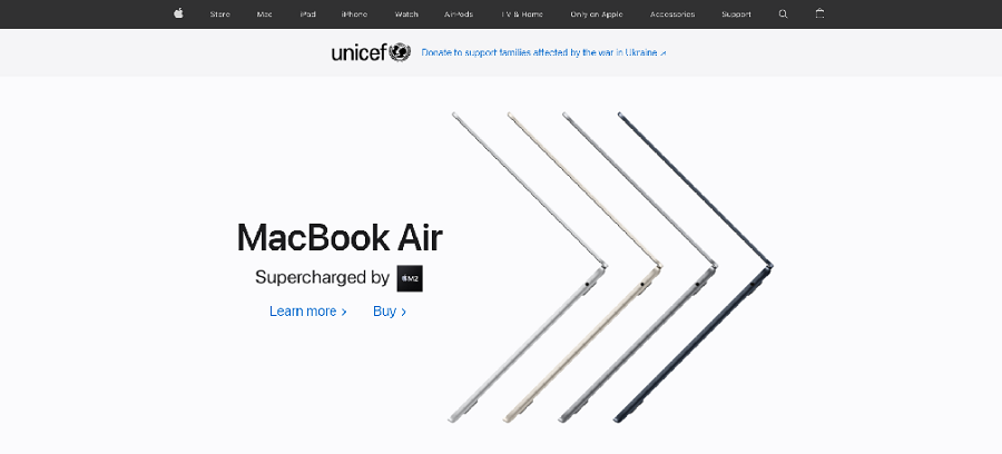
Given the wide array of devices that Apple offers, it’s no surprise that this tech giant chose a responsive web design.
Desktop: Landing on the homepage, Apple displays their latest offering, the iPhone 13, and ensures the eye-catching phone is accompanied with an attractive image and visible call-to-action (CTA) buttons.
Navigation is sticky with every landing page a user will need — key to the user journey (when there’s space for it!) because it ensures visitors don’t lose sight of the website’s menu wherever they are on the website.
Then, scrolling down the page, Macbooks, iPads and gift cards are categorized side by side to provide a streamlined presentation of products.
Mobile: In the mobile version, the navigation menu is turned into a sticky hamburger menu to save space.
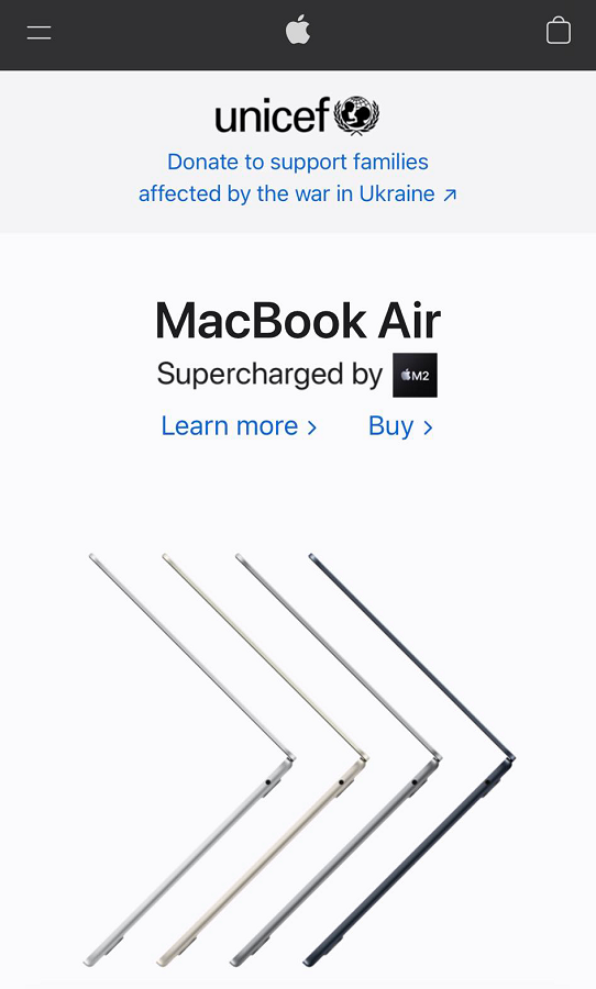
Website elements such as images and text are optimized and scaled down without compromising quality.
No need to scroll sideways to see full images!
Looking at the two versions, you can clearly see the key elements are the same — high-quality images, standout CTAs, a clean design with ample white space — which tells us that users can have largely the same experience on any device.
2. Converse
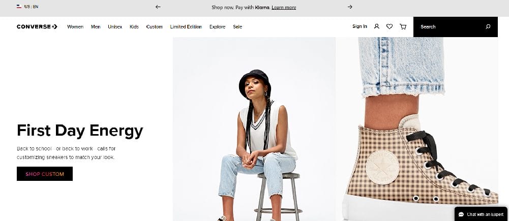
As an eCommerce website, a responsive website is a must so Converse’s customers can shop, even on the go.
Desktop: Landing on the homepage, Converse provides a sticky navigation menu offering different categories, including a sign-in option, a search bar and a virtual shopping cart.
In addition, they display the latest collection of sneakers “The Lugged 2.0” front and center with a “Shop Now” CTA button visible for quick access.
Mobile: Transitioning to the mobile version, the same pair of sneakers is the centerpiece with a large “Shop Now” CTA button just below.
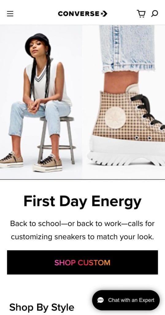
The navigation bar is reduced to a hamburger menu, with minimized sign-in options: the search and shopping cart icons.
Similar to the example above, the responsive web design approach allowed Converse to provide a similar experience on any device.
If you’re looking for other best eCommerce website examples
3. Dropbox
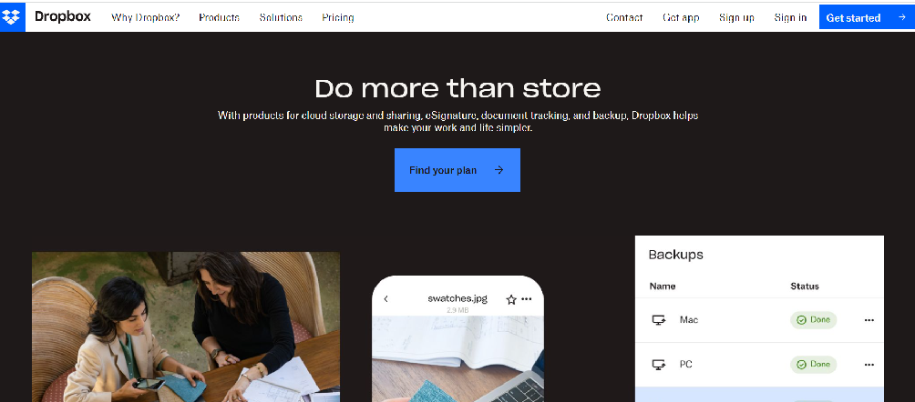
Due to Dropbox’s nature of storing and sharing files even when users are on the go, they played it smart by ensuring their website is responsive regardless of the device.
Desktop: Similar to our previous examples, Dropbox flaunts its unique value proposition right above the fold for users to see what they offer.
In this case, Dropbox adds eSignature, a new feature to their copy. In addition, they follow web design best practices such as a sticky navigation menu with key landing pages: Contact, Sign Up, Sign In and Get Started.
Mobile: Mobile users slightly get the same experience similar to those using a desktop or laptop, with the exception of fixed images.
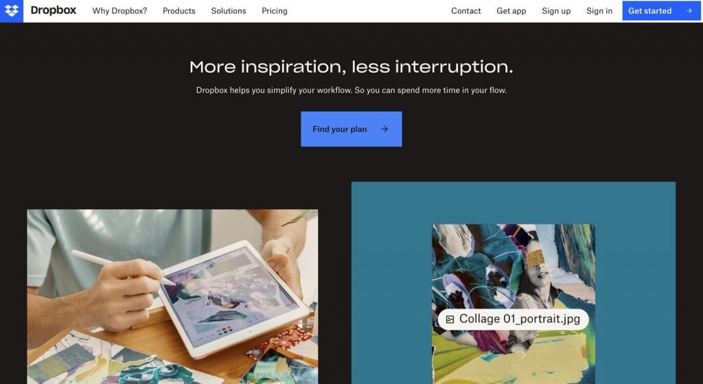
The key differences with the mobile version include a hamburger menu due to the limited space, only “Sign In” as a landing page is visible and images that don’t fit the screen.
How To Test A Website’s Responsiveness
So now you know what a responsive web design is and how it differs from the mobile-first approach.
You might be wondering: how do you know if a website is responsive? Here are some methods you can use to find out! Google Chrome method:
- Click on Google Chrome
- Visit a website
- Press Ctrl + Shift + I to open Chrome DevTools
- Press Ctrl + Shift + M to toggle the device toolbar
- View a website from a laptop, desktop or mobile perspective
Google Mobile-Friendly Test method: Google’s Mobile-Friendly Test is a free tool you can use to check if a website is optimized for mobile devices. Just enter the website into the search bar and the tool will show a notification if the website is mobile-friendly or not.
What Is Responsive Web Design? Key Takeaways
If you’re looking to optimize your website’s user experience on any device, then responsive web design is the solution you’re looking for.
Our custom website designers create websites that are responsive to ensure your visitors have an excellent and streamlined user experience, regardless of the device they’re on.
From increasing your chances of ranking on Google to preventing your users from the hassle of website redirects, responsive web design is a worthwhile investment to ensure every user is able to experience your brand as intended!
"*" indicates required fields


