
A CATALOG THAT DOESN’T MATCH
Shifting backgrounds, inconsistent scale, colors that vary across the range. In a grid view it reads as carelessness, and carelessness reads as risk.

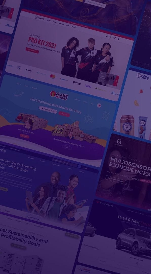








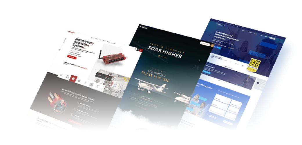
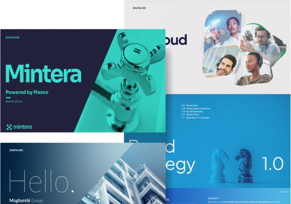
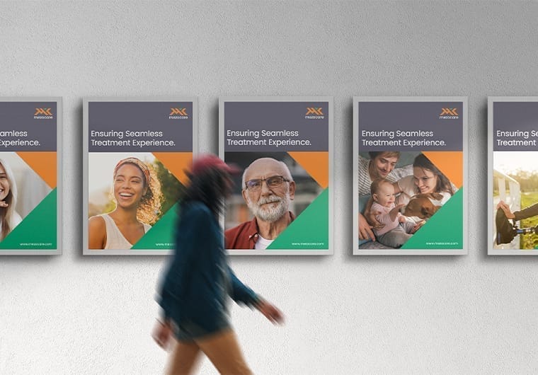



Defined backgrounds, lighting, angles, crops and scale references, documented so consistency survives a change of photographer or a new product line.

Compliant main images built to spec, plus the lifestyle, detail and infographic images where the brand can actually sell.

Templated formats, treatment libraries and modular components so performance marketers can generate on-brand variants without a designer per asset.

Size guides, dimension diagrams, comparison tables, material and care panels — the assets that answer the questions that stop a purchase.

Promotional banners, email graphics and category headers, with channel size variants built in.

Identifying what carries the brand personality and making sure it survives the trip from box to product page. For packaging itself, see packaging design.
We start by looking at how your products currently appear across the store, rather than reviewing each product in isolation.
We audit the live catalog in grid view to spot inconsistencies in imagery, composition, typography, color and product presentation. We also review your brand, target customers, competitors and the marketplaces where your products appear.
This gives us a clear visual direction for creating a more consistent shopping experience.
We develop visual directions that make your products easier to recognize, compare and understand while staying consistent with your brand.
We explore layouts, typography, graphic elements, product imagery and supporting visuals based on where the assets will be used, from product pages and ads to email campaigns and marketplace listings.
We also create a shot specification as a standalone deliverable, defining the photography requirements, compositions, angles, backgrounds and product details needed for consistent future content.
Once a direction is selected, we refine the visual system across the assets your store needs.
This can include product graphics, promotional banners, category visuals, comparison graphics, email assets and paid advertising creative.
We make sure the system works across different products and formats without requiring every new asset to be designed from scratch.
We test the graphics in the environments where shoppers will actually see them.
We check how assets look across product grids, product pages, mobile layouts, ads and different screen sizes, making sure important information remains clear and the product stays the focus.
We also account for marketplace requirements so the branded designs remain usable without creating compliance issues.
We prepare the final assets in organized, production-ready formats for your team and external partners.
Alongside the branded design set, we provide marketplace-compliant templates for the channels where your products are sold, so compliant versions are built into the system rather than improvised later.
The result is a reusable graphic system that keeps your product catalog visually consistent as it grows.
Pure white background at RGB 255, 255, 255; the product filling at least 85% of the frame; a minimum of 500 pixels on the longest side, with 1,000 recommended and 1,600 or more needed for zoom; and no logos, watermarks, text overlays or promotional material.
Non-compliant images can get a listing rejected, and image quality affects search ranking — so it costs visibility before it costs conversion. Requirements change, so confirm current specs before a shoot.
Not as the main image, which is why you need two sets. The main image meets the spec exactly; the secondary and lifestyle images are where context, scale, detail and infographic treatments do the selling.
Brands that only produce one set usually end up with either a suppressed listing or a compliant shot taken on a phone.
Sometimes, but start with the specification. Without a written shot spec — background, lighting, angles, crops, scale, file delivery — a reshoot produces one consistent batch that drifts again with the next product line. The spec is what makes the consistency durable and the costs predictable.
More than most brands plan for. Platforms reward variety, creative fatigues, and testing needs multiple variants per concept across formats.
That’s a production system rather than a briefing process — templated formats and modular components that a marketer can recombine without a designer per asset.
By identifying which elements actually carry the personality — usually a color relationship, an illustration style, a graphic device or a voice — and making sure they appear in both places.
It’s rarely a full redesign of either side. Buddha Brands came to us with exactly this gap.
Yes — see our packaging design services. This page covers where packaging meets digital; that one covers the physical work.
Usually the shot specification and a compliant marketplace set, because they affect every product and every channel.
Ad creative systems return quickly if you’re spending meaningfully on paid media. Product page graphics matter most where returns or pre-purchase questions are a known problem.
Product imagery should make the product easy to understand before a shopper reads the description. We determine which angles, details, scale references and contextual shots are needed based on the product and how customers make purchase decisions.
Not necessarily. We can create a visual system with reusable layouts and templates that keeps the catalog consistent while allowing products with different selling points to stand out.
We establish clear rules for composition, backgrounds, typography, image treatment and supporting graphics so new products can follow the same system. Templates and production specifications also make it easier for internal teams and external photographers to maintain consistency.
Yes. We can create supporting graphics that explain product features, benefits, specifications, comparisons and use cases within the product page experience.
We create marketplace-ready versions that follow each platform’s image requirements without losing the core brand presentation. This gives your team approved templates instead of having to adapt assets from scratch for every channel.
Yes. We can develop a shot specification that defines the required angles, compositions, backgrounds, product details and usage shots for the catalog. This gives photographers a clear production brief rather than leaving requirements to interpretation.
We can structure creative around the actions you want to improve, such as product engagement, add-to-cart activity or purchases. Performance data can then inform which layouts, messages and visual treatments are worth developing further.
Yes. We can build reusable templates for recurring needs such as product launches, promotions, social ads, email campaigns and marketplace assets. This lets your team produce new creative without having to redesign the system every time.

"*" indicates required fields