
FOUR MINUTES AFTER A WHISTLE
Built by someone who isn’t a designer, at speed, possibly on a phone. If it needs judgment to operate, it won’t hold.









A consumer brand might produce a few dozen designed assets in a quarter. A sports organization produces that in a week during season, and the cadence is set by events rather than by a plan — a signing announcement can’t wait for a design review, and a score graphic is worthless twenty minutes after the result.
That volume is why the traditional agency model fails here. Nobody is briefing an external designer for a substitution graphic. The organization’s own staff — often one or two people, often not designers — are producing almost everything, at speed, frequently on the move.
So the real deliverable is a production system: templates covering the recurring asset types, built in the tools the team actually uses, with the decisions already made. Type sizes fixed. Safe areas defined. Photo treatment automated. Sponsor placement locked. Color roles assigned rather than chosen. The person populating it should be making a content decision, not a design one.
Judge a sports design system by what it produces on its worst night, not its best. The graphic made in four minutes by a tired social manager is the one most people see.
The content calendar in sport is unusually knowable. Across almost every organization the same asset types recur:
Pre-event — fixture announcement, ticket promotion, lineup, matchday.
Live — score updates, goal or scoring events, quarter and period breaks, final result.
Post-event — highlights, player of the match, statistics, quote cards.
Roster and business — signings, departures, milestones, injury updates, anniversaries, partnership announcements.
Because they’re predictable, they can be designed in advance as a family. Every one of them templated, with variants for platform aspect ratios and for the awkward cases nobody plans for — a nine-goal scoreline that breaks the layout, a name too long for the field, a result you’d rather announce quietly.
That last category is where most systems fail. Templates get built for the clean case and then improvised for everything else, and the improvisation is what erodes consistency over a season.
Almost every sports graphic is built on a photograph, and the photographs are wildly inconsistent — different photographers, lighting, angles, crops, backgrounds, kit variants. A template that only works with a clean cut-out on a neutral background will look broken half the time.
The systems that hold up build for that variability: defined treatment recipes that work across a range of source images, gradient and overlay systems that guarantee text legibility regardless of what’s behind it, cropping rules tied to the subject rather than the frame, and a fallback for the nights when the only usable image is poor.
For organizations doing cut-outs at volume it’s also worth being honest about the labor. Someone has to mask those images, and if the process isn’t fast the system won’t be used as intended.
Sports organizations sell partnership inventory, and much of it is delivered through exactly these graphics — a presenting sponsor on the score card, a partner on the player of the match, a naming rights holder on the matchday asset.
That obligation has to be designed in, not accommodated afterward. A template with a sponsor slot that was clearly added later looks like what it is, and it devalues the inventory you sold. Worse, it creates a recurring negotiation: each new partner asks for placement, and without a defined structure each request gets improvised.
Building the sponsor architecture into the template family from the start means the placement is consistent, the sizing is defensible when a partner asks for more, and the commercial team can sell the inventory knowing what it will look like.
These graphics are consumed while scrolling, at small size, usually muted, often one-handed. The viewer isn’t studying them.
That sets a hard legibility standard: the primary information — the score, the name, the result — has to be readable at a glance and at thumbnail size. Type that looks elegant at full size disappears in a feed. Subtle color relationships collapse. Detail in the background competes with the message.
The discipline is to identify the single thing each asset type exists to communicate and make that unmistakable, with everything else subordinate. A score graphic where you have to hunt for the score is a common and entirely avoidable failure.
Motion is worth a note here too. Animated versions of the same templates consistently outperform static ones in feed environments, and if the system is built properly they’re variants rather than separate projects — same layout, same rules, movement added.
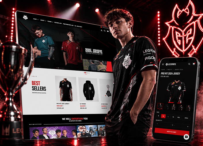
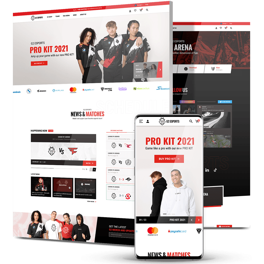
Shop and fan content shared a single site that served neither well. Conversion sat at 0.65%, cart abandonment ran as high as 70.58%, pages took 6.23 seconds to load, and returning visitors stalled at 19% against a roughly 30% ecommerce average.
We audited leading esports storefronts, built fan personas around G2’s core 18 to 24 demographic, and shaped a three-pillar brand position: Passion for Gaming, Competitive Spirit and Next Generation. That position drove the visual system, not the other way around.
The result splits Shop from Teams, Fan Arena and News into distinct destinations, with a modular hero, category filtering and a template system built to spin up new team, player and creator pages as the roster grows. Design that keeps working after the launch deck closes.
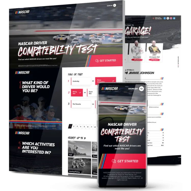
Reaching a younger, digitally native audience takes more than a campaign refresh. NASCAR wanted something fans would actually want to share, and something that put Cup Series drivers at the center of it.
Our team designed an interactive driver-matching quiz, motion-heavy and mobile-first, with strong NASCAR branding running through every screen. Results landed in a “garage” showing each fan their four most compatible drivers, complete with bios, car visuals and fun facts.
Over 80,000 emails collected, and 36% of participants identified themselves as first-time fans. The back end was built so driver answers, images, car visuals and scoring logic can be swapped without touching code, which turned one campaign into a format NASCAR can reuse across race series.
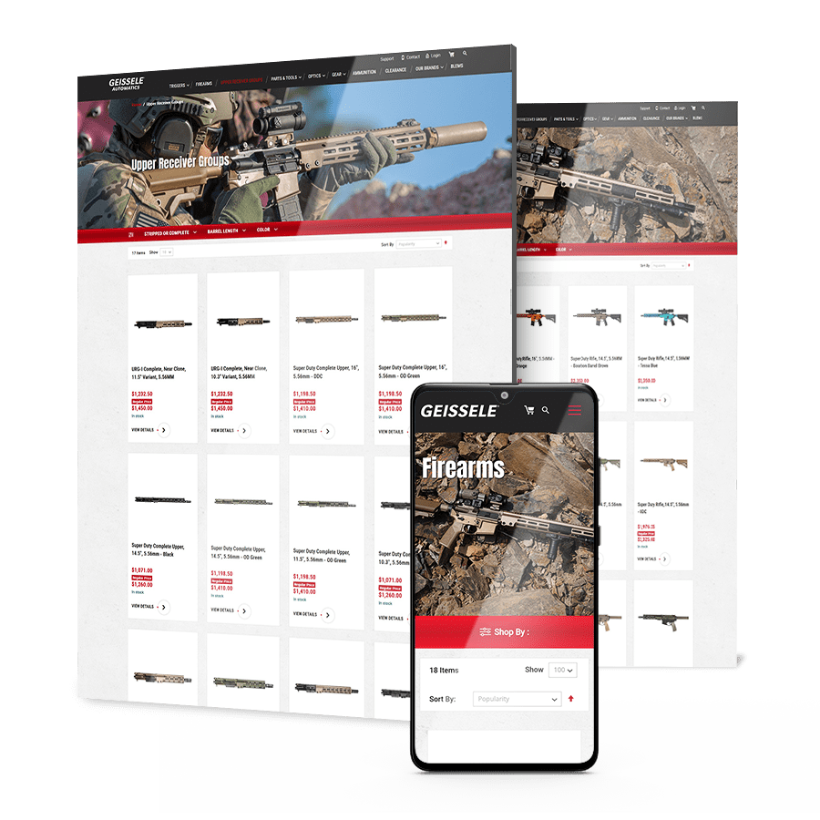
Sale periods brought high intent and high traffic. What was missing was creative built around what each segment had already looked at, plus the automation to deliver it at the right moment.
We segmented campaigns by user intent and designed the creative to match: discount reminders and automated flows for warm buyers, nurturing and educational content for the wider Geissele community, with an upsell track built from repeat purchase behavior.
Across a four-day Fourth of July sale the program sent 1.3 million emails, drove 120,000 website visitors and lifted sales of Geissele-manufactured products 40%. Revenue from email doubled year over year.
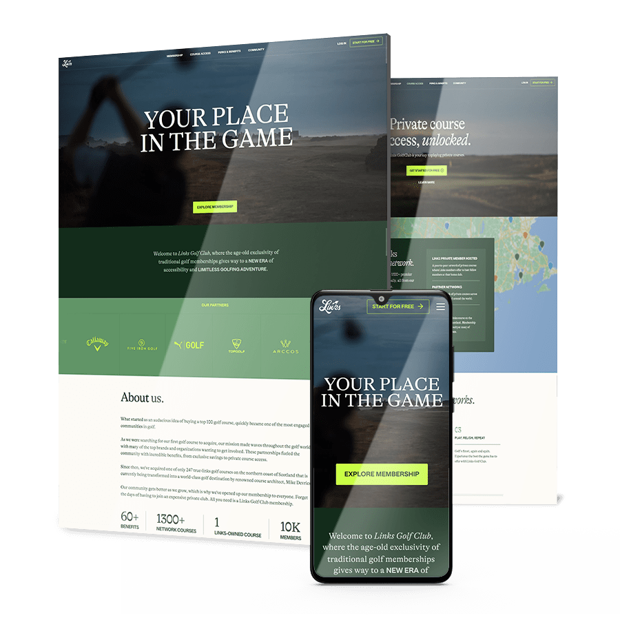
A brand new domain, a brand name that doubles as one of golf’s most searched generic terms, and a six to twelve month runway before a new site normally earns any ranking at all. Links Golf did not have twelve months.
We ran an aggressive SEO and content program: 30 high-authority links a month, six optimized posts a month built on long-tail research, and continuous technical work across the site.
In under six months the club ranked #1 on Google for its own name, ahead of Wikipedia, with domain rating up 38 points and 5,000 new backlinks. Membership sales followed.
The full recurring family — fixture, lineup, live score, result, player of the match, quote cards — built as variants of one system with edge cases handled.
Signings, departures, milestones and partnership announcements, templated so a routine announcement doesn’t need a designer.
Recipes and overlay rules that guarantee legibility across inconsistent source imagery, with a workable process for cut-outs at volume.
Placement, sizing and hierarchy defined across the template family so inventory is consistent and defensible.
Animated versions of the same templates, built as variants rather than separate work.
Files in the tools your team actually uses, with the decisions locked and the people who’ll run it trained on it.





Subscribe to our newsletter to get the latest industry insights and graphic design best practices delivered to your inbox.
"*" indicates required fields
It’s the normal situation, and it’s the reason to build a system rather than commission artwork.
The question isn’t whether your designs are good, it’s whether one person can produce forty consistent assets a week at speed.
That’s a templating and decision-locking problem.
Fewer than most organizations expect, because the asset types repeat.
A typical season is covered by a family of recurring templates — fixture, lineup, live score, result, player of the match, quote card, signing, milestone — each with platform aspect variants and defined handling for the edge cases.
Yes, if it’s built for that. Treatments that assume a clean cut-out on a neutral background will fail regularly.
Overlay and gradient systems that guarantee text legibility regardless of the image behind it are what make a system usable on an ordinary week.
By designing the placement into the template family from the start — defined position, defined size, defined hierarchy across every asset type.
It makes the inventory consistent for the partner, defensible when they ask for more, and sellable by your commercial team because they know what it looks like.
Where the system supports it, yes — animated variants generally outperform static in feed environments. Built properly they’re variants of the same templates rather than a separate production line, which is what makes them sustainable at this volume.
The volume is higher and the calendar is less predictable, but the logic is the same. Esports organizations publish more, across more platforms, with stream overlays as an additional asset class — which makes the system argument stronger, not weaker.
This is the layer that applies them. If the marks themselves need work, start with sports logo design.
Ff the positioning is unresolved, start with sports and entertainment branding. A template system built on an identity that’s about to change is work done twice.
"*" indicates required fields