


READ AT SIXTY MILES AN HOUR
Vehicle livery is the highest-impression asset most contractors own. Two seconds, from an adjacent lane. Fine linework and thin type lose.



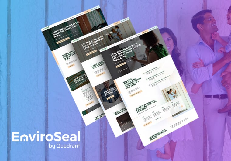
EnviroSeal, a spray foam brand by Quadrant Performance Materials, launched as a standalone name with almost no existing brand assets.
We shaped the identity from the ground up, with a modern logo, typography, color palette and full brand book.
A warm, credible presence now speaks to contractors, builders and homeowners alike.
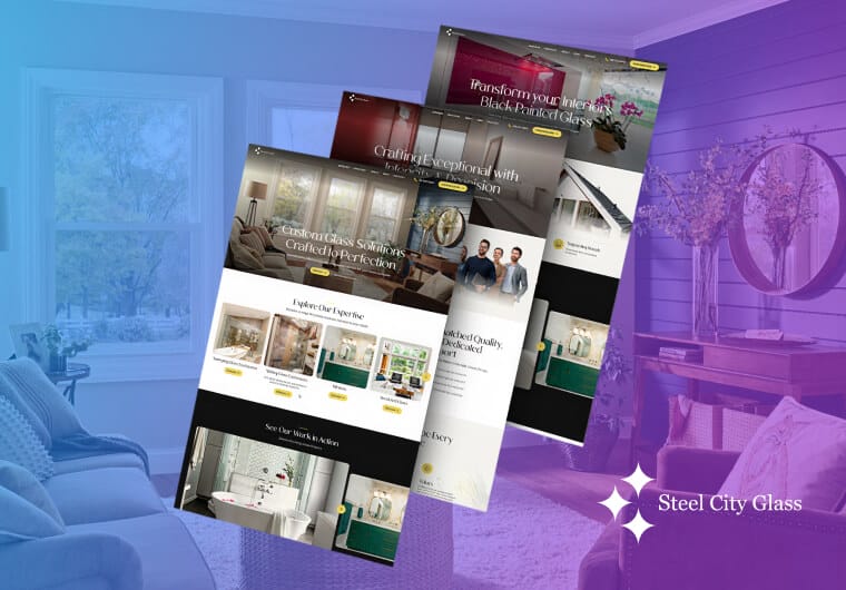
Steel City Glass is a family-owned contracting company whose decades of craftsmanship weren’t coming through in a dated online presence.
We refined the legacy logo and messaging to preserve the family heritage while giving the brand a polished, modern identity, then carried it across a site serving homeowners and commercial clients alike.
The reputation now reads as clearly online as it does in the work.



A mark built for distance legibility first, tested at the sizes and conditions it will actually be seen in.
Layouts that lead with the trade, place the mark correctly in the hierarchy, and compose required license information deliberately rather than as an afterthought.
The versions that get used on workwear, hard hats and dark backgrounds — supplied at the start rather than requested later.
Yard signs, hoarding, embroidery specification and equipment decals, specified so suppliers can apply them consistently.
Redrawing and modernizing an established family mark without discarding the recognition it has earned.
When positioning and messaging need resolving too, see our construction company branding services.
"*" indicates required fields
As a full-service agency, we plan and create
logo design solutions for businesses of all shapes and sizes.












Our team runs a discovery session to understand your company’s history, values and position in the local construction market.
We also establish whether this project starts a new identity from scratch or reworks an existing mark that already carries recognition worth protecting, and confirm every state your business operates and advertises in, since licensing and signage requirements vary by state.
Design work begins once discovery wraps, with every concept tied back to how your company actually operates and competes.
We research industry trends and competitor branding to find room for differentiation, then build out initial concepts based on what we learn.
A shortlist of concepts gets presented in full color, black-and-white and monochrome versions, then applied to real jobsite collateral like trucks, signage and safety gear, so you can see how each direction actually holds up.
At this stage, every candidate mark also gets checked at vehicle scale and typical viewing distance, not just on a screen, since a logo that reads well on a monitor doesn’t always come through on a truck door from thirty feet away.
The selected direction moves into refinement, with typography, spacing, color and any supporting iconography adjusted until the mark performs across every application.
Consistency gets confirmed across digital and print before anything moves to final delivery.
Final files get delivered in formats suited for digital, print and fabrication, along with a style guide covering usage, scaling and approved color variations.
Because construction branding lives on vehicles, signs and apparel as much as it lives online, we also include a compliance-aware vehicle template with license information already composed in, plus one-color, reversed and minimum-size artwork ready to hand off to wrap, sign and embroidery suppliers.
Beyond the logo itself, we can build out full brand guidelines covering do’s and don’ts, spacing rules and format variations, giving your team a reference as the company grows into new markets, equipment or crews.
Legibility at distance, a strong silhouette, high contrast, and a short readable name. The mark’s most valuable placement is a moving vehicle seen for two seconds, so everything that adds detail without adding recognition is working against you.
In California, yes. Business and Professions Code §7029.6 requires it on commercially registered vehicles at a minimum of 72-point — three-quarters of an inch in height and width — and clearly visible, with related requirements covering advertising, websites and business documents.
Penalties run from $100 to $5,000 per violation. Requirements differ by state, so this needs checking wherever you operate — but design the space in from the start either way.
The vehicle should, prominently. The mark itself doesn’t have to, provided the trade appears clearly alongside it. A stranger’s first question is what you do, not who you are, and a layout that answers in the wrong order wastes the impression.
Usually not outright. If the name has local recognition, that recognition is a real asset. Refinement — redrawing for clean reproduction, correcting spacing and weight, resolving color, and building the one-color and reversed versions that probably don’t exist — solves most practical problems while keeping what customers know. That’s the approach we took with Steel City Glass.
Only as a system. A single file won’t do it. You need the primary, a one-color version, a reversed version and defined minimum sizes — because embroidery, vinyl and small print each have their own limits.
Usually through execution rather than concept. In a category where most marks are generic and applied inconsistently, a well-drawn mark applied consistently across truck, workwear, signage and paperwork reads as a more serious business — which is the actual competitive advantage.
Distinctiveness helps, but consistency does more work here.
If the business is clear on what it does and who it serves, and the problem is genuinely that the mark is poor or badly applied, a logo project is right. If you’re entering a new market or changing customer type, the positioning has to be resolved first

"*" indicates required fields