Babies R Us logo
Enchant Christmas's logo
G2 eSports logo
Grenco Science's logo
Miami Country Day School logo
HP logo
NYU logo
P&G logo
Sony logo
Xerox's logo

Your LogoIs Mostly A Thumbnail Now

  • 01
    Where The Mark Actually Gets Seen 
    Ask a restaurateur where their logo lives and they’ll describe the sign, the menu, the window.

    Look at the impression counts and the answer is different: a delivery marketplace listing, a Google Maps pin, a Google Business Profile, an Instagram avatar, a reservation platform tile. 

    In every one of those the mark is small, usually circular or square-cropped, and sitting in a grid next to direct competitors. It gets perhaps half a second of attention while someone scrolls a list of places to eat. 

    That environment punishes things restaurant logos traditionally do well. Fine linework fills in. Detailed illustration becomes a smudge. A long wordmark becomes unreadable.

    Established, script-heavy or crest-style marks — exactly the ones that signal quality on a physical sign — often perform worst. 

    The response isn’t to abandon the sign version. It’s to design a system with a defined hierarchy: a primary mark for the environments that give it room, and a reduced mark — often a monogram, a single element extracted from the primary, or a radically simplified silhouette — built specifically for small circular crops. 

    Both have to be recognizably the same brand, which is the actual design problem. 

    Restaurants that skip this end up letting a platform crop their sign logo into a circle, which is how you get a mark with the top of a letter and half a fork in it. 
  • 02
    One Color, Many Substrates 
    The other constraint that ends careers for pretty logos is reproduction. 

    A restaurant mark gets embroidered onto aprons and caps, screen printed on paper bags, cut in vinyl for windows, laser etched, foil stamped on menus, molded into signage, and printed on receipt paper that can’t hold fine detail. Several of those are one-color processes.

    Embroidery has a minimum stroke weight below which thread simply won’t hold a line. 

    That means a gradient, a fine outline or a mark that depends on color separation to be legible is a mark that will look degraded across a meaningful share of its applications — and the degraded versions are the ones customers physically hold. 

    The test is simple and worth applying before anything is approved: does the mark still read as itself in solid black, at one inch wide, with no color and no gradient? If it doesn’t, it isn’t finished, however good the presentation deck looked. 

  • 03
    The Category-cliché Trap 
    Food and drink is one of the most visually clichéd categories in commercial design. Chef hats, crossed cutlery, wheat sheaves, chopsticks framing a bowl, a mustache, a rooftop skyline, a fork-and-knife roundel. Each was distinctive once and is now visual filler. 

    The problem isn’t taste, it’s function. A mark built from category conventions communicates what type of business this is while communicating nothing about which business this is — which is precisely backwards in a delivery app grid where every competitor is already known to be a restaurant.

    The category is context; your job is differentiation within it. 

    The stronger approach usually comes from something specific: a founder’s name, a location, a technique, a dish, an origin, an idiosyncrasy of the room.

    Specifics are inherently ownable in a way category signals aren’t, and they give the mark a story staff can repeat. 

    There’s a caveat worth being honest about.

    Some conventions carry genuine functional information — cuisine signaling helps a customer who is deciding what they feel like eating. The judgment is whether a convention is doing work or just occupying space, and that’s a decision to make deliberately rather than by default. 


  • 04
    Restaurants Become Institutions, And Marks Become Heritage 
    Most commercial logos are replaced every seven to ten years without anyone noticing.

    Restaurant logos are different: the ones that survive become neighborhood landmarks, and customers form an attachment to them that has nothing to do with design quality. 

    That cuts both ways. For a new restaurant it means the mark should be designed to age — resisting the styling of its launch year hard enough that it won’t date the business by association.

    For an established restaurant it means change carries real risk, and the honest recommendation is often refinement rather than replacement: redraw for reproduction, fix the spacing, build the missing small-scale version, and leave the thing customers recognize intact. 

    An agency that arrives wanting to redesign a forty-year-old neighborhood mark from scratch usually hasn’t understood what it’s being asked to protect.  

What A Restaurant Mark Has To Survive

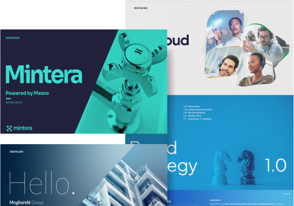
A collage of brand books and promotional materials

THE 40-PIXEL CIRCLE

Delivery listings, map pins, profile pictures. Half a second, in a grid of competitors. If there’s no reduced mark, the platform will crop your sign logo badly. 

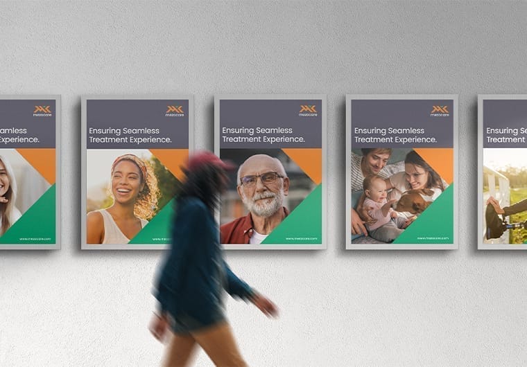
Healthcare branding campaign posters displayed on a wall with a person walking past the display

ONE-COLOR EMBROIDERY

Aprons, caps, bags, vinyl, etching. If the mark doesn’t read in solid black at an inch wide, it isn’t finished. 

THE CATEGORY CLICHÉ

In a grid where everything is already a restaurant, a chef’s hat says nothing. Specifics are ownable; conventions aren’t. 
A healthcare professional speaks with a smiling older woman seated on a couch in a bright home setting

TWENTY YEARS 

Restaurant marks outlive their design trends and become heritage. Design for aging, and for an established mark, refine rather than replace. 
WHY DIGITAL SILK?

Our Restaurant Logo Design Services

Digital Silk's digital marketing and web design agency services

Primary Mark Design

The signature mark, designed for the environments that give it room: signage, menus, packaging, entrance.

Reduced And Responsive Marks 

A monogram or simplified variant built specifically for small circular crops — delivery apps, map pins, avatars — that still reads as the same brand.

Reproduction Testing

Every mark proved in one color, at minimum size, and against embroidery and vinyl constraints before approval, not after the first order of aprons. 

Colorful icon of a presentation board

Typography And Color System 

The type and palette that surround the mark on menus, signage and packaging, specified so they can be applied consistently by printers and sign makers. 

Brand Book And Usage Guidelines 

Clear space, minimum sizes, approved variants and what not to do — the document that keeps the mark intact once other people start applying it.

Full Brand Identity 

When the mark is genuinely the last step rather than the first, see our restaurant branding services.

Our Restaurant Logo Design Process

Take a look at our logo design process.
  • 01
    Brand Research & Direction

    Before sketching anything, we get familiar with what makes the restaurant distinctive.

    We look at the concept, cuisine, atmosphere, target diners and competitive set, along with where the logo will appear most often. A fine-dining restaurant, neighborhood café and fast-casual concept all need very different visual cues.

    We turn those findings into a clear creative direction that gives the design a point of view.

  • 02
    Logo Concepts

    We explore multiple visual directions rather than forcing the first idea that looks good.

    Typography, symbols, lettering, proportions and visual references are tested against the restaurant’s personality and the impression it wants to leave with diners.

    Each candidate also goes through a small-scale review gate. We view the marks at avatar size and place them in a realistic competitor grid to see whether they remain recognizable and distinctive when reduced and viewed alongside other restaurant brands.

  • 03
    Refinement & Identity Statement

    Once a direction stands out, we work through the details that make the mark feel finished.

    We refine the proportions, spacing, typography and supporting colors, then develop the variations needed for different applications.

    The goal is a logo that feels intentional whether it appears on a menu, storefront, social profile, packaging or promotional material.

  • 04
    Application Testing

    A logo cannot be judged properly by looking at it in isolation.

    We test the selected mark across realistic restaurant applications and sizes to make sure it holds up on both digital and physical materials.

    We check details such as legibility at small sizes, reproduction on different backgrounds and how the mark behaves when used in a single color.

  • 05
    Final Artwork & Delivery

    We prepare the completed identity for the people who will actually use and reproduce it.

    The final reproduction pack includes one-color, reversed and minimum-size artwork prepared for sign makers, embroiderers and printers.

    You receive organized, production-ready files that make it straightforward to use the logo consistently across the restaurant’s physical and digital touchpoints.

Restaurant Logo Design FAQs

What makes a restaurant logo work in delivery apps?

Simplicity and a purpose-built reduced version. Those listings crop to a small circle and sit in a grid of competitors, so fine linework and long wordmarks disappear.

The fix is a defined hierarchy — a primary mark for signage and menus, and a monogram or simplified variant designed specifically for small crops, both clearly the same brand. 

Do we need more than one version of our logo? 

Almost certainly. A restaurant mark typically needs a primary version, a reduced or monogram version for small applications, a one-color version for embroidery and vinyl, and a reversed version for dark backgrounds.

Delivering a single file is where most logo projects fail their client six months later. 

Can our existing logo be fixed rather than replaced? 

Often, and it’s frequently the better answer — particularly for an established restaurant where customers recognize the mark.

Redrawing for clean reproduction, correcting spacing, and building the missing small-scale and one-color versions can resolve most practical problems while leaving the thing people know intact. 

Should our logo say what kind of food we serve? 

Sometimes, but less often than people assume. In a delivery grid every competitor is already known to be a restaurant, so category signals do less work than they appear to.

Something specific — a name, a place, a technique, a dish — is usually more ownable and gives staff a story to repeat.  

How much detail can we include? 

Test it in solid black at one inch wide. If it still reads as itself, the detail is safe. If it fills in or blurs, it will do the same on an embroidered cap, a vinyl window and a receipt. 

We’re opening in six weeks. Is that enough time? 

For a mark and core applications, usually yes. What compresses badly is the reproduction work — sign fabrication, embroidery digitizing and packaging print all have their own lead times.

Tell us the opening date at the start and we’ll sequence around the longest lead item rather than the design. 

Do we need a full brand instead of just a logo? 

Depends what problem you’re solving. If it’s genuinely a mark — you know who you are and need it drawn properly — a logo project is the right scope.

If you’re still deciding what the restaurant is, the mark will change once that settles, and starting with restaurant branding saves doing the work twice. 

Talk To Our Restaurant Design Team

Tell us where the mark will live — signage, packaging, delivery platforms, uniforms — and whether you’re starting fresh or protecting something customers already know. 
Take The Smart Road To

Digitizing Your Business Growth

Follow Us

Start A Conversation With Us

"*" indicates required fields

This field is for validation purposes and should be left unchanged.