-
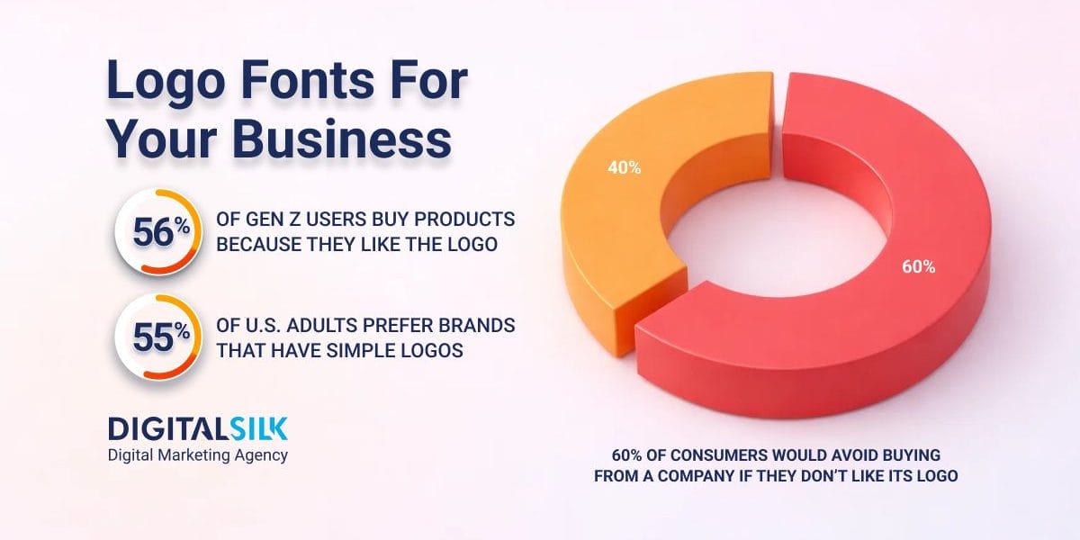
Logo appeal can influence purchases: When people like a logo, the font can contribute to buying intent before product details enter the picture.
-
Legibility protects recognition everywhere: If the name is hard to read at small sizes, the logo loses value across apps, navigation bars and social.
-
Brand fit matters more than trends: Fonts work best when they reflect your brand personality instead of whatever’s popular at the moment.
Your logo’s font is often the first brand signal people register, shaping expectations about price, credibility and positioning in a fraction of a second.
In 2026, when most brands are encountered through app icons, fast scrolls and forwarded screenshots, typography carries commercial weight without the benefit of context or explanation.
When 34% of U.S. adults say they’ve bought a product solely because they liked the company’s logo, it’s clear that a font can tip revenue before marketing ever enters the picture.
Below, we’ll break down how to identify the best font for your business logo, share some of the more widespread formats and discuss popular examples to inspire your strategy.
How To Choose A Font For Your Business Logo
Choosing the best logo font for your business involves careful consideration of your brand’s personality, target audience and industry.
Beyond being a typographic element, a font holds the potential to be a powerful tool for communicating your brand’s identity and values.
To choose the best font for your business logo:
1. Seek Inspiration From Successful Brands
Analyze logos of successful brands in your industry. While you shouldn’t copy their exact fonts or style, you can draw inspiration from their design choices.
Understanding how the most recognized brands use typography to reinforce their brand identity can guide you in making informed decisions for your own logo font.
2. Match The Logo Font With Your Brand’s Personality
When choosing a font for your business logo, consider whether it aligns with your brand’s personality traits, values and overall image.
A logo font that complements your brand’s essence can reinforce its message and create a strong visual connection with your target audience.
For example, if you’re creating a logo for a corporate brand and looking to convey trust and expertise, you might opt for a clean and elegant serif font.
Serif fonts exude professionalism and tradition, making them ideal for industries such as finance and law.
On the other hand, if your brand is modern and innovative, a sans-serif font might be a better fit.
Sans-serif fonts convey a sense of innovation and simplicity, making them popular among tech startups and creative businesses.
3. Consider Your Target Audience
Choosing a logo font that resonates with your audience can establish a sense of familiarity and help strengthen the consumer bond with your brand.
Among U.S. consumers, Gen Z is the most influenced by brand logos, with 56% saying they’ve purchased a product because the logo caught their attention, putting your font in the same lane as revenue-driving first impressions.
Conduct thorough research on your target demographic, considering your audience’s preferences, age group, cultural background and industry-specific expectations that might influence their perception of different fonts.
4. Ensure Legibility
Legibility affects how easily your logo can be recognized wherever it appears, from app icons and websites to proposals and signage.
If a font loses definition at small sizes or becomes hard to parse at a glance, the brand name fades into the background.
This aligns with broader consumer preferences, as 55% of U.S. adults say they prefer simple logos, often because they’re easier to understand quickly.
A font that hinders legibility may lead to confusion and an ineffective conveyance of your brand’s message.
Clear letterforms, consistent spacing and subtle details keep the name readable on small screens, in navigation bars and on social thumbnails.
5. Test Scalability
Your logo will appear across various mediums and sizes, from business cards to billboards.
Ensure that the font remains visually appealing and recognizable when scaled up or down.
A logo font that maintains its impact at different sizes ensures consistency across all marketing materials.
6. Consider International Appeal
If your business operates in international markets, consider the logo font’s ability to include specific international letters or characters.
A font that falls apart outside its original language can introduce inconsistency and confusion, making the logo look incomplete or improvised in certain regions.
With 60% of consumers saying they would avoid buying from a company if they don’t like its logo, typography that feels unfamiliar or incorrect can push people away before they even evaluate the products or services.
Ensuring that your font is suitable for international audiences will strengthen your brand’s presence and recognition across borders.
7. Opt For Timelessness
The font you choose today can lock your brand into a design cycle that either supports long-term recognition or forces repeated resets.
Trend-driven type can fall out of favor within a few years, pushing brands to update their logos sooner than planned and weakening familiarity along the way.
This helps explain why some buyers value permanence, with 14% of U.S. adults saying a brand should never change its logo.
Opt for a logo font with a timeless quality, one that remains relevant and impactful for years to come, saving your brand from frequent rebranding efforts down the road.
Classic serif families, clean sans-serifs and thoughtfully crafted custom letterforms tend to age more gracefully than decorative or trend-heavy styles.
8. Check Licensing Rights
If you are using a font from a font library or purchasing a custom font, ensure that you have the appropriate licensing rights to use it for commercial purposes.
Violating font licensing agreements can lead to legal issues down the line.
15 Best Fonts For A Business Logo
While there are countless fonts you could choose for your business logo, there are a handful that stand out among the rest for their readability, timelessness and other key characteristics.
Explore our carefully curated list of the 15 best logo fonts for a business below:
1. Helvetica
Helvetica is a versatile and widely recognized sans serif font that was created in 1957 and has since become one of the most popular logo fonts in the world.

It presents a clean, even typographic structure with consistent spacing and uniform letterforms that keep the name legible at any size.
When This Font Is The Right Choice
When a logo needs to feel established and dependable across corporate websites, investor materials and long-term brand assets.
When This Font Could Backfire
Less effective for brands that need to differentiate quickly in crowded markets where many competitors rely on the same typographic language.
What You Can Use Instead
Neue Haas Grotesk offers a similar foundation with more refined detailing, while Avenir provides wider proportions and more open forms that can feel less rigid.
2. Futura
Futura is a geometric sans-serif font that embodies a futuristic and forward-thinking spirit.
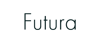
Its construction is based on near-perfect circles and straight lines, which gives the wordmark a deliberate, engineered appearance that feels intentional instead of expressive.
When This Font Is The Right Choice
Works well for companies positioning themselves around innovation, scale or long-term vision, especially where the logo needs to feel intentional and forward-facing.
When This Font Could Backfire
Less suitable for brands that rely on warmth, heritage or nuance, since the geometric structure can come across as impersonal.
What You Can Use Instead
Gotham offers similar geometric roots with more flexibility, while Proxima Nova introduces roundness and spacing that feel more approachable without losing structure.
3. Garamond
Garamond is an elegant and timeless serif font, named after the renowned 16th-century French engraver Claude Garamond.

Its letterforms are shaped by calligraphic influence and careful contrast, which gives the wordmark a sense of depth and tradition without feeling ornamental.
When This Font Is The Right Choice
Well-suited for organizations that rely on authority, heritage or intellectual credibility, particularly in sectors where trust is built over time.
When This Font Could Backfire
It can feel mismatched in contexts that require very simple shapes or uniform stroke widths, where Garamond’s contrast and detailing may reduce visual consistency.
What You Can Use Instead
Baskerville offers similar historical grounding with more contrast, while Sabon keeps the classical foundation with slightly tighter proportions.
4. Baltica
Baltica is a modern and elegant serif font with slightly rounded serifs, giving it a unique and contemporary twist while still exuding a sense of tradition and sophistication.
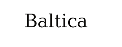
Its well-proportioned letterforms and ample spacing between characters contribute to optimal legibility.
When This Font Is The Right Choice
Baltica’s clean and balanced letterforms make it an excellent choice for businesses seeking to establish a modern yet refined brand image.
When This Font Could Backfire
The rounded serifs and moderate contrast can lose definition at very small sizes or in low-resolution applications where finer details matter.
What You Can Use Instead
Tiempos offers more contrast and firmer detailing, while Merriweather uses wider letterforms and simpler serif shapes that maintain legibility across sizes.
5. Bodoni
Bodoni is a high-contrast serif font with sharp, distinct lines and contrasting thick and thin strokes.
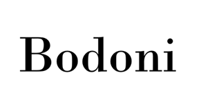
The contrast between heavy verticals and very fine hairlines gives the wordmark a dramatic, editorial look that draws attention to form and spacing more than texture.
When This Font Is The Right Choice
Best suited for logos that appear primarily at larger sizes, such as website headers, print covers or signage, where the thin strokes remain visible.
It exudes elegance and sophistication, making it a popular choice for luxury brands, high-end fashion houses and creative industries.
When This Font Could Backfire
Small-scale applications like favicons, social avatars or dense layouts can cause the hairlines to disappear or break up.
What You Can Use Instead
Didot keeps the high-contrast structure with more consistency, while Playfair Display reduces the stroke extremes for easier reproduction.
6. Lato
Lato is a versatile and modern sans-serif font with a friendly and approachable appearance.
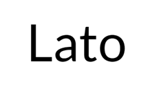
It blends clean geometry with subtly rounded details, so the wordmark feels modern without looking rigid or overly engineered.
The x-height is generous and the spacing is even, which helps the name remain readable when it’s used in smaller placements like navigation bars, email headers or product UI.
When This Font Is The Right Choice
A smart pick when you want one typeface to cover both the logo and supporting brand touchpoints, especially if consistency across web, app and print is a priority.
When This Font Could Backfire
The letterforms are close in proportion and structure to many system sans-serif fonts, which can make the logo feel less distinctive in digital interfaces.
What You Can Use Instead
Inter gives a more UI-native tone with tighter optical tuning, while Source Sans 3 offers a similar friendliness with slightly more character in the letterforms.
7. Pacifico
Pacifico is a fun and quirky script font that mimics casual handwriting.
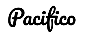
The connected letterforms and uneven stroke flow create an informal, expressive look that is immediately recognizable as handwritten.
As a logo typeface, it relies heavily on continuous curves and joins, which places more visual emphasis on flow than on clear character separation.
When This Font Is The Right Choice
Its playful and lighthearted appearance makes it perfect for creative and artsy businesses, as well as brands targeting a youthful and trendy audience.
When This Font Could Backfire
The continuous connections between letters can reduce legibility at smaller sizes and make individual characters harder to distinguish in dense digital layouts.
What You Can Use Instead
Lobster offers a script style with more controlled connections, while Playfair Display Italic adds a sense of formality through italic letterforms and higher contrast.
8. Baskerville
Baskerville is a classic and elegant serif font with a rich history dating back to the 18th century.

The strokes show more variation in thickness than older serif designs, paired with open counters that keep the letter shapes clear and readable.
When This Font Is The Right Choice
A good fit for logos that appear alongside long-form text, reports or editorial-style layouts where consistency between display and reading sizes matters.
When This Font Could Backfire
Logos built around very simple geometric shapes or minimal icon systems can clash visually with Baskerville’s transitional letterforms.
What You Can Use Instead
Times Ten keeps similar proportions with heavier strokes, while Georgia adapts classical serif construction for clearer performance on screens.
9. Montserrat
Montserrat is a clean and modern sans-serif font designed by Argentine graphic designer Julieta Ulanovsky.

It was inspired by posters, signs and painted windows seen in Buenos Aires’ old Montserrat quarter in the first half of the 20th century.
The wide letterforms and open spacing give the name a billboard-like presence that traces back to its signage origins.
When This Font Is The Right Choice
A solid choice for brands with shorter names that benefit from generous spacing and a clear silhouette, particularly in headline-driven identities.
When This Font Could Backfire
Longer names or condensed logo formats can start to feel stretched, since the wide proportions demand horizontal space.
What You Can Use Instead
Gotham keeps the geometric structure with tighter proportions, while Avenir Next offers a more compact feel with smoother curves.
10. Trajan
Trajan is an elegant and sophisticated serif font created by Carol Twombly and inspired by the letterforms of ancient Roman inscriptions.
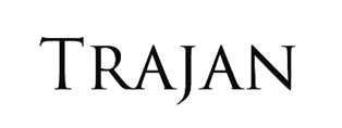
Its association with Roman antiquity and the timeless legacy of great civilizations appeals to consumers who appreciate tradition, quality and attention to detail.
Built entirely in capital letters, the proportions and carved detailing give the lettering a formal, monumental feel that draws more from stone engraving than print typography.
When This Font Is The Right Choice
Trajan’s classic and timeless appearance makes it a popular choice for luxury brands, high-end restaurants and businesses that want to convey a sense of history, prestige or power.
When This Font Could Backfire
Extended names or frequent use at smaller sizes can reduce legibility, since the all-caps design offers limited variation in letter height and spacing.
What You Can Use Instead
Cinzel keeps the classical reference with more contemporary spacing, while Cormorant offers historical character with greater flexibility in layout and hierarchy.
11. Quattrocento
Quattrocento is a classic and elegant serif font that draws inspiration from the letterforms used during the Italian Renaissance.

Its name refers to the 15th century, which is considered the height of the Renaissance period.
The font’s graceful curves and delicate serifs exude a sense of artistic refinement and sophistication.
When This Font Is The Right Choice
Quattrocento is an excellent choice for businesses that want to convey a timeless and cultured image.It works particularly well for brands in the art, luxury and creative industries.
When This Font Could Backfire
Logos that need perfectly even visual weight across all letters can run into issues, since some characters appear lighter due to the calligraphic construction and uneven stroke distribution.
What You Can Use Instead
Cormorant keeps the historical influence with more weight variation, while Libre Baskerville offers a calmer serif structure that adapts more easily to contemporary layouts.
12. Frutiger
Frutiger is a versatile and modern sans serif font designed by Adrian Frutiger. It is highly legible and versatile, making it a practical choice for a wide range of design applications.
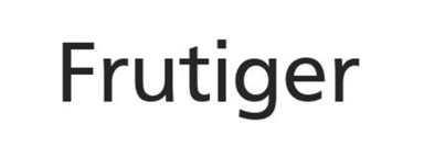
Frutiger’s neutral and unassuming personality also allows it to work harmoniously with other typefaces, enabling designers to create cohesive and well-balanced typographic compositions.
When This Font Is The Right Choice
Useful for brand names with many characters or complex letter combinations, where clear differentiation between similar shapes like I, l and 1 or O and 0 matters.
When This Font Could Backfire
Very short names or acronym-based logos can feel visually flat, since the even stroke treatment offers little variation to build a distinctive shape.
What You Can Use Instead
FF Meta keeps the humanist foundation with more variation in form, while Univers introduces stricter geometry and weight contrast for clearer structure.
13. Didot
Didot is an elegant and high-contrast serif font named after the Didot family, a group of prominent French printers, publishers and typefounders.
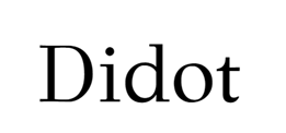
Didot is characterized by its thin, delicate serifs, tall letterforms and strong vertical stress.
When This Font Is The Right Choice
Short brand names with controlled spacing benefit most, since Didot’s narrow forms and vertical emphasis create a compact, high-fashion silhouette when letter spacing is carefully managed.
When This Font Could Backfire
Names with many curved letters or mixed character widths can look uneven, as Didot’s thin horizontals and ball terminals exaggerate spacing inconsistencies between characters.
What You Can Use Instead
Bodoni keeps the high-contrast DNA with more uniform spacing behavior, while Canela softens the vertical emphasis and hairlines for names that need more typographic tolerance.
14. Proxima Nova
Proxima Nova is a modern and versatile sans serif font designed by Mark Simonson. It was released in 2005 and has quickly gained popularity for its clean and elegant appearance.

This font has become a favorite among designers and businesses alike due to its extensive character set, various font weights and excellent legibility across different sizes and devices.
When This Font Is The Right Choice
Proxima Nova strikes a balance between contemporary and approachable, making it an ideal choice for modern brands and startups.
When This Font Could Backfire
If the logo must look proprietary on its own, Proxima Nova can come across as generic because it’s widely used and its forms are intentionally familiar.
What You Can Use Instead
Graphik brings a more geometric, design-forward structure with noticeably different proportions. TT Norms offers a similar range of versatility and offers a slightly different overall shape in the letterforms.
15. Lobster
Lobster is a decorative font designed by Pablo Impallari, known for its playful and casual nature. This makes it an excellent choice for brands that want to convey a sense of creativity, fun and uniqueness.
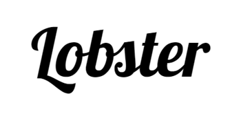
Its flowing and cursive-like letterforms give it an organic and authentic feel, as if each letter were handwritten.
When This Font Is The Right Choice
It’s used by many businesses in the creative and artistic fields to communicate a sense of handmade craftsmanship, a personal touch and a creative flair.
When This Font Could Backfire
While Lobster can be an attention-grabbing and exciting logo font choice, it may not be the best fit for brands aiming for a formal or serious tone.
What You Can Use Instead
Pacifico offers a script style with lighter connections and more breathing room between letters. Cooper Black delivers a bold, expressive presence without relying on cursive construction.
4 Main Logo Font Types To Consider
The font you choose for your business logo plays a role in conveying the personality, values and philosophy of your brand.
In fact, it can significantly impact consumer perception and behavior, which is why making the choice is no easy feat.
While the world of typography offers a vast array of font styles, logo fonts can be broadly categorized into four main types: serif, sans serif, script and decorative fonts. Let’s dive into each in more detail.
1. Serif Fonts
Serif fonts are characterized by small decorative lines or strokes (serifs) at the ends of each letter. These fonts exude a sense of tradition, elegance and reliability.
They are often associated with established and prestigious brands, like Rolex, BMW and The New York Times.
[Source: Rolex]
Serif logo fonts are common for businesses in the law and finance industries where trust and credibility are paramount.
Classic examples of serif fonts include Baskerville, Times New Roman and Georgia.
2. Sans Serif Fonts
An overwhelming majority of the 500 biggest companies in the world use sans serif fonts, making this font the most popular option for business logo fonts.
As implied by the name (“sans” meaning “without” in French), sans serif fonts lack the decorative strokes at the ends of letters — a trait of serif fonts.
Instead, sans serif fonts have a clean, modern and minimalistic appearance, making them ideal for brands that want to project a contemporary and approachable image.
Sans serif fonts are commonly used by tech companies, startups and fashion brands — including Facebook, Google and Vogue.

[Source: Facebook]
The simplicity and straightforward design make them easily readable in both digital and print media. Some popular sans-serif fonts are Arial, Helvetica and Futura.
3. Script Fonts
Script fonts mimic handwriting with flowing and cursive-like letterforms. These fonts are perfect for adding a touch of elegance and personalization to your brand.
They evoke a sense of creativity and sophistication, making them ideal for businesses in the luxury, fashion and beauty industries, including Cartier, Christian Louboutin and Chopard.
[Source: Cartier]
It’s important to note that script fonts can be difficult to read in small sizes and may not work well for body text.
Some examples of script fonts are Brush Script, Great Vibes and Pacifico.
4. Decorative Fonts
Decorative fonts, also known as display fonts, are highly stylized and eye-catching.
They often have unique and intricate designs that set them apart and are perfect for brands that want to showcase their creativity and personality, like Disney, Harry Potter and Harley Davidson.
Keep in mind that while decorative fonts can be attention-grabbing, they may not be the best choice for conveying a professional and serious tone, which some industries might require.
Examples of decorative fonts include Broadway, Jokerman and Comic Sans.
Most Recognizable Business Logo Fonts
The world of typography offers a plethora of logo font options, but if you find the right fit, your logo could become iconic and synonymous with your brand, like the famous examples below.
Let’s explore some of the most recognizable logo fonts:
1. Coca-Cola
Beverage brand Coca-Cola uses a custom-designed script logo font known as “Spencerian Script.”

This elegant and flowing font has become inseparable from the brand’s identity, representing the timeless and classic appeal of Coca-Cola.
2. Google
Technology company Google uses a custom-designed logo font called “Product Sans.”

It is a clean and modern sans-serif font that aligns with Google’s emphasis on simplicity and user-friendliness.
3. Airbnb
Hospitality and travel brand Airbnb uses a custom logo font called “Circular.”
This rounded and friendly font complements the brand’s inclusive, approachable and community-driven image.
4. Netflix
Streaming service Netflix uses a custom typeface called “Netflix Sans.”

This logo font was designed by Netflix’s in-house design team in collaboration with the font foundry Dalton Maag.
5. Adidas
Sports brand Adidas uses a custom logo font called “Adihaus.” This clean and modern font complements the simplicity and elegance of the “three-stripe” logo, enhancing the overall brand identity.
The font’s legibility makes it suitable for various applications, from branding to product labeling.
6. YouTube
Video-sharing platform YouTube uses the “TradeGothic LT Bold Condensed” logo font.

The font’s bold and condensed design showcases the platform’s commitment to simplicity and clarity.
7. IMB
Technology and IT services company IBM uses a custom logo font called “IBM Plex.”
This versatile sans serif font reflects the brand’s focus on technology and innovation.
Find The Best Font For Your Business Logo With Digital Silk
Your business logo serves as the face of your brand, making a lasting impression on consumers and setting the tone for your entire business identity.
One crucial aspect of creating a remarkable logo is choosing the right font, which can significantly influence your brand’s visual appeal and recognition.
In the top examples we shared, one trait that many of the most recognized logos share is custom design.
At Digital Silk, we understand the importance of crafting a logo that truly represents your business.
Our team of award-winning designers is equipped with the expertise to guide you through the font selection process, ensuring your logo truly reflects your brand’s identity and connects with your target audience.
As a full-service web design agency, our deliverables include:
- Brand and logo design
- Conversion-first branding solutions
- Rebranding services
- Digital marketing
- Custom web design
- Custom web development
Contact our team, call us at (800) 206-9413 or fill in the Request a Quote form below to schedule a consultation.
"*" indicates required fields


