-
Web, logo and document fonts serve different roles: What works for long-form reading, brand marks or screen-heavy pages isn’t interchangeable and needs intentional pairing.
-
Neutral fonts improve readability, not distinction: Popular options like Open Sans or Roboto make content easier to move through but require stronger hierarchy or companion fonts to avoid blending in.
-
Consistency across materials builds recognition: A coordinated font system across the site, logo and client documents helps the firm feel more cohesive and easier to recall during comparisons.
Prospective clients form an opinion about a law firm before they read a single page in full, often while skimming a homepage, a practice page or a PDF.
With search engines driving 94% of law firm brand awareness, that first encounter usually starts with a click and a quick visual scan, where the font influences how professional, current and trustworthy the firm appears.
So, what are the best fonts for lawyers that support credibility at a glance across websites, logos and client documents?
Below, we explore 10 different font options for law firms, along with key elements to consider when choosing the right one and the impact it has on brand perception and performance.
Best Fonts For Law Firm Websites
The best fonts for law firm websites drive positive associations of credibility and trust for legal firms while producing an easy-to-use user experience (UX) on an engaging user interface (UI).
With 90% of law firms operating a website, the fonts below reflect how firms present themselves to prospective clients who scan pages quickly, compare options side by side and decide whether to continue reading:
1. Open Sans
Open Sans is a neutral, approachable and friendly Sans Serif typeface.

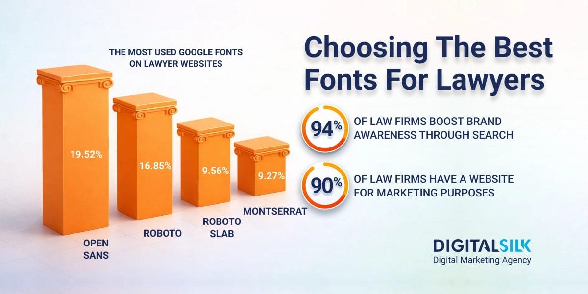
It’s one of the most popular fonts across industries, as it appears in over 362 million websites worldwide and almost 20% of all law firm websites.
When Using This Font Works
Open Sans is a common choice due to its optimization for web, mobile and print interfaces that ensure legibility across channels.
It works well on content-heavy pages, like practice areas, attorney bios and resource sections where visitors skim quickly and scan multiple sections in one sitting.
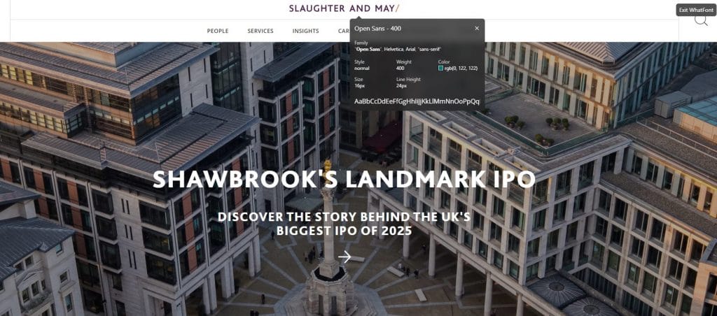
For instance, multinational law firm Slaughter and May uses Open Sans for its website navigation items and body paragraph text.
When Using This Font Fails
Open Sans can look flat on minimalist layouts, underdesigned homepages or sites that rely on typography to carry visual interest.
When paired with generic spacing, default weights or weak hierarchy, it can feel basic and make even high-end firms look undifferentiated.
What This Means For Lawyers
Open Sans makes long pages easier to scan and reduces visual fatigue across websites and documents, but it does little to set a firm apart on its own.
If you use it as your primary font, pair it with a more distinctive headline typeface and be deliberate with sizing and spacing so the site looks purpose-built rather than off-the-shelf.
2. Roboto
Roboto is one of the best fonts for lawyers’ websites because it is modern, clean and highly legible.

As such, it’s used by more than 462 million websites worldwide, which has made it familiar to users who spend much of their time reading on screens.
When Using This Font Works
The Sans Serif design makes Roboto well-suited for digital platforms, ensuring readability across various devices and browsers.
Additionally, Roboto is versatile, allowing for effective use in headings and body text and its various weights and styles provide flexibility for branding and design purposes.
For instance, our web designers used Roboto as the main body text for Sobo & Sobo’s New Jersey law firm website.
The font ensures website accessibility for visitors of all backgrounds, devices and screen sizes.
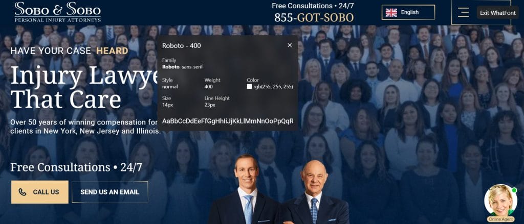
The sleek, modern lines of Roboto’s Sans Serif design provide a counterpoint to the refined, traditional elegance of Noto Serif’s serif typeface that we added to the website’s headings.
This complementary contrast creates a visually striking and highly readable combination that reflects the firm’s professionalism and delivers a refined online presence.
When Using This Font Fails
A traditional, heritage-forward brand can feel mismatched with Roboto’s crisp, modern design.
It can also look rigid when paired with compressed spacing, heavy weights or overly strict grids, especially on pages meant to feel welcoming.
What This Means For Lawyers
Roboto makes large volumes of information easier to work through and supports consistent presentation across pages, but it brings a distinctly modern character with it.
Use it with more generous spacing and a secondary typeface that adds warmth so the site feels polished and human rather than purely utilitarian.
3. Montserrat
Montserrat is a modern geometric Sans Serif with wide letterforms and sharp edges that make headings visually prominent on screens.

It’s featured in more than 16.5 million websites, largely because those proportions give titles and navigation a clear definition without decorative detail.
When Using This Font Works
Montserrat shines when you need clear wayfinding, like sticky navigation, practice-area grids, service page headers and landing page hero sections.
It’s also a smart fit for firms that run paid search or directory traffic to specific landing pages, since the typography helps visitors understand page structure quickly and find the next step.
Roulston Urquhart Criminal Defence uses Montserrat in large, spaced out headlines to establish clear hierarchy and command attention the moment the page loads.
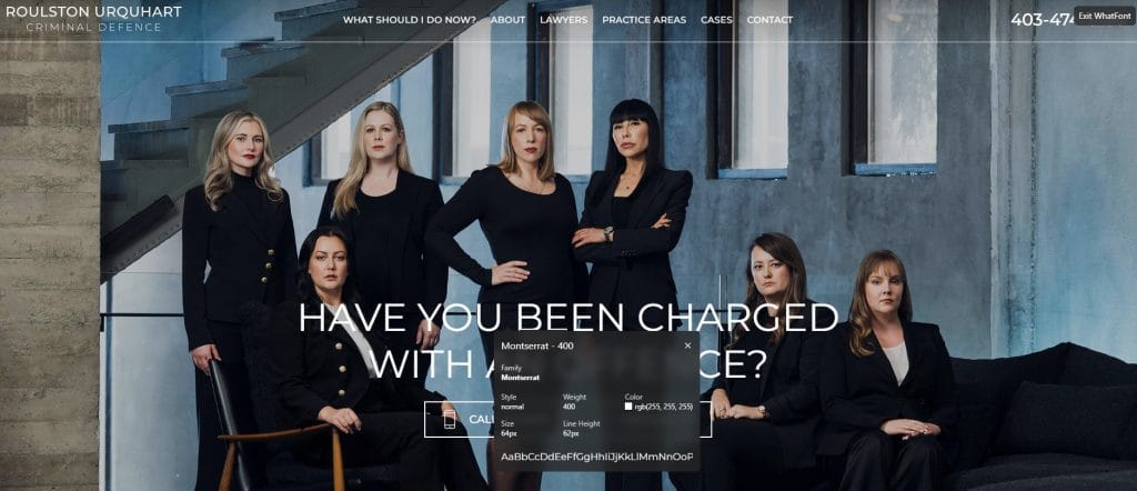
The font’s wide letterforms and clean shapes keep the headline readable over a busy background photo, which helps visitors understand the message quickly without visual distraction.
When Using This Font Fails
Using Montserrat for extended body copy can slow down reading on pages with detailed explanations or long FAQs.
It can also feel overly assertive on conservative sites when paired with large all-caps text, wide letter spacing or heavier weights that pull attention away from the content.
What This Means For Lawyers
Montserrat brings definition and order to the top layers of a page, but it can overpower the design if it’s used too broadly.
Limit it to headings and interface elements, set longer sections in a more neutral body font and avoid stacking bold styles so the site communicates control rather than visual noise.
4. Barlow
Barlow is a versatile, modern Sans Serif font with a slightly rounded and low-contrast style, that’s used on over 590,000 websites worldwide.

The rounded details soften the look of headlines and buttons, which can make the interface feel more welcoming at first glance.
When Using This Font Works
Its clean, geometric design makes the font highly legible across all forms of website content, from homepage titles to blog copy and privacy notices.
It also performs well in layouts that mix short sections, callouts and form-driven pages where visual flow matters.
For example, our branding team paired Barlow with the elegant Serif font Sangira for Dunnion Law‘s website, a personal injury law practice based in California.

The typography choices help to position Dunnion Law as a reliable practice that provides high-quality, personal legal solutions.
When Using This Font Fails
Barlow can feel too casual for firms that rely on formality or tradition as part of their positioning.
On dense, text-heavy pages, its rounded shapes can reduce contrast between letters and slow down scanning over longer passages.
What This Means For Lawyers
Barlow can help a firm feel more accessible during those first few seconds on the site, which may support engagement on high-level pages.
The tradeoff is that it demands careful use across long-form content, where more neutral fonts often perform better over time.
Best Fonts For Lawyer Logos
Considering that 60% of people avoid companies whose logos they don’t like, having a brand-specific and memorable design is crucial in building brand recognition and loyalty for your business.
Many law firms achieve this by using standardized logotype fonts as a base for creativity:
1. Playfair Display
Playfair Display is a high-contrast Serif typeface with sharp transitions and elegant proportions that immediately signal tradition and formality.

Its roots in editorial design make it familiar in print-heavy contexts, which is why it often appears in law firm logos that want to reflect history, longevity and established authority.
When Using This Font Works
Use Playfair Display works best for logos that need a classic, premium impression, especially for wordmarks with shorter names and enough space around the lettering.
For instance, Kirkland & Ellis LLP‘s custom logo font drives authority and professionalism through clean lines and classic design elements that create a sense of tradition, stability and credibility.

While the font is easy to read, the serif flourishes add an element of sophistication, representing the brand‘s reputation for excellence in corporate and private equity law.
When Using This Font Fails
Very small logo applications can reveal its limits, since the thinnest parts of the letters may disappear in favicons, social avatars, distance signage or embroidery.
It can also feel mismatched in logo systems built around simple geometry and uniform stroke widths.
What This Means For Lawyers
Playfair Display brings a refined, heritage-focused character to a logo, but it requires careful handling across formats.
Planning a simplified alternate mark for small uses, keeping it confined to the logo and pairing it with a Sans Serif elsewhere helps maintain legibility and consistency.
2. Arial
Arial is a clean Sans Serif with neutral proportions and minimal stylistic detail, which is why it’s widely used in corporate identity projects.

In logo design, it comes across as familiar and direct, but it can also signal “default” if it’s placed into a wordmark without custom spacing or supporting brand elements.
When Using This Font Works
Arial works for logo wordmarks when the priority is straightforward legibility across every size, from a website header to an email signature to small-format print.
It also makes sense when your identity relies more on a symbol, monogram or color system, with the wordmark playing a supporting role.
Take the multinational law firm Latham & Watkins LLP as an example, with its clean and simple logo that provides a sense of clarity and precision.

Using a Sans Serif font gives the font a modern and forward-thinking image, reflecting Latham & Watkins’ commitment to staying at the forefront of legal developments.
When Using This Font Fails
Plain Arial with standard letter spacing can look generic, especially in competitive markets where many firms already present as conservative and corporate.
It also struggles in premium positioning, since the shapes are widely recognizable and don’t create a distinct signature.
What This Means For Lawyers
Arial keeps your firm name readable in almost any context, but it rarely creates a memorable mark on its own.
If Arial is the base, treat it as a starting point, adjust spacing carefully, consider subtle customization in a few letters and pair it with a distinctive icon or monogram so the logo becomes easier to recognize at a glance.
3. Public Sans
Public Sans was originally created for public-sector communication, which explains its straightforward letterforms and focus on readability.

In law firm logos, it presents the firm name clearly and plainly, keeping attention on the name rather than decorative detail.
When Using This Font Works
Public Sans suits logo wordmarks that appear frequently in small formats, such as website headers, email signatures, letterhead and court-facing materials.
Its simple shapes remain readable when reduced in size or printed on lower-quality materials.
For example, Linklaters‘ bespoke Serif font provides an individual visual identity, creating a logotype that builds brand recognition and fosters brand awareness.

The clean lines and classic design reflect tradition and professionalism, while its Serif features add individuality and attention to detail, all of which are important perceptions to craft for a global law firm providing top-in-class legal solutions.
When Using This Font Fails
Public Sans can look generic when the logo relies mainly on the wordmark to stand out.
It’s also a poor match for firms that want their logo to signal tradition, exclusivity or long-established reputation.
What This Means For Lawyers
Public Sans reduces visual complexity in a logo, which can make the firm name easy to read across documents and digital materials.
That neutrality can also make the logo harder to spot in directories, search results and referral materials unless it’s paired with a distinctive visual system.
Best Fonts For Legal Documents
The majority of courts’ key requirement for legal documents is that they are clear and legible.
While size is seen as the most important factor, your chosen font should also prioritize readability.
Three of the top fonts for legal documents include:
1. Times New Roman
Times New Roman is a classic Serif font that’s long been a go-to for documents of all kinds, including legal papers.

Its narrow letterforms allow more words per page, which is one reason it remains common in briefs, contracts and court filings where length and formatting still matter.
When Using This Font Works
Times New Roman makes sense in court-mandated documents, formal filings and situations where tradition and compliance outweigh presentation.
It’s also practical when page limits apply, since the compact design helps control length without altering margins.
When Using This Font Fails
In digital documents or client-facing materials, Times New Roman can feel visually crowded and dated.
Paragraphs tend to blur together on screen, making it harder for readers to track sections and arguments without extra formatting.
What This Means For Lawyers
Times New Roman meets expectations in regulated contexts, but it places the burden of readability on layout rather than typography.
Use it where compliance matters and consider modern Serif options when the goal is sustained attention rather than procedural acceptance.
2. Georgia
Georgia is a Serif typeface designed for screen reading, with wider letterforms and generous spacing that make dense text easier to follow in digital documents.

It brings a more contemporary feel than older document fonts while keeping the formality expected in legal writing.
When Using This Font Works
Georgia suits briefs, reports and client-facing documents that are read primarily on screens rather than printed and filed.
It also performs well in longer documents where readers move back and forth between sections, since headings and body text remain clearly separated.
When Using This Font Fails
In tightly formatted filings or legacy templates built around narrower fonts, Georgia can push text onto additional pages and disrupt established layouts.
It may also feel informal in courts or jurisdictions that still expect traditional document styling.
What This Means For Lawyers
Georgia makes long documents easier on the eyes on screens, which matters when clients and opposing counsel read on laptops and phones.
Keep it for digital-first materials and client deliverables and stick to more traditional filing fonts when page count, court formatting and legacy templates control the layout.
3. Helvetica
Helvetica is an easy-to-read Sans Serif font with a balanced design and precise letterforms that deliver a professional text that is manageable in large blocks or multiple pages.

Its neutrality has made it a default in corporate documents, which carries over well into legal materials that need to look orderly and consistent.
When Using This Font Works
Helvetica is best suited for legal documents that require a modern and clean appearance, such as marketing materials and client-facing documents.
It also handles multi-page documents with tables, bullet points and footnotes without drawing attention to the typography itself.
When Using This Font Fails
In long, text-heavy documents, Helvetica’s uniform stroke widths can make paragraphs feel dense, especially on screen.
What This Means For Lawyers
Helvetica brings a clean, businesslike feel to legal documents, but it requires thoughtful spacing and layout to avoid visual fatigue.
Use it where consistency and structure matter most and be selective about deploying it in documents meant for extended reading.
Why Do Fonts Matter For Law Firms?
Picking the right font for your law firm’s website, marketing materials and legal documents provides three important benefits.
At a time when 70% of users say it’s easy to find lawyers, presentation increasingly shapes who feels credible, established and worth contacting once they arrive.
Specifically, the best fonts for lawyers help to:
- Drive credibility: A high-quality font choice conveys professionalism and trustworthiness, essential qualities in the legal industry.
- Increase recognition: A professional font ensures consistency and a memorable visual identity across all firm communications, helping clients easily identify and recall the firm.
- Boost readability and accessibility: A clear font ensures that legal documents and communications are easily readable and accessible to a diverse audience, including those with visual impairments.
What To Consider When Choosing The Best Fonts For Lawyers
Before choosing your font, your law firm should consider the following factors to ensure you’re making the right choice:
1. Type Of Font: Serif vs. Sans Serif
Your font style plays an important role in how your law firm is perceived. This is because it helps portray your brand personality, values and philosophy.
Consider the two of the main typefaces, Serif and Sans Serif, for example.
Serif fonts usually have decorative flourishes, or lines, added at the beginning and end of their letters – similar to old typewriters.
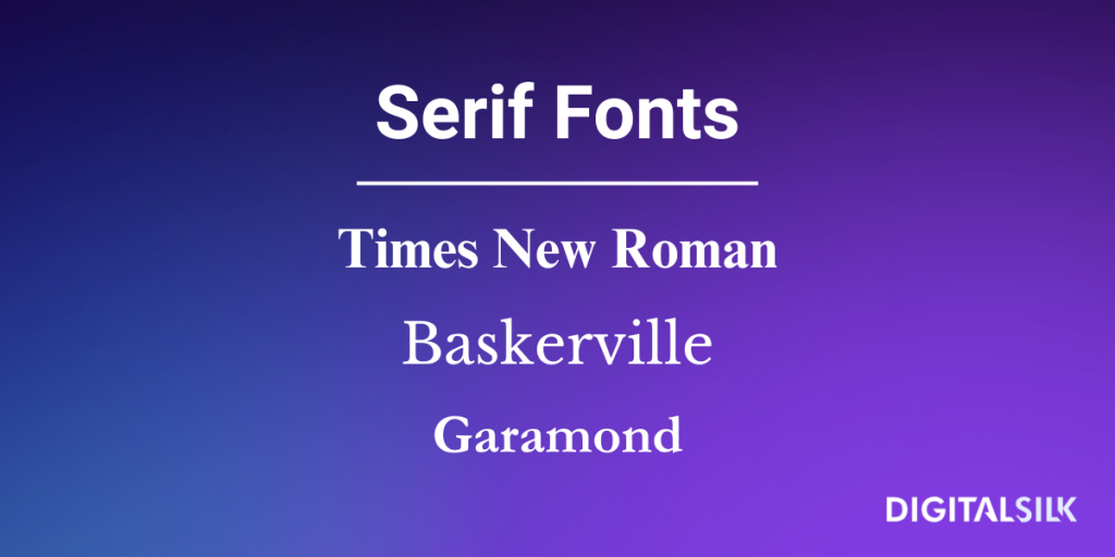
Choosing a Serif font, like Times New Roman, for your law firm is one way to drive associations of legacy, reliability and authority.
The extra lines also help visibility when font size is smaller.
Sans Serif fonts, like Arial and Helvetica, take a more modern approach by removing the lines to match today’s handwriting styles.
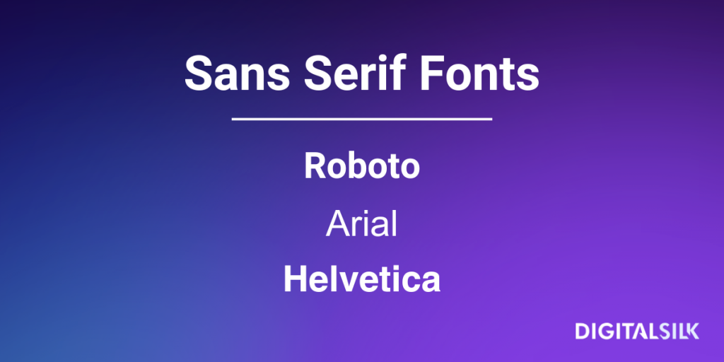
The minimal, fresh style can promote a more agile brand identity, while Sans Serif is also often favored on printed, large-scale branded collateral like signs and billboards.
2. Placement & Pairings
Whether on your website, marketing collateral or internal documents, you’ll likely need to choose more than one font for your law firm.
Considering complementary fonts is an important step in creating visually engaging materials with headings that stand out and don’t clash with your body text.
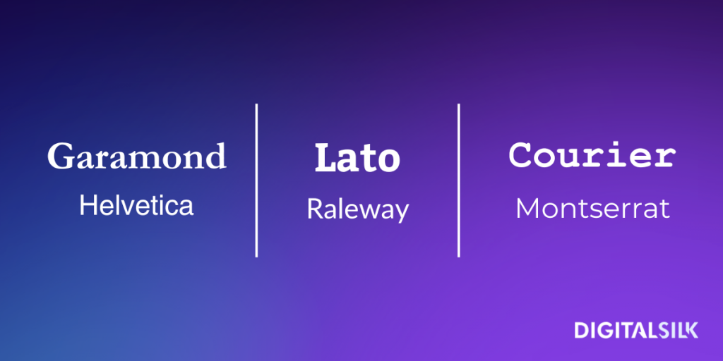
As Sans Serif fonts tend to suit smaller font sizes, consider using a font matching tool like Monotype to combine a Sans Serif body text with Serif headings.
Some proven partnerships that boost credibility for law firms include:
3. Formatting
Your font won’t always be seen at face value.
When deciding which fonts are best for your law firm’s documents, website and marketing materials, keep in mind the font’s readability when in bold, italic and strikethrough.
Features like letter and line spacing are also important since they determine how easily users can skim through the content.
Before finalizing your font of choice, make sure to test its flexibility and aesthetics with as many different formatting styles as possible. You can do this with free tools like Google Fonts.
Grow Your Law Firm With Digital Silk
From the font on your website’s homepage and blog posts to your logos and legal documents, typography is central to your law firm’s brand image.
Understanding different fonts and choosing those that create a memorable, on-brand visual identity can enhance your law firm’s reputation and loyalty.
As a reliable web design agency and end-to-end branding company, we can help guide you through your decision-making process from ideation to implementation and beyond.
Our experienced team can analyze your brand identity, suggest the fonts that best represent your values and deliver final typography solutions across channels.
As a full-service agency, our solutions span:
- Custom web design
- Custom web development
- Premium branding services
- Brand and logo design
- Digital marketing
For every law firm project we take on, our team makes sure to:
- Take project ownership
- Provide total transparency
- Deliver measurable results
Have a law firm branding or web design project?
Contact us, call us at (800) 206-9413 or complete the Request a Quote form below for a free, custom consultation.
"*" indicates required fields


