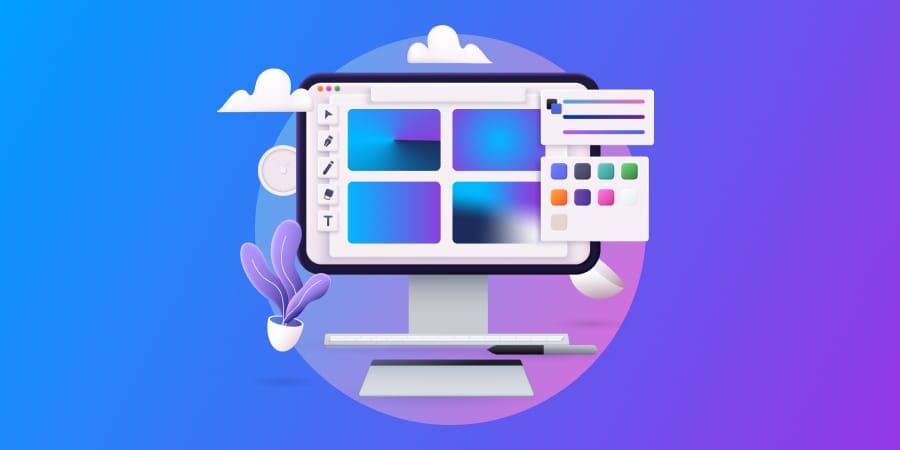
Dark Mode
Explore our handpicked collection of beautiful color gradient designs for business owners. Use these colorful gradient designs and improve your website.

Published: October 20, 2023
In the dynamic world of web design, gradient design has emerged as a trend that breathes life and color into digital interfaces.
In the bid for uniqueness, the use of gradients offers your brand an avenue to stand out from the crowd of your competitors.
But what are gradients? How can your business make the most of it? And what do gradient design examples look like in practice?
Our design experts tell all below.
Have a graphic design project? We craft unique, on-brand designs.
Request a Quote
What Is Gradient In Design?
Gradient in design is the gradual transition between colors. This blending results in a visual effect of colors seamlessly fading into each other, creating a sense of depth.
Gradients have made a significant comeback in contemporary design, gracing everything from logos to website backgrounds.
They can be linear, radiate outwardly or form complex patterns to develop visual journeys and evoke emotional reactions from a selected audience.
How To Use Gradient Design
Using gradients in your design is more than simply adding a splash of color.
When done right, modern gradient design can evoke a desired reaction from your target audience, taking them on a visual journey to understanding your brand and its identity.
Here are some ways to achieve this:
1. Carefully Consider Your Colors
Many gradient design guides argue that using two colors is outdated, and you should instead choose three.
At Digital Silk, we take gradient design closer to total customization.
Our award-winning design team believes that best practices in gradient color schemes shouldn’t use templated gradients limited to a focal number of colors.
Your gradient design colors should instead be uniquely tailored to the emotive and actionable reaction you are trying to evoke from your target audience.
- Trying to create a sense of calmness? Blue and teal alone might work.
- Aiming to create a burst of energy? A rainbow–inspired red, orange, yellow, green and violet could do the trick.
By thinking creatively and innovatively, your gradient designs will outperform those clutched to inside-the-box two- or three-color techniques.
2. Focus On Your Brand Identity
By creating gradients with colors associated to your brand, you can drive brand recognition.
How much, exactly?
Up to 80%.
Whether on a website or branded materials, your gradient designs don’t have to reinvent the wheel.
Keep your gradient styles, colors and elements in line with your wider brand strategy. This way, you are adding another brick to the wall of your recognizable brand identity.

3. Use Diverse Sources Of Light
Colors aren’t the only way to create a gradient that influences actions through behavioral design.
By creating or changing the source of light within your gradient design, you can pave a path for the visitor’s attention and guide their eyes to an element you want them to check out – be it a call-to-action (CTA), image, or a different section of the website.
Light sources can also dictate the mood of your gradient design.
A simple, yet beautifully effective example of this is A Colors Show.
The production features a series of music artists who perform in the center of a radial gradient that stems from a light source behind them.
Take a look at how the artist is highlighted by the gradient and its source of light in a recent episode below.
It’s clear to see that all attention is guided to the artist and their microphone, removing distractions to pin focus on their voice.
How Our Experts Create Gradient Designs
Whether placed on a website or brand collaterals, a high-quality graphic design gradient will strengthen a brand identity and support a brand strategy.
At Digital Silk, our gradient designs take on unique forms for every project. This means they aren’t predefined with specific color schemes or gradient patterns.
Instead, they each relate to the identity, personality and goals of the client they belong to.
Below is a selection of our favorite gradient design examples and how they are connected to their brand’s wider image.
Looking for graphic design experts for your website or branding materials?
Meet Our Team
4 Best Examples Of Gradients In Web Design
39% of website visitors believe color to be the most important aspect of web design.
Gradients can take this one step further.
Below are some examples of how we incorporated bespoke gradients into our custom web designs:
1. NewChurch LIVE
Website: https://newchurchlive.tv/
Industry: Community & religion

NewChurch LIVE is a community church striving to create a balance between community, religion and life.
Our gradient transitions from light purple to dark blue, evoking emotions of creativity, wisdom and devotion but also peace and calmness.
Set over the website homepage’s hero image, the on-brand gradient has been carefully positioned to highlight the stage and its speaker before fading into the deep blue off-stage.
2. Citanex
Website: https://www.citanex.com/
Industry: Digital services

Citanex supports businesses to adapt to growing digital and technological challenges.
Our web design team decided to base their website around blue tones to match the current visual identity and drive connotations of trust and confidence.
For Citanex, they used a light to dark blue gradient design to draw attention to desired points of the page, such as key messaging and CTA buttons.
3. Prohashing
Website: https://prohashing.com/
Industry: Cryptocurrency

In a study conducted by HubSpot, red CTAs were found to outperform green CTAs in conversions by 21%.
For Prohashing, a crypto mining platform, we added unmissable red to orange gradient CTAs to boost conversions and guide visitors along an optimized conversion funnel.
Prohashing is also a strong example of multiple gradients working together.
The background gradient supports the company’s brand identity and creates a soothing color for the button gradients to stand out against and capture attention.
4. Biowars
Website: https://www.biowars.com/
Industry: Comics, games & biology

Biowars is a comic book community with biology-based protagonists and antagonists.
To match the scientific and futuristic identity of the Biowars community, our website design includes colorful gradient designs throughout.
From electric blues to sharp greens, glowing purples and bold reds, the gradients intertwine and contrast to highlight the features of the main characters and website elements.
Have a web design project? Meet our award-winning design team.
Schedule A Consultation
5 Best Examples Of Gradients In Brand Design
One study of craft beer packaging found total fixation durations (TFD) to range between just under one second and slightly under two seconds.
In other words, your packaging has roughly one second to make an impression.
Below are some of our recent branding and marketing collateral that helped our clients make a lasting impression.
1. Dognomics
Dognomics was created to discover sensitive information and genetically provide dog DNA tests.
Our brand design team chose a soft blue and purple gradient to extend their visual identity across collaterals, such as packaging design, marketing creatives and banners.

These colors combined create a soft welcoming and trustworthy feel that connects with the brand and its purpose of supporting the health of dogs throughout the United States.

2. EV Universe
EV Universe is a robust marketplace created to become the #1 online source for buying and selling used or new electric vehicles.
When developing a gradient design to fit EV Universe’s brand identity, our design experts focused on the electric vehicle industry’s technical and innovative nature.
The LED-style light sources and red/blue gradient schemes bring home the techy visual identity which stems from EV’s futuristic logo, typography and design patterns.

Meanwhile, examples like the notebook below highlight the possibility of gradients on busy backgrounds.
This new technique, which places gradients on top of geometric illustrations and graphic designs, adds depth and layers to marketing collaterals that would have previously looked dull and monotone.

3. Genate
Genate is the first comprehensive prenatal genetic nutrition test – offering precise, DNA-based nutritional recommendations for your baby’s best start.
For Genate, we intentionally selected a gentle soft gradient for the visual identity to convey a welcoming and calm aura.
This is paired with emerging pattern elements and a logotype that stands gracefully on its own, acting as a vibrant symbol that signifies DNA, details and movement, all of which communicate a tender and refined brand appearance.

4. Frontier
Frontier is a trusted source for aftermarket auto parts that offer auto body and collision repair parts for nearly every make and model.
Our brand design specialists worked with Frontier to create vibrant gradients and soft tones to highlight the brand’s credibility and strong industry reputation.

Additional brand materials feature a unique design, using the “F” in a staggered or repeated pattern that overlays a gradual, subtle gradient for enhanced visual appeal.

5. Cribbed
Cribbed is a Denver-based real estate company.
We combined gradient backgrounds with logo design concepts to highlight how Cribbed’s logo would look against both warmer orange and deeper black on-brand backgrounds.

Our team also provided gradient designs of alternate color schemes to highlight the flexibility of Cribbed’s key brand assets and visuals, such as their logo.
Have a branding project? Our experts produce strategic, creative designs.
Set Up A Consultation
Top Gradient Design Patterns
Although the best gradients are unique for every graphic design, there are a number of popular base patterns to help set the wheels of your next project in motion.
These include:
- Linear Gradient: Where colors transition in a straight line, either from top to bottom or left to right.
- Radial Gradient: Where colors blend outward from a central point, creating a circular or oval transition.
- Angular Gradient: Where colors radiate from a fixed angle, resulting in a dynamic, directional effect.
- Mesh Gradient: Where colors transition in a grid-like structure, allowing for precise and complex color blending in design.
What do these gradient patterns look like in practice?
Our in-depth infographic highlights the key differences with examples below:

Experience Custom Graphic Design With Digital Silk
At Digital Silk, our design team are award winners.
We are pathing the way in innovative gradient designs, removing tired methodologies with creative destruction.
By collaborating with our specialist team of website and branding designers, you’ll access a collection of professionals dedicated to crafting custom designs fit for your brand only.
As a full-service agency, we deliver end-to-end design solutions to grow your brand.
These include:
- Custom web design
- Brand design
- Graphic design
- Logo design
What makes our agency stand out from the competition?
- We treat every project as if it is our own.
- We work with no hidden fees or timeframes by acting with total transparency.
- We make goal-oriented decisions that produce measurable results.
But don’t take our word for it. Take a look at our case studies and contact us or call us at (800) 206-9413 to request a free, custom consultation and let us know about your project requirements.
Alternatively, fill in our request a quote form below to price your project and start the process today!
Request A Quote For Your Design Project
Tell us about your goals and let our experts give you a custom proposal.
"*" indicates required fields


![10 Best Fonts For Lawyers’ Websites, Logos & Docs In 2026 [+Examples] image](https://www.digitalsilk.com/wp-content/uploads/2026/04/best-fonts-for-lawyers-hero-image-300x169.jpg)