



THE 11PM REBUILD
A rep reworks three slides before a meeting. What leaves your building is their version, not yours. Design for that or lose control of it.



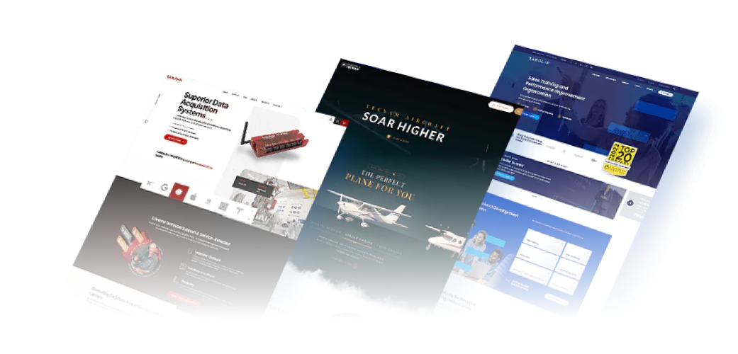
Modula makes automated storage systems, but its value was hard to convey and its content wasn’t cutting through a crowded market.
We shaped a content and campaign strategy that translates a complex product range into clear, educational material, targeted by industry and role across search, social and paid.
Over 18 months organic traffic grew 1,025% and conversions rose 37%.
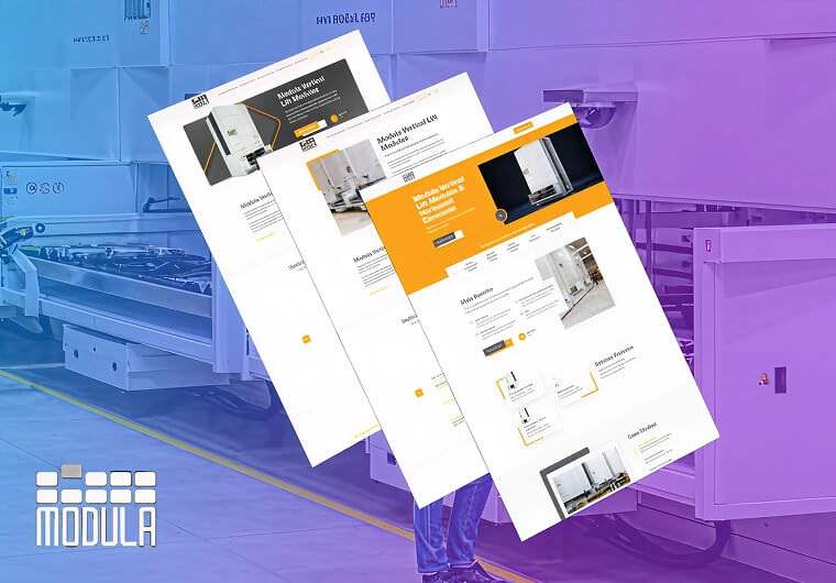
Sorellis is the new brand behind Decillion’s move into the data center land market, a high-trust space where it had no credibility.
We designed the identity from the ground up, with a logo suite built on intentional geometry, plus a graphic system, typography and iconography, all documented in a full brand book.
A cohesive identity now sets Sorellis apart in a competitive market.
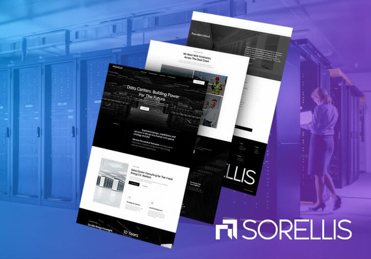
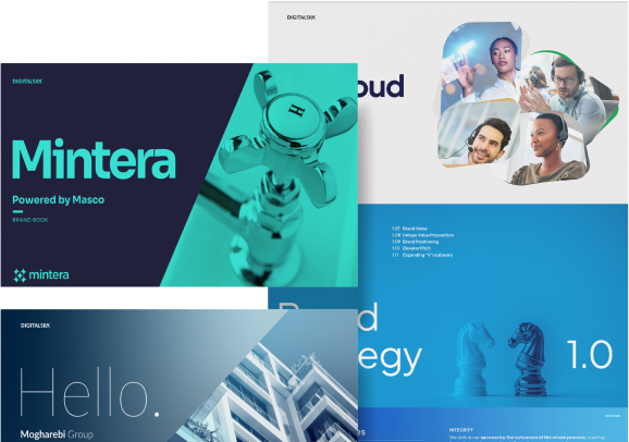



Decks, one-pagers, case study formats and proposal templates built on shared components that hold up when a non-designer edits them under time pressure.
Architecture, process and product illustration that explains the mechanism accurately — reusable across deck, site, proposal and event.
Master slides, locked layouts, populated chart components and defaults tight enough that the system doesn’t drift.
Finding what’s actually in circulation, cutting what isn’t used, and rebuilding the rest on one system with a source of truth people will actually use.
Booth systems designed for hall distance and close reading as separate jobs, extending to banners, leave-behinds and smaller items.
Explicit file and format guidance so the same system survives both, which is where most B2B collateral falls apart.
"*" indicates required fields
We plan and create graphic designs for B2B businesses in all industries.












We start by interviewing your stakeholders to understand the business, the project goals and the creative direction you’re after, then review your brand book and style guidelines so everything we produce stays consistent with what’s already out there.
Part of this phase means collecting what’s genuinely in circulation, not just the approved library. That includes the unofficial versions floating around on individual reps’ laptops, since those are often the templates people actually reach for day to day. That’s the real inventory we’re designing against.
With discovery complete, we define how design should be used across your sales and marketing materials to strengthen the visual identity you already have.
We gather key assets, logos, iconography and photography, and map out which templates and collateral types the business genuinely needs, based on what your teams are producing and sharing on a regular basis.
Our team builds out the actual templates and assets, one-pagers, decks, sell sheets and whatever else the strategy calls for.
Every template gets built against realistic worst-case content rather than placeholder text, the longest company name on your roster, the densest data table, a headline that runs four lines instead of one. If a template only works with tidy sample copy, it doesn’t survive contact with a real deal.
You review every design as it comes together, and nothing advances until you’ve signed off.
We refine typography, spacing, color and layout based on your feedback, checking each piece against the brand guidelines established earlier so consistency holds across the full set of materials.
Final files get delivered in the formats your team actually uses, along with usage guidance so templates get applied the same way across every rep and region.
Before we call it finished, we test the system for real. A salesperson gets it, along with an actual open opportunity and thirty minutes to build something with it. Whatever breaks in that window gets fixed before rollout, not after.
Mostly by making the template better rather than by enforcement. Reps go off-template when the official version doesn’t fit the opportunity or is slower to use than rebuilding.
Templates designed with realistic content ranges, locked layouts and populated chart components remove most of the reasons. Governance that adds friction gets routed around.
Often, through illustration and diagramming that shows the actual mechanism. That’s what we did for Modula, where wire and cable products are visually indistinguishable and photography alone couldn’t differentiate them — custom illustration gave the range a distinct visual language and made the story legible.
Very common, and fixable. Audit what’s genuinely in circulation, consolidate to the artifacts that actually get used, rebuild those on shared components, and put the current versions somewhere easier to reach than a desktop folder. The consolidation matters more than the redesign.
Treating distance and proximity as two different design problems. The upper area is read across the hall and needs one unmistakable message; the lower area is read once someone stops and can carry detail. Most booths design one thing and get neither.
Usually alongside, and after positioning. If the messaging is unresolved the collateral will be rebuilt when it settles — see B2B branding. If the story is right, sales enablement often returns faster than a site rebuild because it goes straight into live opportunities.
Yes, and we recommend building in whatever your team actually uses rather than what’s most comfortable to design in. A beautiful system in software your sales team doesn’t have is a system nobody runs.
Branding decides what the company stands for and what it looks like. This is the layer that applies it to the artifacts that carry a deal. If positioning is the open question, start with B2B branding instead.

"*" indicates required fields