


Before Planning A Financial Advisor Website Design, Consider These Insights
Before creating a financial advisor website design, it’s important to gather industry insights that could inform your design one way or another.
Here are a few interesting insights, based on some frequently asked questions, to take into consideration when planning your financial advisor website design:
What Social Media Platforms Should Financial Advisors Use?
Table of Contents
Before Planning A Financial Advisor Website Design, Consider These Insights
Before starting a financial advisor website design project, it’s important to gather industry insights that could inform your design one way or another.
Here are a few interesting insights, based on some frequently asked questions, to take into consideration when planning your financial advisor website design:
What Social Media Platforms Should Financial Advisors Use?
34% of Gen Z is learning financial advice from YouTube and Tiktok.
What does that mean for your brand? That you should consider modernizing both your financial advisor website design and your approach to social media platforms.
While you may never have considered platforms like YouTube, TikTok or Instagram before, these social media platforms can help you increase your reach and gain the attention of a new generation of people who are seeking financial advice.
How Many Americans Work With Financial Advisors?
In 2021, about 38% of Americans worked with a financial advisor. On the other side, 54% said they didn't have one at all.
For a lot of people, it comes down to debt or the belief that they can handle their finances on their own.
You can encourage site visitors to understand the importance of working with a financial advisor by creating a strategically-designed financial advisor website design that speaks to them.
Key points here include benefits-driven copy, clear messaging and educational content in different forms, from blogs to videos and social media posts.
Get More Weekly Website Insights & Inspiration
Our Financial Advisor Website Design Best Practices, Header-to-Footer
From attracting prospects using your website to ensuring potential clients can reach you through visible contact details, here are some of our best practices for financial advisor website design:
- Put your unique value proposition and main call to action front and center in the hero section of your homepage, above the fold. Visitors should immediately understand who you are and what you do and know exactly where to go next.
- Then, add a dedicated FAQ section to your financial advisor website. It serves multiple purposes. It educates your visitors, gives you a shot at ranking for featured snippets in search and shows transparency, which goes a long way toward building trust.
- Publish quality content like blog posts and downloadable resources such as whitepapers. This keeps visitors learning and it brings in organic traffic through SEO over time.
- Stay on top of SEO fundamentals. This means optimized meta descriptions, headers, title tags, image alt tags, all of it. These are the basics that help your financial advisor website show up higher in search results.
- 79% of people say they're more likely to come back to a site that's easy to use. So make sure yours works well on mobile and has straightforward navigation.
- Keep paragraphs short, with three lines max. People skim, and walls of text will push them away.
- Skip the jargon. Write like you're explaining things to someone who's smart but not a finance expert. If your copy needs a glossary, it's too complicated.
- Show proof that you're credible. Testimonials, media mentions and logos of brands you've worked with and put them on your site so visitors can see that real people and companies trust you.
- Use clear calls to action that guide visitors toward what matters, such as filling out a contact form and booking a call, whatever your main conversion point is.
- Add a sticky navigation bar so important links stay visible as people scroll through the page. It's a small thing that makes a big difference.
- Make your contact details easy to find. Ideally, put them in your sticky nav so they're always one click away no matter where someone is on your site.
Best Financial Advisor Website Design Examples To Get Inspired By [+ Our Notes]
Whether you lean toward sleek and modern or clean and simple, these ten financial advisor website designs are worth studying.
We've broken down what each one gets right, from navigation and messaging to CTAs and the small details that drive conversions.
1. Buckingham Strategic Wealth
Website: buckinghamstrategicwealth.com
Category: Financial Advisor

For an industry that may be seen as intimidating to some, Buckingham Strategic Wealth uses clear, benefits-driven messaging to explain to the visitor both how they can help, and the value of their services.
Their CTAs are valuable and engaging. Site visitors who click on “Meet our people,” “Our strategy” and “Get to know us” know exactly where these buttons will take them.
On top of that, the video content and animations throughout the site add visual interest without getting in the way.
There's a lot to look at and explore, keeping the visitors interested at all times.
If you want to see financial advisor website design done well, this is it.
2. Stash Wealth
Website: stashwealth.com
Category: Financial Advisor

Stash Wealth has a personality and they're not shy about it.
Their brand voice is distinct, and they lean into it hard, which is exactly what helps them stand apart in a crowded space.
The messaging is bold. The typefaces are bold. And the imagery they use is diverse and energizing, perfectly matching their line: "We treat you like a millionaire before you are one."
Who's going to say no to that?
3. Betterment
Website: betterment.com
Category: Financial Advisor

Betterment leads with what you actually get, and that is easy, optimized, personalized solutions.
The copy is benefits-first, which keeps things clear and focused.
Typography stays consistent and readable across the homepage and the color palette adds visual interest in the right places without overwhelming anything.
The whole page flows well, it looks good and it's easy to take in.
4. Define Financial
Website: definefinancial.com
Category: Financial Advisor
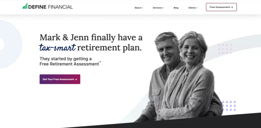
Four pages. Fast load times. And that's it. And it works.
Define Financial keeps things simple and the result is a smooth, intuitive experience.
When a site loads quickly and doesn't make you hunt for what you need, it reflects well on the brand behind it.
They also put their awards and recognitions front and center. In finance, credibility matters more than almost anything and showing off that kind of proof is an easy win for attracting new clients.
5. HCR Wealth Advisors
Website: hcrwealth.com
Category: Financial Advisor

The tagline says it all: "A true partner in life and wealth."
HCR is more than a financial planner. In fact, they're tying themselves to your whole lifestyle.
That kind of messaging is especially useful when you're in a space where everyone offers roughly the same thing and it gives people a reason to choose you.
The site structure helps too. Clean layout, clear navigation and a design that moves you through the page without friction.
6. Avantax
Website: avantax.com
Category: Financial Advisor
Avantax isn't trying to wow you with clever copy. The messaging is simple, direct and gets to the point.
Where they really deliver is the user experience. The sticky navigation stays on screen wherever you scroll, so finding information never feels like a chore.
This site is a good reminder that not every brand needs flash.
Sometimes easy navigation, helpful content and a structure that meets people where they are is enough to get them to convert.
7. Bragg Financial
Website: braggfinancial.com
Category: Financial Advisor

Bragg Financial clearly understands that trust isn't optional in this industry but rather the starting point.
As you move through the site, the messaging builds the picture they want you to see, knowledgeable, service-driven and dependable.
You only get a few seconds to make a good first impression online. Bragg uses that window well by featuring client testimonials and industry awards early on.
It's a simple tactic, but it works, because people trust people and seeing that proof upfront goes a long way.
8. Riviera Capital
Website: rivieracp.com
Category: Financial Advisor

Riviera Capital knows exactly who they're talking to and that is the professional consumer.
Their messaging is tailored and that specificity is what makes it land.
Having a clear target audience baked into your brand strategy is one of those foundational things that makes everything else on the site work better.
The design itself is clean and polished, which keeps the content from feeling heavy even when there's a lot to take in.
The visuals and the words pull in the same direction and that consistency is what sets Riviera apart from the pack.
9. Good Financial Cents
Website: goodfinancialcents.com
Category: Financial Advisor
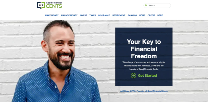
If their website’s an accurate reflection of their brand, Good Financial Cents is all about action. Their site is stacked with thoughtful Calls to Action that effectively guide the user journey.
While some CTAs aid in decision-making rather than conversion, other direct CTAs propel the user to start a relationship with the brand. The effective use of all of these helps guide the user through milestones, ultimately optimizing Good Financial Cents’ conversion funnel.
Good Financial Cents is a strong example of how financial advisor website design can drive real results.
Schedule A Consultation With Our Financial Advisor Website Design Company
As an end-to-end financial advisor website design company, Digital Silk offers a free consultation & custom proposals for custom website design projects.
Simply fill out the Request a Quote form, tell us about your goals and our experts will provide you with actionable insights and cost estimates.
Or, call us at (800) 206-9413 to start the conversation.