

Clearinghouse CDFI
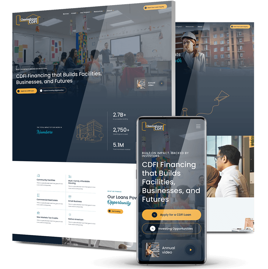
A Website That Screens Borrowers Before The Lending Team Does
-
Clearinghouse CDFI’s website led with the mission and buried the criteria, so inquiries arrived from people who would never qualify for a commercial, real-estate-backed loan.
-
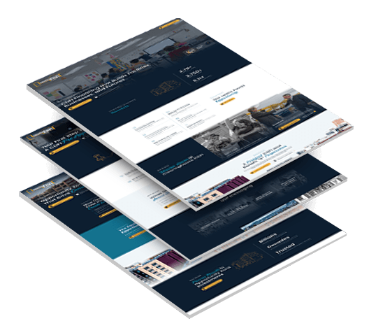
Digital Silk ran the full strategy sequence before any design — discovery, digital strategy, site architecture, then messaging and conversion funnel — and split the site into separate borrower and investor paths.
-
Through a full replatform, organic traffic rose 87% from the pre-launch low to the launch month, Domain Rating held at 45-47, and every qualified inquiry now lands in Salesforce already attributed.

The Challenge
The Mission Led, The Criteria Were Buried
Visitors understood immediately that Clearinghouse helps people. What they never reached was the qualifying detail: that the loans are commercial, that they must be secured against real estate, that there is a seven-figure minimum, and that single-family mortgages and startup lending are out of scope entirely.
A Screening Burden On The Wrong Team
The gap between “they help people” and the actual lending criteria produced a steady stream of inquiries the team could not fund. Disqualifying them fell to the people who should have been underwriting deals.
One Website Serving Two Unrelated Audiences
Clearinghouse was not serving a single audience. It was serving borrowers and investors — two groups with almost nothing in common in what they need to see, what proof convinces them, or what a conversion even looks like.
The Funded Pipeline Wasn’t Coming From Borrowers
Discovery surfaced that the loans that actually closed were not arriving from direct borrowers. They came from brokers: intermediaries who already understand when a deal isn’t bankable and know exactly where to place it. The site had been designed as though the borrower was the only reader.
An Institutional Voice Mid-Shift
Clearinghouse was partway through a deliberate change in how it talks about itself. The site still spoke in the older register, and the new one had to keep the mission, the impact and the borrower stories intact while saying it differently — against a launch date tied to a fixed annual-meeting deadline.

The Solution
-
One Question Behind Every Planning Decision
Every architectural and content choice was tested against the same question: who is actually on this page, and are they fundable? That question, not the homepage, was the starting point for the build. -
Two Front Doors Instead Of One Website
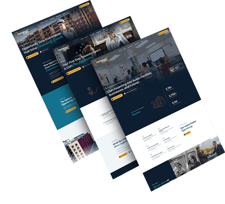
Rather than designing one site for a mixed audience, we designed two paths that split at the navigation itself. The borrower path and the investor path each carry their own funnel, their own proof set and their own definition of a qualified lead. Brokers — deal-literate and impatient with marketing language — became a primary design consideration on the borrower side rather than an afterthought. -
Positioning That Keeps The Mission And Adds The Criteria
The messaging moved with the architecture. The site now leads with proven capital that strengthens communities, a line doing two jobs at once: it keeps the mission and the impact intact, and it repositions Clearinghouse as what it actually is — a lender with a track record and real criteria, not a charity. -
Qualification As The Experience, Not The Fine Print
On the borrower side, we promoted “How the pre-application works” and “Who qualifies” to the top of the journey, built a lending-focus grid mapping every project type financed, stated the exclusions plainly on the page, organized borrower stories by project type so a prospect recognizes their own deal, and added quick-reference flyers and a borrower FAQ to absorb the questions that used to arrive by phone. -
Proof Built For Investors
On the investor side, the numbers carry the page: portfolio performance and financial metrics over time, named bank partners, a CEO message, investor reports, and an interactive impact map plotting the funded portfolio geographically.
The Results
-
87%increase in monthly organic traffic
-
125ranking organic keywords, 23 of them in the top three positions
-
47Domain Rating, up from 45 before, meaning no authority loss during the replatform
1,000+ Completed Projects
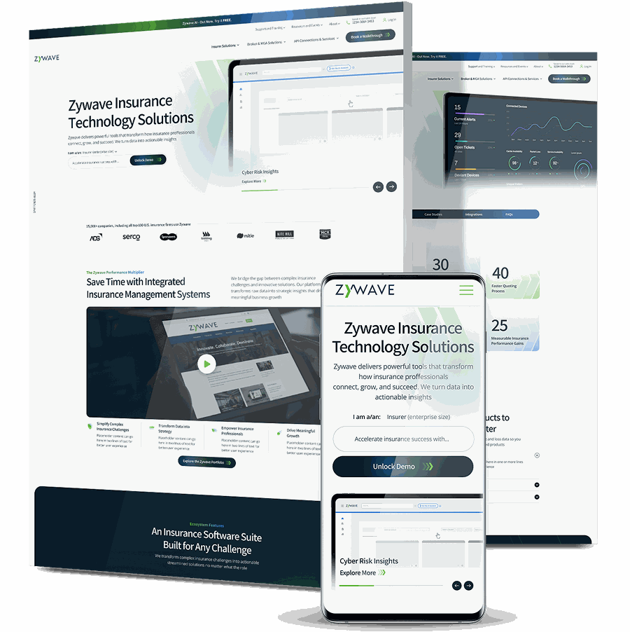
Zywave’s Conversion-Driven Demand Engine
Zywave is a Milwaukee-based insurtech serving insurance brokers, carriers and service providers. The site ranked well for branded and niche industry terms, but visitors rarely progressed into leads.
We led a phased, CRO-driven redesign that shifted the architecture from product-first to audience-first, rebuilt audience hubs and product pages around buyer intent, and replaced resource PDFs with structured, crawlable web content.
Within five months of launch, monthly lead form submissions rose about 135%, converting users per month grew over 115% and homepage click engagement climbed roughly 60%.
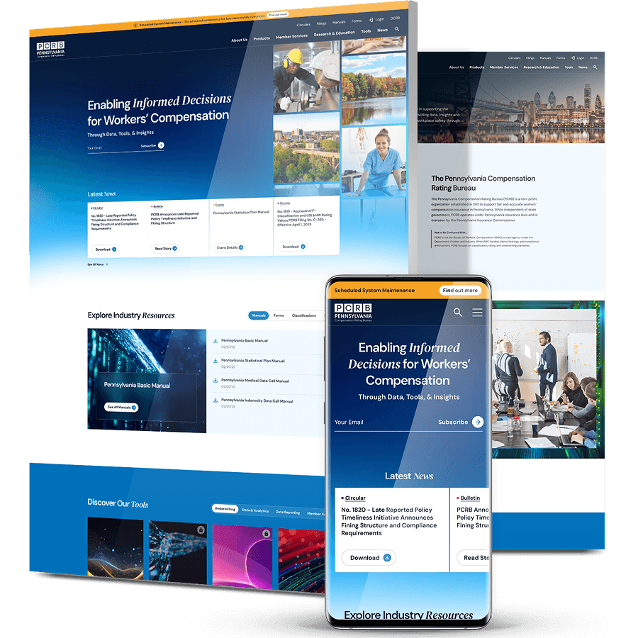
PCRB’s 6,000-Document Digital Library
The Pennsylvania Compensation Rating Bureau sets workers’ compensation standards for the state, maintaining the rate filings, manuals and circulars that insurers depend on. Members had to download and manually search large PDFs to find a single rule or rate.
We rebuilt the information architecture around PCRB’s actual user types — carriers, employers, agents and actuaries — and migrated 6,000+ regulatory documents into a centralized, searchable Digital Library.
The platform ended member reliance on static PDFs and gave the PCRB team full CMS control over document publishing and content governance, with no developer dependency.
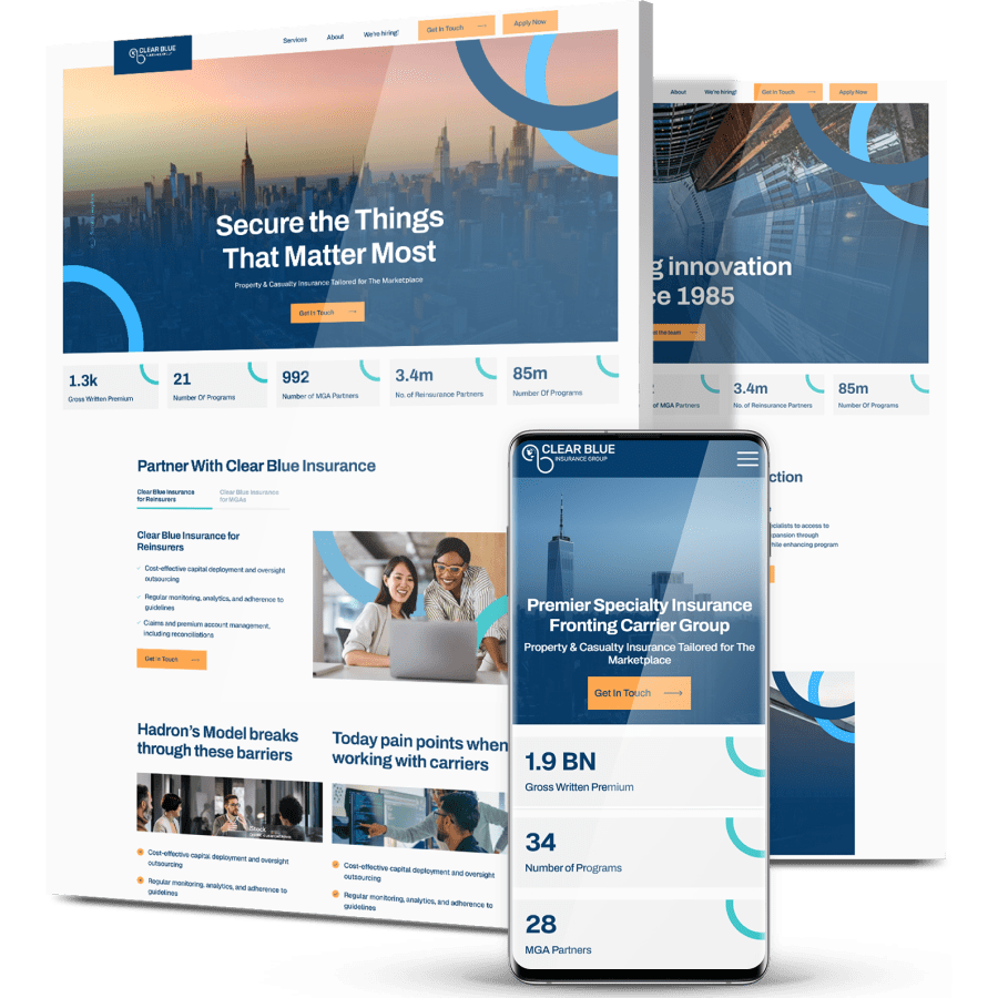
Clear Blue Insurance Group’s Brand & Website Rebuild
Clear Blue provides insurance solutions for carriers and managing general agents, but its fragmented branding and dated website didn’t reflect that standing, and content across programs ran inconsistent and overly technical.
We delivered a full rebrand and custom website build: brand strategy and messaging hierarchy, a refreshed logo and color system documented in a brand book, and a conversion-focused site with simplified navigation across programs and partnerships.
The launch gave Clear Blue a cohesive identity and a platform built to scale, and Digital Silk remains its Tier 1 partner for hosting and optimization.
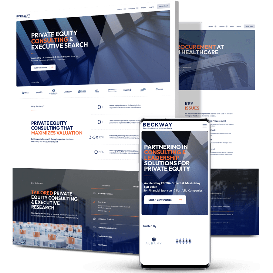
Beckway’s B2B Platform For A Private Equity Audience
Beckway is a private equity operations firm whose previous site had no calls to action and no guided user journey, with long, dense pages burying the information a sophisticated B2B buyer needed.
We restructured the content into six core landing pages, added a sticky mega menu and modular sections for services, bios and case studies, and applied Beckway’s existing brand guidelines across a scalable design system.
The case study storytelling module drew strong enough early reception that the client expanded it after launch, and Beckway signed on for ongoing hosting and maintenance.
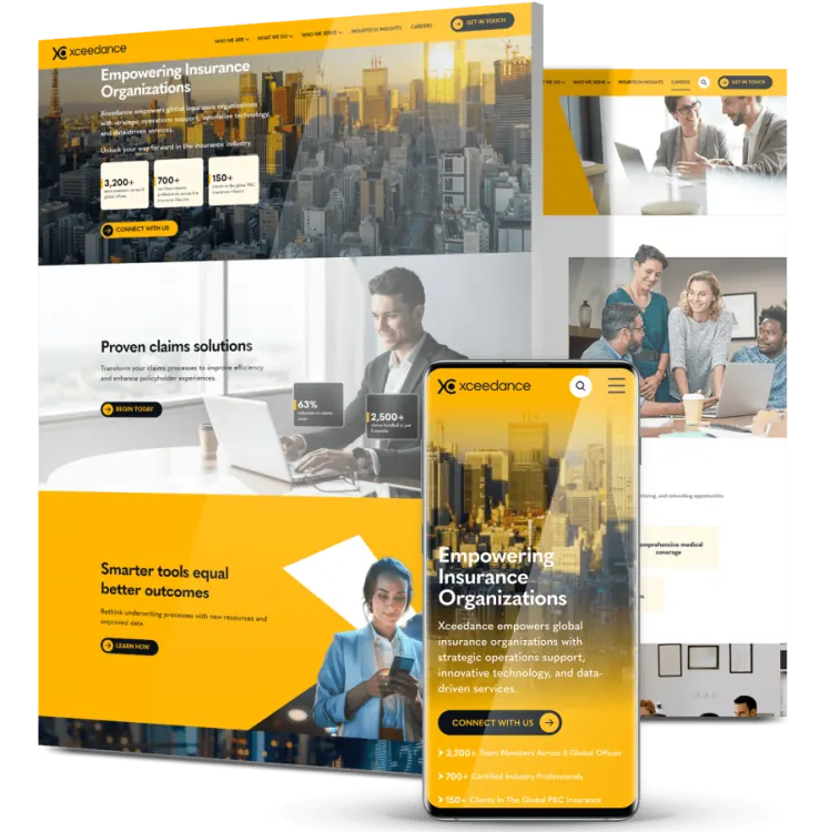
Xceedance’s Scalable Insurance Technology Platform
Xceedance serves insurance clients with automated, paperwork-free processes, but its outdated website failed to communicate that position — and its recruitment team needed a steady flow of quality applications.
We rebuilt the site on custom modules the team can mix and match as the business grows, designed a high-conversion campaign landing page with complex scroll animations, integrated Salesforce, and created a careers page built around company culture.
The work delivered more than 200,000 first-time visitors within six months, with landing page conversion rates reaching 11%.
Bethpage Federal Credit Union’s User Acquisition Surge
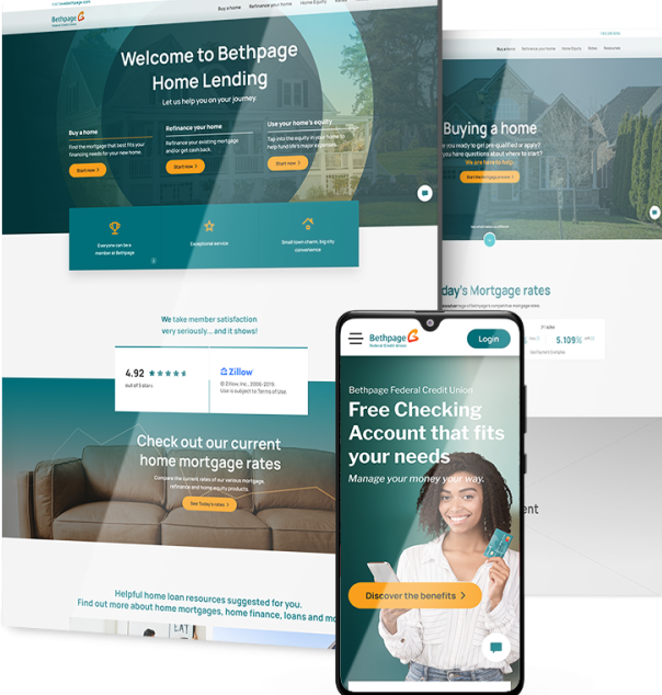
BFCU is a leading New York credit union that needed to connect with a wide-ranging audience, millennial business owners in particular, while bridging the gap between its traditional in-bank experience and a full digital presence.
We refined the brand positioning strategy to align messaging with each target segment, then revamped the website with a streamlined online banking interface, interactive financial calculators and integrated appointment scheduling, laying the foundations for a virtual branch.
Separate conversion funnels for personal and business banking helped drive a 4,161% surge in new users and a 1,303% increase in sessions.
Digitizing Your Business Growth
Start a conversation with us
"*" indicates required fields