

INTEGRITY ELECTRICAL SERVICES
A Website Built To Pre-Qualify A $100M Contractor In Under A Minute
-
Integrity Electrical Services runs $100M a year of commercial electrical work across Greater Phoenix, but general contractors it had worked with for years were still telling the team to their face that they thought of the company as a small shop doing small jobs.
-
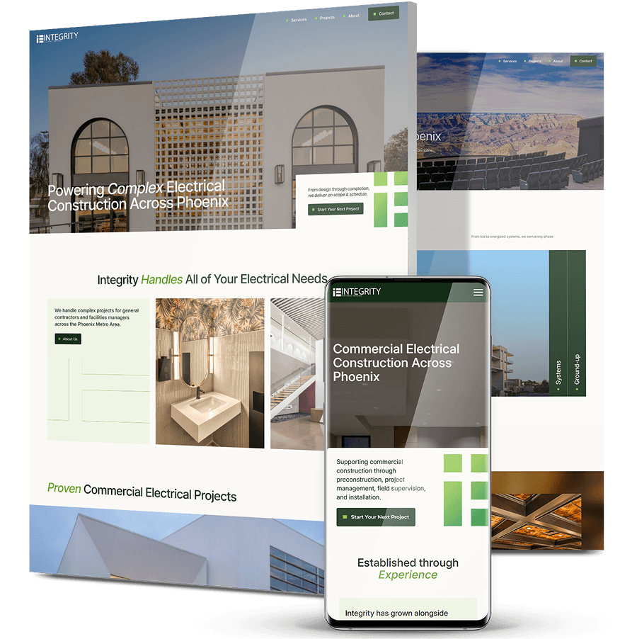
Digital Silk started with digital strategy rather than design, mapping who actually selects an electrical subcontractor — estimators, project executives, facilities managers — and gave the site one job: let a general contractor pre-qualify Integrity in under a minute.
-
The rebuilt site is portfolio-first, with structured project pages carrying square footage, delivery method and environment, separate contact paths for new projects and service calls, and GA4 standing up analytics where there had been none.


The Challenge
A $100M Contractor That Read As A Small Shop
General contractors Integrity had worked with for years were saying it directly: they still thought of the company as a small operation doing small jobs. When a sub’s perceived size is what determines whether it gets invited to bid, that perception costs real work.
The Lowest Digital Visibility In Its Competitive Set
Discovery found Integrity’s real-world scale matched its largest competitors, while its digital visibility was the weakest in the group. The gap between what the company delivered and what a prospect could find was doing the damage.
The Most Persuasive Asset Had No Structure
The portfolio was the strongest thing Integrity owned — and the least usable. Projects carried no scale indicators, no delivery method, no industry classification. An estimator had no way to judge whether Integrity had done work like theirs before.
The Repeat-Work Department Was Hidden
Service & Maintenance drives recurring revenue and long-term client relationships, but it was effectively buried on the site, with no route in for a facilities manager who needed support rather than a new build.
Nothing Was Being Measured
There was no analytics on the site at all. No sessions, no inquiry tracking, no baseline — which meant no way to know what was working or to prove what changed.

The Solution
-
Strategy First: Mapping The Buying Committee
We built the strategy around the three people who decide: estimators judging fit and risk, project executives assessing capacity, and facilities managers looking for ongoing support. Each needs different proof, and the site was structured to serve all three rather than averaging them into one generic audience. -
A Portfolio-First Architecture
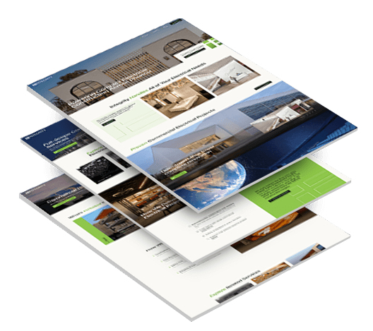
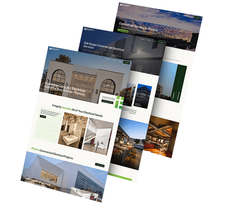
We rebuilt the site around the projects, because that is the argument. The projects library filters by industry and delivery method, so a prospect can find work comparable to their own in a few clicks rather than scrolling a flat gallery. -
Project Pages As Structured Proof
Each project now carries the metadata an estimator actually evaluates: square footage, delivery method, industry and jobsite environment. Luke Field at 2.4 million square feet, a 101,000+ square foot medical office at One Scottsdale, 120,000 square feet of Penske cold storage, LEGO’s 40,000 square foot Tempe office. Scale stated as fact rather than claimed. -
Positioning Built On Schedule, Not Price
We positioned Integrity as the sub that protects the schedule rather than the cheapest bid: built for complex projects, proven in the field, supported for the full lifecycle. The homepage opens on the line that matters most to a general contractor — trusted by general contractors and developers across Phoenix. -
Intent-Based Contact Paths
Integrity’s estimating team can’t quote blind, so we replaced the generic quote form with two clearly separated routes: Start Your Next Project for new construction, and Request Service for maintenance and emergency support. -
Service & Maintenance Promoted Into The Navigation
We pulled the department that drives repeat work up into the main navigation alongside the four construction services, giving lifecycle support its own visible route for the first time.
The Results
-
Implemented Trackingof metrics like impressions, CTR, and bounce rate using GA4
-
5 Scoped Services, 11 Industriesthat are clearly presented, where competitive visibility had been the lowest in its set
-
A Filterable Projects Librarycarrying square footage, delivery method, industry and environment on every project
-
Two Separate Contact Pathsrouting new construction and service requests to the teams that handle them
1,000+ Completed Projects
Puma Energy’s B2B And B2C Split
Puma Energy’s website didn’t match its brand, wasn’t built for mobile, and served both B2B and B2C audiences through a single undifferentiated journey.
We overhauled the design with considered typography, vibrant color and custom graphics, built separate user journey flows for each audience segment, made the layout fully responsive, and ran keyword research and optimization across the site.
Three weeks after launch, website visitors were up 27%, direct traffic up 32.1% and user engagement up 63%.
POWR2’s Market-Education Redesign
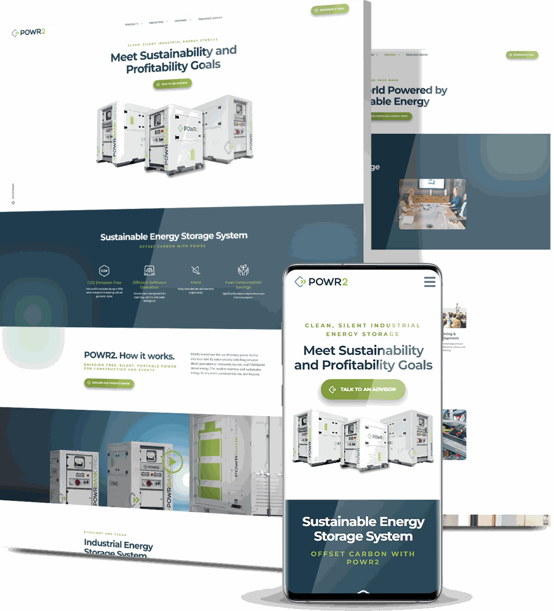
POWR2 makes portable energy storage systems in a segment still establishing itself in the US, which meant its website had to educate the market before it could sell to it — and the existing platform converted poorly.
We delivered a custom redesign built around large visuals and streamlined navigation, improved mobile responsiveness and load speed, added an interactive 3D model, and mapped clear conversion paths anchored by “Talk To An Advisor” CTAs.
Within six months, organic traffic rose 80% and total traffic rose 77%.
Juise Mobility’s Category Repositioning
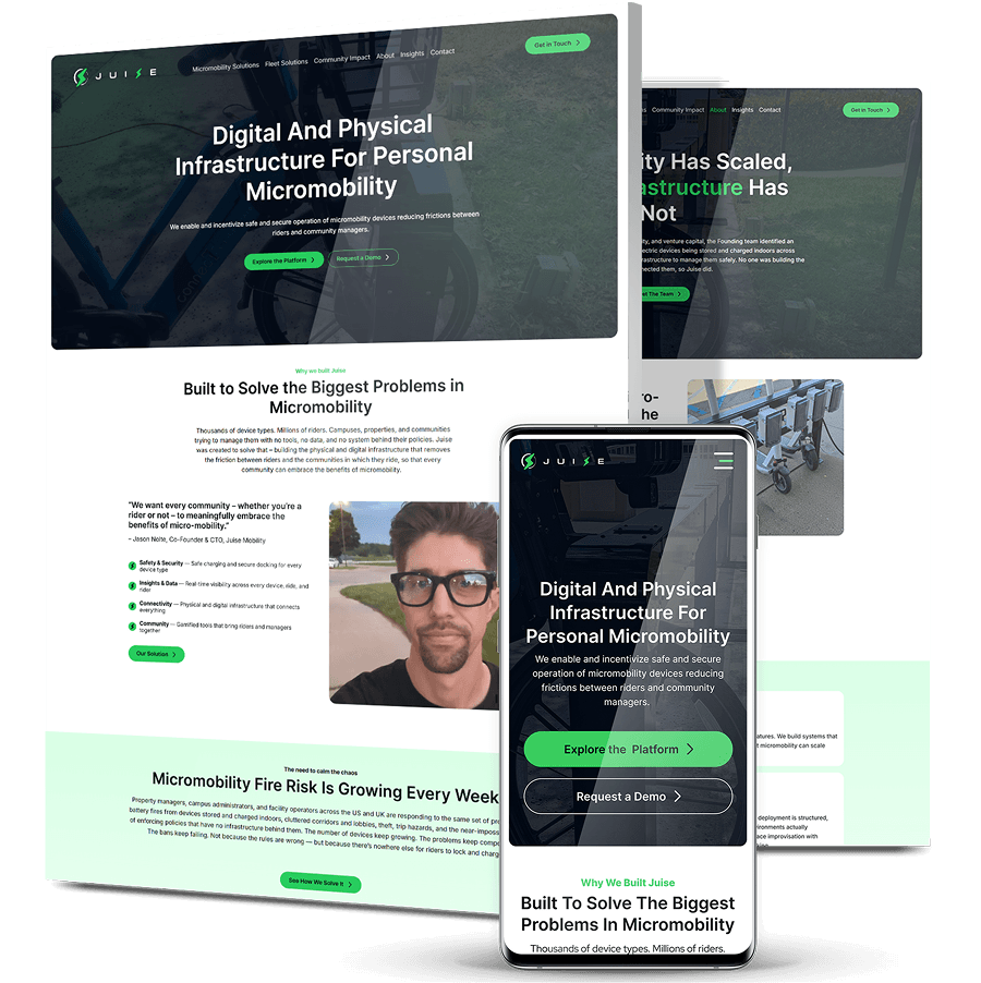
Juise Mobility builds connected charging and docking infrastructure for e-bikes and e-scooters, but its website read like a hardware catalog and addressed a campus risk manager and a venture investor in exactly the same voice.
We mapped the competitive messaging landscape, found every rival crowded into the same “safety and order” territory, and rebuilt the site around a larger argument: millions of privately owned devices with nowhere safe to charge is an infrastructure problem.
The new site splits into dedicated Micromobility Solutions, Fleet Solutions and Community Impact paths, backed by third-party evidence and calls to action matched to intent.
Sorellis’ Brand Launch From The Ground Up
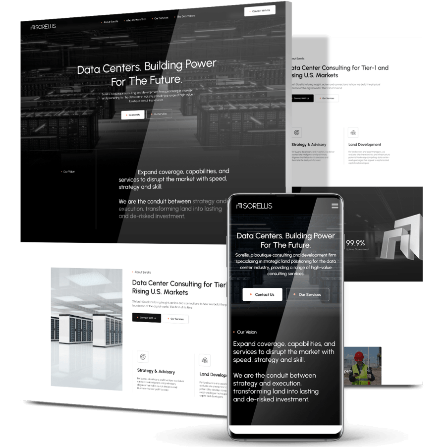
Sorellis is the brand we created for Decillion, a female-led data center advisory firm entering a high-trust market with no name, no logo, no messaging and no room for a weak first impression.
We built the brand as a connected system: the Sorellis name itself, a full logo suite, messaging architecture covering mission through UVP, personas for both sides of the deal chain, and a brand book documenting color, typography, photography and layout.
Sorellis entered the market with a high-trust landing page that guides visitors by stakeholder type and routes contact inquiries accordingly, communicating credibility and differentiation from day one.
Unison Infrastructure’s Brand Architecture
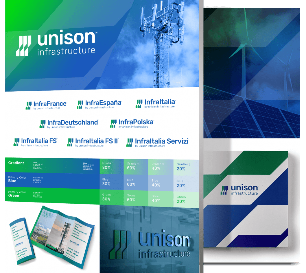
Unison Infrastructure operates across the US and Europe but lacked a cohesive identity, and multiple European subsidiaries with no unified brand architecture diluted the message across every channel.
We built a brand strategy aligning identity with business goals, established a brand architecture consistent across the main site and all subsidiaries, created a new logo connecting parent to subsidiaries, and developed an employer branding deck to support hiring.
Over six months, engagement rate rose 11.76%, engagement time rose 146.91% and session duration rose 26.29%.
Insights Delivered To Your Inbox
"*" indicates required fields
Digitizing Your Business Growth
Start a conversation with us
"*" indicates required fields