

Modernizing A Website For Enterprise IoE Buyers
-
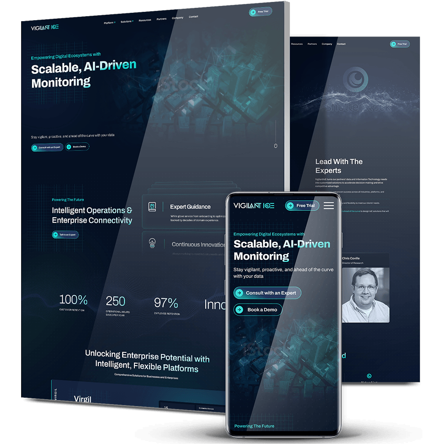
VigilantIoE builds monitoring, predictive analytics and managed operations platforms for healthcare, government, critical infrastructure and industrial enterprises. The existing site didn’t do the brand any justice.
-
Our experts delivered a modern web design with a new site structure, navigation and messaging to showcase VigilantIoE’s platforms for technical decision-makers.
-
The redesigned site gives engineers and procurement teams a clearer path from research to a next step, like requesting a demo.

The Challenge
VigilantIoE’s site struggled to showcase its value in more ways than one.
Unclear Product Messaging
VigilantIoE’s site didn’t clearly explain what its platforms, like Virgil, actually do or who they serve across healthcare, government, critical infrastructure and industrial environments.
Complex Navigation & Hierarchy
Buyers researching monitoring, interoperability or managed operations services had no direct path to the right solution.
Weak User Journeys For Technical Buyers
Engineers and technical decision-makers had limited ways to move from research to a next step, like requesting a demo or contacting sales.

The Solution
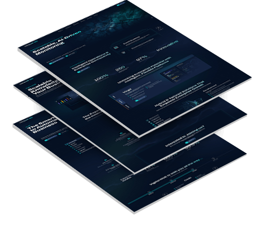
around its core platforms and the buyers who evaluate them.
-
Clearer Messaging For Its Core Value
We rewrote messaging to explain what Virgil does and how it unifies IT, OT and IoT environments with real-time visibility and proactive intelligence.
This gives technical buyers a direct answer to what the platform is and why it matters. -
Simplified Navigation & Visual Hierarchy
We restructured the navigation so buyers can move directly to the solution they need, whether that’s system monitoring, predictive insights or managed operations.
Each path leads toward a clear next step instead of a dead end. -
Messaging That Leads With Operational Outcomes
We changed messaging to lead with operational resilience, scalability and measurable business outcomes instead of generic technology language.
This speaks directly to what enterprise buyers in healthcare, government and critical infrastructure are evaluating for.
The Results
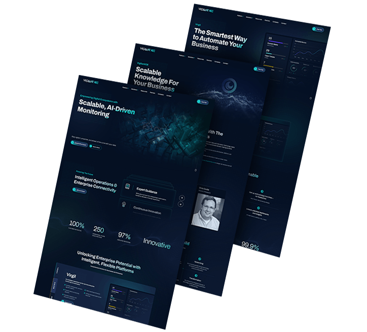
a clearer reason to trust and engage with the platform:
-
Clarified Unique Value PropositionWhat Virgil does and who it serves
-
Simplified NavigationDirect routes to monitoring, insights
and managed operations -
Outcome-Focused MessagingOperational performance, scalability
and measurable impact -
A Straightforward Next StepGuides engineers and procurement teams
toward a demo request
Mastrex: High-End Visuals Without The Slow Load
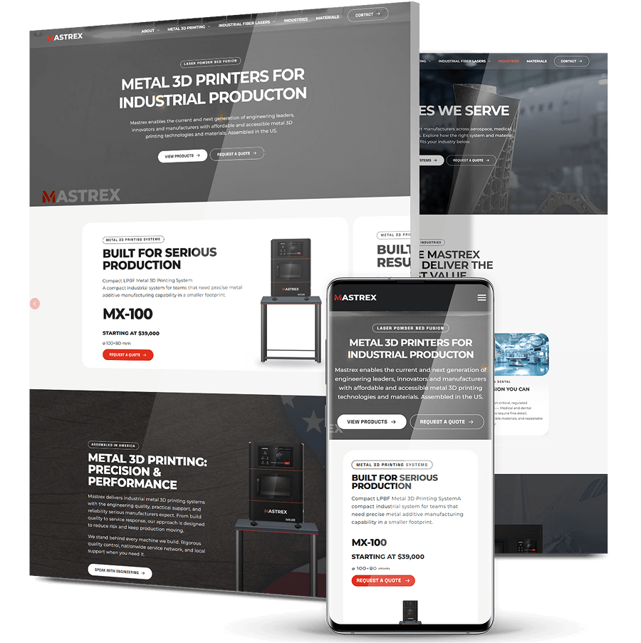
Mastrex’s owner wanted every machine to look its best online, but the high-resolution images his team uploaded were far too heavy for a website. Pages stalled, product views failed to load, and potential buyers left before they saw a single system.
We rebuilt the site from the ground up and kept the high-end look while fixing the files behind it. Product images are now resized for the web and served in modern formats.
The industrial metal 3D printers and fiber lasers still look sharp, and pages load quickly enough for buyers to explore the full range.
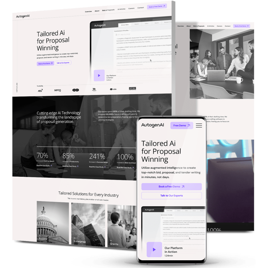
AutogenAI – Enterprise AI, with a site built for lead growth
AutogenAI builds AI-powered bid and proposal writing tools, with real U.S. traction but a basic site that couldn’t carry the authority enterprise buyers expect.
Our experts delivered a modern, SEO-ready platform with scalable architecture, U.S.-focused messaging and HubSpot lead capture.
Credibility comes through from the first screen, the kind that lifted sessions 648% and engagement 299% in three months.
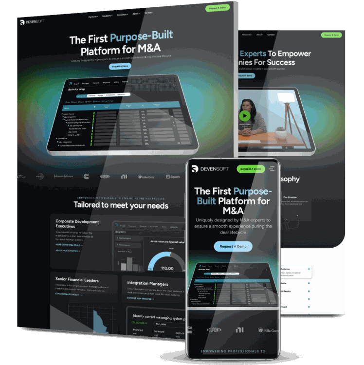
Devensoft – M&A technology, with active users up 45.9%
Devensoft’s advanced M&A platform was not being represented effectively by its existing website.
We replaced the original site with a fully redesigned experience built around clearer product communication, intuitive navigation and more direct conversion paths.
Over the following year, the number of active users climbed 45.9% to 6,200, and engaged sessions increased by almost 47%.
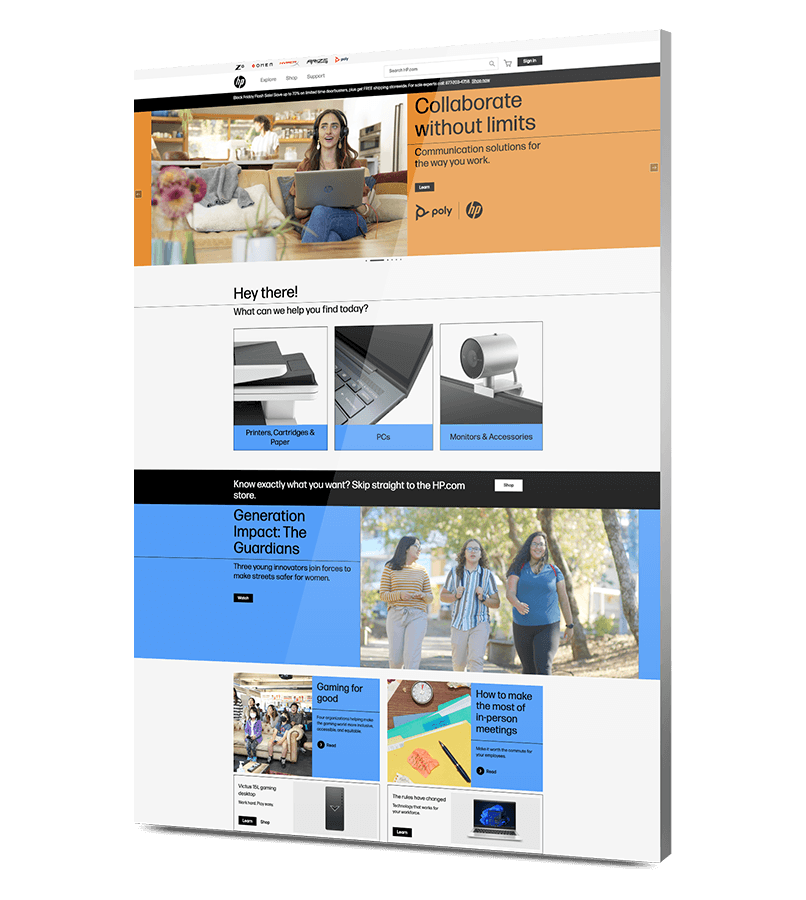
HP – Global loyalty administration, made simple
Running a worldwide rewards program across stores and ecommerce called for one system that could protect customer data and stay consistent in every market.
Our experts developed a custom loyalty portal where customers upload receipts, track points and redeem rewards.
Membership feels effortless from the first upload, drawing 40,000 members in six months and bringing more than half back to buy again.
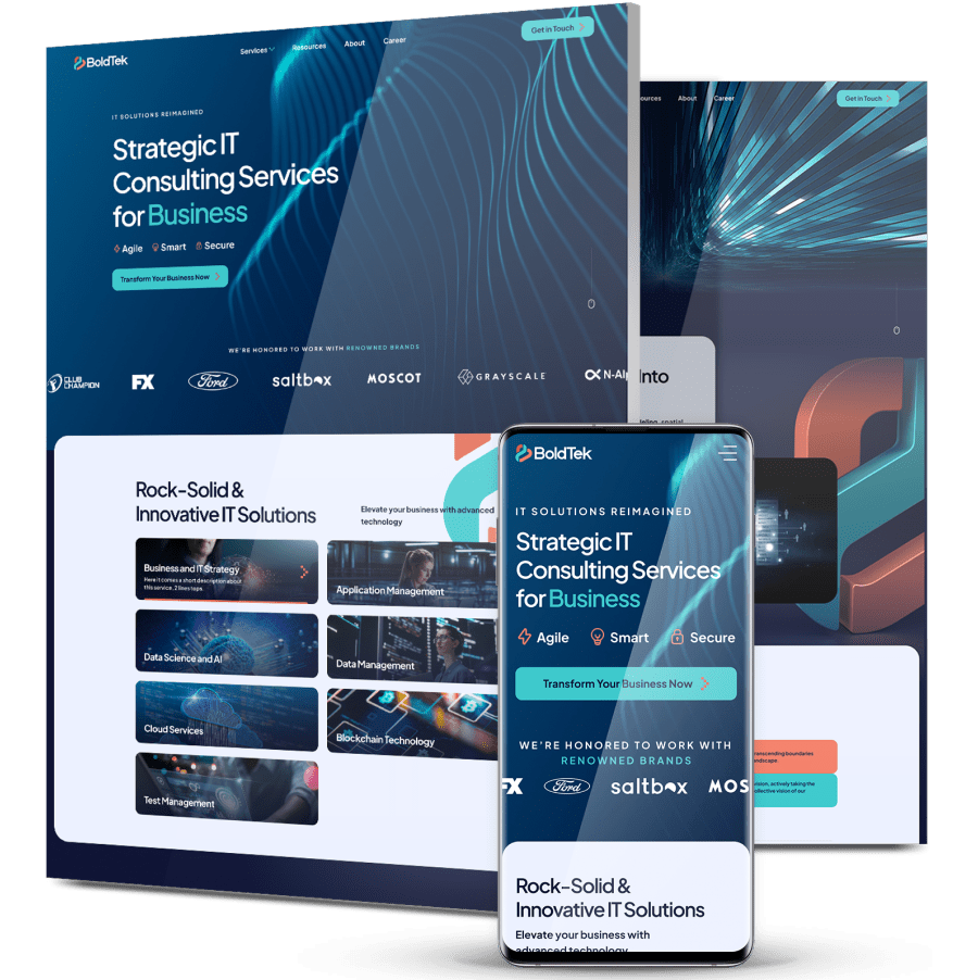
BoldTek – A full redesign, with a CMS the team controls
BoldTek was working from an outdated site that brought in few leads, resisted updates and did little for the brand.
Our experts developed a fresh brand strategy with a new logo and brand book, then a full redesign with clear conversion funnels and a flexible CMS the team can manage.
The experience feels modern and sure of itself now, lifting total users nearly 468% and engaged sessions 359% over the year.
Digitizing Your Business Growth
Start A Conversation With Us
"*" indicates required fields