

Making Industrial Metal 3D Printing Easy To Understand And Buy
-
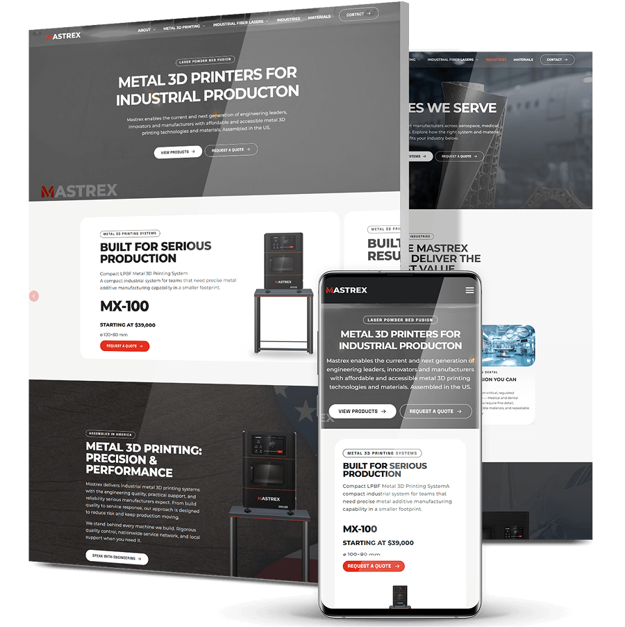
Mastrex sells industrial metal 3D printers and fiber laser systems to manufacturers in aerospace, defense, medical and dental, energy and research. Its old site was so weighed down by oversized image files that pages struggled to load, and visitors left before they could look at the products.
-
Digital Silk rebuilt the site from the ground up. We chose and adapted each module to fit how Mastrex buyers research equipment, then rewrote the product copy so it reads clearly to the people who have to understand, compare and justify a purchase.
-
The new site takes visitors through products, industries and materials in a clear order, then on to a consultation and a quote. The product imagery is optimized for the web, so it stays sharp without slowing pages down.


The Challenge
A Site Too Slow To Show The Products
The owner wanted the products to look their best, so the team uploaded very high-resolution images. Those files were far too large for the web. Pages struggled to load, product views stalled, and visitors gave up before they saw what Mastrex sells.
Visitors And Leads Lost To Load Times
Every visitor who left a page before it loaded was a potential customer Mastrex never got to talk to. These machines are a serious capital purchase, and buyers research them carefully, so losing people at the first page was expensive.
A Highly Technical Offer That Easily Overwhelms
Build volumes, laser configurations, alloys and industry tolerances matter enormously to these buyers. But if all that detail arrives at once, it buries the decision-making. The site needed to feel as capable as the machines while keeping the next step obvious.
No Clear Route Through The Range
Mastrex sells two product lines across several industries and materials. Buyers had no simple way to work out which system fit their application before they had to ask for help.

The Solution
-
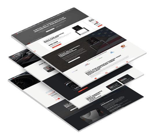
Modules Chosen Around The Buying Journey
Our team reviewed every module in the build library against how Mastrex wanted its information to come across, then picked the ones that suited each job best. That process produced the homepage product slider, the industries module and the dedicated materials module. -
A Clear Path From Product To Quote
We organized the site around the order buyers actually work through. First the systems, then the industries they serve, then the materials they print. From there, a four-step consultation process leads to a quote, so every page points toward the next step. -
Imagery That Stays Sharp Without Slowing The Site
We kept the high-end look the owner wanted while fixing what had made the old site slow. Product images are resized for the web and served in modern formats, so the machines still look sharp and pages load quickly. -
Product Copy Written For Technical Buyers
We rewrote the copy for each system so the details buyers compare, such as build volume, laser setup and intended use, are easy to find without wading through long passages. -
Industry And Material Detail Without The Overload
Seven industry areas and the core metals each have their own concise explanation. A buyer in medical, defense or tooling can see quickly whether Mastrex fits their work, and the deeper technical detail is still there when they need it.
The Results
-
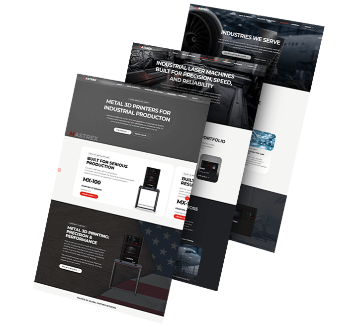
Web-Optimized Imagerythat keeps every system looking sharp without the oversized files that made the old site so slow
-
9 Systemsacross metal 3D printing and industrial lasers, each presented so buyers can compare them side by side
-
7 Industriesfrom aerospace and defense to academia, each showing where Mastrex systems fit
-
A 4-Step Path To A Quotetaking buyers from sharing their application to a clear recommendation and price
1,000+ Completed Projects
VigilantIoE: Explaining What The Platform Actually Does
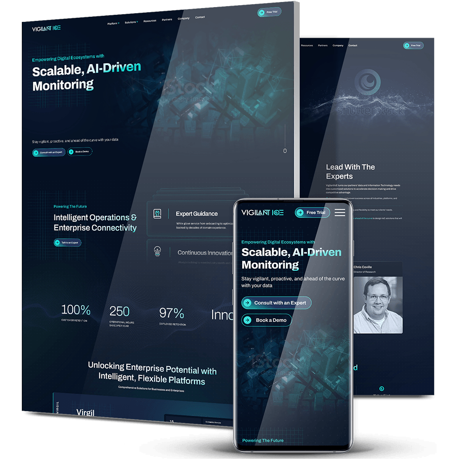
VigilantIoE builds monitoring, predictive analytics and managed operations platforms for healthcare, government, critical infrastructure and industrial companies. Its old website never clearly said what its flagship platform, Virgil, did.
We rewrote the messaging to explain how Virgil brings IT, OT and IoT environments together. We rebuilt the navigation so buyers could go straight to monitoring, insights or managed operations, and led the copy with operational outcomes instead of technical jargon.
Engineers and procurement teams now have a clear path from their first research to requesting a demo.
AGS Devices: Keeping 16,000 Products Up To Date Automatically
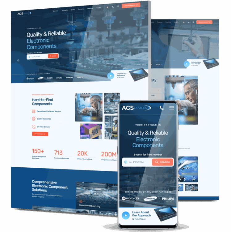
Keeping more than 16,000 electronic component listings current used to be a manual chore every day for AGS Devices, a family-owned distributor serving aerospace and healthcare manufacturers.
We connected the website to the company’s ePDS system so inventory now updates automatically each day. We added search and filtering to make individual parts easy to find, and redesigned the site around a clear B2B buying journey.
From August 2023 to August 2024, user engagement rose 90.56%, bounce rate dropped 28.5% and user growth reached 14.3%.
Pak-Tec: Product Navigation For Industrial Buyers
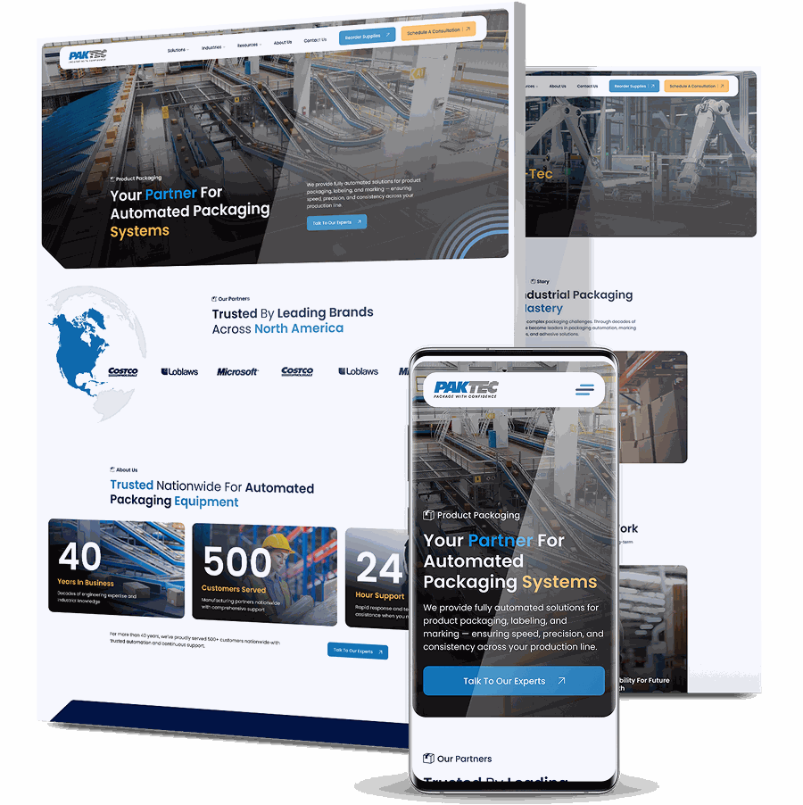
Pak-Tec sells packaging automation equipment, including case coding, inkjet printing, stretch wrapping and end-of-line systems. Its old website made that range hard to explore, and buyers lost interest before they reached an inquiry.
We planned the site around its product categories, gave each product vertical its own conversion path, designed it mobile-first for buyers working on the floor, and built it on a custom WordPress platform with redirects and technical SEO in place.
After launch, average engagement time per active user rose 22.6%.
KPI Solutions: Showing The Full Scale Of A 1971 Company
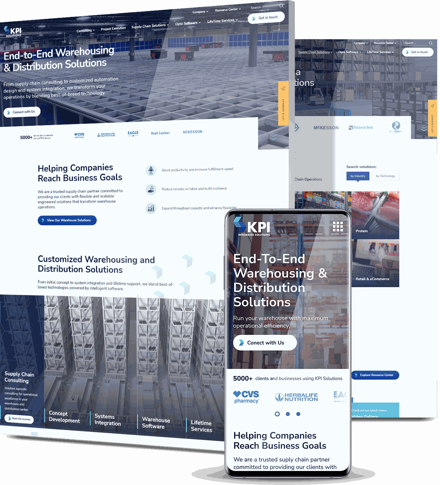
KPI Solutions had grown over decades and through several acquisitions into a complete supply chain partner, covering consulting, engineering, systems integration and software. Its website still described a much smaller company.
We rebuilt the site around four capability pillars and put proof on the homepage: more than 800 client success stories and a logo wall that includes CVS Health and McKesson. We also added a Resource Center designed to capture enterprise buyers while they are still researching.
After launch, sessions rose 53.8%, engaged sessions rose 73.4% and user engagement rose 33.6%.
Modula: Bringing In Fewer, Better Leads
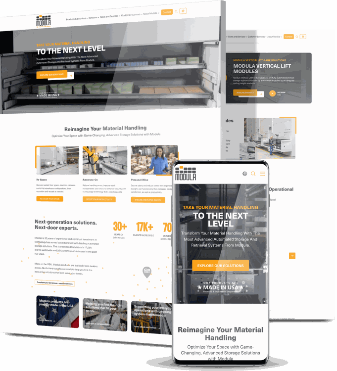
Modula makes automated storage and retrieval systems. It was attracting plenty of leads, but too few were the right fit, and its complex product range wasn’t converting the people who did arrive.
We researched the competitive U.S. market and chose keywords based on search intent. We then targeted buyers by industry, job title and state across Google, Bing and social, backed by educational content and retargeting for the most qualified prospects.
Over 18 months, organic traffic grew 1,025%, conversions rose 37% and Domain Rating rose 31 points.
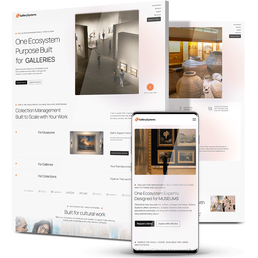
Gallery Systems: Three Websites Combined Into One
Gallery Systems’ software is used by institutions including the Getty and MoMA, but its brand lines were spread across three separate websites. In one year, organic keywords dropped from 2,720 to 305.
We combined Gallery Systems, ArtSystems and ArtBinder into one domain so that content and search authority build up in a single place. We designed it in an editorial style taken from the museums it serves, rather than the usual enterprise software look.
The new site directs museums, galleries, private collections and artist estates to the right product, and builds search authority through one shared content library.
Digitizing Your Business Growth
Start a conversation with us
"*" indicates required fields