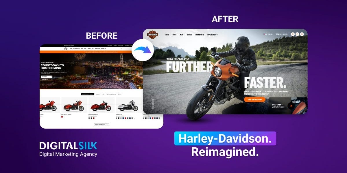
Harley-Davidson is a world-renowned motorcycle brand. Go to any corner of the world, and they’re recognized. They have a loyal following.
Harley represents the wind in your face, the open road beneath your tires and the unmistakable rush of exhilaration. A brand like that needs a website that mirrors that energy.
Digital Silk’s case study explores how motion-driven design principles can enhance a templated homepage into an engaging digital experience that embodies a motorcycle brand’s spirit.
Below is a comparison between the existing design and our educational homepage redesign concept:
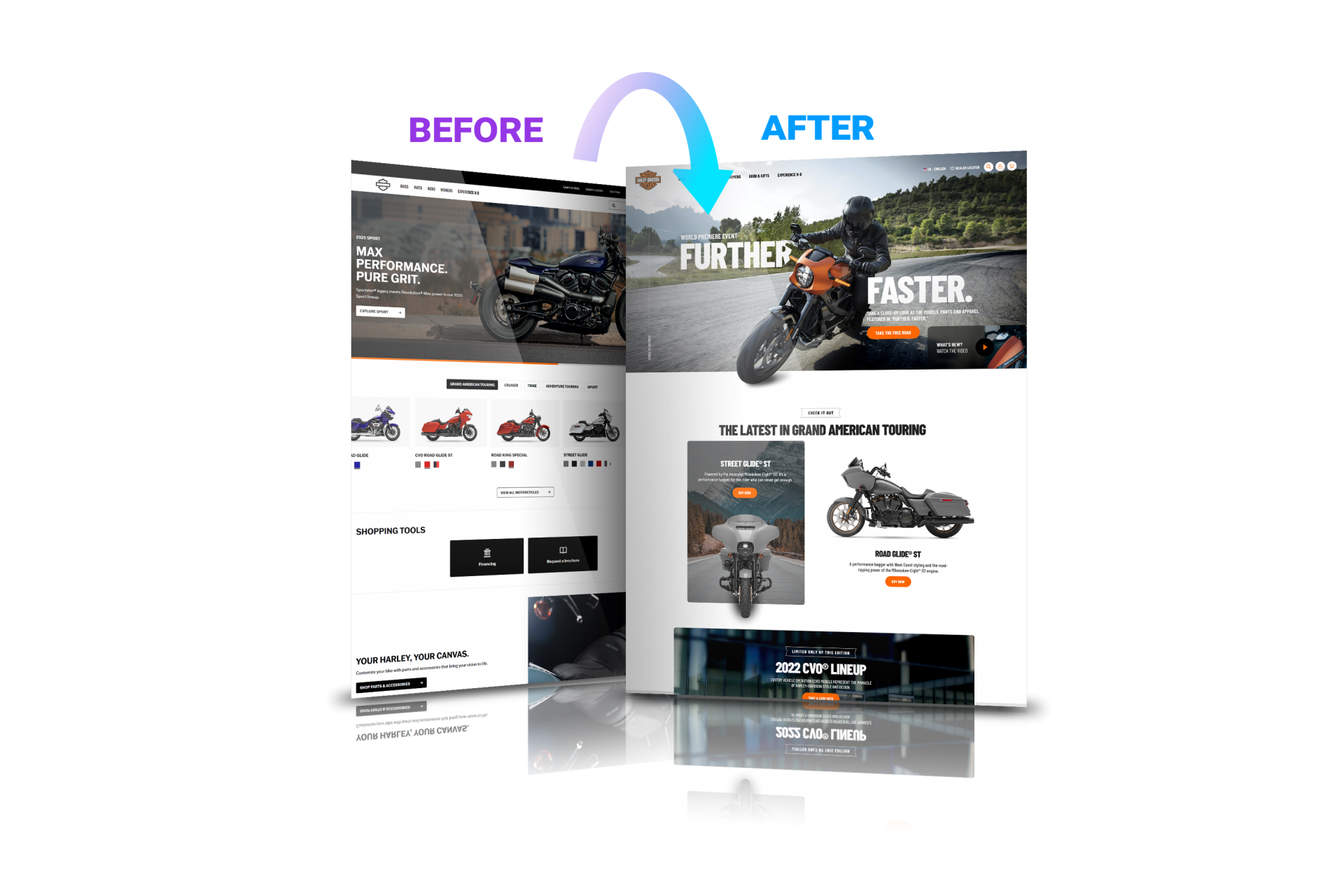
Our redesign illustrates principles that may better reflect the spirit of freedom and motion associated with motorcycle brands.
1. Breathing Life Into A Motion-Driven Brand
Harley-Davidson’s current homepage is clean and functional, but it may feel more templated than emotional.
Its structure is flexible, which can be a strength, but it may not fully reflect the lifestyle and movement the brand represents.
Our redesign uses perspective, landscape and animation to create a sense of exhilaration, not just navigation.
We believe successful websites must be:
- Fun
- Engaging
- Informative
While Harley-Davidson offers rich information, Digital Silk’s exploration looks at how interactivity and visual movement could enhance engagement.
The Design Challenge
The homepage feels static and boxed in.
Its predictability is good for usability, but it may lack emotional spark.
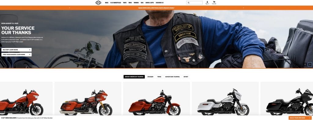
This layout might suit a product catalog, but it may not accurately reflect the lifestyle that Harley-Davidson embodies.
Riders expect a sense of energy and movement.
Our Approach
We explored ways to bring the ride to the screen:
- Bikes glide forward as users scroll
- Mountains rise in the background
- Nature and rolling landscapes animate, adding depth and energy
- Out-of-the-box visuals break free from rigid layouts
- Parallax effects powered by CSS transforms ensure smooth performance across devices
We used perspective, motion and natural elements to simulate the thrill of the motorcycle, the outdoors and enjoying the wind.
Best Practice
Motion should look good but also reflect what your brand is about.
For Harley-Davidson, that means using motion to simulate acceleration, flow and freedom.
If your website is about selling an experience, ask yourself: does it truly mirror your brand and your products and services? Does it make people feel something real?
Let’s explore how to turn static experiences into engaging journeys.
2. A Hero Section That Truly Captivates
A hero section on your homepage should set the tone for the entire website.
Visuals play a vital role in shaping a brand’s online presence and should communicate not just the products, but also the lifestyle that comes with them.
For a brand like Harley-Davidson, it could communicate power, freedom and the start of an exhilarating ride.
The Design Challenge
The current visuals are bold and high-quality, yet may not fully capture the thrill of the ride.
In fact, the hero section looks more like a gallery than an invitation to adventure.

Our Approach
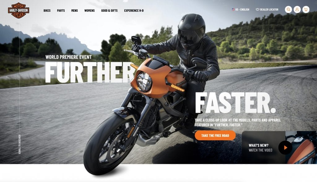
We created a cinematic hero section that tells a story:
- Tires break frame boundaries, simulating forward momentum
- Reflections, angles and blur add visual cues of motion
- A click-to-play video showcases what’s new with Harley-Davidson
- Bold call-to-actions and overlays increase urgency and focus
- The hero section offers a thrilling experience, rather than being just a static block
Best Practice
The hero section should be just that: the star of your page.
Your visuals should tell a story and resonate with the lifestyle of your audience.
Make it cinematic, emotional and immersive to captivate visitors from the get-go, sparking their interest in your brand.
3. Cleaner, More Intuitive Navigation
Navigation should never be an afterthought. Since Harley-Davidson embodies freedom and exploration, a well-designed navigation bar is crucial.
Good navigation should offer control and ease, just like handling a motorcycle.
In our reimagined experience, we created breathing room, fluid movement and simplified options that empower users to explore with ease, evoking the same sense of control and exhilaration that comes with navigating the open road.
The Design Challenge
The existing navigation on Harley’s site is functional, but includes too many menu items.
Dropdowns may feel heavy and overwhelm the user.

Our Approach
We simplified the navigation and trimmed it down from eight primary menu items to six key categories.

Our concept introduces:
- Better spacing
- Cleaner logic
- Fluid movement
- A mobile-first experience that works in the garage or on the go
Best Practice
Streamlined navigation improves engagement, especially on mobile.
A mobile-first approach ensures navigation works perfectly regardless of the device and screen size.
4. Typography That Matches The Ride
Typography is one of the most overlooked yet powerful elements of any website.
It plays a central role in establishing tone and guiding the user’s eye.
The Design Challenge
For Harley-Davidson, typography must do more than deliver content. It needs to reflect their spirit and identity.
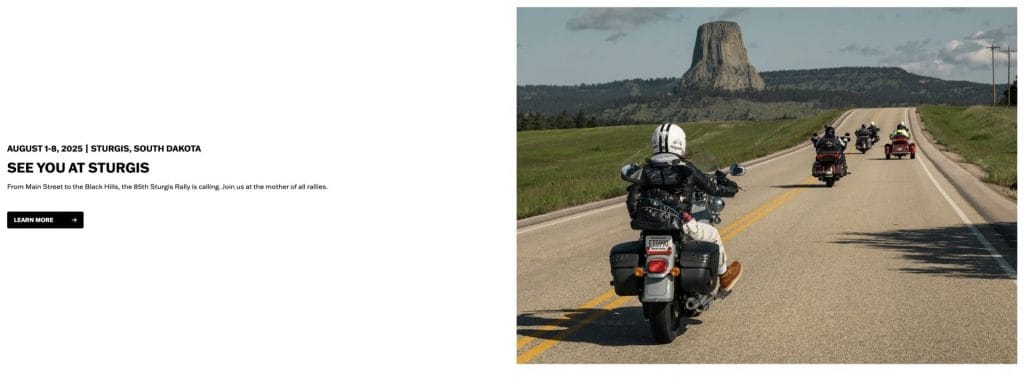
Harley’s type is bold, yes, but it may not quite reflect Harley’s grit, power, precision and movement.
Our Approach
We modernized the typeface, while keeping its boldness:
- Four font weights establish visual hierarchy
- Sleek letterforms mirror Harley’s design DNA — durable, engineered, iconic
- Type guides the eye and reinforces Harley’s identity and emotion
Here, typography feels like part of the ride.
Best Practice
Typography should do more than inform. It needs to speak your brand’s essence.
Use it to guide users, reinforce tone and energize static layouts while also ensuring accessibility for all riders.
5. A Visual Flow That Reflects The Ride
Motorcycling is dynamic, but static grids can feel repetitive.
Our redesign breaks out of that box by using rolling visuals, layered imagery and natural flow that mirrors the experience of winding through mountain roads.
The Design Challenge
Product blocks on Harley’s current site don’t evolve as users scroll. Motorcycles appear too confined:

Our Approach
We introduced movement through:
- Asymmetrical grids and layered images for visual rhythm
- Scroll-triggered animations
- Rolling visuals and motion-inspired structure that mimic the unpredictability of a ride
- Visuals with landscapes, rolling hills and natural textures
- A progressive flow from discovery to consideration to purchase
The new flow keeps visitors engaged and creates a natural progression from discovery to consideration to purchase, guiding motorcycle enthusiasts through their decision-making process.
Best Practice
Visual flow should mimic a journey.
Present content in a varied, engaging and dynamic way. You want to guide your users through your site effectively, so make sure that every scroll feels purposeful.
6. Microinteractions That Elevate The Experience
It’s often the smallest touches that create the biggest impressions.
When users scroll, click or hover, they should feel the site responding, like a bike beneath their fingertips.
Our redesign integrates these purposeful details in a way that reflects Harley’s energy.
The Design Challenge
Without motion feedback, interactions may feel passive, creating emotional distance between the user and brand.
Our Approach
We added purposeful microinteractions:
- Hover effects on buttons, cards and images to enhance interactivity
- Scroll-triggered transitions
- Subtle shadows and shifts for depth
- Micro animations that reinforce Harley’s premium vibe
Best Practice
Microinteractions help you better connect with your audience. They elevate the site’s usability and give it personality.
But more importantly, they signal responsiveness and show your brand is paying attention.
Use microinteractions to reward curiosity and build trust.
7. Enhancing The Customer Journey From Discovery To Purchase
Buying a Harley isn’t about specifics; it’s about the story.
The Design Challenge
The current site doesn’t seem to treat each page as part of a cohesive, emotional journey.
Our Approach
We reimagined the customer journey as a digital ride:
- Simplified flow from discovery to model comparison to dealer engagement
- Interactive tools to help users visualize custom bikes
- Strategically timed call-to-actions embedded along the scroll path
- A unified, emotion-driven UX that feels like a salesperson, not a product list
- Every click moves users closer to conversion, while reinforcing brand loyalty
Interactive elements help users visualize their custom bike and simulate the journey.
Best Practice
Design the entire user journey, not just individual pages.
Every page, scroll and interaction should contribute to a larger narrative that builds trust and momentum from the first visit to final conversion.
The Bottom Line: Your Website Is Your Salesperson
Your website is your salesperson.
People should come to your site and experience your brand; they should feel its essence just by looking at your site.
Digital Silk’s educational redesign of Harley-Davidson’s homepage explores how:
- Design can move with the user
- Pages can evoke emotion
- Layouts can turn clicks into action
This case study is not a critique but an exercise in visual storytelling and user experience.
Educational Takeaways
Digital Silk’s educational case study demonstrates key principles for motorcycle brand websites:
- Movement and Energy: Use animations and a flowing design to reflect your brand’s experience.
- Emotional Connection: Every detail matters. That’s why you need to choose fonts that resonate with your brand’s character and incorporate microinteractions that add a personal touch. This helps visitors feel connected to the lifestyle your brand represents, making their experience much more enjoyable.
- User Journey Design: Aim to create a seamless experience. Guide visitors as they move from discovering your brand to considering a purchase and finally taking action. Think of it as crafting a journey that invites them to become a part of the motorcycle community.
- Performance and Accessibility: Motion is great, but it should enhance usability, not complicate it. Make sure that your site works smoothly across all devices, so everyone can enjoy the experience without any hitches.
Our educational approach highlights how a thoughtful design can breathe life into a website, transforming it from a static page into an engaging digital platform. This not only honors the legacy of your brand but also fosters stronger connections with users.
Disclaimer
-
This case study represents an unsolicited redesign of an existing website that Digital Silk did not create and does not own. It is presented for educational and illustrative purposes only. Digital Silk is not affiliated with, endorsed by or connected to Harley-Davidson. All trademarks, logos and brand elements shown remain the property of their respective owners. This work aims solely to demonstrate best-in-class design principles to enhance user experience and is not intended to infringe upon any intellectual property rights.
"*" indicates required fields


