-
Websites now influence decisions before sales does: High-performing tech websites reduce uncertainty, build trust early and support evaluation long before a sales conversation begins.
-
Clarity and performance matter more than visual trends: The strongest tech websites prioritize clear messaging, predictable structure and fast performance over novelty or design experimentation.
-
Modern tech websites function as business systems: Leading brands design their websites to support growth, trust and scale and not as campaigns or one-off redesigns.
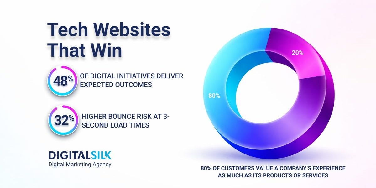
80% of customers say the experience a company provides is as important as its products or services, making digital experience a core part of how value is judged.
At the same time, Google’s performance research consistently shows that as page load time increases from one to three seconds, the probability of bounce rises by 32%.
These two forces, risk and performance, now shape how technology companies are evaluated online.
In 2026, the best tech websites are no longer judged by how they look, but by how decisively they remove doubt, signal maturity and accelerate decisions.
This analysis is written for founders, CMOs, CTOs and growth leaders at technology companies where digital experience directly affects trust, sales velocity and scale.
The examples below illustrate what that looks like in practice and what executive teams can learn from them. These websites were selected based on scale, category leadership and how clearly they support real decision-making across different buyer types.
8 Tech Websites That Define Competitive Advantage In 2026
The following technology websites stand out for their user-friendliness, building trust and support in critical business decisions.
Each example demonstrates a strategic principle that executive teams can apply when evaluating or evolving their own digital presence.
1. Bang & Olufsen
- Company type: Consumer products
- Website: bang-olufsen.com
- Design by: Digital Silk
Bang & Olufsen has established itself as a sound technology expert with a reputation that precedes it.
Bang & Olufsen leads with short, punchy messaging to communicate both offering and intent.
On the homepage, lines like “You dream it. We craft it.” and “Worth the wait.” set tone and expectation before the visitor even thinks about specs.
A standout video in the hero section instantly grabs attention and pulls the visitor in towards conversion.
The clean, white navigation bar is kept simple and sticky, following the user as they scroll.
As you browse the products, the experience stays very visual.
On hover, product images switch to real-life photos, such as people wearing the headphones, speakers placed in living spaces, helping visitors picture how the products fit into everyday life.
This keeps the focus on feel and lifestyle, not specs.
The layout stays clean and spacious, with plenty of white space and a calm color palette.
Navigation is simple and sticky, and CTAs like “Shop” or “Design yours” are easy to find without feeling pushy.
Subtle motion and video add depth, but never distract from the products themselves.
The site immerses the user in the brand and provides exactly what their target audience is looking for — a cool, modern website experience that matches the brand.
Why It Matters For Leaders
Bang & Olufsen shows how a clear, confident website can support premium pricing.
By focusing on feel, context and simplicity, the site encourages visitors to value the product and not compare it line by line on price.
2. Apple
- Company type: Consumer technology
- Website: apple.com
Apple’s website is built around clarity and control.
Product pages open with very little copy, often just a short phrase or headline and rely on strong visuals to do the heavy lifting.
The structure is predictable, which helps users move quickly without thinking about where to go next.
As you scroll, content unfolds in a deliberate order.
Visuals zoom in on details like materials, camera quality or form factor, while short blocks of copy explain benefits without overwhelming the reader.
The buying flow is tightly integrated, with comparisons, financing options and setup guidance placed exactly where questions tend to arise.
Nothing feels rushed or cluttered.
Apple’s sans serif font is part of their brand by now, recognized by millions across the globe. Typography switches between black and white to maintain readability depending on the background, but the typeface remains consistent throughout.
The experience is fast, familiar and calm, even though the products themselves are complex.
Key Insights For Leaders
Apple shows how a website can reduce friction at scale.
When information is clear and well-paced, users move forward with confidence instead of hesitation.
3. Stripe
- Company type: Financial technology platform
- Website: stripe.com
Stripe’s website is clear about what it offers from the first screen: financial infrastructure that helps businesses grow.
The homepage balances simplicity with depth, guiding different audiences, like startups, enterprises and developers toward relevant paths without forcing a single journey.
As users explore, Stripe blends product marketing with real proof.
Dashboard visuals, flow diagrams and short explanations show how the platform works in practice.
Documentation, API references and guides are easy to reach and treated as part of the core experience, not an afterthought.
The site feels practical and direct.
It answers common questions early and makes it easy for users to keep moving without waiting for a sales conversation.
The Strategic Takeaway
Stripe demonstrates how a website can shorten sales cycles.
When answers, documentation and trust signals are easy to find, users can evaluate and commit faster.
4. ServiceNow
- Company type: Enterprise software platform
- Website: servicenow.com
ServiceNow’s website reflects the reality of enterprise buying.
Instead of pushing visitors into a long product list, it organizes content by industry, role and business outcome. This helps different stakeholders quickly find what’s relevant to them.
Pages focus on what the platform enables: automation, efficiency and scale before getting into product detail.
Visuals often show workflows and systems rather than interfaces, reinforcing the idea of an enterprise-wide solution.
Despite the size of the platform, the experience feels structured and steady.
Information is layered carefully, so visitors aren’t overwhelmed all at once.
The Broader Lesson:
ServiceNow shows that large platforms don’t have to feel confusing.
Clear structure and outcome-led navigation help complexity feel manageable.
Before moving further, a pattern is already emerging.
The strongest sites so far don’t try to impress with novelty.
They focus on clarity, predictable structure and making complex value easier to understand.
5. Adobe
Adobe’s website handles a wide and complex product ecosystem, including Creative Cloud, Experience Cloud, Document Cloud and AI tools without overwhelming visitors.
From the homepage, users are guided by what they want to do rather than by product names, which makes the entry point feel intuitive even for first-time visitors.
Product pages rely heavily on real interface visuals, short videos and simple explanations that show how tools are used in practice.
Creative products are presented through outcomes and workflows, while enterprise solutions are framed around business goals like personalization, analytics and customer experience.
Navigation stays consistent across sections, helping users move between creative, marketing and enterprise content without feeling like they’ve entered a different site.
AI messaging is present but controlled, positioned as a capability that supports existing workflows rather than a separate or abstract concept.
Visitors can explore at their own pace without feeling pushed or lost.
Why It Matters For Leaders
Adobe shows how large product portfolios can stay approachable.
Clear organization, familiar language and real product visuals help users understand value quickly, even when the ecosystem is broad and complex.
6. Salesforce
- Company type: Enterprise software
- Website: salesforce.com
Salesforce’s website is built around guidance.
From the homepage, visitors are directed by role, industry or goal, rather than pushed into a long list of products.
This helps first-time and returning users quickly understand where to start.
Visuals focus on real product screens and customer use cases, supported by plain-language explanations of what each cloud or solution does.
CTAs are frequent but not aggressive, often inviting users to learn, watch or explore before committing.
Despite the size of the Salesforce ecosystem, the experience feels conversational and supportive, reducing the sense of overwhelm that often comes with enterprise software.
The Broader Lesson
Salesforce demonstrates the value of guided discovery.
When a website anticipates confusion and leads users step by step, large product portfolios become easier to evaluate and adopt.
7. Snowflake
- Company type: Cloud data platform
- Website: snowflake.com
Snowflake’s website focuses on outcomes first.
Rather than leading with technical architecture, it talks about speed, scale and the ability to use data more effectively across the business.
Complex ideas are broken down with diagrams, short explanations and modular sections that are easy to scan.
Navigation supports different audiences, whether the visitor is technical or more business-focused.
The overall experience feels clean and structured, reinforcing trust while making a complex category easier to understand.
What Executives Should Notice
Snowflake shows how technical platforms can speak clearly to business leaders.
When complexity is translated into outcomes, confidence follows.
8. OpenNode
- Company type: Financial services / payments infrastructure
- Website: opennode.com
OpenNode’s website is direct and transparent.
From the start, it highlights how the platform works, how payments are settled and what businesses can expect in terms of security and reliability.
Custom visuals and diagrams explain flows and processes instead of relying on generic imagery.
Real product screenshots show dashboards, invoices and reporting, helping users understand the system quickly.
Trust elements, such as security, compliance and platform status are visible early and integrated naturally into the experience.
The Implication
OpenNode shows that in high-risk categories, trust has to be obvious.
Clear explanations and visibility reduce hesitation and speed up decisions.
What These Examples Reveal About Web Strategy In 2026
Across very different categories of tech websites, including consumer products, enterprise software, platforms and infrastructure, the same patterns show up again and again.
The strongest tech websites make it easy to understand what the company does, who it’s for and why it matters.
They don’t rely on clever language, visual tricks or novelty to hold attention.
Instead, they focus on clear messaging, predictable structure and experiences that feel calm and trustworthy.
Pages load quickly, navigation behaves consistently and content is paced so users aren’t forced to work for answers.
Visual design supports understanding, but never gets in the way of it.
Trust is also built early and visibly.
Whether through product visuals, real workflows, transparent explanations or clear navigation, these sites reduce uncertainty before asking users to take the next step. Persuasion comes second to confidence.
This pattern reflects a broader challenge in digital transformation.
According to Gartner research, only 48% of digital initiatives enterprise-wide meet or exceed their business outcome targets, suggesting that most organizations still struggle to connect digital investments to measurable results.
In other words, many companies still treat digital experiences as technology or design problems rather than strategic business systems.
Taken together, the eight examples above point to a clear shift.
In 2026, a tech website is a strategic system that supports acquisition, trust, evaluation and conversion long before a sales conversation begins.
Why “Trends” Matter Less Than Systems In 2026
The idea of chasing web design trends has lost relevance for technology companies.
What matters now is whether a website can:
- Scale as products evolve
- Support multiple audiences without confusion
- Adapt to AI-driven discovery and summarization
- Build trust before a sales conversation ever happens
The eight websites highlighted earlier succeed because they prioritize durability over novelty.
Their experiences are flexible, modular and predictable, and these qualities matter far more than visual style cycles.
Design The Best Tech Website With Digital Silk
Technology companies operate in environments where expectations shift quickly, competition intensifies and credibility is tested early.
In that context, a website is often the first place where confidence is built or lost.
The examples in this article show that the strongest tech websites are not driven by trends or visual experimentation.
They are shaped by clear positioning, disciplined structure and experiences designed to support real decisions.
When clarity, performance and trust are built into the foundation, digital presence becomes a growth asset rather than a risk.
Digital Silk partners with technology brands to design and develop websites that support scale, reduce friction and translate complex value into clear outcomes.
The question for technology leaders now is simple: does your website help buyers reach confidence or quietly slow them down?
As a recognized custom web design company, our services include:
- Premium branding solutions
- Custom web design
- Custom web development
- Data-driven marketing
Contact our team, call us at (800) 206-9413 or fill in the Request a Quote form below to schedule a consultation.
Create the best tech websites with us!
"*" indicates required fields


