

Making A Highly Technical Benefits Platform Easy To Buy
-
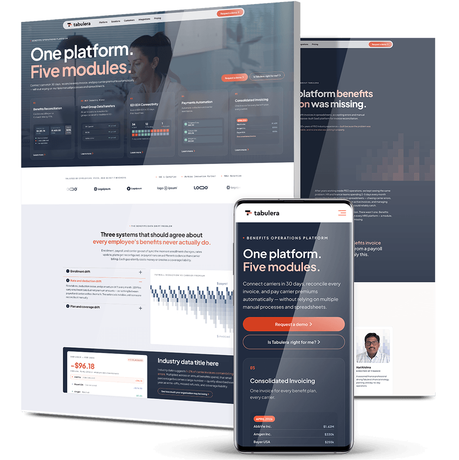
Tabulera had grown from a reconciliation tool into a five-module benefits premium administration suite, but invoice reconciliation, EDI 834 feeds and premium remittance are hard to explain quickly, and its buyers range from employers and brokers to PEOs, trusts and staffing companies.
-
Digital Silk started with messaging, setting a core positioning and tone that pairs modern SaaS energy with the steadiness of a financial institution, then mapped it page by page before redesigning the brand and Webflow website.
-
The new site leads with speed and compatibility, gives every audience segment a direct path to its workflow, and puts proof at every decision point, backed by a reusable brand system for sales decks, one-pagers, LinkedIn and events.


The Challenge
A Product That’s Hard To Explain Quickly
Invoice reconciliation, EDI 834 carrier feeds and premium remittance don’t lend themselves to a five-second pitch. Without a sharper story, prospects risked seeing Tabulera as a generic benefits tool rather than the specialist it is.
Five Audiences, Five Sets Of Criteria
Employers, benefits brokers, PEOs, multi-employer trusts and staffing companies each arrive with different pain points and different ways of evaluating software. One message for all of them would land with none.
A Platform That Outgrew Its Story
Tabulera expanded from a single reconciliation tool into five modules. The digital presence needed a unified narrative that explained the whole suite without losing the clarity of any one part.
Two Objections To Answer Up Front
Buyers worried about long, disruptive implementations, since legacy EDI vendors often take many months to connect a single carrier. They also worried whether Tabulera would work with their existing HRIS and payroll systems.
No Shared System For Sales Materials
Decks, event graphics and LinkedIn assets needed a consistent visual and verbal system, so anyone on the team could produce on-brand materials without design support.

The Solution
-
A Messaging Framework, Mapped Page By Page
Working with Tabulera’s marketing and creative leads, we set the core positioning, “Benefits reconciliation and EDI connectivity. Done right. Every month.”, and mapped it across the homepage and ten unique landing pages on a FigJam messaging board. Each section recorded the visitor’s intent, what they need to see and the copy that answers it. -
Navigation Built Around Products And Audiences
We reorganized the mega menu so the platform’s modules, the markets it serves, its integrations and company information each have their own route, giving every audience segment and every module a direct path in. -
A Homepage That Shows The Product Working
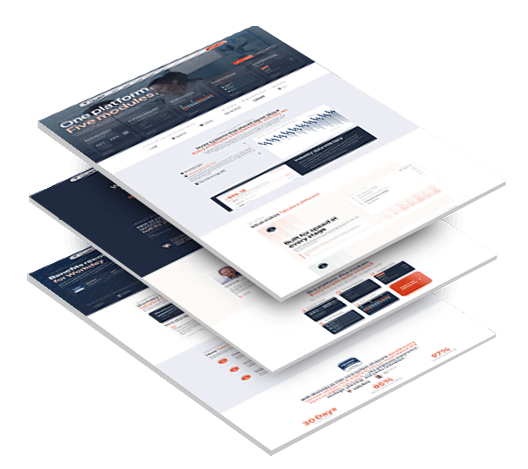
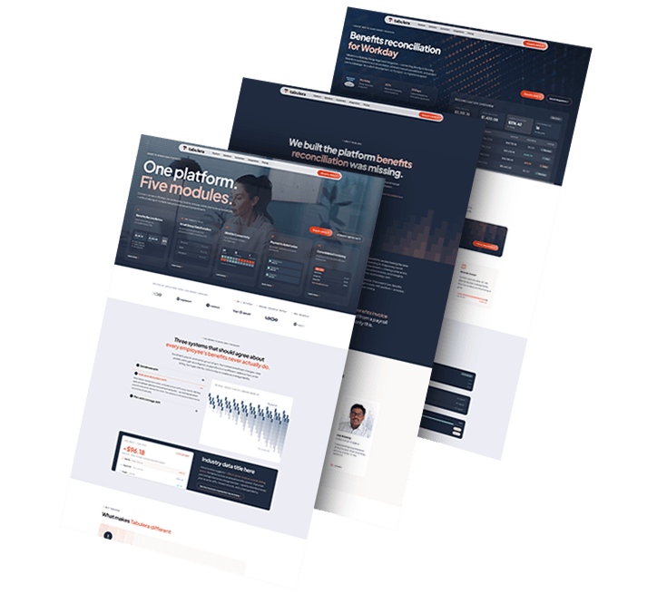
The hero frames the offer as “One platform. Five modules.”, with animated module cards and stylized dashboard data. A problem section names three types of “drift” between HR, payroll and carriers, then links to a premium leakage estimator that turns the problem into a number. -
Objections Answered Before They Come Up
A “Why Tabulera” section leads with speed, compatibility and full visibility, backed by a customer quote and headline proof points. Integration pages for partners including Workday, PrismHR, isolved, Employee Navigator, UKG and ADP show buyers Tabulera fits the stack they already run. -
Proof At Every Decision Point
Client logos, SOC 1 certification, Workday Innovation Partner and NAPEO badges, case study cards and an integration partner wall sit where buyers make decisions, rather than buried at the bottom of the page. -
A Visual Language That’s Technical And Approachable
Pixel-gradient accents, looping product videos and clean data visualizations give the brand a distinctive look that reads as credible to finance teams and approachable to everyone else. -
A Brand System For Sales And Marketing
We built a master PowerPoint template as a true Slide Master with nine reusable layouts, including proof, process, comparison and integrations-table slides, plus a coordinated suite of one-pagers, LinkedIn banners, an event booth backdrop and business cards.
The Results
-
One Messaging Frameworkrunning across the homepage, solution pages, integration pages and every piece of collateral
-
5 Audience Segmentseach reaching its own workflow within a click or two of the homepage
-
6 Integration Partnersshowcased to answer the compatibility question before a buyer has to ask it
-
9 Reusable Slide Layoutsin a master deck that lets anyone on the team build on-brand presentations without design support
1,000+ Completed Projects
Clearinghouse CDFI: A Pre-Application That Feeds The Pipeline
A loan pre-application isn’t a contact form. Clearinghouse CDFI’s had to capture project type, collateral, deal size and sponsor detail in enough depth for a lending advisor to triage it, while staying short enough that a busy broker would actually finish it.
We rebuilt the form from the ground up around the same qualification logic as the rest of the borrower journey, then mapped it field by field into Clearinghouse’s Salesforce instance so every submission lands in the pipeline already attributed.
Through the replatform, Ahrefs estimates show organic traffic up 87% from the pre-launch low to the launch month, with 23 keywords ranking in the top three.

PCRB: One Site, Four Very Different Professionals
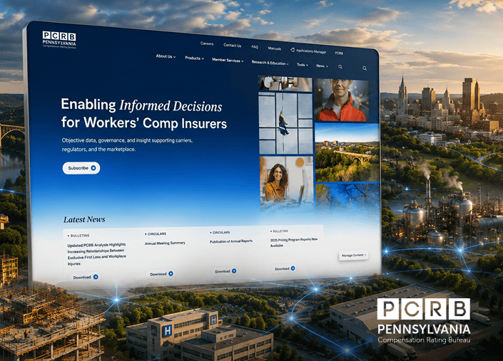
Carriers, employers, agents and actuaries all rely on the Pennsylvania Compensation Rating Bureau’s workers’ compensation standards, but each looks for something different in its rate filings, manuals and circulars.
We rebuilt the information architecture around those four user types, so each professional reaches the rules and rates relevant to their work instead of searching through large PDFs by hand.
More than 6,000 regulatory documents now sit in a searchable Digital Library that PCRB’s own team publishes and manages.
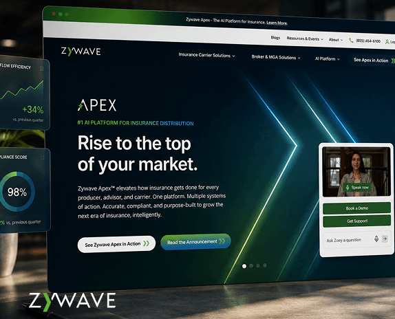
Zywave: Organized Around Buyers, Not Products
Zywave’s insurtech platform serves insurance brokers, carriers and service providers, but its website was organized around products. Visitors found it through branded and niche searches, then rarely went on to become leads.
We led a phased, CRO-driven redesign that reorganized the site around its audiences, rebuilt audience hubs and product pages around what each buyer is trying to do, and turned resource PDFs into structured web content search engines can read.
Within five months of launch, monthly lead form submissions rose about 135% and converting users per month rose more than 115%.
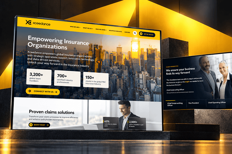
Xceedance: A Modular Site That Grows With The Business
Xceedance automates paperwork-heavy processes for insurance clients, so its website needed to keep pace with a business that kept adding services, campaigns and open roles.
We built the site on custom modules the team can mix and match as needs change, designed a high-conversion campaign landing page with complex scroll animations, and integrated Salesforce to capture leads.
Within six months, the site drew more than 200,000 first-time visitors, with landing page conversion rates reaching 11%.
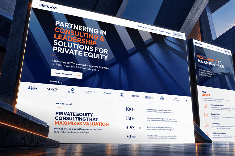
Beckway: Case Studies That Did The Selling
Private equity buyers want proof, not promises. Beckway’s operations expertise was buried in long, dense pages with no guided journey to show what the firm had actually delivered.
We restructured the content into six core landing pages, added a sticky mega menu, and built modular sections for services, team bios and case studies, applying Beckway’s existing brand guidelines across a scalable design system.
The case study storytelling module landed so well that Beckway expanded it after launch.
"*" indicates required fields