
Checkout Page Design: Key Highlights
-
Conversion-focused design: A checkout page converts better when it contains only what’s needed to place the order and removes unnecessary steps and side links that pull shoppers away.
-
When intent collapses: Forced account creation, hidden fees or form errors waste acquisition spend by breaking momentum at the final moment.
-
Trust must be visible: Security badges, transparent totals and familiar payment options matter most when customers are asked to share payment details.
By the time a buyer reaches checkout, the decision to purchase has largely been made, yet that decision is still easy to reverse.
After investing in acquisition, positioning and pricing, a few poorly designed steps can introduce hesitation and send the customer elsewhere.
In 2025, the global online shopping cart abandonment rate reached 70.19%, a clear signal that checkout breakdowns are costing businesses revenue at scale.
In this post, we’ll examine standout checkout page design examples and the practical best practices behind them, with a focus on reducing abandonment without adding friction to the buying process.
10 Best Checkout Page Design Examples
Every additional shopper increases the cost of a weak checkout, because more intent reaches the same breaking point.
By 2029, the number of eCommerce shoppers is expected to reach 333.5 million, which puts even more pressure on checkout flows to convert demand instead of leaking it.
Below are 10 checkout experiences that show how thoughtful structure, clear step-by-step progress and trust-building details keep buyers moving to completion.
1. Rollink
Rollink is one of Digital Silk’s eCommerce clients that offers collapsible suitcases.
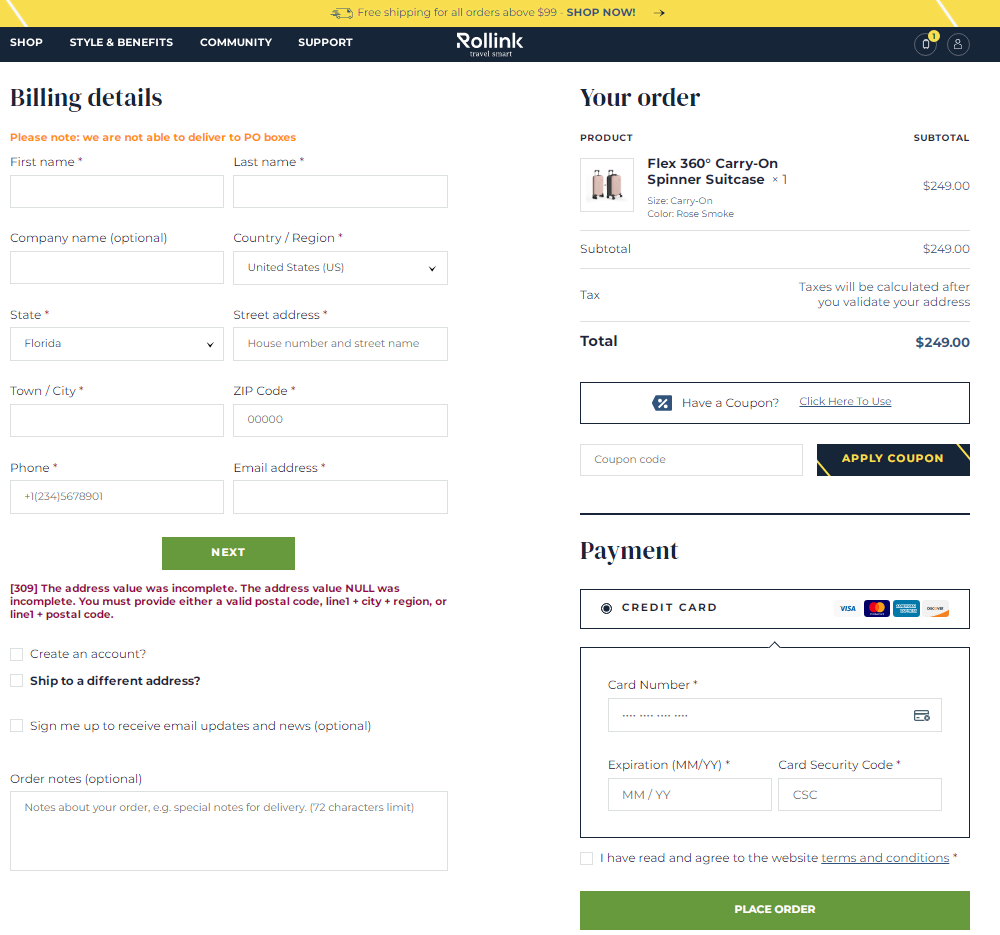
Rollink’s checkout page includes a coupon code field, cart overview, multiple payment options and a prominent “Place Order” CTA.
The brand’s checkout form comes with marked mandatory fields, visual feedback and an explanation for the incorrect information input.
This Digital Silk solution offers a user-centric design with key features like a comprehensive cart overview, diverse payment options and a prominent call-to-action (CTA), all while offering an intuitive interface with visual feedback and guidance for ensuring accurate information input.
")
2. Etsy
Etsy is a global marketplace with a simple checkout process that’s one of the best checkout page examples for easy-to-follow navigation.

After adding your desired product/products to the cart and clicking on the ‘proceed to checkout’ button, you are presented with various sign-up/registry choices, including an option to sign up as a guest.
Once you go past this pop-up, either as a guest or a member, you will be presented with a single-page order form.

Etsy’s checkout page design also includes a progress indicator at the top right corner, where you can see how many steps away you are from completing your order.
Etsy’s checkout page embodies numerous best practices, with its standout quality being a dedication to simplicity.
3. Sigma Beauty
Sigma Beauty is a well-known beauty brand that specializes in creating and selling high-quality makeup products, beauty tools and accessories.
The brand sets a remarkable standard with its straightforward and user-friendly checkout page design.

When you reach the checkout phase, you encounter just two easy steps: delivery and payment.
The Sigma checkout page design offers multiple shipping options, empowering their customers to decide when their orders will be delivered and how much they want to spend on shipping fees.
Additionally, Sigma provides a convenient feature that allows you to save your checkout items for future purchases.
This means you can return to the website later on and quickly find your desired items, ready to pick up where you left off.
With its streamlined two-step process, versatile shipping choices and the added convenience of saving items for future purchases, Sigma’s checkout experience showcases a commitment to easy, seamless transactions.
4. Casper
Casper is a well-known brand for sleep essentials such as mattresses and bed sheets.

Their checkout page design stands out with its clean layout that efficiently provides all necessary information for completing a purchase.
The Order Summary is thoughtfully placed to the side, offering a clear breakdown of costs and a free refund guarantee.
What truly sets Casper apart is its chatbot feature. By offering customers the opportunity to communicate with representatives right on the checkout page, Casper ensures that all questions and concerns are addressed, providing consumers with the peace of mind they need to complete their order.
5. Babies R Us
Babies R Us is a trusted retail brand that caters to all things baby, providing high-quality products, valuable information and a supportive community for families of diverse backgrounds.
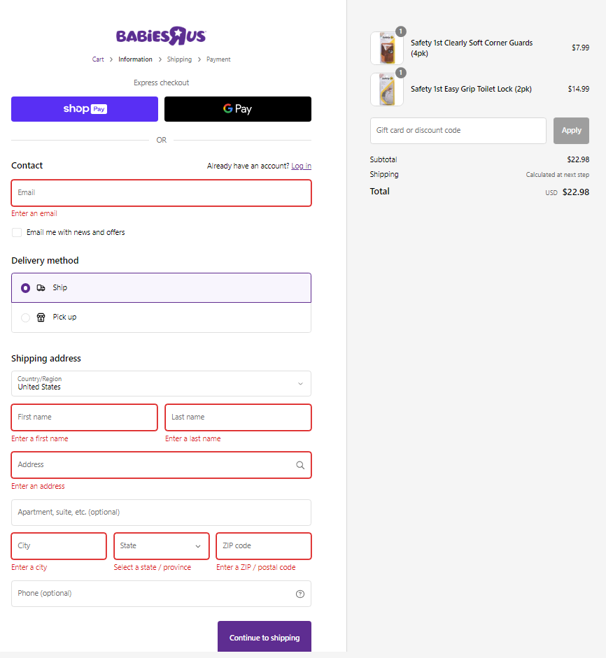
This design follows best practices for checkout page design, but what stands out specifically is a helpful visual cue that indicates any missed mandatory fields in the checkout form.
These important fields will turn red, catching your attention and ensuring you enter all the required information accurately.
While the shipping fee may not be visible right away, you will be promptly informed that the shipping details will be revealed to you after completing the next step.
This transparent approach empowers customers to make informed decisions during the checkout process and fosters a sense of trust along the way.
6. Samsung
Samsung‘s checkout page design follows the best design practices by including various payment options and showcasing trust seals prominently.
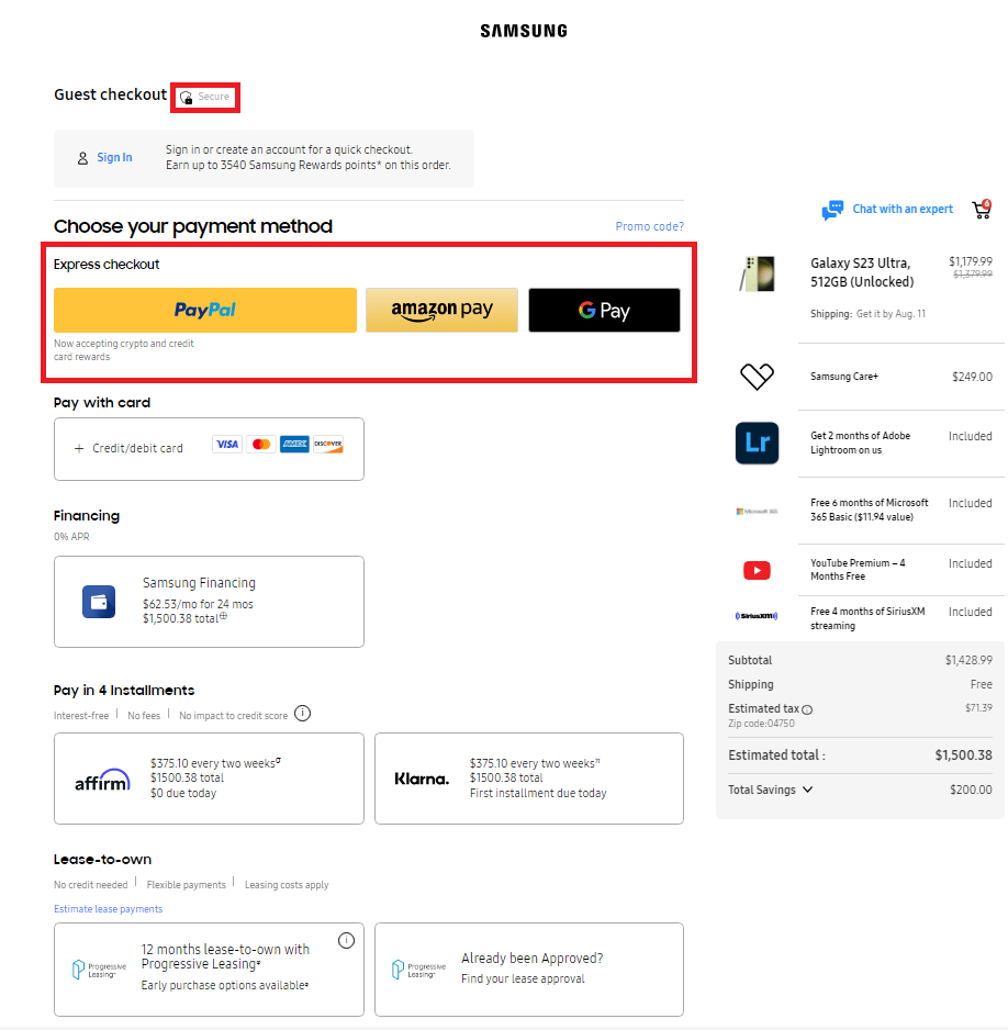
The page also includes a field for promo codes, four installment options allowing their customers to choose a payment plan that suits their preferences.
Samsung also added a feature that allows you to modify the shopping cart as you please, emphasizing customer empowerment in enabling shoppers to refine their selections effortlessly without navigating back to the cart page.
By incorporating a myriad of payment options, prominently displayed trust seals and offering the convenience of real-time cart modifications, Samsung’s checkout page design seamlessly combines user empowerment and practicality.
7. Stündenglass
Stündenglass is another one of Digital Silk’s eCommerce clients that offers award-winning Glass Gravity Infusers, powered by pure fluid physics for industries such as culinary, mixology, hookah and aromatherapy.

Our solution for the Stündenglass’ checkout page design includes a visually appealing dark-themed layout and a straightforward checkout path.
In line with the best practices for checkout page design, the Stündenglass checkout page features progress tracking and a prominently displayed discount code field, all seamlessly integrated into a visually engaging dark-themed layout.
8. Lego
Lego‘s checkout page design is quite minimalist and straightforward.

Once you click on the “Checkout Securely” button, you are presented with a two-step checkout process for shipping and payment, thus minimizing barriers in the purchasing journey.
Lego also offers a guest checkout option, eliminating potential friction points and enabling a hassle-free checkout experience.
Lego’s unwavering commitment to user-centered design is evident in its streamlined two-step checkout process and the option for guest purchases, collectively crafting a seamless checkout experience.
9. Lugz
Lugz is a footwear brand that offers a stylish collection of boots, sneakers and casual shoes that embody timeless design.
Digital Silk’s designers delivered a custom website for the brand, complete with an optimized checkout page design.

In our commitment to implementing best practices, we ensured Lugz’s checkout page stands out with a feature that includes a fast checkout option, highlighted by a blue button adorned with a lightning symbol.
By clicking on it, you open a pop-up checkout form with only the essential fields required for completing your order.
Unlike other choices that would guide you through a multi-step checkout process, this option streamlines the experience, allowing customers to swiftly proceed with their purchase.

By incorporating the user-friendly fast checkout option and its streamlined approach, we helped Lugz optimize the buyer’s journey, enhancing convenience and expediting the ordering process for a seamless customer experience.
10. G Pen
Pioneering vape technology with the first-ever tank system for essential fluids and aromatherapy, G Pen offers high-powered vapes at an accessible price point.
Digital Silk’s experts created a responsive, intuitive and user-friendly checkout page, that displays seamlessly on both desktop and mobile:
Our mobile checkout page design for G Pen includes a simple form, progress tracking and sizable input fields that are easily accessible on smaller screens.
If you encounter any issues during checkout, you can connect with the brand’s customer support team via live chat.
")
Best Practices For A Checkout Page Design That Converts
Across industries, the average conversion rate sits at 2.9%, meaning most traffic leaves without buying.
Even small checkout issues like an extra field, a surprise fee or a confusing error message can push a ready-to-buy customer to pause or leave.
Here are practical guidelines for checkout page design that help more purchase-ready customers follow through:
1. Enable Guest Checkout
Offering a guest checkout option allows your customers to complete their purchases without the hassle of creating an account.
Many customers prefer a quick and seamless shopping experience, so enabling guest checkout caters to their needs.
As seen in the Urban Outfitters example below, guests can bypass the time taken to set up an account simply by adding their email address.

This step is especially important as it removes the barrier for your first-time visitors who may not be willing to commit to account creation yet.
2. Provide Multiple Payment Options
Every customer has their preferred payment method, so offering multiple options caters to their diverse needs.
76% of U.S. consumers want the ability to use their preferred payment method when shopping online, which makes payment flexibility a direct factor in whether a purchase goes through.
Providing multiple options like paying with credit cards, debit cards, digital wallets (like PayPal, Apple Pay, Google Pay) and even alternative methods like bank transfers or installment plans gives your customers flexibility and convenience during the checkout process.
This will increase the likelihood of securing the sale, as your customers can use the method they trust and feel most comfortable with.
3. Be Transparent About Your Costs
Unexpected costs are one of the fastest ways to break purchase intent at checkout.
In the U.S. alone, 39% of consumers abandon an online purchase because additional costs like shipping, taxes or fees appeared late in the process, turning what felt like a settled decision into a second round of evaluation.
Clearly displaying key details upfront, like the total price, including taxes, shipping fees and additional charges, prevents any last-minute surprises during checkout.
By being transparent about the costs, you establish a sense of reliability and honesty, fostering a positive shopping experience.
4. Optimize Your Checkout Page Design For Responsiveness
Mobile shopping is on the rise and optimizing your checkout process for mobile devices is essential.
In 2025, smartphones took the lead in retail site traffic worldwide, accounting for approximately 78% of all visits to online stores and contributing to 70% of total online purchases made during that period.
Make sure your checkout page design is responsive and works seamlessly on smaller screens. To make your checkout page mobile-friendly:
- Design larger and more prominent buttons than traditional desktop buttons to accommodate touch inputs and ensure easy tapping.
- Provide ample spacing around the buttons to prevent accidental taps and ensure your customers can select the desired option.
- Ensure that buttons have a sufficient touch target area, making it easier for your customers to interact with them.
5. Incorporate Trust Signs
Displaying trust badges, security icons or SSL certificates in your checkout page design helps reassure your customers that their sensitive payment information is safe and encrypted.
Trust signs from recognized security providers signify a secure environment for payment processing, instill confidence and reduce anxieties related to online transactions.
Common examples include SSL certificates and security badges from providers like VeriSign or McAfee, placed close to payment fields where reassurance is most needed.
6. Prioritize Your Customers’ Needs
A user-friendly checkout page design aligns with the customer’s expectations and follows standard design conventions.
Brands that consistently prioritize customer experience see 51% higher retention and 49% faster profit growth, a reminder that seemingly small usability decisions compound over time.
Prioritize the following strategies to make checkout easier to complete and harder to abandon:
- Use clear and descriptive labels for form fields: For instance, if there is a field to enter the email address, the descriptive label would be “Email Address,” clearly indicating that the customer should input their email.
- Arrange your labels logically: Logical arrangement involves grouping related elements together and placing them in a sequence that aligns with the natural flow of user interaction. For instance, if a customer needs to enter their name and address during checkout, the fields should be placed in a sequential order, with the name field before the address field.
Sticking to a simple and intuitive layout ensures that your customers can easily navigate through the checkout process without confusion or frustration.
7. Include A Progress Indicator
Including a progress indicator, such as a step-by-step guide or progress bar, informs your customers about their position in the checkout process.
This visual cue creates a sense of direction and helps customers understand how many more steps they need to complete to finish their purchase.
It also reduces the perceived complexity of the checkout process and encourages customers to continue until the final step.
8. Remove Distractions
Keep your checkout page design focused on the purchase process by eliminating unnecessary distractions.
Avoid displaying ads, unrelated links or promotional pop-ups that may divert customers’ attention away from completing their transaction.
A clutter-free checkout page design ensures that your customers stay focused on the task at hand, which ultimately increases the chance for successful conversion.
Take a look at Peloton’s stripped-back checkout page design for inspiration:

9. Add Data Validation & Notification
Implement data validation to check for errors in the information customers enter during checkout.
If customers input incorrect data, such as an invalid email address or credit card number, provide clear and helpful error messages that guide them in correcting the mistakes.
On the other hand, once the order is successfully placed, display a notification confirming the purchase.
This action reassures customers that they have completed their transaction and removes any uncertainty.
10. Send A Purchase Confirmation Email
Send a follow-up email to your registered customers after they complete a purchase on your eCommerce website.
Purchase confirmation emails serve several important purposes:
- Confirm the details of the customer’s order and provide them with a purchase summary.
- Offer a great opportunity to express gratitude to your customer for choosing to shop in your e-store. A simple thank-you message can go a long way in making your customers feel appreciated and valued.
- Provide updates on the order status, such as information about when the order is expected to be shipped, tracking details and estimated delivery dates.
- Include promotional offers or discounts to encourage your customers to make repeat purchases in the future.
- Useful for gathering feedback from customers about their shopping experience and using the information gathered to improve the overall customer experience.
")
Why Good Checkout Page Design Matters
With online buying now becoming the default option, expectations around speed, transparency and ease are set before a customer ever reaches your site.
The following points explain where checkout page design has the most direct impact:
- Revenue retention: A clear, predictable checkout helps more purchase-ready customers finish instead of abandoning at the last step.
- Customer confidence: Visible pricing, familiar patterns and security cues reduce hesitation when payment details are required.
- Expectation alignment: 92% of U.S. consumers shop online, which means most buyers compare your checkout to experiences they’ve already had elsewhere.
- Operational efficiency: Fewer form errors and fewer abandoned carts lead to fewer support tickets and cleaner order processing.
- Optimization insight: Well-structured checkouts make it easier to see where buyers hesitate and what needs to be fixed.

How To Evaluate Your Checkout Page Design
Evaluating your checkout page design ensures a smooth and seamless shopping experience for your customers. Here are some key tests to perform:
- Functional testing: Test the payment process to ensure accurate order handling, calculations as well as tax calculations.
- Cross-browser testing: Verify that the checkout flow works as intended across different browsers and operating systems to ensure compatibility for all users. For this purpose, you can use tools like Browser Stack.
- Integration testing: Test the integration of your website with the selected payment gateway to ensure a successful transaction flow.
- Performance testing: Evaluate the website’s performance during payment processing to ensure it can handle multiple transactions simultaneously without crashing.
- Security testing: Verify that sensitive data, like credit card numbers and CVV, are transmitted securely through encryption during transactions.
- Geolocation testing: Perform geolocation testing to assess the checkout flow from different regions, checking for language and currency changes and proper tax calculations.
You should also keep track of the following checkout page’s key performance indicators (KPIs):
- Cart abandonment: The percentage of visitors who left their online shopping carts without completing a purchase compared to the total number of sessions with active shopping carts.
- Checkout engagement: The level of customer interaction and activity during the checkout process. It focuses on tracking the number of site visits or sessions where visitors added products to their online shopping carts and then initiated the checkout steps.
- Checkout conversion: The success rate of visitors who completed their payments compared to those who started the checkout process after adding at least one product to their carts.
- Accelerated checkout: The count of all site visits where visitors added products to their carts and opted for digital payment options to bypass the conventional multi-step checkout process.
- Mobile abandonment gap: The difference in checkout funnel effectiveness between mobile and desktop devices.
Design Your eCommerce Website With Digital Silk
A well-designed checkout protects the investment you’ve already made in traffic, pricing and product by removing last-step breakdowns.
At Digital Silk, we create custom eCommerce solutions that prioritize an engaging user experience and drive conversions.
Through innovative design, advanced technology and data-driven strategies, we drive measurable results for our eCommerce clients across all industries.
We take the time to fully understand your industry’s landscape, ensuring that every aspect of your online store, including the checkout page design, search functionality, security and product pages, meets the best UX standards.
As a recognized web design agency, our services include:
Contact our team, call us at (800) 206-9413 or fill in the Request a Quote form below to schedule a consultation.
"*" indicates required fields
