Minimalist Web Design Trends: Key Highlights
-
First impressions matter: Users form opinions in moments and visual balance determines whether they stay engaged.
-
Adaptable interfaces enhance comfort: Light and dark variations improve readability according to user’s preferences and lighting conditions.
-
Asymmetry adds movement: Intentional imbalance introduces more immersive journeys, making minimalist compositions feel dynamic without losing coherence.
When users land on a site, they decide almost instantly whether it deserves their attention.
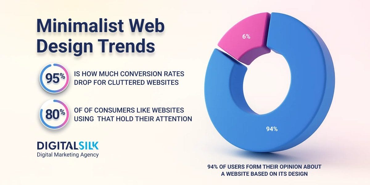
In as little as half a second, 94% of those judgments come from design alone, shaped more by instinct than analysis.
Minimalism appeals to that instinct by removing visual clutter and helping users immediately grasp what a brand offers and why it matters.
In this post, we explore the minimalist web design trends that will shape how brands in 2026 design experiences that capture attention and convey value in an instant.
10 Minimalist Web Design Trends For Inspiration
Minimalist web design principles are evolving from surface-level simplicity to intentional storytelling shaped by structure, contrast and flow.
Modern designers are using space, movement and typography to guide attention in ways that feel effortless yet deliberate.
Below are ten trends showing how minimalism in 2026 is becoming more expressive, strategic and human:
1. Expansive White Space
The most effective minimalist web design inspiration comes from understanding how space shapes attention and emotion.
White space, or negative space, defines structure and hierarchy, helping users process information faster and with less effort.
Since 80% of U.S. consumers enjoy spending time on websites that hold their attention, using white space intentionally can turn a simple layout into an engaging experience.
It’s not about leaving gaps on a page but about creating visual balance that guides attention and makes every element feel purposeful.
Use these ideas to make white space work effectively:
- Use spacing to guide the eye toward the most important content or actions on a page.
- Vary the amount of white space to separate sections and emphasize key messages.
- Break up dense layouts with open areas that make scanning and reading easier.
- Balance text and imagery so each element feels supported by the space around it.
- Remove unnecessary details that crowd the layout and weaken visual impact.
Nothing Tech’s website is a minimalist web design example that uses generous negative space, high contrast and clean structure to keep the focus entirely on its products.
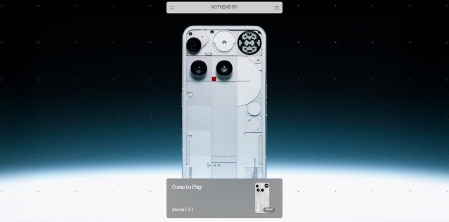
Much like its stripped-down product range, the site’s design uses balanced spacing, subtle movement and purposeful simplicity that feels engaging rather than bare.
The brand’s minimalist approach extends beyond its website and is clearly visible across all of its marketing touchpoints, including its social media and brand strategies.
2. Clean, Bold And Legible Typography
In modern minimalist web design, typography shapes how users move through the on-page content and absorb key messages.
With an average on-site time of 3.1 minutes in 2024, the text has to hold attention through clear hierarchy, balanced spacing and thoughtful contrast.
| METRIC | 2023 | 2024 |
| Bounce Rate | 15.2% | 12.4% |
| Page Views | 14.2 | 15.3 |
| Time Spent | 2.5 minutes | 3.1 minutes |
As visuals become simpler, well-chosen fonts define the structure of a page, using scale and alignment to make information easy to navigate and visually engaging.
To use typography effectively in minimalist design:
- Treat typography as a core design element that defines structure and focus.
- Emphasize contrast and alignment to guide the eye and create balance.
- Prioritize mobile readability by testing how type scales on smaller screens.
- Maintain consistent spacing and hierarchy to make content flow naturally.
- Limit font choices to two complementary styles to preserve simplicity and cohesion.
Roberta’s Pizza is one of the most striking minimalist web design examples, using oversized, handwritten typography as its focal point.
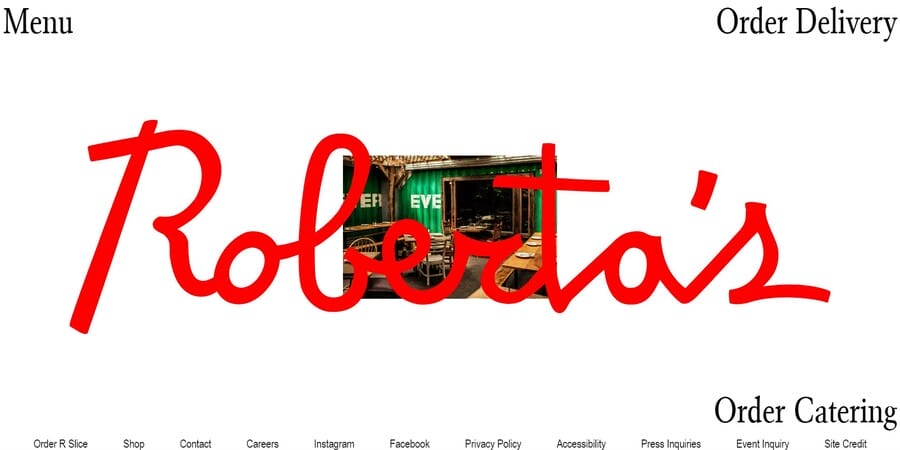
The layout is intentionally sparse, letting the bold red script and background imagery carry the brand’s personality.
It proves that minimalism can feel vibrant, distinctive and unmistakably authentic when each element feels connected to the brand’s story.
3. Color Minimalism & Tonal Harmony
Current minimalist web design best practices emphasize using two or three carefully chosen tones to create unity, depth and direction.
When color is used thoughtfully, it enhances readability, evokes the right emotion and adds a quiet sense of cohesion to the entire design.
Using a balanced approach helps a brand feel cohesive, polished and easy to engage with.
To apply refined color minimalism effectively:
- Limit your palette to a few complementary tones that reflect your brand’s guidelines.
- Use color placement strategically to highlight key elements like calls to action or navigation.
- Pair vibrant accents with neutral foundations to maintain balance and visual flow.
- Apply color psychology intentionally to evoke the right emotion, such as blue for trust, green for calm or red for energy.
- Maintain consistency across all elements to create a cohesive, recognizable experience.
Among minimalist web design examples, Zenit uses a muted grayscale palette and sharp contrast to mirror the precision of engineering design.
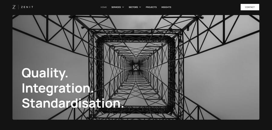
The limited tones highlight clean lines and balanced layouts, showing how thoughtful color choices can make technical work feel refined and approachable.
4. Dark Mode & Adaptive Design Systems
As users move between devices and lighting conditions, websites need to adapt for visual comfort and readability.
With 82.7% of consumers using dark mode on their devices, minimalist web design trends in 2025 and beyond focus on adaptable color systems that match different viewing contexts.
Dark mode reduces eye strain, improves legibility in low light and introduces depth that draws attention to important elements.
When combined with adaptive design systems, which automatically adjust layout, contrast and color based on factors like lighting, device settings and time of day, it helps create interfaces that feel cohesive, intuitive and easy to engage with anywhere.
Follow these strategies to apply dark mode and adaptive systems properly:
- Design both light and dark variations that maintain balance and usability across settings.
- Use calibrated contrast levels to ensure text and visuals remain clear without overpowering the eye.
- Develop adaptive color systems that adjust to device modes, time of day or ambient light.
- Perform in-depth testing of interface elements to confirm readability and tone consistency across different conditions.
- Preserve brand identity by applying core colors and accents thoughtfully across all modes.
Binance is a minimalist web design example that demonstrates how dark mode and adaptive systems can enhance usability and comfort.

The site features a toggle in the top right corner that lets users instantly switch between light and dark themes, allowing for a seamless experience across environments.
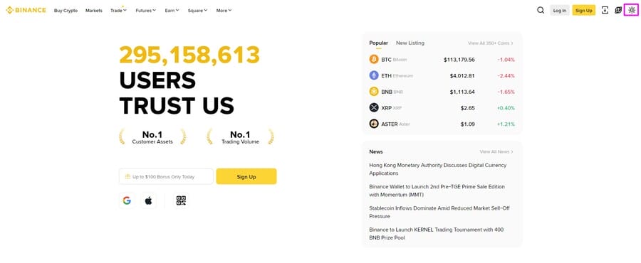
Its design maintains consistency in hierarchy, contrast and brand identity across both modes, showing how adaptability can improve engagement without compromising simplicity or visual balance.
5. Asymmetry & Broken Grid Layouts
Defining minimalist web design principles in 2025 means moving past perfect alignment and embracing composition that feels more natural and dynamic.
Asymmetry replaces predictability with movement, guiding the viewer’s attention through intentional imbalance and contrast.
Broken grid layouts take this further by adjusting column widths, overlapping elements and experimenting with spacing to create flow while keeping content clear.
This approach feels modern because it keeps the structure intuitive while allowing design to show more personality and depth.
To design with asymmetry and broken grids:
- Start with a simple grid framework and adjust alignment or spacing to create intentional variation.
- Use layering techniques to overlap elements that relate to one another, adding depth without confusion.
- Experiment with container blocks to group visuals and text in unconventional but cohesive ways.
- Vary gutters and margins to change pacing across the layout while maintaining readability.
- Balance visual weight through white space so the composition feels deliberate rather than chaotic.
Laura Monin’s website is a minimalist web design example that uses asymmetry and layering to create a sense of motion and artistic depth.

The overlapping images and off-center typography feel spontaneous yet intentional, mirroring the creative nature of fashion design.
It shows how breaking the grid can turn simplicity into visual storytelling without losing clarity or flow.
6. Content-First, Mobile-First Approach
Web design with minimalist features is supposed to give users what they need, when and where they need it.
With mobile traffic accounting for 56.74% of global web activity, websites must cater to smaller screens where space and attention are limited.
Pages built this way prioritize hierarchy, legibility and purpose, trimming away anything that delays comprehension or interaction.
Cluttered layouts can cut conversion rates by as much as 95%, showing that excess detail works against engagement.
A content-first and mobile-first mindset reorders the priorities, as the design supports the message, not the other way around.
To design around content and mobile intent:
- Audit page elements before design begins to identify which content drives value and which can be removed or condensed.
- Structure pages using a visual hierarchy that mirrors how people scroll by placing key information and calls to action higher in the layout.
- Use modular content blocks that adapt to screen width without breaking reading patterns.
- Apply typography for readability by adjusting line spacing, font weights and size scaling specific to mobile devices.
- Design navigation around user goals with touch-friendly spacing and clear grouping of related actions.
- Keep performance measurable, setting speed benchmarks and optimizing code and media until the site loads quickly on mobile networks.
Function Health illustrates minimalist web design for 2025 and beyond through a layout that’s built entirely around user intent.

The title heading and call-to-action are positioned front and center, minimizing cognitive load and reducing the steps between interest and action
The design removes anything that doesn’t serve visitors, excluding carousels, background distractions or competing visuals, so the core offer is clear even on a mobile viewport.
7. Neumorphism, Glassmorphism & Soft Shadows
With 79% of consumers saying they would buy from the same company again after a positive digital experience, the way a website feels can be as influential as what it says.
Subtle depth helps build that emotional connection, giving minimalism a sense of dimension that feels contemporary rather than flat.
Neumorphism brings softness and realism into minimalist design through muted palettes, rounded shapes and gentle shadows that make buttons and cards feel slightly raised or pressed.
It bridges the gap between flat and physical design, creating an interface that feels approachable and tactile.
When implemented with accessibility in mind, neumorphism can make digital products feel crafted rather than coded, a look well-suited to brands seeking warmth and modern precision.
Using neumorphism effectively means following these steps:
- Use light and shadow deliberately to create depth that feels intentional, keeping the visual hierarchy simple and consistent.
- Apply the soft 3D effect to key interactive elements like buttons, toggles, and cards to guide user actions naturally.
- Design cards to appear subtly raised from the background, reinforcing structure without breaking minimal balance.
- Add inner shadows to input fields to create natural depth cues that invite interaction without heavy borders.
- Maintain accessible contrast levels so the tactile appearance never interferes with readability or usability.
- Support the aesthetic with a muted color palette and rounded edges to enhance softness while keeping the 3D appearance.
For instance, Stripe’s homepage uses soft gradients, layered shadows and subtle highlights to give interface elements a smooth, tactile quality.
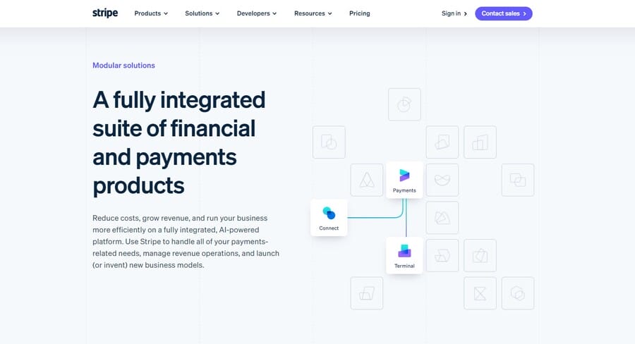
The buttons, cards and data modules appear molded into the surface rather than placed on top of it, making the design feel cohesive and intuitive while keeping the focus on interaction and clarity of information.
On the other hand, Glassmorphism adds dimension through translucent layers that mimic frosted glass, blending background and foreground elements for visual harmony.
When executed well, it brings elegance and focus to modern interfaces by allowing content to stand out while still feeling integrated with its environment.
Used widely in Apple’s and Microsoft’s design systems, this trend balances sophistication with functionality when supported by contrast-aware design choices.
Best practices when using glassmorphism include:
- Adjust opacity and blur levels to ensure text and icons remain readable across varied backgrounds.
- Use subtle gradients and strokes to define depth and avoid flatness against minimalist layouts.
- Limit glass effects to key UI surfaces such as cards, navigation panels or modules, keeping the experience uncluttered.
- Test transparency settings for accessibility, offering users control over contrast or visual density when possible.
Reflect is a good example of glassmorphism in minimalist web design, using translucent layers and blurred edges to create a sense of depth and modernity.
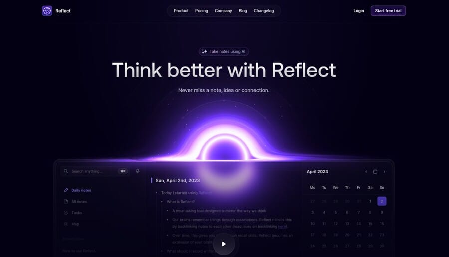
The transparent navigation bar, buttons and call-to-action elements appear to float above the dark background, adding dimensionality without clutter.
8. Flat Design 3.0 & Functional Animations
Flat Design 3.0 builds on traditional flat design by introducing subtle depth, movement and responsiveness while staying true to minimalist principles.
It uses flat color, clean geometry and smooth interaction patterns to communicate hierarchy and guide users without unnecessary effects.
To implement Flat Design 3.0 effectively, focus on these principles:
- Use clean 2D elements and geometric shapes to organize information visually and maintain structural clarity.
- Choose bright, high-contrast color palettes to improve recognition and create visual hierarchy.
- Rely on simple, sans-serif typography that complements the design’s streamlined tone.
- Apply consistent grid-based layouts to keep balance and flow across sections and devices.
- Make deliberate use of whitespace to separate content, support readability and prevent visual overload.
- Avoid unnecessary texture or depth effects, focusing instead on precision, proportion and usability.
Take minimalist web design inspiration from Cyclemon, which blends playful illustration with a clean, flat layout that keeps the focus on storytelling through color and form.
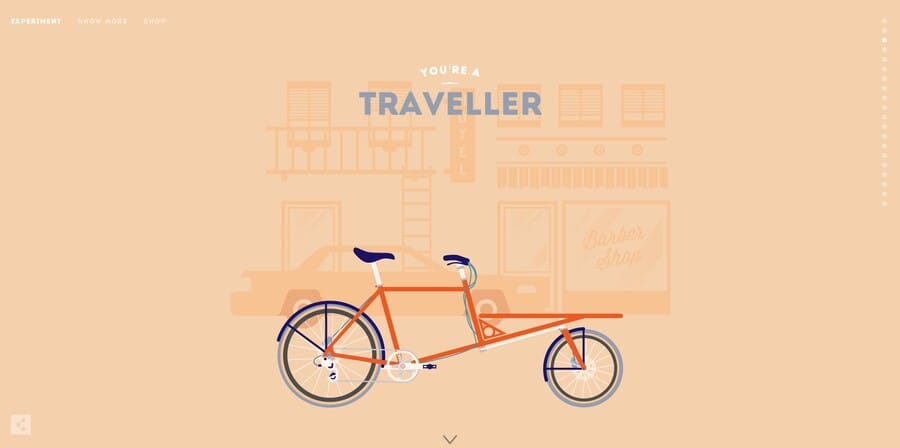
The site uses soft pastels, simple typography and balanced symmetry to create a visually engaging yet uncluttered experience.
9. Microinteractions & Minimal Motion UX
Microinteractions are the smallest details that define how users experience a digital product and they turn basic actions into intuitive, satisfying moments.
In minimalist web design, these movements act as silent guides that replace cluttered prompts or pop-ups.
With cart abandonment rates in the US reaching 83%, these subtle cues can influence completion by making the digital experience feel more intuitive and trustworthy.
To design microinteractions that add clarity and intention:
- Use motion to confirm user actions, like subtle color shifts or scale changes when buttons are tapped.
- Keep animations short and predictable so users instantly understand the outcome of their actions.
- Design transitions that guide attention, helping users follow movement between interface states.
- Apply motion sparingly, limiting it to areas where it supports usability, not visual flair.
- Ensure feedback feels connected to user intent, such as progress indicators that reassure users during load times.
- Test across devices and input types to confirm every interaction feels natural on both touch and desktop environments.
For example, Pure Cosmetics demonstrates how microinteractions and minimal motion can guide behavior within a clean, content-focused layout.

The hero section CTA that shifts from transparent to white directs attention without interrupting the browsing flow, while the expanding circular cursor gives subtle feedback that confirms action.
10. Minimalist Imagery, Line Icons & SVG Illustration
Minimalist imagery and line-based illustration focus on showing information clearly and efficiently, using visuals that support understanding rather than decoration.
When done well, they make a page feel open, purposeful and easy to navigate.
You can use minimalist visuals and incons by:
- Using salable vector graphics (SVGs) wherever possible so icons and illustrations remain crisp and lightweight on every device.
- Selecting imagery with intent, choosing visuals that clarify meaning or reinforce a message instead of filling space.
- Keeping a unified illustration style by maintaining consistent stroke weights, shapes, and color tones.
- Letting icons serve as functional guides, helping users interpret actions or content faster.
- Pairing visuals with open space to create focus and prevent the design from feeling dense.
- Checking scalability and contrast to ensure icons and images remain visible and readable across all viewing conditions.
For instance, Slack’s website shows how minimalist imagery and line icons can make complex products feel approachable and easy to grasp.
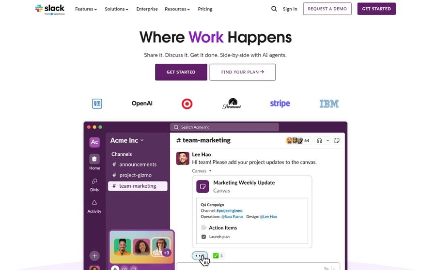
Instead of overwhelming visitors with feature-heavy visuals, it uses simple SVG illustrations and clean iconography to highlight collaboration and workflow in action.
How To Apply Minimalism At Scale For Enterprise Websites
Minimalist design is deceptively complex, as global brands with hundreds of pages, user journeys and campaigns don’t merely remove elements, but rather require simplified interfaces at scale.
Here’s how enterprise businesses can apply minimalism through data-driven processes, consistency and constant refinement:
1. Content Hierarchy Audit
Start by identifying what users need to complete their goals or solve their problems, as every heading, image and call-to-action needs to earn its place.
Removing on-page distractions reduces users’ cognitive load and helps them focus on what drives value instead of what fills up the space on their screens.
2. Modular Design System Creation
Reusable user interface (UI) components are the backbone of scalable minimalism as they ensure consistent branding across regions, product lines and language variations.
A modular system speeds up development processes, maintains brand integrity and minimizes rework as new initiatives roll out.
3. Mobile-First And Speed-First Engineering
As a non-negotiable component of simplified user experiences, you can improve website loading speed by optimizing the code, images and rendering to meet Core Web Vitals benchmarks.
Test across multiple devices and connections to ensure quick loading times and seamless user interactions, especially on mobile, where most website visits begin.
4. Conversion-Focused Navigation
Structure navigation around user intent to guide visitors naturally toward key actions, reducing unnecessary clicks and shortening the path to conversion.
5. Ongoing Optimization
Designing a minimalist website isn’t a one-time project, as it requires continuous optimization to constantly improve the interface and performance.
Use analytics tools to monitor how users interact with your website, including scroll depth, engagement and time to interactive, to continuously refine the design and content to remove friction points.
Minimalist Vs. Maximalist Web Design: For Enterprises: When To Choose Each
Understanding the minimalist vs maximalist web design difference can help you decide which approach best reflects your goals, audience and personality.
Both can be effective when aligned with the right message and business intent:
Choose minimalism when:
- The conversion journey needs to be fast and effortless
- You need clear messaging that doesn’t rely on heavy visuals
- Your prioritize performance, accessibility and scalability
- The goal is to convey professionalism and inspire trust
Minimalism works best for data-driven industries like technology, finance or healthcare, where simple interfaces support lead generation and conversions.
Choose maximalism when:
- Emotion and storytelling shape the brand experience
- Rich visuals spark user curiosity
- The audience values creativity and sensory engagement
- The goal is memorability and lasting emotional impact
Maximalism suits industries that rely on immersive experiences and emotional triggers, such as the fashion, entertainment or hospitality sectors, where visual representation improves user connection.
Below, you can find a quick decision guide with a few key questions to help guide your decision:
| QUESTION | WHAT TO DO IF YOU ANSWERED YES |
| Is your primary goal to improve conversion performance? | Minimalist |
| Do users buy based on sensory emotion and immersion? | Maximalist |
| Do you manage complex scripts, product catalogs or multilingual sites? | Minimalist |
| Is visual identity your main differentiator? | Maximalist |
Why Minimalism Matters For Enterprise Brands In 2026
At the enterprise level, minimalism transforms complex digital ecosystems into clear, high-performing experiences that offer a few key perks:
- Faster performance: Reducing visual and technical weight improves load speed and responsiveness, directly influencing engagement and conversion.
- Higher conversion potential: As the number of on-page elements increases from 400 to 6,000, the likelihood of conversion drops by up to 95%. A minimalist approach keeps attention where it creates measurable outcomes.
- Improved comprehension: Structured layouts and thoughtful spacing help users absorb information quickly and stay oriented throughout their journey.
- Simplified navigation: Streamlined pathways reduce friction, making it easier for users to complete tasks and progress toward conversion points.
- Stronger brand credibility: 75% of consumers judge a company’s credibility by its website design. Clean, purposeful design signals competence, attention and trustworthiness from the first interaction.
When Minimalism Goes Wrong And How To Avoid It
Minimalism can make enterprise websites faster to navigate and easier to understand.
But when too much is removed, people start to lose context and the experience feels incomplete.
Here are common pitfalls that can reduce engagement and how to prevent them:
- Oversimplified navigation: Sparse menus make visitors guess their next step. Streamlining should make movement intuitive, not uncertain.
- Diluted brand personality: Overly neutral design can make brands feel interchangeable. Even a minimalist interface should carry the tone and energy that make the company recognizable.
- Low-contrast typography: Soft colors and fine type often fail real-world accessibility checks. Legibility needs to be treated as a core design principle, not a secondary concern.
- Under-communicated value: Removing too much content leaves visitors unsure what’s offered or why it matters. Every page should still convey purpose, differentiation and a clear next action.
For instance, LUCI features a stark, minimalist homepage where the oversized letters animate on hover, yet it’s not immediately clear what the site offers or what the brand stands for.

Only after exploring do cues like “Explore our rings collection” and product names such as VOID and EMBER make it apparent that they sell rings.
The About page uses abstract language about bridging digital and physical realms, which adds to the initial ambiguity instead of leading with a clear product message.
How to avoid these pitfalls: Keep simplicity intentional, not restrictive. Use visual hierarchy, clear contrast and concise language so every element serves a purpose.
What’s Next For Minimalist Web Design In 2026 And Beyond
Minimalism is moving beyond visual simplicity toward intelligent, human-centered design.
As technology evolves, its future will likely focus on these key areas:
- AI-powered simplicity: With 79% of business leaders saying their company needs to adopt AI to stay competitive, minimalist interfaces could use automation and predictive design to tailor experiences while keeping them seamless and distraction-free.
- Conversational and voice interfaces: Minimalism might evolve to support voice-led navigation and assistive interactions that remove visual clutter while maintaining accessibility and ease.
- Sustainable design practices: Websites could shift toward lightweight builds, optimizing performance and energy use while aligning design with environmental awareness.
- Performance-driven decisions: Every visual and functional choice might be guided by measurable impact, ensuring that simplicity directly supports engagement and business outcomes.
- Human-first simplicity: As audiences seek authenticity and calm in digital spaces, minimalism may center on emotional clarity, helping brands feel approachable and real.
Why Enterprises Choose Digital Silk For Minimalist Redesigns
Minimalism has evolved from an aesthetic choice into a strategic advantage, shaping how brands communicate clarity, trust and intent in a digital world that’s increasingly complex.
The future of design will belong to experiences that feel effortless, intelligent and distinctly human.
Digital Silk’s web designers and developers craft minimalist websites that merge refined visuals with performance-driven functionality, creating digital experiences that connect with users and grow brands online.
As a custom website design company, our services include:
- Minimalist website design
- Custom web design
- Custom web development
- Branding services
- Digital marketing
Contact our team, call us at (800) 206-9413 or fill in the Request a Quote form below to schedule a consultation.
"*" indicates required fields


