94% of the time, users focus on a website’s design to form an opinion.
Whether you’re creating a new website from the ground up or giving your existing digital presence a facelift, avoiding common web design mistakes can help your business stand out as a trustworthy brand in your industry.
In this article, we’ll share 10 common web design mistakes you should avoid, including how to avoid each mistake and ideal web design examples to get inspiration from.
Digital Silk creates custom websites. Request a Quote
10 Web Design Mistakes To Avoid
Web design mistakes can significantly impact a website’s user experience, engagement and conversions.
Just how much, exactly? Complete our quiz below to find out.
Results
Congratulations! You passed our mini quiz.
Have a web design project? Contact our award-winning design team to build your custom, mistake-free website.
Not quite! Better luck next time.
Have a web design project? Contact our award-winning design team to build your custom, mistake-free website.
#1. What percentage of visitors will leave a website if it is poorly designed?
#2. What percentage of consumers consider bad UX the main reason to leave a website?
#3. To what extent can a well designed user interface increase conversions?
Now that you’ve wrapped up the quiz, take a look at some common web design mistakes you should avoid — including our fix for each issue and ideal web design examples our designers cooked up.
1. Slow Loading Speed
Slow loading speed can lead to poor user experience and often results in higher bounce rates, as visitors are more likely to leave the site before it fully loads.
Factors that contribute to slow loading speed include large file sizes, outdated code and too many plug-ins.
To avoid this mistake, optimize your media files by compressing images and videos and consider using lazy loading techniques to only load content as needed.
Minimize using heavy scripts and flash content that can slow down page rendering.
You can also utilize website speed tools, such as Google PageSpeed Insights and Pingdom, to monitor your website’s loading speed.
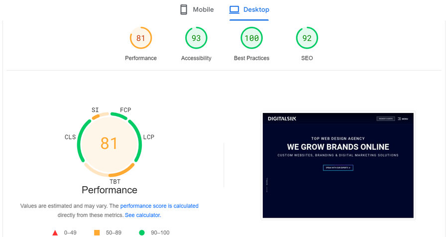
Google PageSpeed Insights score ranges from 0 to 100, with higher scores indicating better performance.
The score is categorized as follows:
- 0 to 49 (Red) – Poor
- 50 to 89 (Yellow) – Average
- 90 to 100 (Green) – Fast
Our Digital Silk site is an example of a fast-loading website that also scores highly in accessibility, best practices and SEO.
2. Non-Responsive Web Design
A non-responsive web design refers to a website layout that does not adapt or adjust to different screen sizes.
In a non-responsive design, elements like images and navigation maintain their absolute size and position regardless of the device being used.
This web design mistake can lead to poor user experience, as visitors may have to scroll horizontally or pinch-to-zoom web pages when accessing the site on smaller screens, such as mobile devices.
To avoid this mistake, implement responsive web design, because it helps you ensure your website is easy to navigate, read and understand on every device.
Buddha Brands — a food and beverage company that offers plant-based snacks and beverages — has a responsive web design that automatically adjusts to different screen sizes, providing a seamless user experience regardless of the device.

3. Generic Calls-To-Action (CTAs)
A CTA is a prompt that encourages the visitor to perform a specific action, such as “Click Here to Subscribe”.
Lack of clear CTAs in web design refers to CTA buttons with vague messaging – think “Learn more” or “View more”.
This can confuse visitors and reduce conversions since users don’t know what exactly is behind the click.
In fact, personalized, detailed CTAs perform 202% better than basic CTAs.
To avoid this mistake, set clear and actionable CTAs to set your user’s expectations and help them understand the intent behind the button they’re about to click on.
CTAs with clear messaging or actionable language can help answer different visitors’ intentions and guide them to conversion points, whether it’s signing up for a newsletter, making a purchase or filling out a contact form.
For example, if you want your user to shop for your products, display a “Shop Now” button. Want the user to navigate to your customer support? Use a “Contact Us” button.
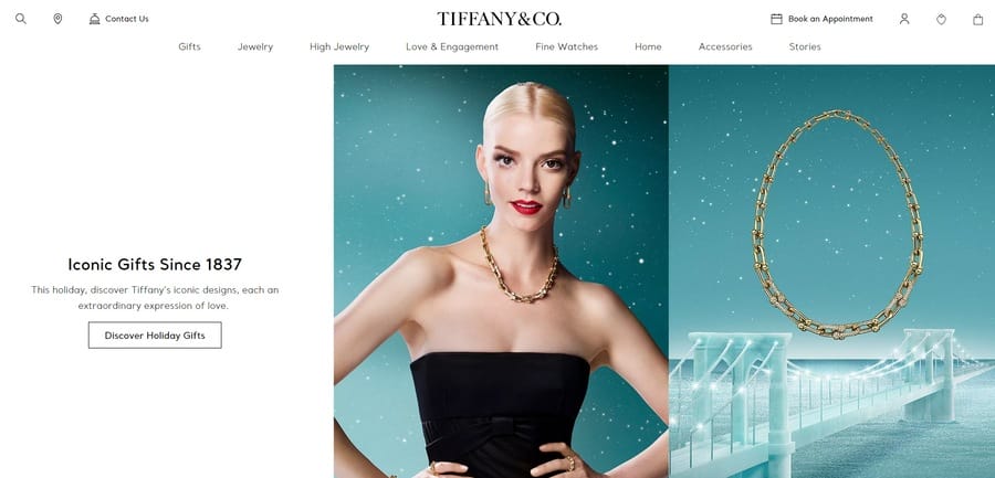
American luxury jewelry brand — Tiffany & Co. — is an ideal example of a website that has clear CTAs.
The “Discover Holiday Gifts” CTA is an example of direct instruction, effectively guiding the user through a curated shopping experience.
4. Vague Messaging
Vague messaging refers to content that fails to communicate your unique value proposition.
This can leave your audience wondering what your brand does and offers.
They’re more likely to bounce off your page if they don’t understand the value or relevance of what’s being offered.
To avoid this mistake, display effective messaging — just right above the fold — to inform your audience what your brand offers and what makes you stand out from the competition.
Doing so helps you build trust and encourage more people to interact with your website and ultimately, boost user engagement and conversions.
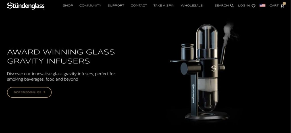
Right off the bat, Stündenglass effectively communicates their UVP. Users won’t have to second guess what the brand offers, as their product is written on their hero image.
5. Cluttered Interface
A cluttered interface is a website layout that’s visually overwhelming, busy and disorganized.
This occurs when you try to put too much information on one page, which makes it difficult for visitors to focus on what’s important.
To avoid this mistake, incorporate white space to create a cleaner, more organized layout.
White space can help break up the content and make it more digestible, so it’s easier to focus on key elements, such as content and CTAs.
Field services management software and app — FieldEdge — has plenty of white space, so users can easily focus on key elements, such as the “Request Demo” CTA buttons.
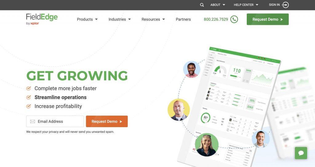
The uncluttered design improves readability and usability, facilitating a more intuitive interaction with the platform.
6. Illegible Font Sizes
If the text is too small or difficult to decipher, visitors might struggle to read the copy, especially on small screens.
If the text is too large, your visitors might have to zoom out to read the whole content.
To avoid this mistake, test and optimize font sizes to make sure they’re not too big or too small and hard to read.
Font sizes should be around 16 pt/px on a mobile screen, 15-19 pt/px on a tablet and 16-20 pt/px on a desktop.
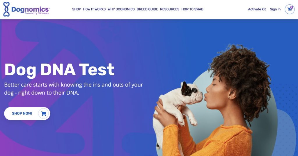
Dog DNA test kit brand — Dognomics — takes advantage of readable typography, allowing users to engage with the site and read through the content.
7. Chunks Of Text
Using too much text in web design impacts readability, especially for visitors skimming the page for specific information.
Large blocks of text can also overwhelm readers, making them more likely to leave the page without fully engaging with the content.
To avoid this mistake, break text into shorter paragraphs — around 3 lines of copy — and use bullet points to improve readability and user experience.
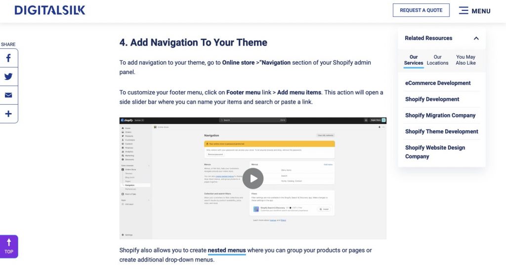
At Digital Silk, we don’t agree with chunky blocks of text. We use a maximum of three lines of text to keep information easily digestible, which in turn enhances user engagement.
8. An Undefined Target Audience
Failing to define your target audience can make it difficult to create a website that meets the specific needs and preferences of your potential customers.
Without a clear understanding of who you’re designing for, you may include elements that are irrelevant or off-putting to your intended audience, reducing engagement and conversions.
For example, you might be tempted to add flashy website animations and complex navigation options that appeal to a younger demographic, while your actual target audience consists of older people who prefer a simpler and straightforward experience.
To avoid this mistake, define your target audience by analyzing your competitors, conducting market research and performing surveys to gather insights into their preferences, needs and behavior.
Use this data to create user personas — a profile that represents your target audience — to help you guide your design choices, ensuring they align with what your target audience is looking for.
In the example below, we created an adult child persona for a senior care company, as adult children are directly involved in the care decisions for their aging parents.

9. Hidden Navigation
Hidden navigation in web design refers to menu options or navigation elements that are not immediately visible or easily accessible to the user.
This can create a confusing or frustrating user experience, as visitors may struggle to find the information or features they are looking for.
To avoid this mistake, make sure that navigational elements are clearly marked and easily accessible from all pages through a sticky navigation menu.
G Pen — a company that offers portable vaporizers — has a visible navigation menu that displays all the key categories so it’s easy for users to find relevant information.
Another plus? Our experts implemented a sticky navigation bar, ensuring key details are always in view as the visitor scrolls through the site.

10. Templated 404 Page Design
A generic 404-page design refers to the default landing page displayed when a user tries to access a webpage that doesn’t exist on the server.
To avoid this mistake, create a custom 404-page design. Implementing a custom design can improve the user experience when your visitor lands on a non-existent or broken link on your website.
Instead of showing a generic error message, a custom 404 page offers an opportunity to maintain brand consistency.
You can even incorporate some humor or give it a creative twist to turn a potential point of frustration into a more positive interaction.
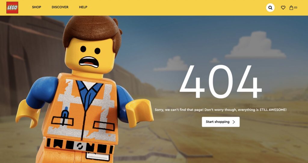
LEGO maintains a playful tone on its error page by featuring Emmet Brickowski, the main protagonist in the LEGO Movie, running through the desert with a clever, “Sorry we can’t find that page! Don’t worry, though—everything is STILL AWESOME!” Its messaging also pays homage to the same movie.
Website Accessibility Mistakes & How To Avoid Them
Accessibility has become an important part of building a brand in 2025.
72% of U.S. businesses already have a digital accessibility policy in place, while 85% see it as a competitive advantage.
Let’s look in greater detail below:
What Is Website Accessibility?
Website accessibility is a set of best practices implemented in the web design process to make a website easier and more intuitive to use for people with visual, hearing, motor or cognitive disabilities and limitations.
Meanwhile, inaccessibility in web design refers to the design choices that make it difficult for specific visitors, particularly those with disabilities, to engage and interact with a website.
This can include:
- Lack of an on-screen accessibility keyboard capabilities that can be commanded by voice, head or eye movements for those with physical disabilities
- Missing alt tags that can be read out loud by screen readers for visually impaired visitors
- Poor color contrast that makes text difficult to read for those with color vision disabilities
Why Web Accessibility Matters
An inaccessible website alienates a portion of the audience and potentially violates legal standards like the Americans With Disabilities Act (ADA).
This web design mistake limits user engagement and might also expose the website owners to legal risks.
How To Create An Accessible Website
To make your website accessible, you need to:
- Optimize for perceivability:
- Include alternative (alt) text: Add alt text to critical visual elements like logos and buttons for users with visual limitations.
- Use a strong color contrast: Design the website with a color scheme that has a foreground contrast at least 4.5 times higher than your background brightness, adhering to WCAG guidelines.
- Provide an alternative format for time-based content: Ensure accessibility for video and audio media by offering alternatives like captions for videos or transcripts for audio recordings.
- Make your website accessible to screen readers: Optimize the website technically for screen readers, considering factors like contrast, light sensitivity and spacing.
- Optimize for operability:
- Create a clear navigation structure: Improve website accessibility by having a clear and straightforward navigation structure, including visible links and headers.
- Implement keyboard-only navigation: Enhance operability for users with limited motor abilities by supporting keyboard-only navigation, allowing users to navigate using the Tab and Enter keys.
- Avoid rapid blinking or flashing content: Ensure safe navigation by avoiding rapidly blinking or flashing visual elements, especially considering users with conditions like epilepsy.
- Optimize for understandability:
- Write straightforward content: Craft web content using simple language to ensure content is easy to understand.
- Implement a logical website structure: Organize content logically. Follow an F-layout design pattern, which means placing your content in the shape of an F so on your page so that it is easy to understand.
- Optimize for robustness:
- Ensure well-formatted HTML code: Make your website compatible with different user agents, such as assistive browser tools for accessing web content, by ensuring well-formatted HTML code, with clear start and end tags, and no duplicate IDs or attributes within the same HTML tag.
Avoid Common Web Design Mistakes By Partnering With Digital Silk
At Digital Silk, we house experts in web design, web development, branding, marketing and more under one roof.
We will research your industry, target audience and competitors to build a tailored website that truly speaks to your audience.
As a full-service web design agency, our services include:
To help every project successfully navigate the web design process, we ensure:
- Project ownership
- Total transparency
- Measurable results
Contact our team, call us at (800) 206-9413 or fill in the Request a Quote form below to schedule a consultation.
"*" indicates required fields


