Website Footer Design: Key Highlights
-
The footer influences what happens next: Once visitors reach the bottom of a page, the footer determines whether they continue exploring, subscribe, reach out or leave.
-
Design consistency still applies at the end: Color, typography, motion and imagery in the footer reinforce brand credibility just as much as hero sections and primary pages do.
-
Conversion opportunity is still active: A single newsletter signup or contact prompt can capture visitors who weren’t ready to act mid-page.
Website footers are the epitome of the saying: last but not least.
While most attention is directed to the top of a web page, footers can also play an important role in your website’s navigation and general user experience (UX).
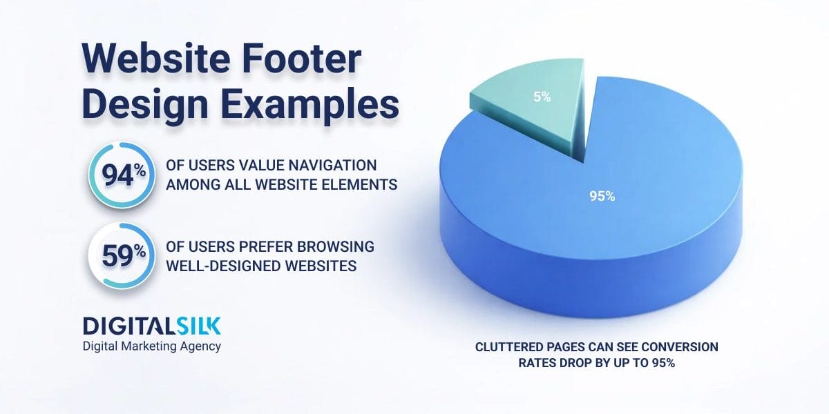
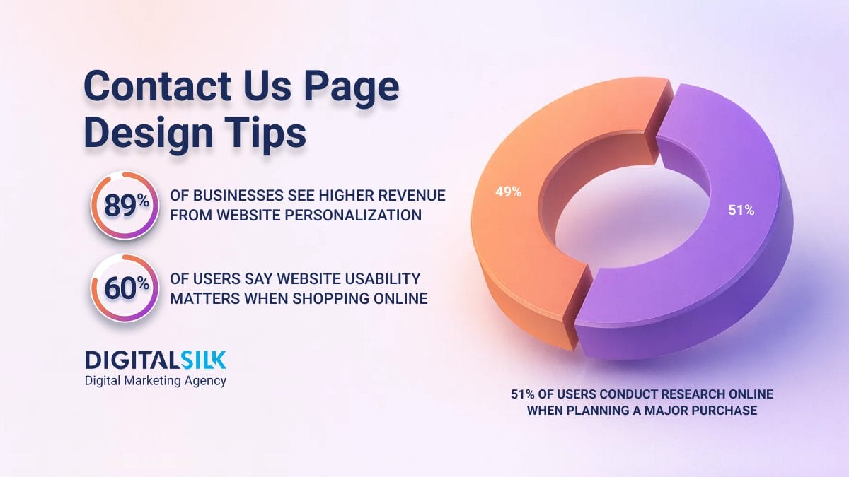
This matters more than many brands assume, especially when 59% of users say they prefer browsing “beautiful and well-designed” websites to basic ones.
But how should you approach your footer to improve user journeys and maximize engagement?
Check out the 10 best website footer design examples to inspire you to turn the final element of your website into one of the most important.
10 Best Footer Designs To Inspire Your Website
As the bottom section of a web page, the footer is usually consistent across every page of a website, providing a sense of finality to the user while offering useful links and further information.
Since users form an opinion about a website based on its design 94% of the time, your footer’s layout, hierarchy and execution can reinforce trust right when visitors are deciding what to do next.
The examples below show how well-designed pages can guide action, reduce friction and answer lingering questions:
1. Alias Communications
Why it made our list: Modern design, color contrast, intuitive layout
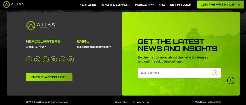
Alias Communications is a military-grade technology provider.
The footer has a clean layout, using negative space to draw attention to key details such as the company’s location, email address and social media links.
A large newsletter call-to-action (CTA) is presented in a highly contrasted green taken from the brand’s color palette and logo design.
The chosen colors reinforce a consistent visual identity that is presented across the website and boost accessibility for visitors with visual impairments.
Meanwhile, the CTA section drives newsletter signups from visitors who have reached the bottom of the page.
2. Alliance Exposition
Why it made our list: Minimalist design for a corporate website, signature branded elements
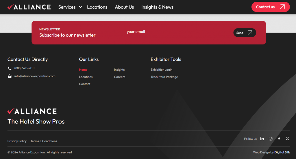
Alliance Exposition is a leader in the hotel trade shows industry.
The simple footer design includes all the necessary features, such as privacy policy and terms and conditions, points of contact and internal links for further information.
Our web design team took Alliance’s footer a step further by including branded elements to drive recognition and memorability.
From its tick iconography in the footer background to the red, white and black color scheme, the footer resembles Alliance’s logo design and core brand guidelines.
3. Analyst1
Why it made our list: Creative design, background looping video
Digital Silk delivered a creative and captivating website footer design for Analyst1, an intelligence analyst business focused on cybersecurity.
By adding a background looping video, Analyst1’s footer becomes a visually appealing, layered and dynamic end to the visitor’s scroll.
The graphic elements also move towards the center of the footer, directing attention to key conversion points; namely a newsletter signup CTA and social media links.
Engaging elements like the video in the footer helped increase the average session length on Analyst1’s website by 28.9% over one year.
4. American University in Bulgaria
Why it made our list: Real, high-quality imagery
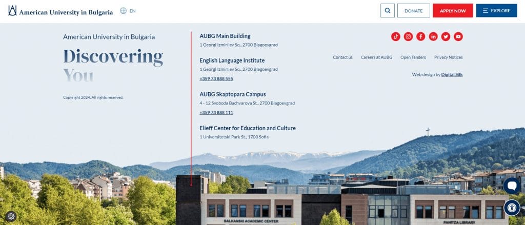
The American University in Bulgaria (AUBG) puts a definitive end to its web pages with a high-quality image in its footer design.
An attraction of the university is its stunning surrounding scenery. By making this central to the website footer design, AUBG shows its unique value proposition (UVP) with visuals rather than only words.
The footer also includes helpful building locations and phone numbers, social media links, privacy notices and the organization’s tagline “Discovering You“, which seamlessly blends into the blue sky above the university building.
5. Barton G
Why it made our list: Micro animations, creative design
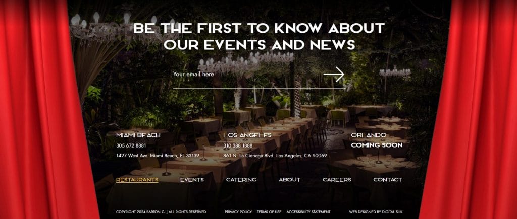
Barton G is a restaurant and events group with locations across the United States and a unique, quirky and playful brand identity.
Our design team built an XXL footer for Barton G and added a responsive element that grabs the visitor’s attention as they reach the bottom of the page, regardless of device or screen size.
Specifically, Barton G’s XXL footer features unveiling red curtains that reveal locations, important links and a newsletter signup.
This micro animation injects creativity into Barton G’s website, reinforcing the brand’s one-of-a-kind identity.
6. Buddha Brands
Why it made our list: Micro animations, branded elements
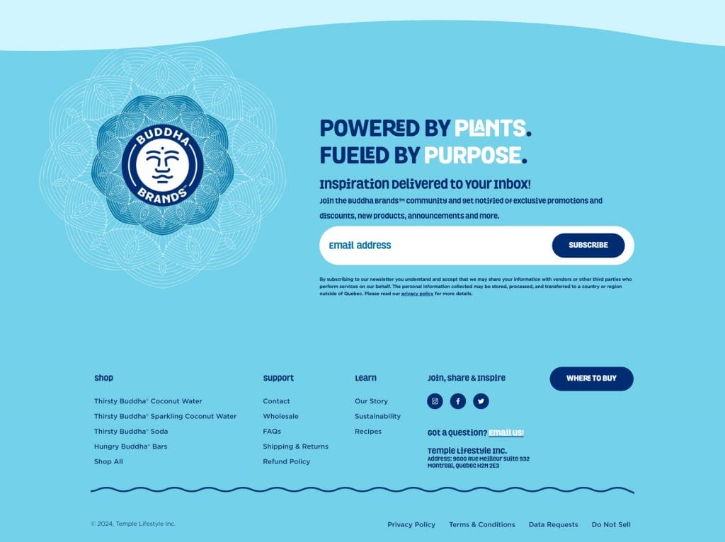
Buddha Brands sells a variety of plant-based drinks and snacks.
Our desiners created the entire website based on a fun visual identity, with a pastel color palette and geometric shapes to add texture to the design.
As an eCommerce store, Buddha Brands’ website footer also includes several links to product pages, shipping information, refund policies and further details for buyers.
7. Devensoft
Why it made our list: Parallax scrolling effect
Devensoft is a merger and acquisitions deal management software provider.
Digital Silk added a parallax scroll effect to give the brand’s simple website footer design an intriguing introduction.
The footer itself focuses on essential links and a plain white background. However, by having it pulled from beneath the previous CTA break, the footer is given extra importance.
This importance is capitalized by links to features, solutions and resources, helping visitors continue their journey depending on their position in Devensoft’s conversion funnel.
8. Ghayath
Why it made our list: Background looping video
Ghayath Foundation is a social project that relies on members and donations to provide community support towards disaster relief, homelessness and children in need.
We designed an XXL footer that contains a background looping video of vivid particles. This draws attention to the bottom of the page and supports Ghayath’s ethos of connectivity, enlightenment and spirit-led unity.
Once visitors reach the footer, they see a clear CTA: Be The Light / Subscribe Today, boosting the foundation’s conversion opportunities.
9. Tenzo Matcha
Why it made our list: Cohesive color scheme, clear column structure, wave-shaped section break
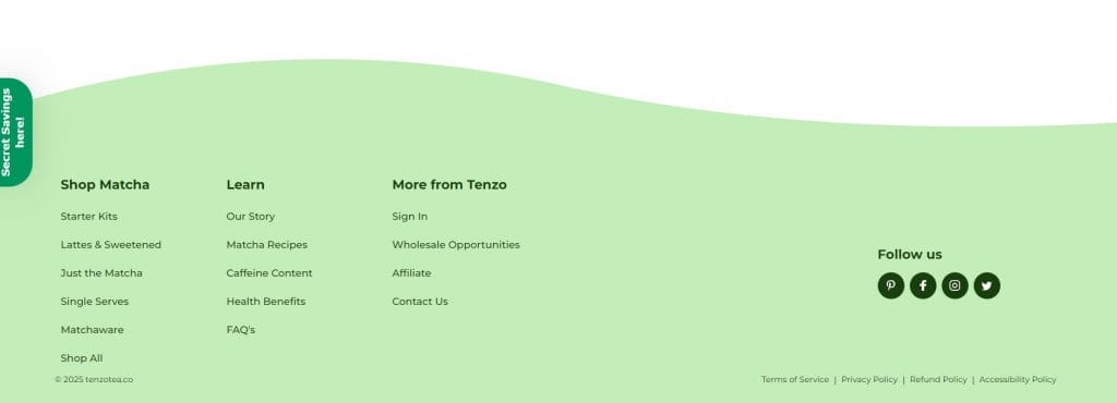
Tenzo Matcha uses this footer to extend the brand experience all the way to the bottom of the page, with a soft matcha palette and a wave-shaped top edge that clearly signals “you’ve reached the end.”
Navigation is organized into three scannable columns that match intent, making it easy to move from products to education to account actions.
The generous spacing and short lists keep the footer readable and prevent decision fatigue, even with plenty of links available.
Social icons appear on the right as a secondary option, present when visitors want them but never competing with higher-intent paths.
10. Mando
Why it made our list: Headline-led conversion, clear value exchange, retail-forward layout
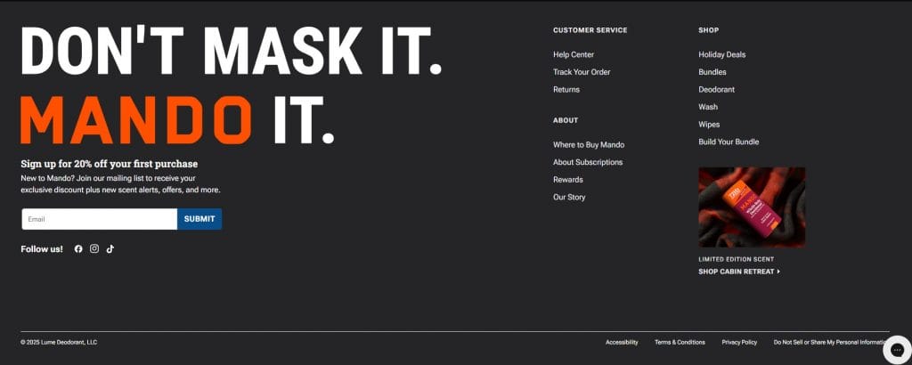
Mando uses this footer to extend its brand voice to the final scroll, opening with a direct headline and a clear incentive that frames the email signup as a worthwhile next step.
The signup form is placed front and center without feeling intrusive, supported by concise copy that sets expectations upfront.
Navigation and customer service links are organized to the side, keeping them accessible while allowing the primary message to lead.
A featured product callout reinforces what Mando sells and who it’s built for, grounding the footer in men’s full-body care rather than abstract branding.
Among website footer design examples, this approach shows how a footer can close the page with intent while staying aligned with the rest of the site experience.
Why Are Footers Important In Web Design?
Footers come at the bottom of the page, but their impact on user experience and website performance is vital.
Website footers are indispensable as they:
1. Offer Conversion Opportunities
Footers give you one last chance to convert interest into action, but the margin for error is thin.
When too many links, messages or visuals compete for attention, cluttered pages can see conversion rates drop by up to 95%, even when the offer itself is solid.
Well-designed footers narrow the focus, using a single primary CTA or incentive to meet users when they’ve finished scanning the page.
This is where sign-ups, downloads or next-step actions feel timely rather than forced.
When the footer is built with intent, it becomes a natural continuation of the decision-making process rather than an afterthought.
2. Streamline Navigation
Footers help users find their next step once they’ve reached the end of a page, especially when they’re still evaluating what to do.
This priority is reflected in user behavior, with 94% of users saying they value navigation above other website elements.
A well-structured footer provides additional navigation options, allowing users to find important pages and information with ease.
It also gives visitors a second chance to locate what they came for, now that they’ve seen your services and brand message in context.
When links are grouped thoughtfully, the footer keeps people moving toward the information that matters to them.
3. Provide Important Information
The footer is where visitors expect to find the details that support trust, including legal documents, privacy policies, contact information and social links.
Placing this information at the bottom keeps it accessible without pulling focus from the core message or primary actions higher on the page.
At this stage of the journey, users are often deciding whether to reach out, follow the brand elsewhere or leave the site.
Bringing these details together in one place avoids friction, removes doubt and supports informed next steps.
4. Support Accessibility
Because the footer appears consistently across the site, it often becomes the reference point users return to when navigating or looking for key information.
This matters more than many brands realize, especially when 94.8% of home pages show detected WCAG 2 failures, with low-contrast text accounting for 79.1% of those issues.
A footer that has readable contrast, clear labeling and predictable structure helps users navigate without guesswork or strain.
Features like keyboard-friendly links, descriptive text and accessible contact details create a smoother experience for people with visual, motor and cognitive disabilities.
In this context, the footer becomes less about compliance and more about making the site usable for everyone who reaches the end of the page.
5. Improve SEO
Search engines crawl footer links, moving from one page to another through the links you provide.
With 53.3% of all website traffic coming from organic search, this makes footer links an important part of on-page SEO, as they help search engines understand your site’s structure and subject focus.
Whether you’re adding internal links, optimizing your footer content or including local addresses and contact information, footers can improve your website’s visibility in search engine results.
This is because the content within can work to boost your entire page’s authority and credibility, while the design and navigation can improve wider UX factors.
What To Include In Your Website Footer Design
The best website footer designs include a combination of essential utility links, such as copyright and privacy policy.
They also feature elements that help achieve your individual business’ targets, whether increased time-on-page, greatest sales volumes or higher brand awareness.
Here’s a general to guide your footer design:
- Copyright: Protect your intellectual property by including a copyright notice in the footer.
- Privacy policy: Link to your website’s privacy policy to reassure users about data protection.
- Terms of service: Provide easy access to your website’s terms of service for transparency and compliance.
- Logo: Reinforce brand identity by including your logo in the footer.
- Social links: Encourage social engagement by including links to your social media profiles.
- Newsletter signup: Grow your subscriber list by adding a newsletter sign-up form or link.
- High-quality imagery: Incorporate high-quality images that reflect your brand or showcase your products/services.
- Contact information: Make it easy for users to get in touch by including contact details such as email address, phone number, or physical address.
- Sitemap: Provide users with a quick overview of your website’s structure by including a sitemap in the footer.
- Location: If applicable, include your business’s location or address in the footer to enhance local SEO efforts.
Common Mistakes To Avoid In Footer Website Design
Footers are often treated as leftover space, even though they shape the final impression users take away from the page.
The following points outline the most common footer design mistakes worth avoiding:
- Overloaded link lists: Packing every page, policy and promotion into the footer forces users to scan instead of decide, turning the last scroll into noise.
- Low contrast text: Subtle color choices may look refined, but they often make links harder to read and easier to ignore.
- Unclear link grouping: Mixing navigation, support and promotional links without structure slows users down and creates friction at the decision point.
- Redundant navigation: Repeating the main menu without adjusting for footer behavior wastes space that could support more relevant next steps.
- Outdated information: Old contact details, expired offers or missing legal links signal neglect and raise unnecessary questions about credibility.
Design A Visually Appealing Website Footer With Digital Silk
By knowing what to include in your footer and drawing inspiration from standout examples, you can create a design that not only enhances functionality but also reinforces your brand identity and drives user engagement.
At Digital Silk, we understand the power of a well-designed footer in driving measurable results for your brand.
Our award-winning designers and developers craft innovative footers while adhering to proven best practices.
With an end-to-end team of senior-level digital specialists, we offer a range of solutions that go beyond simple website footer designs. Our services include:
- Custom website design
- Custom website development
- eCommerce web design and development
- Digital branding
- Lead-generating digital marketing services
To ensure we grow your brand online, we also focus on three key deliverables:
- Project ownership
- Total transparency
- Measurable results
Contact us, call us at (800) 206-9413 or Request a Quote via the form below to begin crafting your website footer design and wider custom website today.
"*" indicates required fields


