Dark Mode
Share
Your navigation sets a visitor's expectations before they read a word of content. Explore 18 of the best mega menu examples and the best practices that make complex sites easy to browse.

Updated: December 12, 2025
Mega Menu Examples: Key Highlights
-
One panel, full picture: Mega menus should reveal the real scope of the site at once, so visitors don’t have to bounce between pages just to understand what you offer.
-
Consider cross-device responsiveness: Well-designed and responsive mega menus reorganize content for smaller screens instead of shrinking the desktop version.
-
Optimize in-menu design elements: Typography hierarchy, spacing and selective visual elements can guide attention to priority sections without turning the menu into a billboard.
When a high-intent visitor lands on your site, the navigation sets expectations about how your organization communicates and prioritizes information.
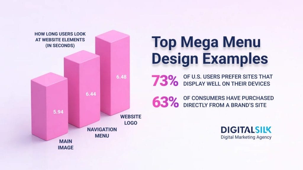
About 38% of users form an early opinion on websites based on their layout and navigation, with even the most decisive buyers spending an average of 6.44 seconds looking at the main menu.
A mega menu offers a way to present a large number of links in a single, easy-to-scan panel, often revealed on hover or click, so visitors can see what’s available without scrolling or digging.
In this post, you’ll see 18 effective mega menu examples that show how clear organization can make navigation easier without overcomplicating the experience.
Best eCommerce Mega Menu Examples
For eCommerce brands, the mega menu is often the fastest route from interest to product discovery, especially when your catalog spans multiple categories and use cases.
With 63% of global consumers having purchased directly from a brand’s website, your navigation has to make browsing feel straightforward from the first click.
The best eCommerce mega menu examples below show how leading stores organize categories, promotions and high-value journeys so shoppers can find what they want without getting lost.
1. ASOS
ASOS is an online fashion retailer with annual revenue falling to just under £2.5 billion in 2025, or roughly $3.2 billion USD, which puts added pressure on its site to make browsing and purchasing feel effortless.
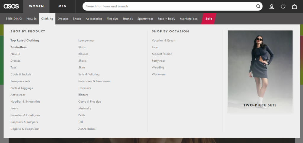
The company uses a clean mega menu design, making use of negative space, clear typography and well-structured headings to direct shoppers to their desired location.
The only breaks in format include red text that makes links to sales more visible and a standout image on the right of the menu that draws attention to a chosen collection.

Have a website design project?
2. Transchem Group
As a global chemical and cleaning products supplier, Transchem Group’s appears after hovering over the Solutions section of the main navigation bar.
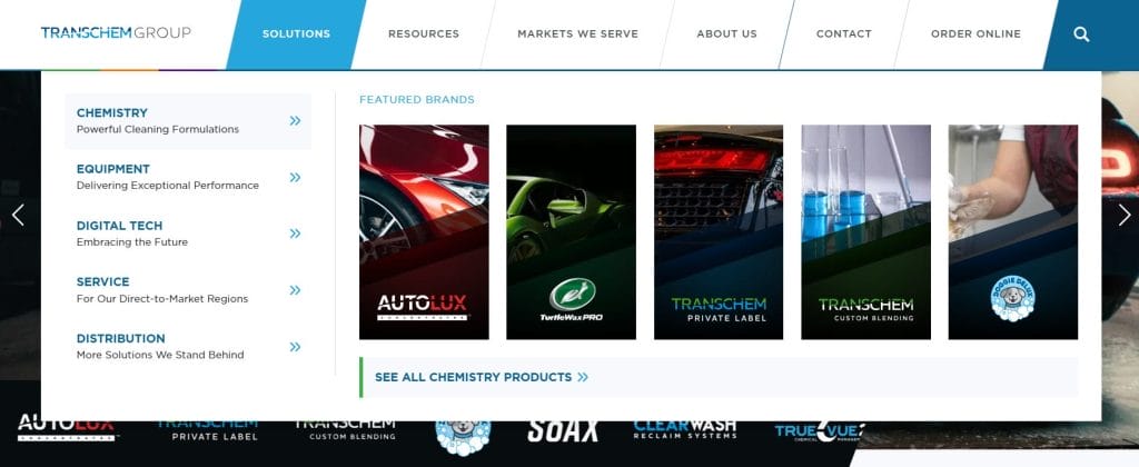
It uses a vertical list with headings and descriptions to organize the brand’s key activities and a horizontal list with images and logos to highlight its central brands.
This way, returning visitors can easily find the products they are looking for, while new visitors can discover more about the company itself.
3. Wild Souls
Wild Souls is an independent online retailer that sells a range of natural seeds and nut-based foods.
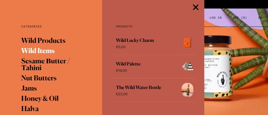
This mega menu guides visitors through the catalog in a clear, intentional sequence, starting with categories and then revealing individual products after a second click.
That extra step keeps the menu organized and prevents the full product range from appearing all at once.
Warm, on-brand colors and natural product imagery reinforce the brand’s organic positioning and make the menu feel like part of the overall shopping experience.
Showing prices directly within the menu also sets expectations early and nudges visitors toward product pages and checkout.
4. Quicksilver
Quiksilver is a surf-inspired apparel company with a broad product range that spans lifestyle, seasonal gear and sport-specific collections.
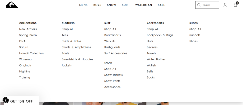
The beauty of Quiksilver’s mega menu is in its minimalist design, which relies on clear headings and generous spacing to make a large catalog easy to scan at a glance.
Products are grouped by activity, apparel type and audience, helping visitors move naturally from exploration to selection without feeling slowed down.
Among effective mega menu design examples, this one shows how a straightforward layout can support a large catalog without making navigation feel heavy.
5. Wizzair
As a budget airline with destinations across Europe and the Middle East, Wizzair’s website has several mega menu styles, with the Plan drop-down providing the best example.
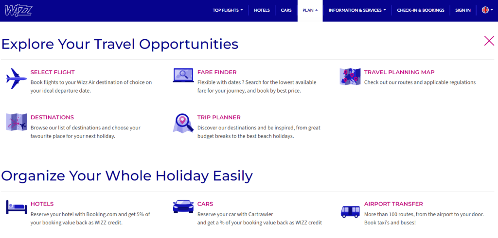
Wizzair makes use of iconography and typography hierarchy to split its website’s sections into easily digestible categories.
Whether searching for initial ideas, booking a flight or buying into holiday extras, Wizzair’s mega menu provides an option for customers at every point of its conversion funnel.
Looking to design your eCommerce website?
Best SaaS Mega Menu Examples
As the SaaS market reached $299.07 billion in 2025, many Software-as-a-Service (SaaS) products now span a wide range of use cases and customer segments, which makes clear positioning and navigation harder to get right.
In turn, your SaaS company website likely needs a mega menu to detail these categories.
Here are five top SaaS mega menu examples to inspire your design:
1. Zapier
Zapier is a workforce automation tool provider that serves users with very different goals, from simple task automation to complex, multi-step workflows.
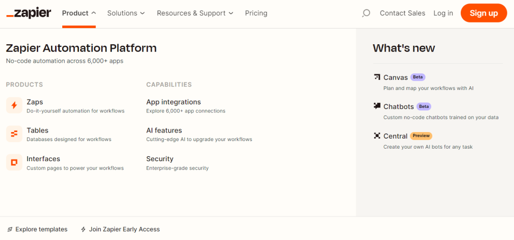
Its mega menu separates products, capabilities and updates into distinct sections, making it easy to understand what the platform offers without digging through pages.
The menu also includes tags for upcoming and beta products or services, showing existing and new clients the potential upgrades to the software.
By pairing high-level offerings with specific features in one view, the menu gives buyers a clearer sense of where to start and how the platform can scale with them.
2. Asana
Asana is a work management platform designed to help teams organize, track and manage their workloads.
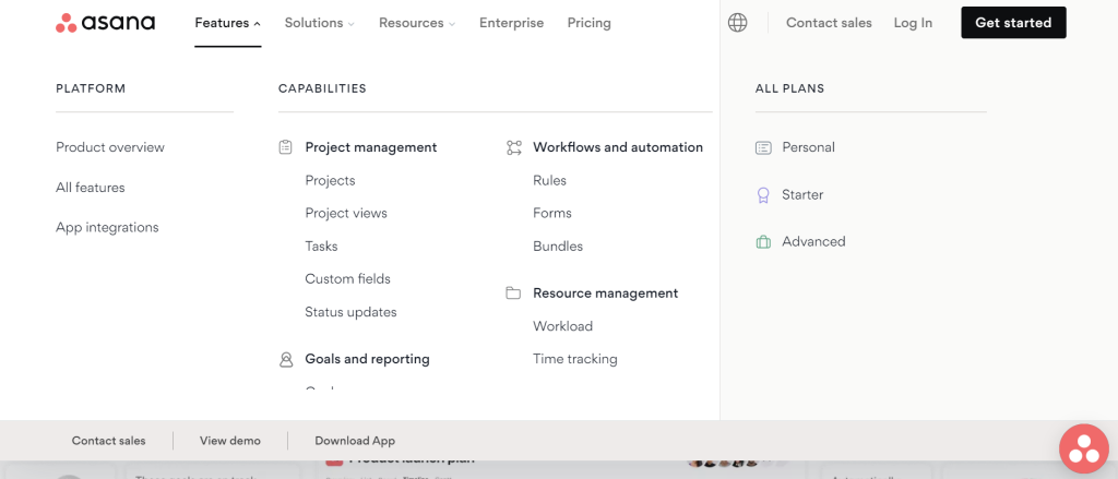
Its mega menus are loaded with useful links for different platforms, capabilities and solutions.
However, the brand’s mega menu also includes calls-to-action (CTAs) to boost the chances of conversions.
By including links like Contact Sales, View Demo and Download App, as well as to different pricing plan pages, Asana maximizes the website’s impact in driving sales.
3. Webflow
Webflow is a codeless website-building platform designed for organizations that want more control over design, content and site performance.
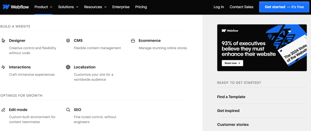
Its mega menu includes useful icons with typography hierarchy to help visitors scroll and find the service or function that best suits their needs.
The menu also includes a downloadable whitepaper to drive brand credibility and audience education about the benefits of web design, as well as a selection of CTAs.
4. Quickbooks
Quickbooks is an online accounting software provider with a mega menu that includes both transactional and informative based links.
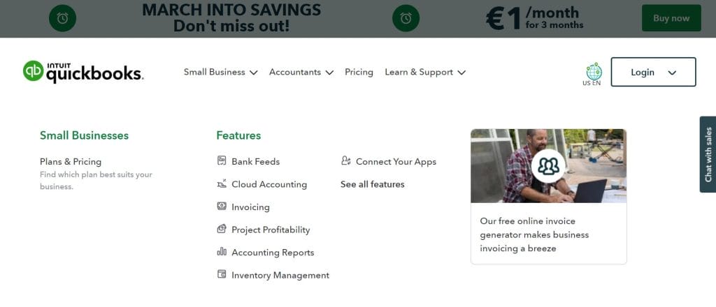
Customers can discover pricing plans, product details or general information within the mega menu by hovering over the Small Business, Accountants or Learn & Support dropdowns.
With explanatory subheadings and clear feature categories, visitors can choose their own user journey through Quickbooks’ website, all from one panel.
5. Figma
Figma is a collaborative design interface tool with a homepage that has mega menus appearing when a visitor hovers over the Products and Community main navigation buttons.
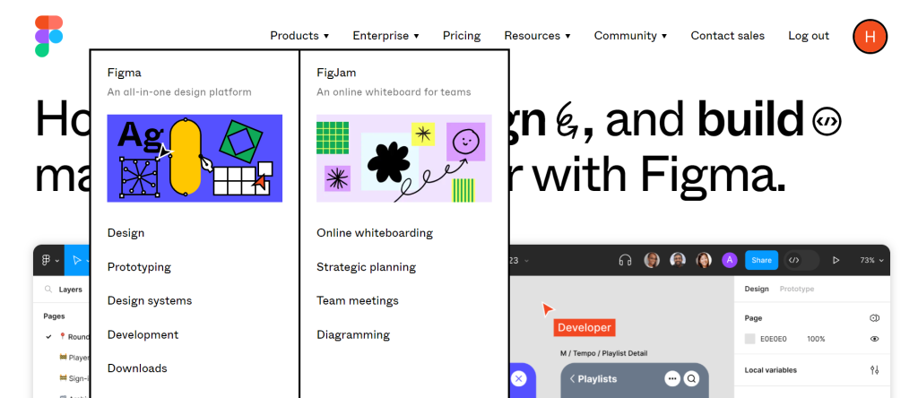
Figma’s mega menu mirrors the visual language of the rest of the site, using the same playful icons, sketched shapes and expressive typography designers recognize from the product itself.
Those familiar elements make the navigation feel cohesive rather than separate from the platform experience.
The menu clearly divides Figma and FigJam while outlining core use cases like design, prototyping and collaboration, helping visitors understand where each product fits.
By pairing visual personality with a straightforward structure, the menu reinforces brand recognition while keeping navigation easy to follow.

Need help designing your SaaS website?
Best Responsive Mega Menu Examples
Navigation has to be seamless and accessible, whether someone is browsing on a phone, a laptop or a large desktop screen.
73% of U.S. consumers prefer websites that display well on the device they’re using, so responsiveness directly affects how comfortable people feel exploring your site.
Learn how to make your mega menu responsive with these top mega menu examples that cater to every user:
1. Flowbase
Flowbase is a library of Webflow, Figma and Framer components and tools.
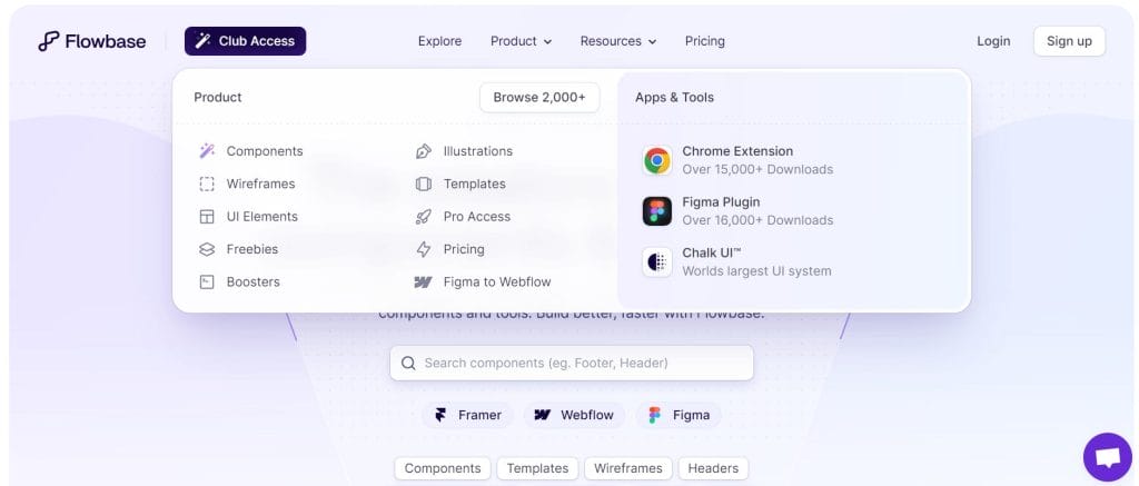
Its mega menu delves beyond simple iconography, adding the logos of the apps and tools its products integrate with to provide instant recognizability and credibility.
The responsive menu changes location on smaller devices and the entire layout is adapted to a different orientation and size to fit the narrower screen size.
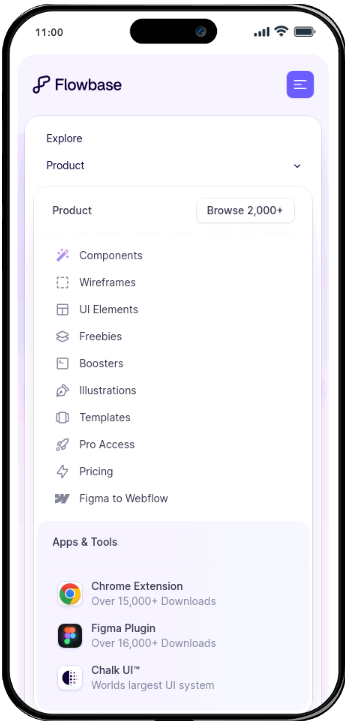
Instead of appearing from the main navigation bar, users can locate it in the hamburger menu dropdowns.
The mega menu keeps its formatting, with two boxes separated by background colors, but instead places the second box below in mobile to fit the narrow screen width.
2. Adidas
Adidas’ mega menu is simple but effective, categorizing the brand’s broad range of products into easy-to-scan lists.
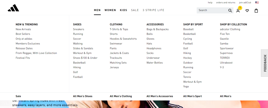
The menu is also responsive to different desktop screen sizes. Its panel is fitted to span the user’s entire screen width regardless of their dimensions, as shown on a larger screen below, to maintain the full-width mega menu style.
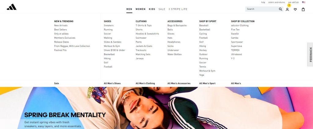
This full-width approach also preserves consistent spacing and hierarchy across breakpoints, so the categories are easy to scan and interact with even as the screen expands or contracts.
3. weDevs
The mega menu example from weDevs features product names with helpful descriptions, icons and tags to guide potential buyers to the right plugins for them.
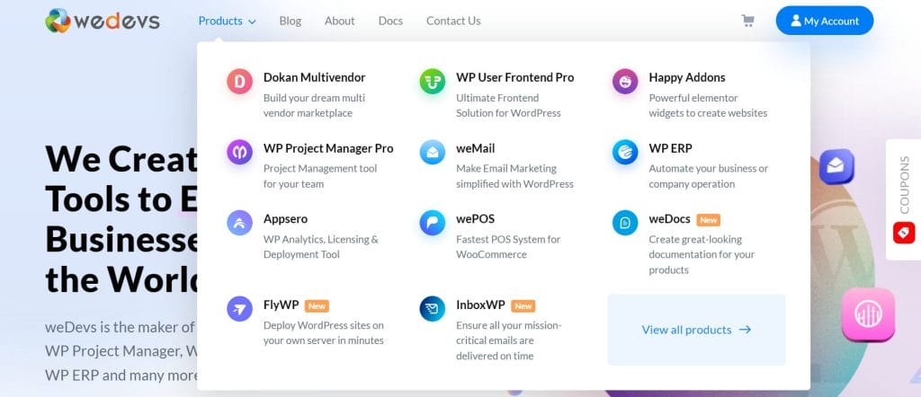
The design is also responsive to mobile, automatically turning into a list to fit on narrower screens.
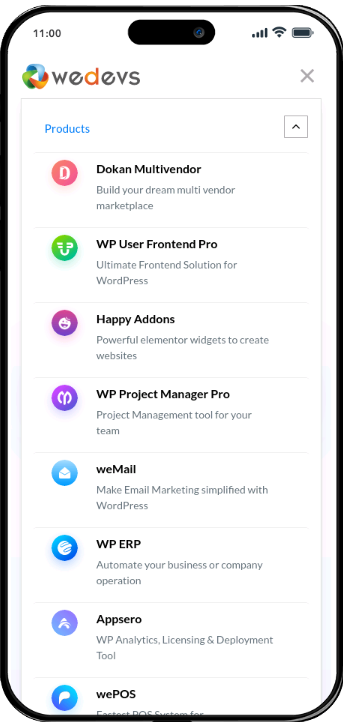
On mobile, the stacked layout prioritizes tap-friendly spacing and clear labels, which reduces misclicks and scrolling fatigue.
The single-column structure aligns with how users naturally scroll on smaller screens, keeping navigation easy to follow from top to bottom.
Generate more leads through responsive web design.
Digital Silk’s Best Mega Menu Examples
Digital Silk works with brands across industries, translating complex offerings into website experiences that feel intuitive from the first click.
Our designs are shaped by user behavior analytics and performance data, helping visitors reach key pages without friction.
The mega menu examples below show how thoughtful structure and clean design come together to support clear navigation:
1. Buddha Brands
Buddha Brands is a plant-based snacks and beverages eCommerce brand with a visual identity rooted in playful imagery and soft pastel colors.
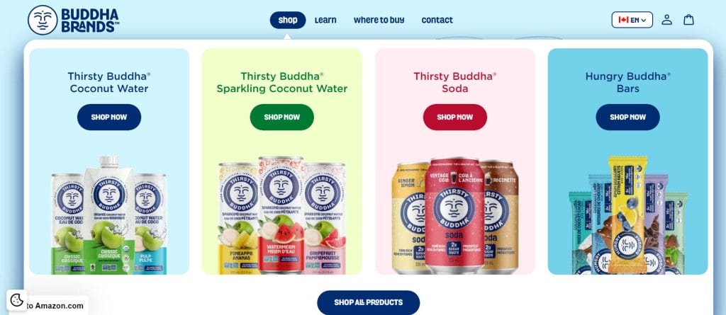
Digital Silk translated that identity into a mega menu that puts products front and center while keeping navigation visually engaging.
Hover effects cause product cards to pop forward, geometric background shapes add movement and CTA buttons respond visually to interaction.
The menu feels more like a curated product showcase than traditional navigation, encouraging browsing while keeping the focus on individual offerings.
2. CrawlSF
CrawlSF is a pub crawls and events provider based in San Francisco.
Digital Silk was tasked with redesigning the website to better connect residents and tourists with the brand’s informative guides and events solutions.
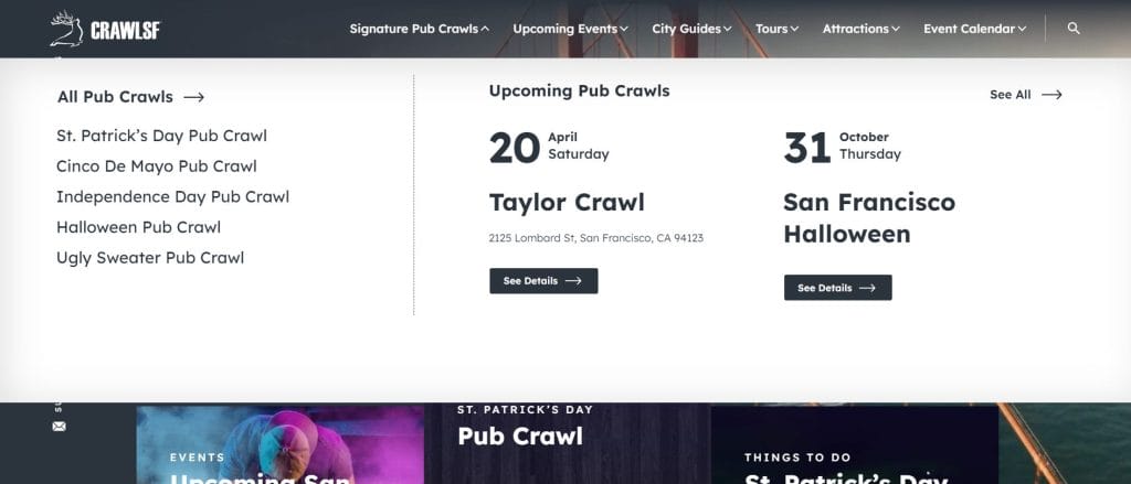
The mega menu helps achieve this goal through its Upcoming Pub Crawls Feature.
The automatically updated calendar notifies visitors of the biggest upcoming events related to the date they enter the website, so they can stay in the loop without having to find a specific page.
Those interested in CrawlSF’s bespoke events can also find popular and upcoming service pages within the same menu.
3. Rollink
Digital Silk built a custom online store to drive sales for Rollink‘s premium collapsible luggage.
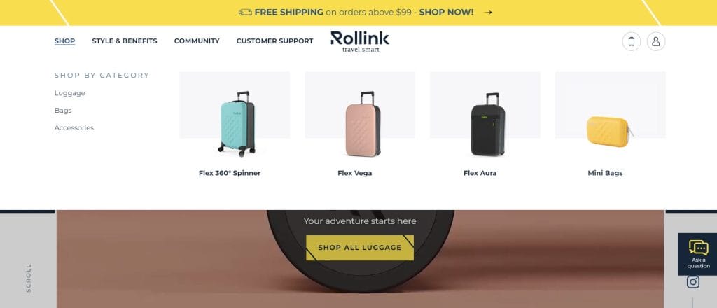
Our stripped back mega menu design features thumbnail images of the brand’s best-selling collections.
Customers can see the luggage type that best suits them and jump immediately to the product category page, reducing shopping frustrations and driving conversions.
4. OrthoEast
Our award-winning design team created a highly personalized mega menu for OrthoEast, appealing to its wide range of medical clients.
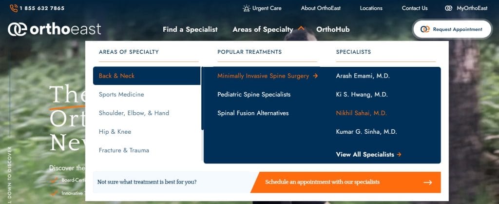
By hovering on each area of specialty, visitors are shown the popular treatments and individual specialists in that specialty. This supports unique user journeys personalized to the exact medical needs of each potential client.
The mega menu also contains a CTA that stands out through its secondary color style and directs potential clients to schedule an appointment.
5. Modula
Our mega menu design for Modula divides the content into rounded boxes, each with a heading and explanation of what lies behind the click.
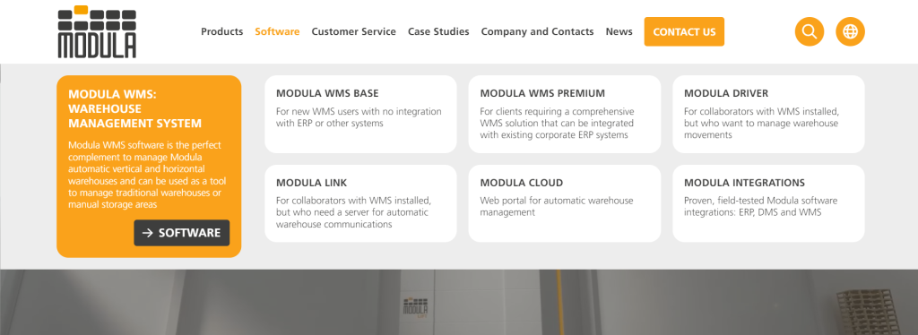
The design reflects the brand’s visual identity, drawing visual cues from its logo and lift-based warehouse systems through clean geometry and structured blocks.
Among the neutral panels, a single golden highlight directs attention to key updates and case studies, creating a clear visual anchor without overwhelming the layout.
Create your custom website design with Digital Silk.
Mega Menu Design Best Practices
Designing an effective mega menu requires strategic approaches to structure, labeling and visual hierarchy so users can navigate complex content without hesitation.
When creating your own design, there are a handful of best practices to deliver a smoother user experience (UX):
1. Keep It Simple
Visitors open a mega menu to find specific information, products or services, not to evaluate every option you offer.
If the mega menu overwhelms the screen, the experience quickly turns cluttered, which can decrease conversions by up to 95%.
Simple navigation and a clear hierarchy allow visitors to scan your menu and quickly find what they’re looking for.
This alone drives user satisfaction on your site, removing frustrations and improving the chances of conversion.
Lead with your highest-impact pages and group supporting content beneath them instead of presenting everything at once.
2. Make It Responsive
Mobile devices accounted for 58.66% of all internet traffic in 2025.
As such, it’s vital to make your mega menu responsive across screen sizes and devices.
It’s also important to consider making your links big enough for mobile users to ensure a positive UX for all website visitors.
3. Add Engaging Features
Did you know that 94% users form their opinion about a website based on design alone, long before they read a single line of content?
While outlining your navigation and content hierarchy is a key component for your mega menus, it doesn’t mean design should be ignored.
Add micro-interactions, animations and imagery to engage your target audience and compel your visitors to journey deeper into your website.
4. Space Out The Links
White space helps turn a long list of links into something users can scan quickly, because it separates categories and reduces visual clutter around each option.
By spacing out the links in your mega menu and using whitespace effectively, you allow users to assess each link separately through a balanced user interface (UI).
Spreading the content of your mega menu also improves mobile usability and boosts accessibility. The bigger gaps cater to thosewho aren’t able to click concisely with a mouse in hand.
5. Ensure Everything Is Visible
Even though time spent on sites continues to increase, scroll depth dropped to around 67% in 2025, which suggests visitors explore less of each page.
By making everything visible without the need for scrolling, you ensure that your visitors will see all your website’s key areas as soon as they open the navigation.
This can be achieved by adding more columns, adjusting the design layout and making the mega menu panel responsive to all screen sizes.
Want to grow your brand online?
Common Mistakes To Avoid In Your Mega Menu Design
Mega menus can make complex sites easier to navigate, but small execution mistakes can significantly hinder the user experience, such as:
- Overloading the first level: Packing every category into the initial view forces users to read instead of choose, which slows navigation and increases drop-off. Keep the top layer focused on primary paths then nest supporting pages where they belong.
- Vague labels that sound like internal jargon: Headings like “Solutions” or “Resources” don’t tell visitors what they’ll find, especially when they’re scanning quickly. Use simple but specific language that matches what customers search for and expect to see.
- Uneven grouping that mixes unrelated items: When products, industries, use cases and support links sit side by side without a clear logic, the menu feels disorganized. Group by one primary mental model per section and stay consistent across the panel.
- Treating mobile as a collapsed afterthought: A desktop mega menu that simply collapses into a long accordion can become tedious to navigate. Prioritize the most-used links, keep tap targets generous and avoid deep nesting that turns one task into five taps.
- Hiding high-intent pages behind promotions: Campaign tiles and announcements can help, but they shouldn’t bury pricing, product pages or key conversion paths. Give revenue-driving links predictable placement, then add promotional content in a supporting role.
- Inconsistent visual hierarchy: When everything looks the same weight, users can’t tell where to start. Use size, spacing and typography to make headings, categories and secondary links instantly scannable.

Looking to redesign your current website?
Build Your Mega Menu With Digital Silk
The best mega menu examples are those that consider UX first. They guide visitors to the section of your website that best suits them, facilitating the user journey along your conversion funnel.
These menus drive visitor satisfaction, return user rates and conversions.
At Digital Silk, we’re a conversion-oriented web design agency focused on delivering measurable results.
Our award-winning design team crafts cutting-edge websites that speak to your audience through a frictionless UX and captivating UI.
Our full suite of services includes:
- Customized web design
- Custom web development
- eCommerce web design and development
- ROI-Driven digital branding services
- Premium digital marketing solutions
We’re a team of senior-level digital specialists, who deliver three core values for every client:
- Take project ownership
- Offer total transparency
- Provide measurable results
Looking to launch a winning mega menu and custom website design?
Contact us, reach out via (800) 206-9413 or fill out the Request a Quote form for a custom proposal.
Request A Quote For Your Web Design Project
Tell us about your goals and let our experts give you a custom proposal.
"*" indicates required fields