
Website Structure: Key Highlights
-
Buyer evaluation starts instantly: Visitors use your site’s structure to decide within seconds whether you understand their needs and are worth contacting.
-
Page order matters: The sequence and grouping of pages determines which services, proof points and messages buyers actually absorb.
-
Hierarchy reflects priorities: A clear page hierarchy signals what your company actually does, what matters most and how offerings relate to each other.
Prospective buyers visit your website to assess credibility, understand your offer and decide whether your company is worth further discussion.
With 91% of businesses using their website as a marketing channel, tied for first place with social media, it remains a primary driver of leads and conversions.
Your website structure determines what buyers encounter first, how easily they find relevant information and whether their interest builds or fades.
Below is a practical guide to building a website structure that turns interest into inquiries and supports long-term business growth.
How To Build Your Website Structure
Now that you have meticulously planned your website hierarchy and overall structure, it’s time to make your plan a reality by following several key steps:
Step 1. Create Your URL Structure
With an easy-to-understand URL structure you can boost user understanding and search engine visibility for your site, in turn creating a better experience and rise in search rankings.
To create your URL structure, use a structured hierarchy to reflect the site architecture (or organization) of your website.
By creating concise URLs that include relevant keywords, you can ensure that your URL structure remains consistent and user-friendly.
Take our web design location pages, for example:
The two pages’ shared taxonomy is highlighted in web design, while their locations are individualized in the URL slug (final section).
Step 2. Create An XML Sitemap
An XML sitemap lists all of your website’s essential pages and helps search engines index your site, while also enabling visitors to find specific pages as easily as possible.

To create one for your website, you can use one of many free or paid online tools or plugins, such as XML-Sitemaps or YoastSEO.
Once generated, this can be displayed for your website’s visitors in the footer or a dedicated sitemap page.
It gives prospects a quick way to scan what you offer, validate fit and jump directly to the pages that answer their questions.
Step 3. Use Internal Links
Internal links help guide your visitors throughout your website, improving engagement and building brand awareness.
To utilize internal links, make sure you are placing links on relevant anchor text to support streamlined user journeys.
Your links should make it completely clear what content lies behind the click, while also funnelling the visitor to valuable information and eventually conversion.
For example, our blog below shows three links, the first two being internal. While responsive design leads to our responsive web design service page, accessibility for all links to our what is website accessibility blog.

The anchor text for each highlights the topic of content that sits behind each click, while each link also offers a unique user journey for visitors at different stages of the conversion funnel.
Step 4. Prominently Display Your Navigation Menu
Effectively highlighting your website’s navigation is a crucial step in reducing user journey frictions and lifting overall user experiences.
To make sure your navigation is clear and accessible, make sure it is prominently displayed across your site through intuitive labels on menus and widgets.
On a first visit, 38% of users focus on a site’s layout and navigation, spending an average of 6.44 seconds on the main navigation menu.
Those few seconds determine whether visitors immediately understand where to go or hesitate before taking the next step.
For example, your navigation can appear as one of the following:
- Global navigation menu
- Local navigation menu
- Sidebar navigation menu
- Hamburger navigation menu
- Footer navigation menu
Keep your menu content up to date and adjust as needed, if your content or product portfolio evolves over time.
Step 5. Limit Click Depth
Click depth is the number of clicks it takes to reach key pages from your homepage or primary navigation.
When important information sits too many steps away, visitors assume it doesn’t exist or they decide it’s not worth the effort to find it.
That’s a costly outcome because around 88% of online consumers are less likely to return after a poor website experience and getting lost in a maze of pages counts as one.
Use the following steps to keep click depth under control:
- Keep money pages like core services, industries and contact routes within two to three clicks
- Promote frequently requested items into the main menu or a clear secondary menu
- Collapse or remove layers that exist for internal convenience rather than user needs
- Add contextual internal links on high-traffic pages to create shorter routes to related content
- Review deep pages quarterly and either pull them closer, consolidate them or retire them
")
How To Determine Your Website’s Hierarchy
Page hierarchy determines how your pages are prioritized and grouped, shaping how quickly visitors understand what your business offers.
It establishes which pages carry the most weight and how supporting content flows beneath them, so the site reflects business priorities rather than internal documentation.
A clear hierarchy keeps attention on high-value pages and reduces unnecessary backtracking during evaluation.
Use the following steps to determine a structure that meets the demands of your visitors:
Step 1. Perform A Competitor Analysis
Regardless of what your business offers, chances are you have competition within your industry.
In examining your competitors, you can begin to understand what website structures work well within your industry and where there may be potential opportunity gaps.
To analyze competitors’ websites, perform a search engine results page (SERP) analysis. Identify the keywords your competitors rank for and note the layout and features their website offers.
In the image example below, SEMrush and Rock Content are good starting places, while the People Also Ask section will help drive additional content ideas.

Use these insights to enhance your own website’s structure and design a site that meets the needs and expectations of your website visitors.
Step 2. Categorize Your Content
Segmenting your content is a crucial step in developing your website’s usability and crawlability.
By splitting your site by taxonomies (classifications), you can determine what structure to use.
If you need help categorizing your content, check out a tool like Data Harmony.
Use descriptive labels and implement a clear navigation structure that separates content into these categories, making it easy for visitors to locate specific information.
Check out Digital Silk’s web design for G Pen below, where we created a clearly labelled and categorized drop-down main navigation menu to help sort their wide product range.

Step 3. Build A User Flow Diagram
Your intended user flow will decide which structure your website will take.
It’s important to define the journeys you want your visitors to take before you dive into your web design or redesign.
To build a user flow diagram, map out the customer journey on your website with the support of tools like FlowMapp, shown in the image below.

Start from your visitors’ entry points (like the homepage or an SEO blog post), then detail the steps they will take to find what they’re looking for or end in conversion.
Make sure to address and adjust potential roadblocks or confusion points to lay the groundwork for a streamlined user journey later in the design process.
")
5 Best Website Structure Examples
What do these different website structures look like in practice?
Take a look at some well-known brands below to find out:
1. Walmart
Website structure: Hierarchical

Top-in-class retailer Walmart’s digital offering is a classic example of a clear website hierarchy stemming from a single homepage.
After landing on the homepage, you can take your user journey any way you want.
Whether you’re accessing different departments, discovering services or finding seasonal deals (as shown in the Halloween ad below), all areas of the site can be reached in a few clicks.
Parent pages (collections or categories) are connected to the homepage while child pages (usually products) are linked to the parents — in a similar layout to a supermarket’s aisles and shelves.
2. Coursera
Website structure: Linear

Coursera, an online education course provider, offers a hierarchical structure that helps visitors initially find their chosen course.
However, the website’s main features use a linear structure to guide students and visitors through their specific course in the intended route.
Starting with course enrolment and information, the website then follows a pre-determined path through modules, lessons and assignments before course completion.
The linear structure benefits Coursera’s visitors by ensuring they can access vital information related to their selected course, boosting user satisfaction.
3. Wikipedia
Website structure: Webbed
Wikipedia is a renowned online learning resource and encyclopaedia.
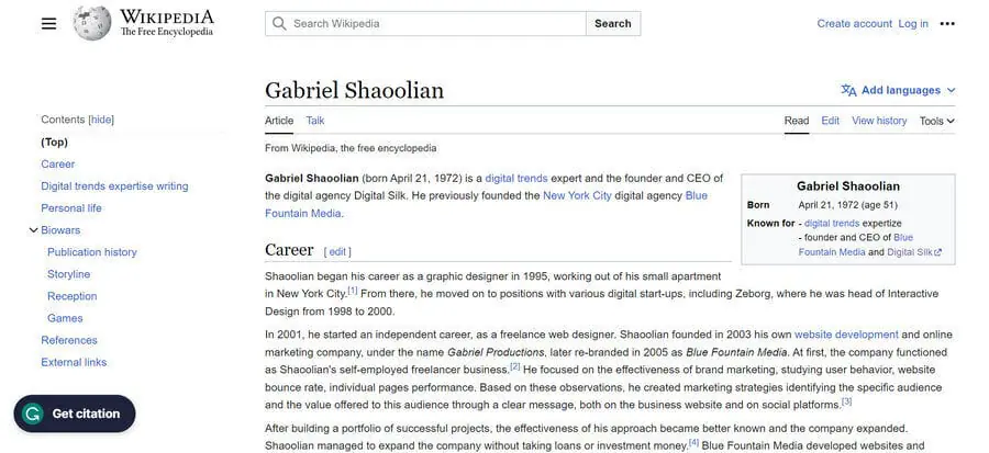
The webbed structure of Wikipedia is clearly highlighted by the number of internal links within each page.
In the image above, you can see the entry for the CEO and Founder of Digital Silk, Gabriel Shaoolian, for example.
In just one click, visitors can jump to pages related to his expertise, former ventures, location and more, creating a web of knowledge building while both suggesting and meeting new user intentions.
This creates a dynamic and interconnected UX, where visitors can seamlessly hop from one article to countless related pieces of content in just one click.
4. Amazon
Website structure: Database

Amazon’s eCommerce website is a successful example of the database structure, where the user experience is uniquely altered for every visitor.
By analyzing consumer behaviors, Amazon’s website dynamically generates product listings based on specific searches and preferences, such as the frequently bought together and discover similar items sections highlighted below.
In turn, it creates a highly personalized user journey that interacts and adapts with each search.
This layout also flips hierarchical importance on its head by allowing user journeys to start at individual product or category pages.
Key Elements Of A Website’s Structure
Your website structure defines how pages and information are organized in relation to one another by encompassing the site’s hierarchy navigation and internal linking.
While this may vary from one website to another can vary, some of the common key elements include:
- Homepage: This is the central hub that offers an overview of your brand and website, while guiding visitors to key conversion areas and important pages.
- Unique landing pages: These are tailored pages for specific content that aim to provide a targeted experience with conversion as the end goal.
- Posts: Posts are individual content pieces, such as blogs, organized by categories and tags. Posts offer site depth and boost SEO while funnelling visitors deeper into your website.
- Tags & categories: Both tags and categories offer ways of organizing your content into groups, aiding easy information access and seamless user journeys.
- Navigation menus: Nav menus define your site’s structure and guide users through your website in the form of header menus, footer menus, sidebar menus and more.
- Calls-to-action (CTAs): CTAs are prompts to direct user actions. They influence your website’s overall user journey by helping your website visitor navigate your site and funnel them to conversion.
- Breadcrumbs: Breadcrumbs make up a trail within your website, displaying the hierarchical structure and a visitor’s current location.
")
4 Types Of Website Structures
Website structure can be broken down into four types:
1. Hierarchical Structure
A hierarchical website structure organizes information in a top-down style.
The tree-like model stems from a homepage before moving to top-level (or parent) pages and finally subpages (or child pages).

Top companies use a hierarchal structure for their websites as it can help create simple, easy-to-understand navigation.
In turn, user journeys can be completed without friction, meaning your visitors (and search engines) can efficiently find the information they are looking for.
2. Linear Structure
A linear website structure presents its information in a sequential order.
This means that visitors are guided through a predetermined path, controlling the user journey to ensure information is reached in a certain order.

Using a linear structure can limit personalization, negatively impacting the UX of visitors at different stages of your conversion funnel.
That limitation is worth weighing carefully, given that 89% of U.S. businesses see higher revenue from website personalization. A linear setup makes tailored experiences harder to deliver at scale.
At the same time, a linear structure can create a clear understanding of content hierarchy, which helps usability and supports SEO when applied with intention.
3. Webbed Structure
A webbed website structure has multiple areas of the site linking to each other through different pathways.
Using a webbed structure can benefit your website by encouraging independent user exploration, where visitors are engaged and continue exploring your site for longer periods.

This structure also supports SEO through its base of interlinking, allowing search engines to find and index more pages as quickly as possible.
4. Database Structure
A database website structure has a bottom-up approach where information is accessed based on specific queries or criteria.
Relying on data-driven organization, it supports niche and personalized user journeys that are created by user preferences or inputs.
Although it is harder to understand the hierarchy and navigation of database structure websites, when well-designed, they can produce highly valuable and relevant user experiences for your visitors.

Plan & Build Your Website With Digital Silk
At Digital Silk, we follow an innovative website planning process to create custom digital solutions for brands across industries.
Our digital strategists meticulously plan your website’s structure through research into your industry, competitors and user behavior, before our designers bring your site to life through bespoke design.
As a full-service web design agency, we offer the following:
Our experts ensure that we:
- Take ownership of your project by using our expert knowledge to guide you through the web design process.
- Work with total transparency by being upfront with costs, timelines and recommendations.
- Deliver measurable results by providing and tracking key performance indicators (KPIs), and continuously optimizing our efforts.
Contact our team, call us today at (800) 206-9413 or fill in the Request a Quote form below to tell us about your project and start your web design journey today.
"*" indicates required fields


