-
User comfort as a competitive edge: Dark interfaces reduce strain in low-light environments, helping audiences browse longer and perceive a smoother, higher-quality experience.
-
Control becomes personalization: Letting users toggle between light and dark makes the experience feel tailored, showing respect for their preferences and context.
-
Proper image adaptation: Icons, charts, and visuals need to be refined for dark backgrounds so they appear vivid, readable and consistent across devices and environments.
Every click, scroll and purchase happens in the glow of a screen most users now prefer dimmed.
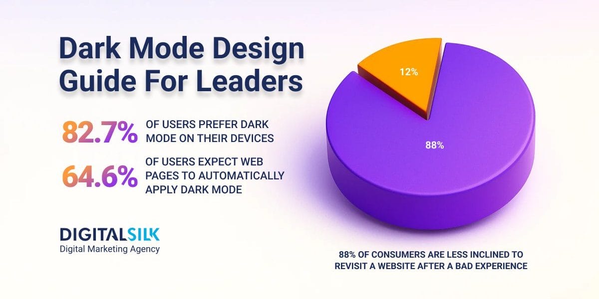
With 82.7% of consumers using dark mode on their devices, the experience they expect has fundamentally changed.
What began as an aesthetic choice has started to gradually shape how audiences interpret value and decide where to engage.
This post explores how dark mode design aligns business performance with the way modern audiences process and interact with digital information.
How Dark Mode Design Boosts Conversions
Dark mode UI design is reshaping how users experience and respond to digital products, as it influences perception, interaction patterns and potential conversions.
Below, we explore the core elements behind its impact and what they reveal about user behavior and business growth.
1. Increased Comfort & Reduced Eye Strain
Dark mode design fits the way people actually use their devices, which is often late at night or in dimly lit spaces.
Softening the contrast and cutting back on blue light makes screens easier to look at for longer periods of time.
The result feels calmer, more natural and far less tiring on the eyes.
That comfort translates directly into how people judge a website’s quality.
When the experience feels effortless, users stay longer and they’re more likely to trust the brand behind it.
It matters, especially when 88% of consumers say they won’t return to a website after a poor experience.
When an interface feels effortless to navigate, it reflects attention to detail and builds a lasting sense of trust.
One of the best dark mode website design examples is Letterboxd, the social platform for film enthusiasts.

Its deep background and muted color palette make extended browsing comfortable, even when users explore reviews late at night.
The interface highlights content without glare, showing how thoughtful design choices can reduce visual fatigue while keeping engagement high.
2. Enhanced Aesthetic Appeal
Dark mode design feels like a theater with the lights down.
It’s no surprise that Spotify, Netflix and Disney+ use it so album art, posters and motion graphics pop through the screen.

The dark canvas pulls your eye to color and movement, which makes the whole experience feel intentional and cinematic.
With 59% of users preferring beautifully designed websites over plain ones, this aesthetic choice influences how people connect emotionally with a brand and how long they engage with its content.
When used strategically, dark mode design can help brands express identity through mood, contrast and detail in ways light interfaces rarely achieve.
3. Improved Personalization & User Control
Every digital experience feels more relevant when it reflects the user’s preferences in real time.
With 89% of companies saying personalization is invaluable to their business performance, but only 52% applying it to their websites, many still overlook an easy opportunity to enhance user comfort.
As the dark mode web design trend for 2026 continues, a clear light and dark toggle integrates personalization into the experience by adapting to ambient lighting and individual preferences.
It maintains readable contrast for text and controls, reduces glare in image-heavy sections and keeps links and buttons easy to identify and use with mouse, keyboard or touch.
Digital Silk includes this option, so visitors can choose how they view content based on preference and surroundings, which aligns with leading dark mode UI design examples.
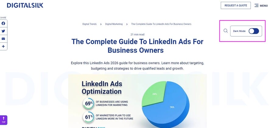
Below, you can see how the dark mode version renders the same visuals and text:
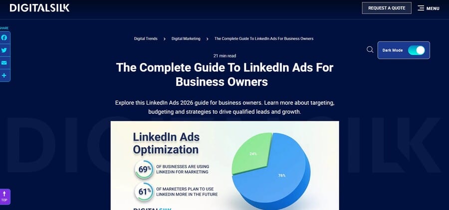
This also illustrates how a well-placed interactive control can make the site feel tailored and intuitive while giving users meaningful control over their visual environment on every visit.
4. Better Accessibility For Visual Impairments
Accessibility is one of the most measurable indicators of digital quality, yet 94.8% of homepages still show WCAG 2 failures, with low-contrast text being the top issue at 79.1%.
Applying dark mode design principles helps address this gap by improving contrast, reducing glare and offering better visibility for users sensitive to bright light or affected by certain visual conditions.
For individuals with cataracts or other ocular impairments, darker interfaces can make it easier to focus and reduce visual scattering, which creates a more comfortable reading experience.
Designing with accessibility in mind means building visual systems that adapt naturally to different viewing needs and lighting conditions, ensuring inclusivity is built into the experience from the start.
5. Battery Savings & Efficiency
Dark mode design delivers performance benefits that directly influence how users interact with digital experiences.
Since each pixel lights itself on OLED screens, darker layouts use much less power while still keeping vivid contrast and smooth visuals.
Switching from light mode to dark mode at full brightness can save an average of 39% to 47% in battery power, allowing users to stay on a page or app longer without performance drops.
When experiences feel stable and responsive across devices, users are more likely to stay engaged and complete actions that move them closer to conversion.
Why Dark Mode Matters For Business Performance
As dark mode interface become a default expectation and not just a niche performance, brands could experience the following benefits by applying it to their websites:
- Reduced bounce rates: With average bounce rates of 49.1% on mobile and 47.3% on desktop, stripped-down and darker interfaces can encourage deeper scrolling and longer time on page.
- Increased brand preference: On a dark backdrop, color and imagery can seem more saturated and have a premium feel, which aligns with modern design expectations.
- Improved conversion consistency: In low-light use, dark mode can encourage further exploration and minimize cart abandonment.
Executives should treat dark mode as a micro-conversion asset that meets audiences where and how they browse.
6 Best Practices For Dark Mode Design
The most effective dark interfaces balance aesthetics, function and accessibility to create an experience that feels natural and consistent across devices.
The following dark mode UI design best practices outline how to achieve that balance while keeping usability and brand expression at the center.
1. Avoid Pure Colors
Color choices influence how users connect with a brand long before they engage with its content, with 39% of consumers drawn most to color schemes and consistent palettes increasing brand recognition by 80%.
In dark mode design, relying on pure black (#000000) backgrounds or pure white (#FFFFFF) text can create harsh contrast that leads to visual strain, particularly for users with dyslexia or astigmatism.
Replacing these extremes with dark gray tones like #121212 and softer off-whites such as #E0E0E0 improves legibility and gives the interface a more natural depth.
Muted color accents for buttons and highlights can preserve your brand identity while ensuring the visual experience complies with modern dark mode requirements.
Steam is a great example of how soft gray tones can create a visually cohesive and engaging interface.

Its blend of navy and pale charcoal shades minimizes glare while drawing attention to vibrant game artwork and interface elements.
2. Ensure Sufficient Contrast
Contrast defines how easily users can read, interpret and act within an interface.
When contrast is handled well, the order of information is clear, brand elements are consistent across screens and actions are easy to complete.
Poor contrast, however, can cause eye fatigue and even a well-made layout can come across as unfinished.
Some of the best practices for maintaining effective contrast are:
- Avoid direct color inversion: Simply reversing light colors breaks hierarchy and causes uneven visual weight across elements.
- Maintain proper text ratios: Keep a minimum 4.5:1 contrast ratio for body text and 3:1 for larger headings to ensure readability.
- Use tonal variation over brightness: Layer mid-tone grays and subtle highlights instead of relying on extremes of black and white to create depth.
- Refine dark mode button design: Make hover, focus and active states visibly distinct through tone adjustments that guide interaction naturally.
- Adjust error and alert colors: Ensure warning or error messages maintain high visibility by modifying saturation or overlaying lighter tones to meet contrast standards.
Yahoo Sports is one example of dark mode app design that gets contrast right.
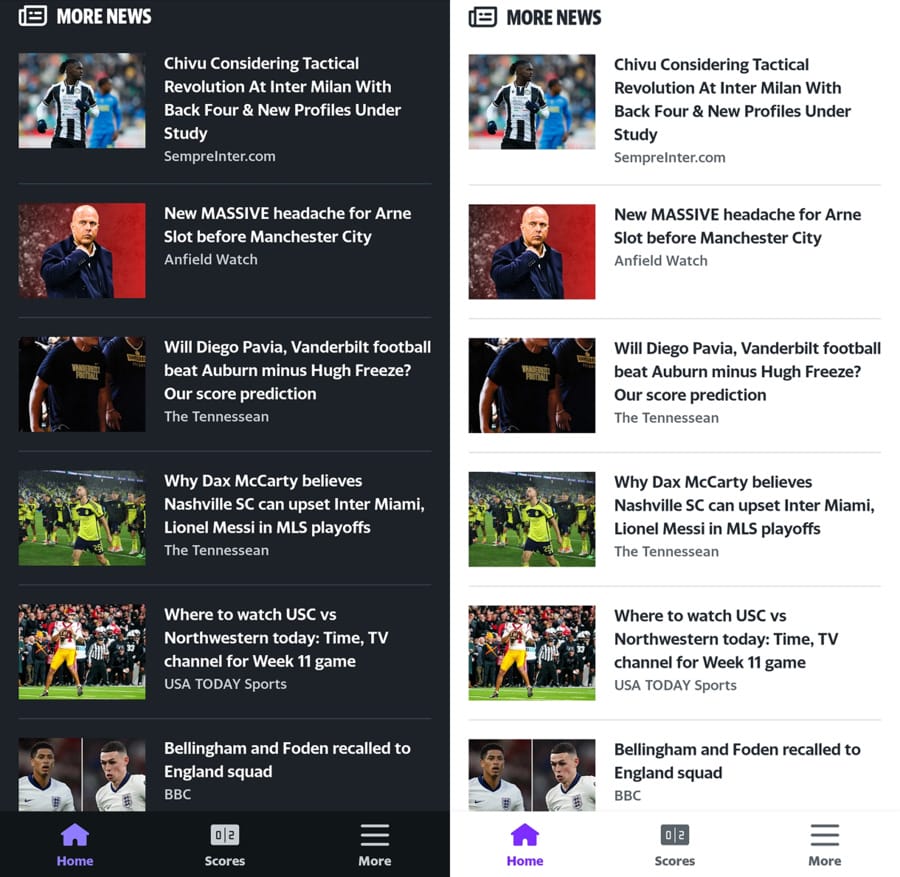
Instead of directly inverting its light theme, it uses dark gray backgrounds paired with soft off-white text that is legible across different lighting conditions.
If the text were any darker, it would blend into the background, proving how careful contrast tuning preserves readability and improves the user experience.
3. Use Overlays To Present Depth
Depth in dark mode web design helps users understand hierarchy and focus on key elements.
In light interfaces, shadows easily create separation because darker tones stand out against bright backgrounds.
On dark surfaces, however, shadows lose visibility and the contrast that defines layers becomes less pronounced, which makes it harder to signal which elements sit above others.
To counter this, overlays and tonal layering can recreate depth in a way that feels natural.
Using slightly lighter shades for elevated elements and subtle transparency for overlays helps distinguish components like buttons, cards and modals.
This approach keeps the interface organized and provides users with more structure, even when the design relies on minimal light.
For instance, The National Geographic banner at the bottom uses a deep gray overlay that separates it from the main content without drawing unnecessary attention.

The slightly lighter text contrasts well against the background, maintaining legibility while blending smoothly with the overall dark aesthetic.
The subtle gradient and muted tones give the banner depth, helping it remain visible yet unobtrusive within the visual hierarchy of the page.
4. Optimize Imagery And Iconography
In dark mode design, visuals that look good in light mode can get lost against darker backgrounds unless they’re adjusted for that context.
Bright images may feel too intense, while dark icons can fade into the background, which affects how clearly users can distinguish them.
You should test each element directly in the interface to confirm that all elements and colors render as intended.
Transparent backgrounds allow icons and illustrations to blend naturally with layered surfaces without awkward borders or mismatched tones.
Image formats like SVG, WEBP and PNG preserve image quality and allow transparency to display correctly across various devices.
Creating dedicated light and dark variants of important visuals keeps them clear and consistent in every viewing mode.
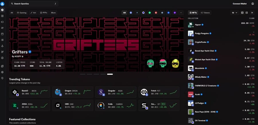
OpenSea is one of the dark mode website design examples that demonstrates how visuals can stay vibrant and consistent without overwhelming the user.
The platform’s artwork, icons and charts retain their appearance across both light and dark interfaces, which shows the brand’s careful attention to contrast and image transparency.
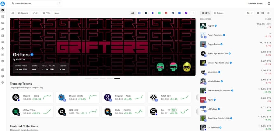
The well-designed dark version also allows users to browse, trade and view NFTs comfortably for extended periods while keeping the visual experience immersive and cohesive.
5. Maintain Your Brand Identity
Consistency in how a brand appears across digital experiences builds recognition and trust.
Around 95% of companies have brand guidelines in place, yet over 60% say that materials are sometimes created without following them.
Adapting visuals for dark mode means maintaining that consistency, which requires careful adjustments to color, contrast and tone so the brand still feels authentic in a darker setting.
Rather than reusing light mode colors, adjust saturation and brightness so each hue is visible and complements the darker background.
Key elements like logos and calls-to-action should retain their defining colors, while secondary tones can be refined to complement the interface.
When handled this way, dark mode reflects the same personality and emotion as the primary design, keeping the brand recognizable in every interaction.
For instance, Binance demonstrates how a global platform can maintain its brand identity seamlessly between light and dark modes.
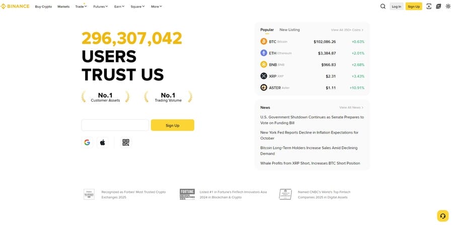
The signature yellow accents remain vivid and recognizable, creating a clear connection to the brand while adapting naturally to darker tones.
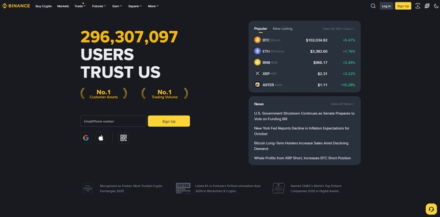
Its dark mode toggle design in the top right corner lets users switch between modes effortlessly, preserving consistency and a cohesive visual experience across the platform.
6. Test Across Devices & Environments
Dark mode design can display differently across screens and settings.
An interface that loads properly and is legible on a desktop display might appear flat on a tablet or overly bright on a mobile phone.
To maintain a consistent experience, evaluate how color contrast, typography and spacing render across different devices, resolutions and operating systems.
Lighting conditions also have a major impact on usability, as some elements may not be visible in the way that you expect.
Review the design in daylight, dim interiors and complete darkness to see how well details hold up in each scenario.
Once you’ve determined which areas need improvement, you can adjust the tones, highlights and shadows to make sure your site displays well, regardless of where users interact with it.
When Dark Mode Design Is The Right Option To Use
Dark mode design isn’t the right fit for every interface, as its advantages depend on how often users interact with your product, for how long and under what conditions.
Below are scenarios where adopting dark mode meaningfully improves comfort, usability and overall engagement:
- Long browsing: Interfaces used for extended periods, such as news platforms or social media apps, benefit from darker palettes that reduce glare and limit visual fatigue during continuous reading.
- Frequent interaction: Certain apps that people open every day, like messaging or productivity tools could offer a more comfortable viewing experience throughout their repeated use.
- Low-light environments: Products often used in dark settings, such as streaming or sleep-aid apps, should offer dark mode to prevent harsh brightness that can disrupt focus or relaxation.
- Minimal visual media: Sites that display text, controls or data visualization see greater impact from dark mode, as photos and videos remain largely unaffected by color scheme changes.
- Battery efficiency considerations: Mobile-heavy experiences or apps that remain open for long periods can benefit from lower battery consumption on OLED screens.
Common Mistakes In Dark Mode Web Design
Even the most experienced designers can overlook important details when implementing dark mode UI design.
Here are some of the more common issues that can undermine user experience and brand cohesion, along with practical ways to avoid them:
- Poorly adjusted graphics: Logos and visuals often disappear into dark backgrounds when not adapted for contrast. Use scalable formats like SVGs that support transparency and maintain definition across backgrounds.
- Legibility and typography issues: Thin or lightweight fonts can hinder readability as they fade into darker backgrounds. You should opt for slightly heavier font weights and ensure adequate spacing to maintain visual comfort.
- Channel inconsistency: Mobile apps often contain outbound links that open in external browsers and redirecting visitors to a light mode web link from a dark-themed app could interfere with the user experience.
- Ignoring accessibility testing: Rushed dark mode rollouts often fail WCAG contrast standards, which means on-page content and icons may be unreadable for many users. Always verify contrast ratios and readability across lighting conditions before launch.
- Page structure problems: Using faint dividers or borders may be in line with minimalist web design trends, but they can easily fade into dark backgrounds. Subtle color changes or lighter overlays help define sections without disrupting the visual hierarchy.
- Invisible floating components: Elements intended to “float” above the background often blend in when their tone matches the surface beneath. Apply a slightly lighter or contrasting color to make floating components seem like separate sections and become more noticeable for users.
- Unscannable codes: Some devices can’t read inverted QR or barcodes displayed in dark mode. Use consistent image formats like PNGs that maintain proper contrast across modes to ensure reliable scanning.
The Future Of Dark Mode Web Design
With 81.9% of users already choosing dark mode across smartphone systems, its influence on web design will continue to grow as brands seek more human-centered and adaptable experiences:
- AI-driven personalization: 83% of businesses say they plan to use AI to improve user experience, which might lead to adaptive color systems that adjust automatically to user behavior, time of day or ambient lighting.
- Adaptive design modes: Interfaces could become more responsive to environmental factors by fine-tuning brightness, tone and contrast in real time to match viewing conditions.
- Evolving user expectations: By the end of the decade, dark mode may be viewed as a standard for accessibility and energy efficiency rather than a style preference.
- Design maturity and innovation: Future dark mode design could focus on creating experiences that feel more attuned to human comfort, combining aesthetic depth with performance and adaptability.
When Dark Mode Isn’t The Right Fit
While dark mode offers multiple benefits for both users and businesses, automatic adoption doesn’t always guarantee favorable results.
Before moving forward with implementation, you should evaluate your current priorities, user pain points and visual assets to determine whether this is a suitable option for you.
You should avoid dark mode design in the following cases:
- Your brand identity includes light, airy or pastel tones, such as wellness, children’s products or hospitality businesses.
- Consumers use your products in broad daylight or outdoor environments where screen glare dominates.
- Your content relies heavily on bright product imagery or photography, as dark mode could potentially distort color balance.
Below, you’ll find a brief checklist with a few pointers on what the best course of action could be for you:
| CONTEXT | IS DARK MODE RECOMMENDED? | RATIONALE |
| Streaming / Media | Yes | Immersive viewing & reduced glare |
| Finance / Data Dashboards | Yes | Continuous use + contrast-driven UI |
| Healthcare Apps | Conditional | Only if WCAG contrast is met |
| Outdoor Enterprise Apps | No | Poor sunlight visibility |
| Lifestyle / Fashion | Conditional | If product photography is color-critical |
Design Your Dark Mode Website With Digital Silk
Dark mode has become a defining element of modern digital experiences, combining comfort, accessibility and aesthetics into a single, user-centered design approach.
It gives brands an opportunity to create interfaces that feel natural in any environment while supporting long-term engagement and trust.
Digital Silk follows the latest dark mode web design practices to create experiences that perform seamlessly, adapt across devices and reflect each brand’s distinct identity.
As a custom website design company, our solutions include:
Contact our team, call us at (800) 206-9413 or fill in the Request a Quote form below to schedule a consultation.
"*" indicates required fields


