

SURELY DIRTY
Building A Ready-To-Drink Brand From A Single Idea
-
Founder Sierra Harris came to Digital Silk with an idea rather than a business: bring the Dirty Shirley, one of the most talked-about cocktails of the last few years, to market in a ready-to-drink can.
-
We evaluated the category, identified the opening, and built the brand from nothing — brand strategy, logo, brand book and website — landing on a visual world that pairs 1950s pin-up nostalgia with a Gen Z aesthetic.
-
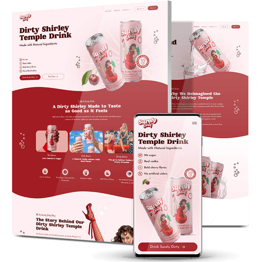
Surely Dirty launched with a complete identity and a site built to sell it: a trademarked wordmark, an ownable cherry-red world, and product messaging built around real vodka, zero sugar and 90 calories a can.

The Challenge
Surely Dirty didn’t come to us with a website problem. They came with an idea and nothing else.
A Brand That Didn’t Exist Yet
Founder Sierra Harris had identified the opportunity — the Dirty Shirley had become one of the most ordered cocktails in the US, but nobody had put it in a can. What existed was the insight. There was no name in market, no identity, no packaging direction and no website.
A Category Where Shelf Presence Is The Whole Game
Ready-to-drink is one of the most crowded shelves in beverage. A canned cocktail is bought in seconds, often from a fridge door surrounded by competitors, which means the identity has to do the selling before anyone tastes the product.
A Nostalgia Play That Could Easily Skew Too Young
The Shirley Temple is a drink most people first had as children. A brand leaning on that memory risks reading as childish rather than knowing — a particular problem for an alcoholic product, where the line matters commercially and legally.
Two Audiences In One Aesthetic
The brand needed to land with women who remember the original drink and with a younger cohort discovering it through social media, without splitting into two visual identities.
No Baseline To Design Against
With no existing product, no sales history and no audience, every decision had to come from category analysis and positioning rather than from performance data.

The Solution
We built the brand from the ground up, starting with where it could win rather than what it should look like.
-
Market Evaluation & Opportunity Sizing
We assessed the ready-to-drink category, mapped how existing brands positioned themselves, and confirmed where an unclaimed Dirty Shirley could stand — a drink with enormous cultural recognition and no branded owner. -
A Brand Strategy Built On One Tension
We built the strategy around a single idea: the drink you grew up loving, given a grown-up twist. Nostalgia is the hook, but the brand is unmistakably adult — real vodka, “The Original Sin,” the deliberate slide from Shirley to Dirty. -
Naming & Logo
Surely Dirty turns the source drink into a name that carries the joke and the product in two words. The logo is a bold white script with a deep red shadow and a small heart accent, trademark included — built to hold at can size and at thumbnail size. -
A Visual World: Pin-Up Nostalgia, Gen Z Energy
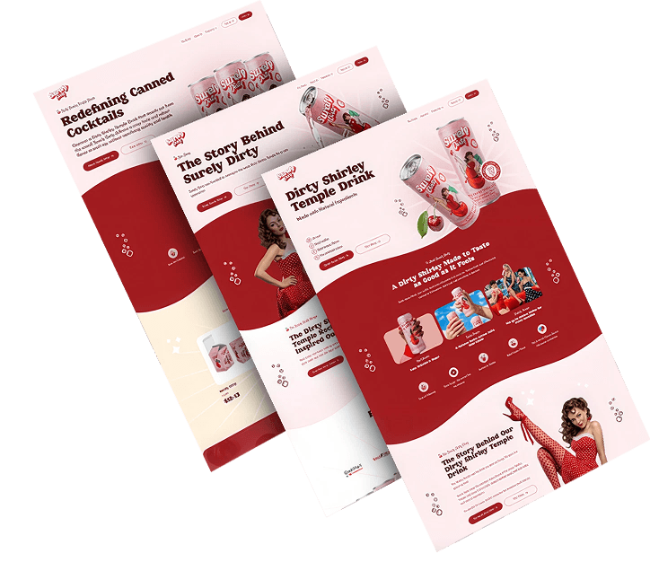
We combined the confidence of 1950s pin-up illustration with a contemporary palette and finish — cherry red, polka dots, sparkle stars, bubble animations and retro-styled lifestyle photography. Familiar enough to trigger the memory, current enough to belong in a Gen Z feed. -
A Brand Book For Consistency Across Can, Shelf And Screen
We documented the identity so it holds everywhere the product appears: logo usage, palette, typography, iconography and imagery direction, giving a new brand the consistency an established one takes for granted. -
A Website Built To Sell The Can
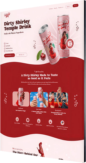
We designed and built the site around product truth and conversion: an animated hero, a four-icon proof set — 0g sugar, real vodka, bold cherry flavor, no artificial colors — a serving-facts panel, the founder’s story, and a route to buy alongside a community sign-up that builds an owned audience from day one.
The Results
Surely Dirty went to market with a complete brand behind it:
-
A Full Brand Systembuilt from nothing — strategy, name, trademarked logo, palette, typography and brand book
-
One Ownable Aestheticpairing 1950s pin-up nostalgia with Gen Z energy, distinct on a shelf of lookalike RTD cans
-
4 Product Proof Pointsreal vodka, 0g sugar, bold cherry flavor and no artificial colors, at 90 calories a can
-
A Site Built To Convertproduct storytelling, serving facts, a direct route to buy and a community list capturing demand from launch
Our Custom Web Design Portfolio
1,000+ Completed Projects
Explore our case studies & see how we grow brands online.
Buddha Brands’ Vibrant eCommerce Rebuild
Buddha Brands sells plant-based snacks and drinks under the Thirsty Buddha and Hungry Buddha lines across North America’s biggest retailers, but its website drew about 8 organic visits a month and ranked for just 6 keywords.
We built a custom eCommerce platform carrying the packaging’s color and personality onto every screen, added an English/French toggle for Canadian shoppers, and paired it with keyword research, sitemap architecture and conversion messaging.
Within 12 to 18 months, organic traffic grew roughly 86x and keywords ranking in the top 100 grew 124x, per Ahrefs.

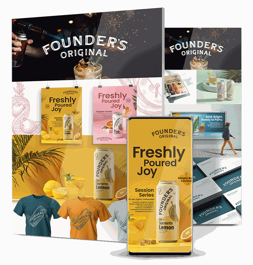
Founder’s Original’s Identity For Scale
Founder’s Original was expanding into new product lines, packaging and market channels, but had no defined identity system — meaning every new application risked drifting further from the last.
We researched the market and competitor positioning, defined the brand foundation from mission through value proposition, refined the existing logo rather than replacing it, and wrote messaging samples the team could use directly.
The brand book documents voice, color, typography, imagery and templates, so future rollouts stay consistent without rework.
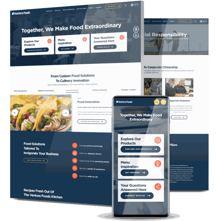
Ventura Foods’ YouTube Audience Build
Ventura Foods wanted to grow its YouTube presence among verified foodservice operators — a narrow B2B audience standard targeting tends to miss — on a fixed $12K monthly budget.
We ran tightly focused Google Ads campaigns refined weekly, used Customer Match lists to reach qualified professionals, restructured the channel for clarity, and designed custom thumbnails to lift click-through.
In six months subscribers grew from 650 to over 70,000, cost per view landed 46% below benchmark at $0.014, monthly views beat target by 80%, and unsubscribes fell from 57% to 13%.
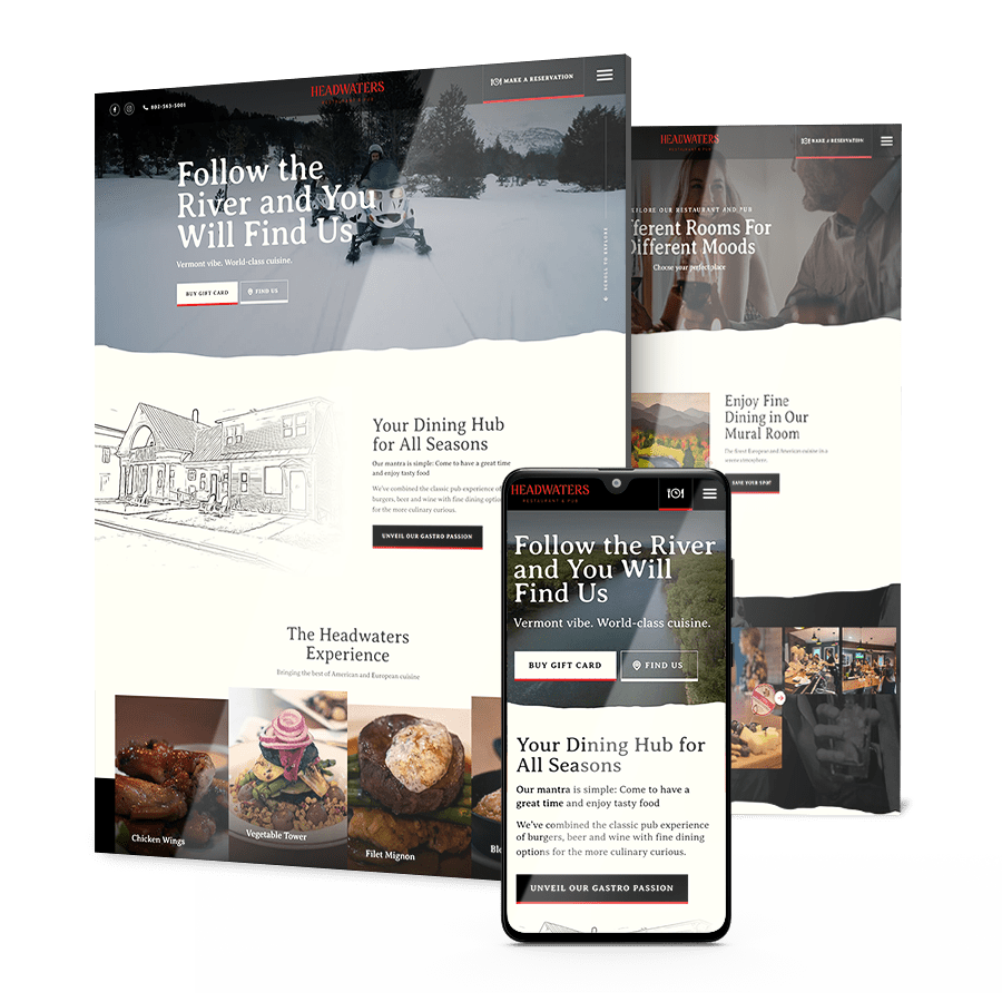
Headwaters’ Launch From Zero
Headwaters opened as a brand-new culinary destination with no booking system on its site, no audience and no way to translate its in-person dining experience into something people could find online.
We built a clean custom site with a reservation flow stripped to the fewest possible steps, created a virtual showcase of the restaurant’s atmosphere, and ran location-targeted PPC with remarketing to reach local diners.
In two months the site drove 605 table reservations and 623 location searches at a cost per acquisition of $3.52.
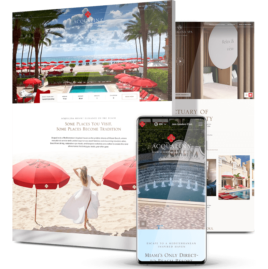
Acqualina Resort & Residences’ Five-Star Booking Experience
Acqualina is a Forbes Five-Star, AAA Five Diamond beachfront resort in Miami and a member of The Leading Hotels of the World, but its website didn’t carry that same sense of prestige.
We delivered digital strategy, a full brand book and a custom CMS build, pulling accommodations, dining, spa and events into one on-brand booking experience with integrated booking engine, event calendars and a live beach camera.
Guests now move from browsing to reserving on a mobile-first site the resort’s own team can update and scale, and the partnership has since grown into ongoing SEO and marketing support.
Get The Latest Web Design
Insights Delivered To Your Inbox
Insights Delivered To Your Inbox
"*" indicates required fields
Take The Smart Road To
Digitizing Your Business Growth
Start a conversation with us
"*" indicates required fields