Contact Us Page Designs: Key Highlights
-
The Contact Us page is an evaluation point: Visitors use it to judge how responsive, organized and reliable your business is before reaching out.
-
Trust is built beside the form: Visible proof points like addresses, business hours, named testimonials and recognizable brands reassure visitors at the moment of action.
-
Accessibility and mobile use matter: Contact pages are often used when intent is highest, so clean structure, tap-friendly fields and accessible patterns keep people from dropping off.
Imagine a hotel with no reception desk. Now picture the guests, delivery workers and bellboys lost in the foyer with no direction.
The scene is similar when a website fails to provide a Contact Us page, since visitors end up confused, not sure who to turn to with their questions and concerns.
By 2029, 97.09% of U.S. consumers will shop online, which means the Contact Us page is no longer a courtesy link but a page people use to judge responsiveness, intent and follow-through.
In this post, we’ll break down the 10 best Contact Us page designs and the elements that make them effective so you can apply the same thinking to your own page and get more qualified inquiries.
10 Best Contact Us Page Designs For Inspiration
The best contact us page designs make it obvious who you are, how to reach you and what happens after someone hits send.
Use the examples below to see how leading brands structure the page, set expectations and earn enough trust for visitors to follow through:
1. Zendesk
Why it made our list: Clear separation between sales inquiries and product support
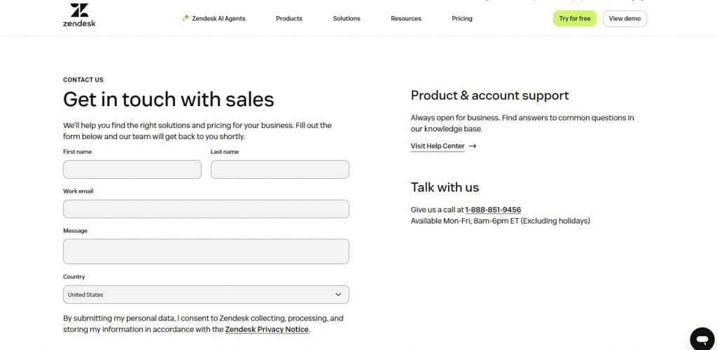
Zendesk’s Contact Us page sets expectations early through a clean layout that pairs a short form with visible phone options.
The company’s business hours and contact options are shown directly on the page, so visitors know when and how they’ll hear back.
Global office locations appear directly on the page, reinforcing accountability through real addresses rather than abstract signals.
The footer keeps useful resources and product links within reach, which supports users who need more context before reaching out.
2. Marvel
Why it made our list: Distinct sections that separate the form from intent-specific options
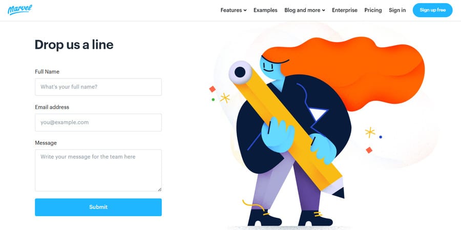
While Marvel’s contact us page design is stripped back and simple, it also offers a targeted user journey, with buttons pointing visitors towards the sales team, support team and press kit.
Just like the mission of their product, Marvel’s contact page is straightforward and streamlined. It contains just three boxes for all types of visitors to complete and quickly send off their query.
While Marvel’s contact us page design is stripped back and simple, it also offers a targeted journey, with buttons pointing visitors towards the sales team, support team and press kit.
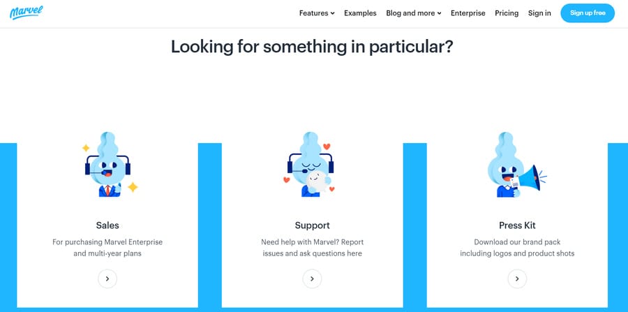
Further down, the “How to find Marvel HQ” section provides a dedicated address and a Google Maps link, useful for partners, press or anyone doing quick due diligence.
3. Plesk
Why it made our list: Early inquiry selection that shapes the rest of the experience
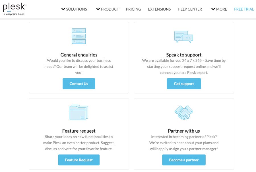
Plesk is a web hosting control panel that provides four initial pathways on a contact us page that sits on the website’s navigation menu bar.
Visitors are directed to either contact general enquiries, get support, send a feature request or partner with Plesk through four separate CTAs (shown above).
However, if the visitor isn’t satisfied with one of the initial paths to conversion, they can fill out the standard contact form that appears below and limits spam requests with a reCAPTCHA fraud detection box.
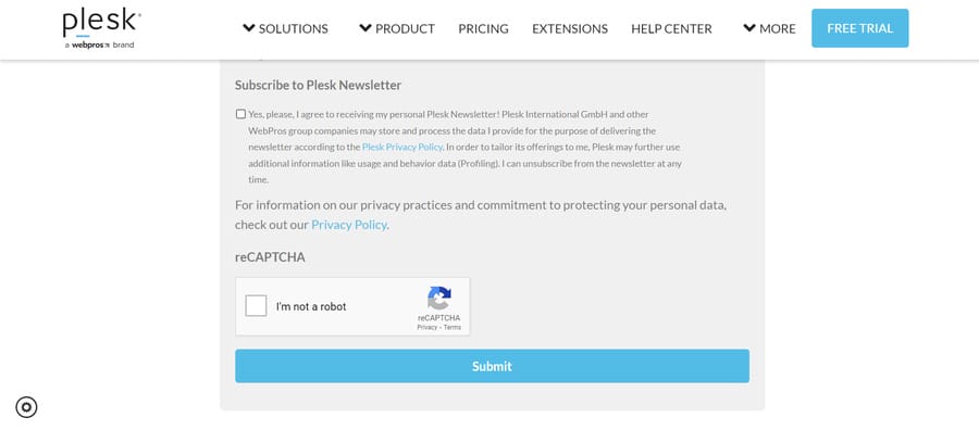
The sales form reflects the complexity of the product by gathering company size, role and location, which supports more relevant follow-up.
4. Monday.com
Why it made our list: High-visibility trust signals placed directly beside the form
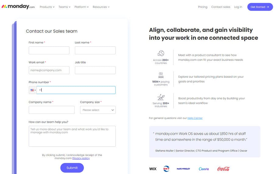
Continuing the list of contact us page designs, Monday.com treats its own iteration like a sales touchpoint, pairing the form with proof points that answer the unspoken question about credibility before submission.
A Fortune 500 trust message and recognizable customer logos appear near the primary call-to-action (CTA), showing that large enterprises already rely on the platform.
The testimonial includes a named executive, job title and company, which turns the quote into a real person with operational responsibility rather than a generic endorsement.
On the form itself, fields such as job title, company size and intended use help frame the inquiry before it reaches sales.
By adding these details next to the contact form, Monday.com builds the customer confidence and trust required to submit the contact request.
5. Greenhouse
Why it made our list: A directory-style layout that routes every intent in one scan
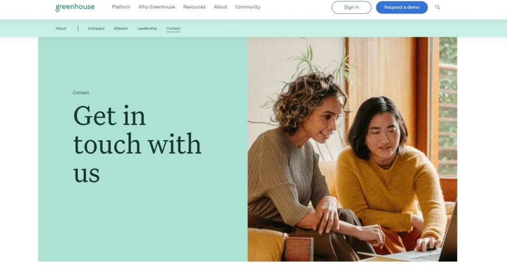
Instead of pushing everyone into a single form, Greenhouse presents contact options like a simple index: sales inquiries, customer support, partner requests, press and media, general inquiries and careers.
Each category points to the right next step, including a demo request link, a dedicated support portal, partner resources, the press page and even a direct phone number for general inquiries.
Further down, Greenhouse lists both mailing and office addresses in full, which helps with procurement, compliance checks and vendor onboarding.
The visual system relies on generous spacing, readable typography and a consistent green palette from the header through the address section.
6. Revolut
Why it made our list: Support messaging that sets service expectations upfront
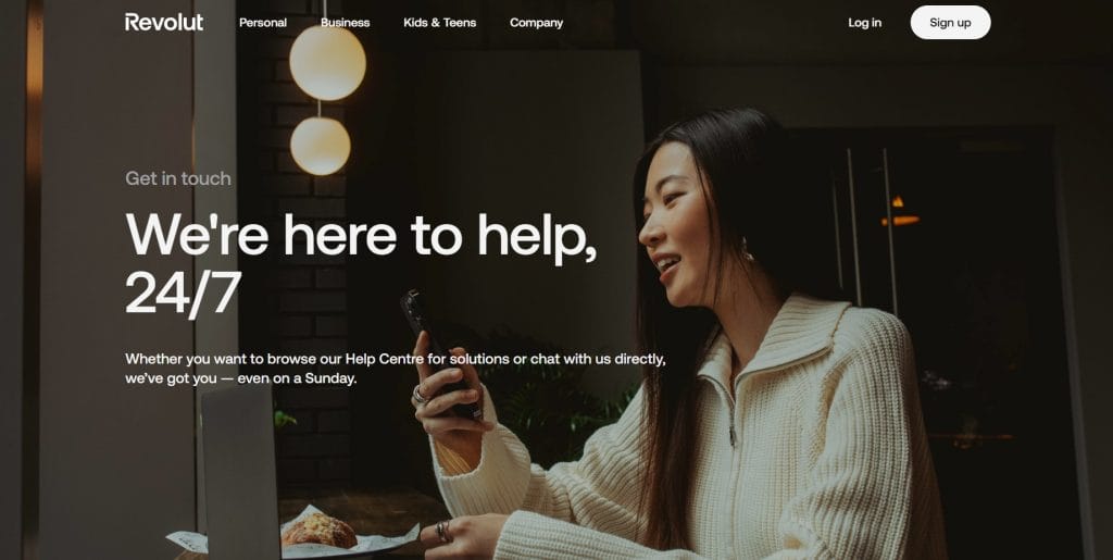
Revolut opens with a direct promise, “We’re here to help, 24/7,” then reinforces it with being available “even on a Sunday,” which matters when someone is dealing with a blocked card, a suspicious charge or account access issues.
Large lifestyle photography does more than decorate the page, since it makes support feel personal and immediate, closer to customer care than a help directory.
The layout then offers two primary options, direct in-app chat with step-by-step instructions and a Help Centre link for people who prefer self-service.
Below that, the “Quick access” and FAQ sections cover high-stakes topics like suspected fraud, account recovery and official requests in an accordion format that keeps scanning simple.
7. Ban.do
Why it made our list: Built-in accessibility controls paired with a playful interface
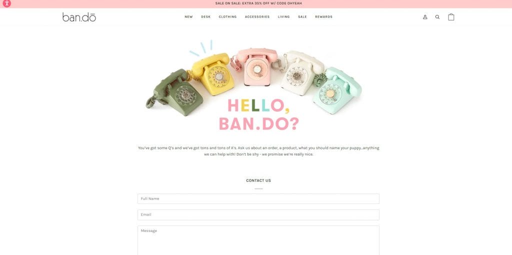
Ban.do takes a playful approach to contact us page designs, opening with bright, on-brand visuals and friendly microcopy that sets an upbeat tone before the form even appears.
The form keeps things simple with just name, email and message, then supports it with practical service details, like a customer service phone number and the company’s business hours.
The accessibility panel is front and center and gives visitors multiple ways to tailor the interface, from vision and keyboard navigation options to cognitive-friendly settings.
Below the form, there’s a dedicated support hub, pointing people to FAQs and the most common operational topics such as shipping, returns and gift cards.
8. Asana
Why it made our list: Sales-first layout with self-serve links for billing, subscriptions and account management
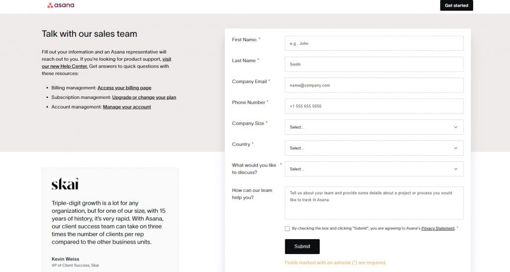
Asana opens with a direct “Talk with our sales team” message and places the form immediately on the page, allowing enterprise buyers to share key details in one go, from company size and location to what they want to discuss.
Alongside the form, links to billing, plan changes and account management redirect existing customers before they reach sales, which protects sales time and shortens resolution for support needs.
A customer quote from Skai adds business context without distracting from the form, while the logo strip below reinforces brand familiarity at a glance.
9. Salesforce
Why it made our list: Multiple contact paths in one view, combining a call request form with direct phone access and account resources
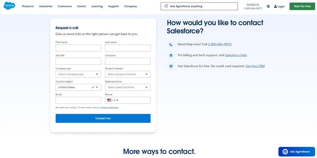
Salesforce approaches the Contact Us page like an operational hub rather than a single action screen.
The layout places a structured call request form beside a live phone number and supporting links, so visitors can choose between scheduling a follow-up or speaking to someone immediately.
Form fields such as company size, region and product interest narrow context early, which suits long sales cycles and layered buying groups.
Below that, card-style sections extend the page into account management, global offices and feedback, making the page useful beyond sales alone.
10. Reddit
Why it made our list: Branding-led help design that prioritizes search
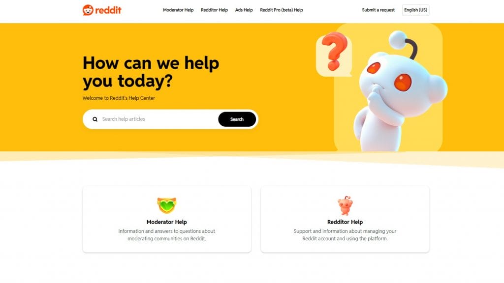
A bright, brand-saturated hero does the heavy lifting here, with Reddit’s orange, a playful 3D character and an oversized headline that immediately frames the page as help-first rather than corporate.
The search bar is treated like the main call to action, set wide and high on the page so most people can start typing before they scan menus or links.
Below that, two large cards split the experience into Moderator Help and Redditor Help, using iconography and generous spacing so each audience can self-select in a second and land in the right knowledge base.
Even the small details support the brand, from the rounded card styling and soft shadows to the simple top navigation with “Submit a request” and language options kept within easy reach.
Digital Silk’s Contact Us Page Design Examples
As a full-service web design agency, Digital Silk works with businesses across industries to deliver user-friendly and conversion-focused contact us page designs.
Explore some of our latest projects below to see how our experts delivered measurable results:
1. OrthoEast
Our web design team created a highly personalized contact us page design for New Jersey-based orthopedic specialists OrthoEast.
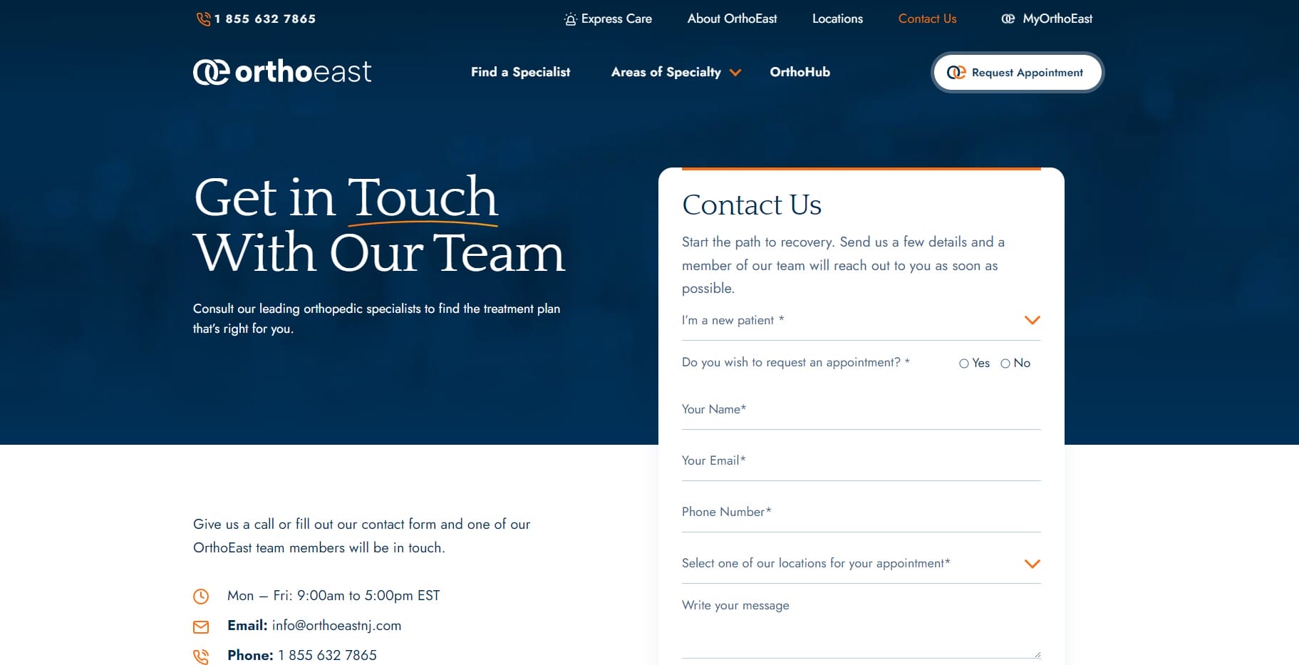
By adding two drop-down menus to the contact form, we created a bespoke contact conversion experience where visitors can select their patient status and location.
Providing specific location information alongside generic contact details is an important factor for people facing orthopedic injury, where a long journey to a clinic may not be possible.
Paired with the interactive map underneath, prospective patients can immediately find information about their nearest orthopedic office.
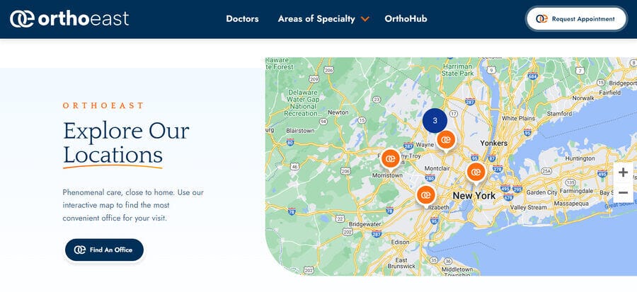
This includes information like email or street addresses, so visitors can either use the form to request an appointment or reach out by email or phone.
2. LJA Engineering
We partnered with full-service engineering consultancy firm LJA to deliver an intuitive design that simplifies the contact request process.
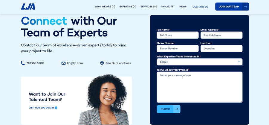
With just four mandatory contact form fields to fill in, including a longer section where visitors can explain in-depth about their unique project, LJA can gain targeted information for high-quality leads.
Our web designers also included an interactive CTA for LJA’s job board to lead job applicants to an area of useful information without the need for contact, in turn limiting contact request management requirements and tailoring the website’s conversion funnels.
3. Devensoft
Devensoft required a website that supported its M&A deal execution process, so Digital Silk crafted a detailed and personalized contact us page design.
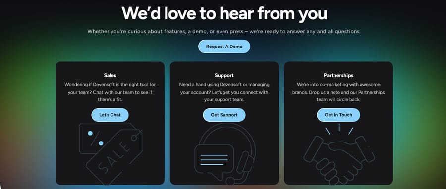
When landing on the page, visitors are given three distinct points of contact: sales, support and partnerships.
With a concise description of each and an eye-catching CTA button, we’ve made it crystal clear what to expect from each contact route.
Further down, visitors are directed to Devensoft’s knowledge base and multiple contact avenues, including the business’ address, email and socials.
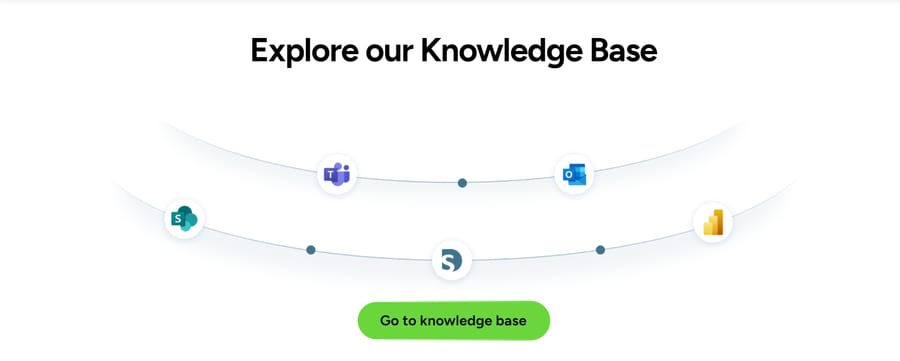
These additions serve to immediately address visitor pain points by pointing to direct information or points-of-contact that may not be included in the three options above.
4. Barton G
Barton G is a unique business encompassing restaurants, event production and catering.
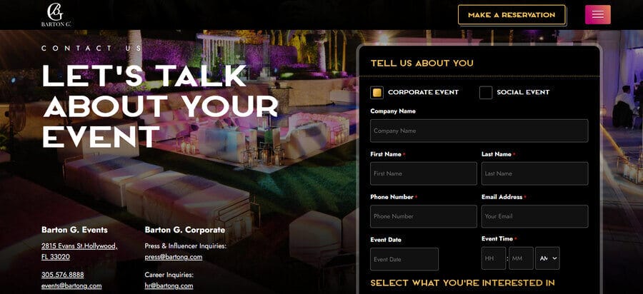
While the website doesn’t contain a sticky navigation menu, the contact us page appears in the main hamburger menu, making it just two clicks away from the homepage.
Visitors are faced with a highly customizable contact form, where they can outline their chosen date, time, number of guests, budget and more.
The brand’s contact us page also follows the website’s extravagant visual identity, with exciting imagery and animations surrounding (but not distracting from) the points of conversion.
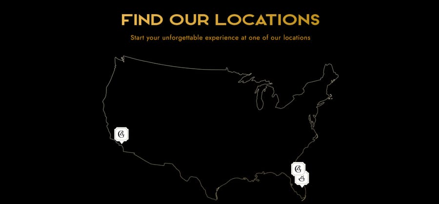
Finally, our designers added a map and unique information regarding the company’s three locations in Florida (Miami and Orlando) and California (Los Angeles).
5. Spar & Bernstein
Collaborating with our New York web design team, NYC and NJ immigration and personal injury lawyers Spar & Bernstein have taken contact us page personalization to the next level.
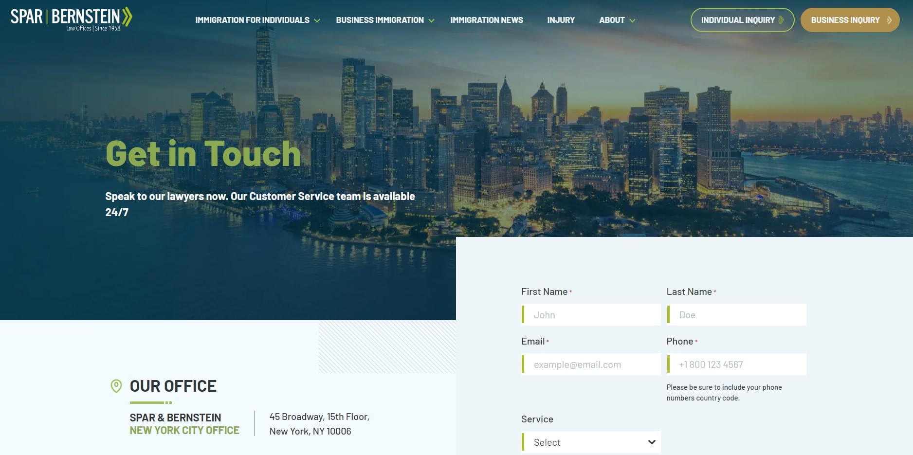
This contact page features a prominent “Get in Touch” section with a contact form allowing users to submit their name, email, phone number and service inquiry.
The office location is presented as a dedicated section with an address block and an embedded map, providing visual context and credibility without overwhelming the layout.
A visually consistent social media grid appears near the bottom of the page, featuring recognizable icons and links to platforms such as LinkedIn, Facebook, Instagram and others.
The targeted messaging resonates with their specific case, increasing the likelihood of conversion and categorizing the contact requests in Spar & Bernstein’s inbound case files.
What Information Should A Contact Us Page Include?
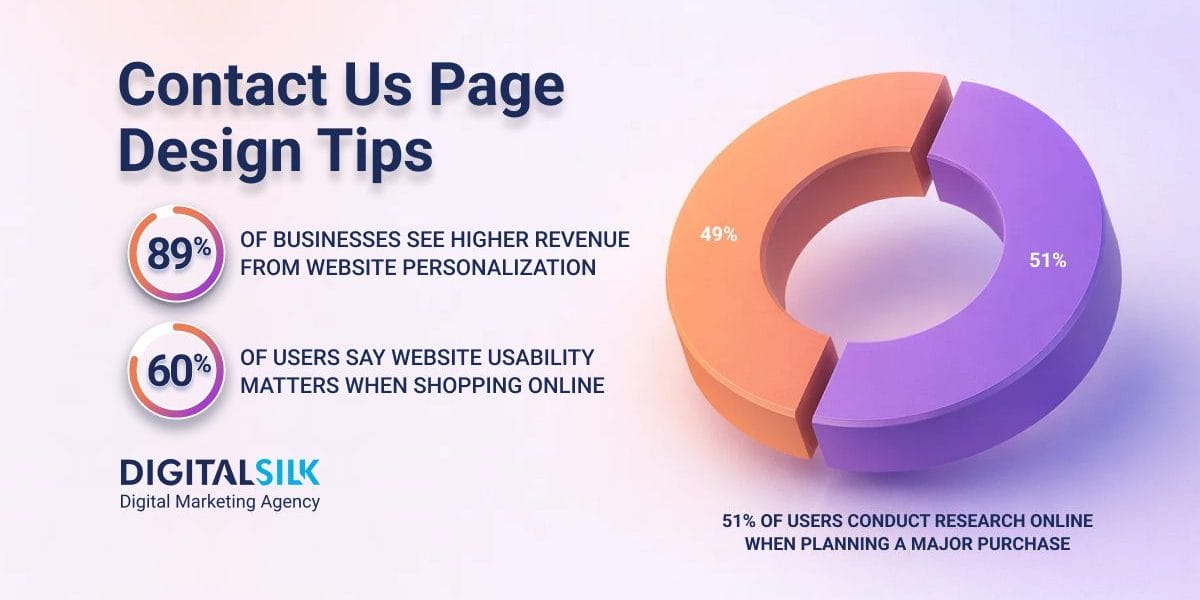
Since 60% of users say website usability matters most when they shop online, your Contact Us page should remove hesitation by showing people exactly how to reach you and what happens next.
To support that expectation, build the page around the following elements that help people reach the right place without extra steps:
- A contact form: Include a built-in form that allows visitors to reach out directly from the page without leaving their current flow.
- Your contact information: Clearly list your phone number, email address and location, or embed a map, so people can choose the channel that fits their situation.
- Live chat options: Offer live chat, whether human or chatbot, to handle questions that need quicker or more detailed responses.
- Frequently asked questions: Use FAQs to address common questions upfront and reduce unnecessary follow-ups.
- Useful outbound links: Point visitors to relevant internal pages that help them find answers or next steps without starting over.
Why Add A Built-In Contact Form To Your Contact Us Page Design?
When 51% of users say they always research online before a major purchase, your Contact Us page becomes part of that research process rather than a final step.
A built-in contact form keeps that moment contained, letting visitors act while intent is high instead of sending them elsewhere to figure out how to reach you.
Beyond making it easier to get in touch, a well-designed contact form supports how buyers evaluate and engage with your business:
- Cuts down on low-quality inquiries by requiring the right details upfront and steering away vague messages.
- Improves attribution by capturing where inquiries originate and which pages drive them, making follow-up more relevant.
- Signals professionalism with a format that feels intentional and consistent with the rest of your site.
- Reduces unnecessary drop-offs by removing the need to open email apps or leave the page mid-action.
- Invites better context with fields for budget range, timeline, service interest or project notes.
Best Practices For A Contact Us Page Design That Converts
A contact us page that reduces complications for all your visitors by providing relevant, easy-access information and clear points of contact is more likely to boost conversions.
Follow these best practices to build a user-friendly design that converts for your business:
1. Make It Easy To Find
A Contact Us page should never feel tucked away or treated as secondary, especially for visitors arriving with a clear reason to reach out.
Placing it in predictable, high-visibility locations reduces unnecessary scanning and respects the limited time people bring to the site.
When This Works
This approach works best for businesses that expect inbound inquiries from buyers who already know what they want and are looking for a direct way to engage.
When It Fails
Problems show up when navigation gets crowded or every page is given equal weight, which turns a simple task into unnecessary scanning.
What This Means For Executives
You gain quicker inbound inquiries by making Contact Us easy to find, but you sacrifice some navigation space that could highlight revenue pages.
The risk is drawing attention too early, so keep the link visible but visually consistent with the rest of the navigation, place it in the main navigation and footer and review engagement regularly to ensure it’s supporting demand rather than diverting it.
2. Offer Multiple Contact Avenues
Email remains the top communication channel for customer service at 64%, while the website follows closely at 47%, reflecting how often people expect to reach a business directly from its site.
Different situations call for different contact methods, so your Contact Us page should account for urgency, familiarity and intent rather than pushing everyone through the same channel.
When This Works
This approach makes sense when inquiries arrive at different levels of urgency and complexity, such as sales questions, partnership requests or existing customer issues that shouldn’t compete for the same inbox.
When It Fails
It can work against you when channels lack clear purpose, leading to slower responses, internal rerouting and a poor first impression.
What This Means For Executives
Multiple contact options widen access, but they also create accountability. Limit the page to channels you can actively manage, define what each option is for and review usage patterns regularly to ensure inquiries reach the right place without adding unnecessary overhead.
3. Simplify The Page
Cluttered pages can see conversion rates drop by as much as 95%, which turns a Contact Us page into a liability instead of a point of entry.
Simplification isn’t about making the page sparse, it’s about removing anything that pulls attention away from the reason someone came there.
When This Works
This approach is especially effective for service-based businesses where inquiries are time-sensitive and visitors already understand what you offer, such as returning prospects, referrals or buyers coming from deeper product or service pages.
When It Fails
It can fall flat when the page becomes so bare that visitors don’t know what to expect next or whether they’re reaching the right person.
What This Means For Executives
You’ll likely see more completed inquiries, but you’ll also lose room for secondary messages and internal priorities.
Keep the form and key contact details front and center, then treat everything else as optional and remove it unless it directly supports getting someone to reach out.
4. Personalize Your Messaging
89% of U.S. businesses report higher revenue after adding personalization to their websites or apps, which reinforces how relevance influences engagement.
On this page, personalization is about aligning language and structure with why someone is reaching out, so the message feels appropriate to their context rather than generic.
When This Works
This approach resonates when visitors arrive with expectations shaped by industry, role or prior touchpoints, such as returning prospects or people coming from targeted service pages.
When It Fails
You’ll feel the downside when the page starts asking visitors to self-select too early, like choosing from long dropdowns, multiple “request type” routes or copy written for niche scenarios that most people don’t recognize.
What This Means For Executives
Personalized messaging can improve inquiry quality, but it comes with tradeoffs around complexity and maintenance.
Keep a clear primary message in place, then introduce targeted language or contact options only where intent is clear and performance can be measured.
5. Optimize For Mobile
With 58.5% of all traffic now coming from mobile devices, the contact experience has to work just as well on a phone as it does on a desktop.
Mobile users interact differently, often in shorter sessions and less predictable settings, so small layout and form details can determine whether someone completes the reach-out or drops off.
When This Works
You’ll see better completion rates when the page is built for touch and speed, with tap-friendly buttons, minimal form fields and spacing that reduces mis-taps and errors.
When It Fails
Mobile performance often suffers when layouts are treated as scaled-down desktop pages, resulting in cramped forms, hard-to-tap elements or content that forces too much
What This Means For Executives
Optimizing for mobile can increase inbound volume, but it may require simplifying forms and deprioritizing secondary content.
Review mobile behavior separately from desktop, test form completion on real devices and adjust field count, spacing and button placement to support fast, error-free submissions.
6. Provide A Response Time
Stating a response timeframe sets expectations before someone submits a form, which removes uncertainty about what happens next.
A clear window signals that inquiries are monitored and handled intentionally rather than disappearing into a queue.
When This Works
This is especially effective for businesses where timing matters and visitors want reassurance before committing their contact details.
An example of this is keyholder company KeySmart, which showcases the one-business-day response time at the top of their contact us page design.

When It Fails
It can backfire if the stated timeframe isn’t consistently met or if vague language leaves room for interpretation, which erodes trust instead of building it.
What This Means For Executives
Publishing a response time creates accountability and improves submission rates, but it also sets a public standard you have to meet.
Choose a timeframe your operation can reliably support, place it near primary CTAs or forms and review response performance regularly to ensure the promise stays accurat
7. Answer Questions Directly
When creating your contact page, consider the questions you might be able to answer without the need for contact.
Analyze the nature of previous contact submissions and previous customer service feedback to find the topics most likely to be questioned by your website visitors, or if you’re a new brand, conduct surveys to find out what your most likely FAQs would be.
When This Works
This is most effective when inquiries follow clear patterns, such as recurring questions about pricing ranges, timelines, availability, project fit or what happens after someone submits the form.
When It Fails
It falls apart when the page tries to anticipate everything, burying useful answers under long lists or linking out to content that feels disconnected from the original question.
What This Means For Executives
Answering questions directly reduces avoidable inquiries, but it also requires ongoing review as buyer behavior changes.
Regularly audit contact submissions, identify repeat themes and address only what genuinely shortens the path to action, leaving complex or high-value requests for direct contact.
Craft Your Custom Web Design With Digital Silk
A high-performing Contact Us page brings together visibility, simplicity and relevance, making it easy for people to reach you while setting the right expectations and reducing unnecessary back-and-forth.
By understanding your unique requirements and researching your audience, Digital Silk creates personalized, high-end contact us pages that both drive valuable conversions and boost user satisfaction.
As a lead-generating web design agency, we deliver superior contact us pages within multiple wider services, including:
- Custom web design
- eCommerce web design
- Website redesign services
- Conversion-first branding services
- Brand and logo design
- Premium digital marketing
To make sure your website leaves a lasting impression on your target audience, we provide a set of key deliverables to every project:
- Project ownership
- Complete transparency
- Measurable results
- Expert guidance
Contact our team or call us at (800) 206-9413 to request your free consultation and take the next steps toward building your custom website today. Or, fill in the request a quote form below for a free, custom quote.
"*" indicates required fields


