Healthcare Website Design Examples: Key Highlights
-
Design influences trust before care begins: Layout, imagery and structure shape how credible and patient-focused a provider appears during fast scans from search.
-
Self-service tools drive engagement: Online scheduling, bill payments, portals and search functions reduce call volume while supporting how patients prefer to interact.
-
Accessibility directly affects intake: Forms, text size, contrast and keyboard support determine whether patients can complete key actions without assistance.
Have you noticed how people instinctively Google their symptoms or search for nearby doctors when their health changes unexpectedly?
For healthcare practitioners, a website is your business’ first impression, a patient-doctor communication hub and a 24/7 customer care and appointment booking platform.
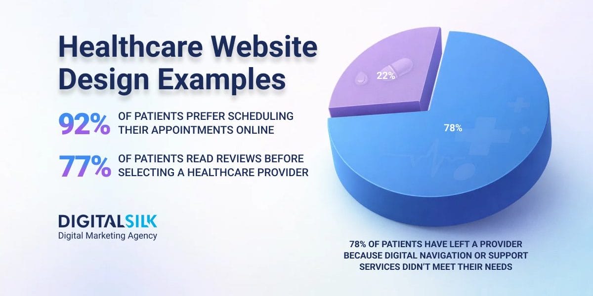
When navigation breaks down, patients don’t hesitate to move on, with 78% of them saying they’ve left a provider because digital navigation or support services didn’t meet their needs.
In this post, we’ll highlight 10 healthcare website design examples and outline the key elements and best practices for maximum engagement and minimal bounce rates.
10 Best Healthcare Website Designs
75% of patients search for healthcare providers online, typically including a visit to their website.
With an influx of patients turning to the internet for medical information and care, it’s essential that your website accurately reflects your brand values, services and focus on a patient-centered approach.
Below, we’ve compiled the top healthcare website designs for 2025 based on their usability, inclusivity and visual appeal.
1. Maven Clinic
Standout feature: Soothing green color scheme
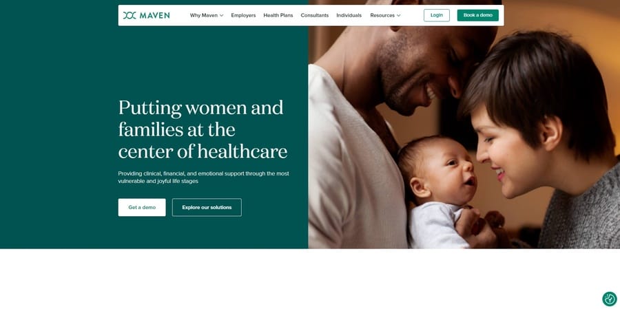
Maven Clinic effectively uses color psychology through a calm and approachable green color palette to evoke trust, familiarity and reliability.
The simple, sticky navigation menu at the top offers quick links to useful resources, healthcare consultants and available plans, while the poignant hero section illustrates the clinic’s family, fertility and maternity services.
Below the fold, the clinic flaunts its 2,000+ partners that help raise healthcare standards, highlights its availability in over 175 countries and showcases some of the results its patients have achieved.
This thoughtful design reinforces Maven Clinic’s commitment to patient-centered care.
2. Athenahealth
Standout feature: Business-focused navigation that separates buyer, user and patient needs
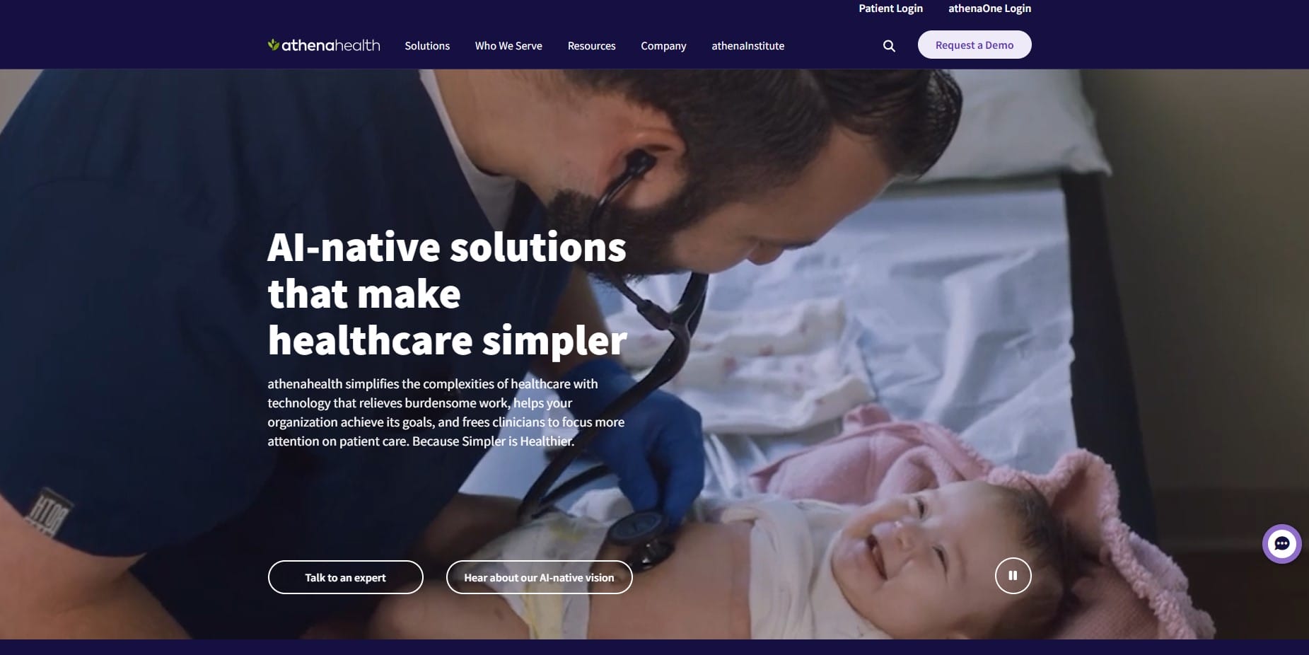
Next on the list of the best healthcare website design examples, Athenahealth sets expectations immediately with clinical imagery and a direct headline that positions AI-native tools as a way to reduce administrative burden and keep clinicians focused on patient care.
The header makes intent unmistakable by placing a patient login and the athenaOne login front and center, reinforcing access to records and ongoing care, which matters when 70% of patients value access to medical records the most in their dedicated portals.
As visitors scroll, the page organizes EHR, billing and patient engagement into clearly defined modules that can be reviewed quickly without digging.
The athenaOne section reinforces the platform’s emphasis on documentation and more complete records, tying product capability to everyday practice demands.
3. Peter Mac
Standout feature: Empathetic, clear and informative on-page content
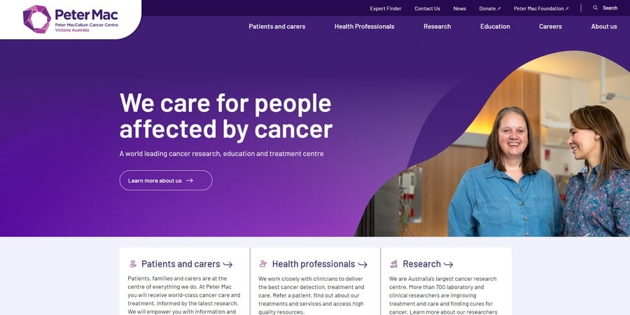
Peter Mac uses emotional branding and authentic storytelling to its advantage with approachable language and patient-centric content.
The website’s layout prioritizes information over aesthetics. It features a clean, minimalist design with strategically placed important details, such as treatment options, cancer research and educational resources.
The drop-down mega menu includes subtle wave-like animations that activate when users hover over each category, while the search function at the top right corner allows for easy navigation and quick access to specific information.
4. Synergy Private Health
Standout feature: Images that highlight state-of-the-art amenities
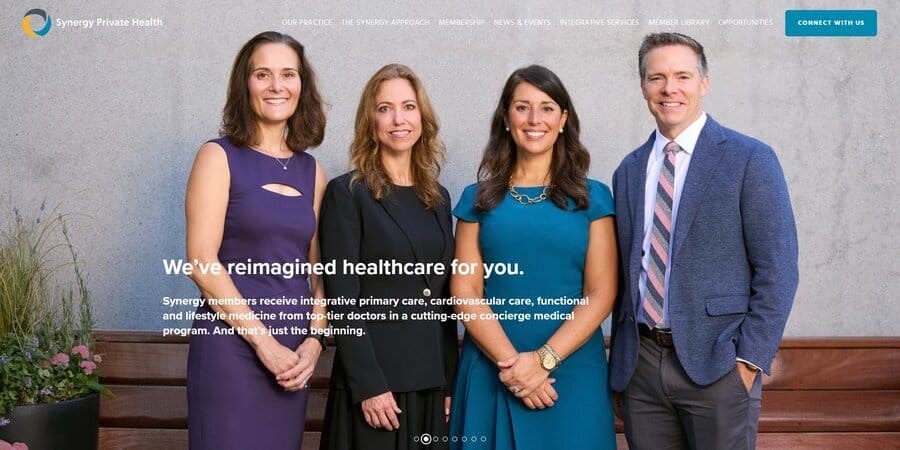
Users spend 5.94 seconds looking at a website’s main image and Synergy Private Health makes fantastic use of this short window of time with a sliding hero section that showcases its medical practitioners, available services and health coaching resources.
The website prominently displays the facility’s “We’ve reimagined healthcare for you” slogan and humanizes its brand with images of satisfied patients and staff members.
Visitors can explore Synergy’s Private Health’s core values, meet its experienced and compassionate team and learn about the facility’s unique approach to personalized healthcare through the website’s clear information architecture.
5. Brightside Health
Standout feature: Straightforward online appointment scheduling
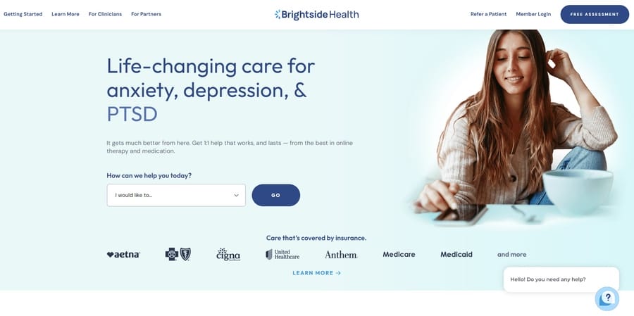
92% of patients prefer scheduling appointments online through provider websites, which they can easily do through Brightside Health‘s simple, user-friendly interface.
The website reflects Brightside’s commitment to personalized and accessible mental health care with results-based treatment plans, one-on-one therapy sessions, interactive lessons and a supportive community.
The homepage also highlights its insurance-covered policies, offers free assessment appointments and features a live chat option for immediate queries.
6. Virtua Health
Standout feature: Useful search function to connect with medical professionals
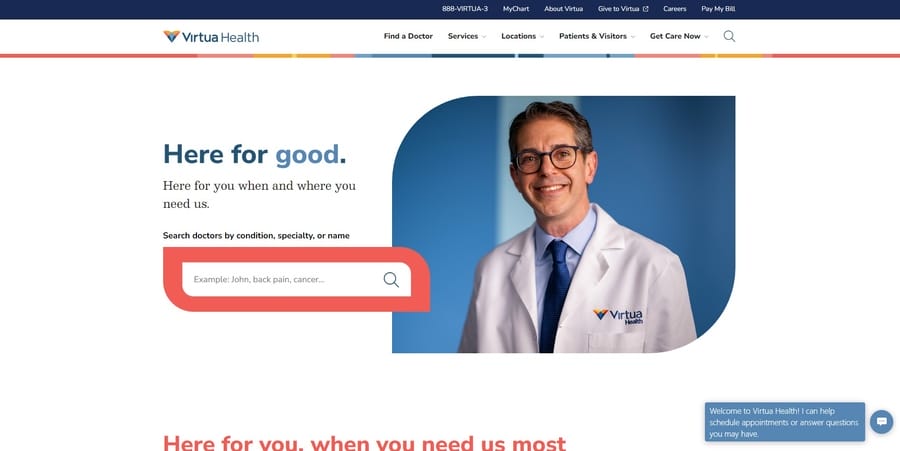
Virtua Health uses its signature brand colors and minimalist design to optimize doctor searches, appointment bookings, bill payments and virtual visit requests.
The site includes a “Find a Doctor” search bar that allows visitors to filter their searches by name, specialty or condition, while the “Find a Location” feature helps users locate the nearest Virtua Health facility.
Scrolling down, users can explore the clinic’s community outreach initiatives, view the latest patient stories and sign up for the “Good Vibes Newsletter”.
7. Mercy Health
Standout feature: Bright, boxy and dynamic design
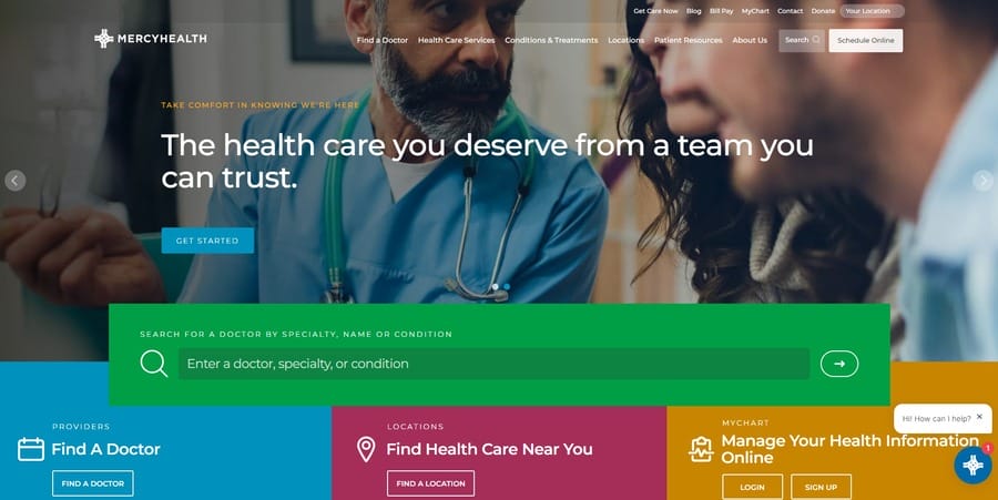
The prominent green search bar is what initially catches your eye on the Mercy Health website, along with three differently colored boxes for quick access to available doctors, locations and online management systems for health information.
The transparent navigation bar at the top features drop-down menus with useful links to the clinic’s principal services, patient resources and online scheduling system.
Moreover, the website features MyChart integrations so patients can easily access their medical records, review test results and communicate with their physicians online.
8. NextCare
Standout feature: Virtual care integrations
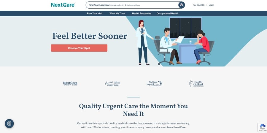
Urgent care clinic NextCare boasts a primarily pastel color scheme with soft isometric illustrations. However, it contrasts this toned-down design with a bold red “Reserve Your Spot” CTA to evoke a sense of urgency and prompt patients to schedule an appointment online.
Just below the hero section, the site emphasizes the clinic’s in-person and virtual care options to highlight the convenience and accessibility of its services.
Additionally, the homepage features Google review ratings and patient testimonials to establish trust and credibility. It also includes a section that promotes the clinic’s year-round health resources.
9. Tia Health
Standout feature: Table comparison of its services with other healthcare options
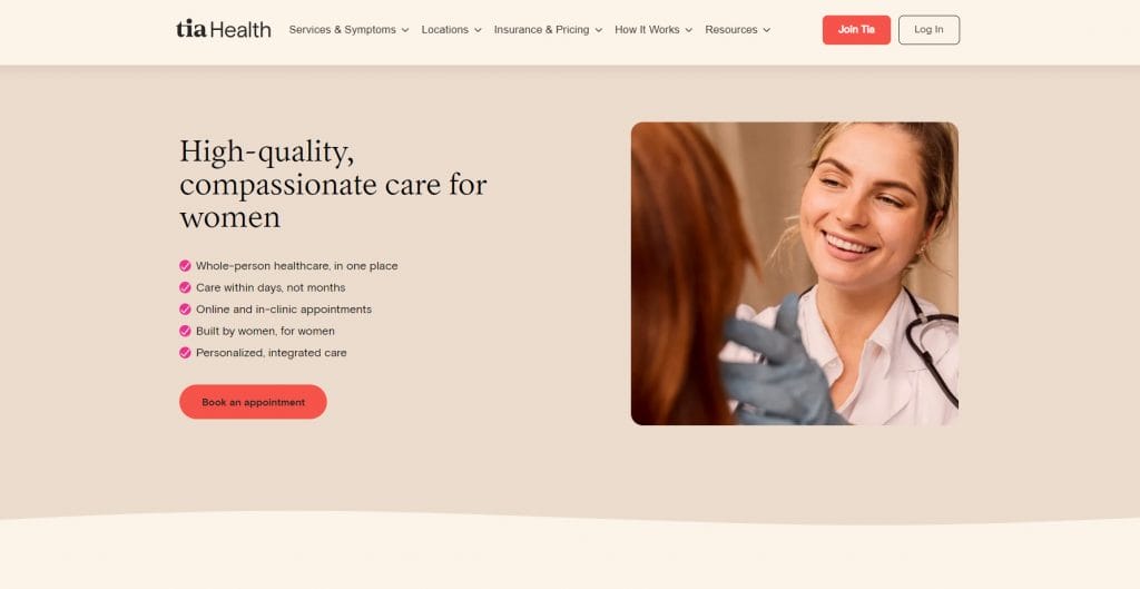
Focusing on women’s health and counselling, Tia Health uses a calming pink and brownish-cream color scheme to reflect its nurturing, supportive and approachable brand persona.
The homepage flaunts its comprehensive care packages by comparing its services to traditional, concierge or virtual healthcare options side-by-side, using simple and visually appealing graphics to illustrate its key points.
Lower on the page, Tia Health presents short bios of its women’s health experts, provides clear information about insurance and care plans and includes reviews from satisfied patients.
10. Rest Assured
Standout feature: Large, easily legible fonts
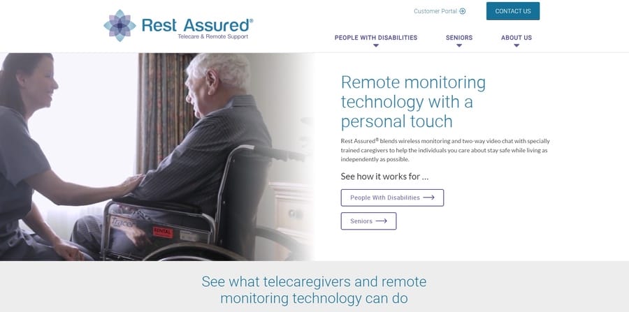
As a healthcare brand specializing in remote monitoring and chronic care management, Rest Assured has designed its website to accommodate its target audience of older adults and individuals with disabilities. The site features a large and legible font for better readability.
The hero section includes videos of older adults and people with disabilities from diverse backgrounds, followed by an interactive section that clearly explains Rest Assured’s Unique Value Proposition (UVP) and how it can help users manage and improve their health.
Further down the page, visitors can find social proof, access information about care packages and a “Contact Us” footer section.
Digital Silk’s Best Healthcare Website Designs
Digital Silk has worked with various healthcare providers to deliver high-performing, responsive and patient-focused websites. Some of our latest projects include:
1. ABC Senior Services
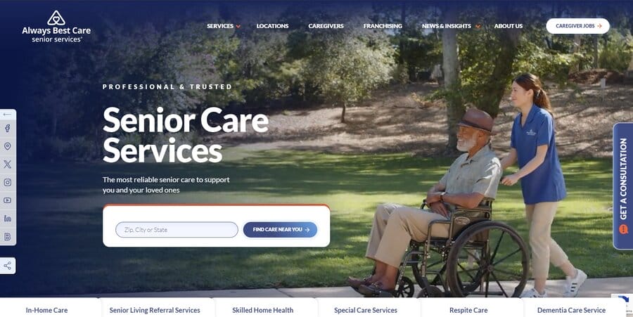
Digital Silk restructured and optimized ABC Senior Services‘ user journey for easier navigation, clear calls-to-action and improved cross-device performance.
Our team executed targeted SEO tactics for both on-page and off-page content to improve the site’s Google domain rating, establish industry authority and improve brand positioning.
We used the brand’s signature blue and orange colors throughout the website along with a clean and modern design to create a sense of trust, reliability and professionalism.
2. OrthoEast
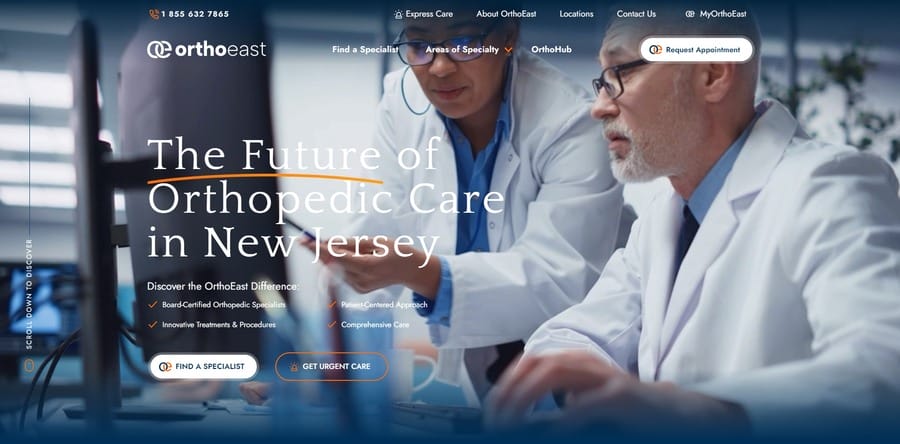
Our team helped consolidate OrthoEast‘s medical group merger into a singular digital platform for orthopedic services.
Digital Silk performed an in-depth analysis of the existing website structure to assess the quality of the on-page content and determine content gaps to enrich the unified website without losing continuity.
We designed an integrated and lead-generating website that caters to OrthoEast’s existing and prospective patients through clear product presentations, strategic calls-to-action and quick access to patient forms.
3. Mezocare
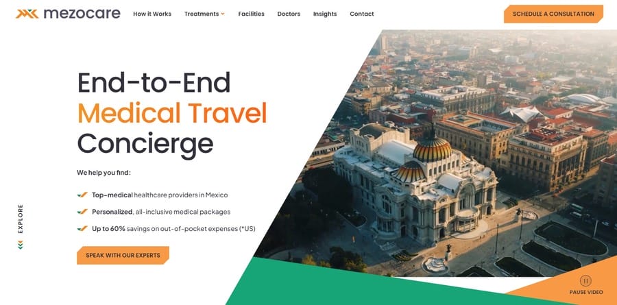
Our team created a signature brand identity for Mezocare, an end-to-end travel, concierge and medical service provider for cross-border health care.
The website’s signature color triad of zesty orange, jade green and charcoal gray and the brand’s signature “You’re not alone” slogan embody comforting and trustworthy qualities for patients seeking medical treatments abroad.
Digital Silk designed a website that helps patients navigate through the medical tourism process, while showcasing Mezocare’s personalized services and high standards of care through marketing.
4. SNP Therapeutics
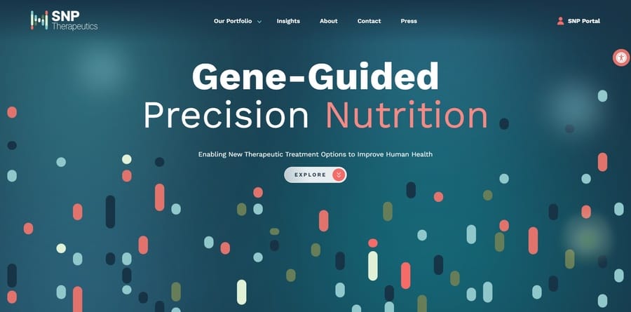
Digital Silk optimized usability, navigation and responsiveness for SNP Therapeutics, a metabolic and genetic research center for precision nutrition.
Our team created a conversion-focused website that establishes credibility and showcases SNP’s cutting-edge research in personalized nutrition for individual health optimization.
We included animated genetic diagrams, interactive maps and useful PDF resources to enhance the user experience and educate visitors on SNP’s services.
10 Key Elements Of Effective Healthcare Website Designs
Put yourself in your patients’ shoes, what would you want to see and experience when visiting some of the best healthcare websites?
How can you effectively avoid common web design mistakes and create an attractive and easy-to-navigate website for your practice?
Consider including the following elements:
1. Custom And Memorable Logo
Visitors spend an average of 6.48 seconds focusing on a website’s logo, which can reinforce your brand identity and strengthen recognition and recall.
The purpose of a logo at this level is immediate recognition across every touchpoint, from your site header to portal login screens and follow-up emails.
When Using This Strategy Works
This strategy matters whenever patients need to recognize you quickly, such as during appointment booking, portal access, billing review, referral follow-ups or care coordination across locations.
It’s especially valuable in moments where patients interact with your brand without staff guidance, including mobile searches, patient portals and post-visit communications.
What Could Go Wrong
Logos driven by trends or fine detail lose impact at small sizes and blur together alongside established providers.
Inconsistent naming across locations or services can weaken recognition when patients see different marks on bills, portals and physical signage.
Implications For Healthcare Providers
A well-executed logo improves recognition across patient-facing channels and depends on consistent application across systems and vendors.
Placement influences recall, with 89% of users more likely to remember logos in the traditional top-left position, reinforcing the need for thoughtful layout across mobile headers, patient portals, appointment confirmations and referral documents.
2. Transparent Service And Doctor Information
58.5% of U.S. adults use the internet to search for health or medical information, so many patients arrive already comparing options and looking for specifics.
Doctor profiles, credentials, treatment categories, office hours and insurance details set expectations early and reduce avoidable back-and-forth before anyone calls.
When Using This Strategy Works
This approach is especially useful when patients are looking for a specialist, evaluating a new provider after a move or trying to confirm coverage and availability before booking.
It also pays off for groups with multiple locations, rotating schedules or overlapping service lines where patients can get lost quickly.
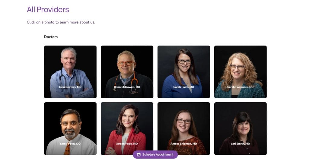
For instance, Just Kids Pediatrics introduces its providers through a simple grid that highlights names and credentials alongside consistent photography.
What Could Go Wrong
Profiles that rely on medical shorthand, academic language or internal titles can confuse patients and slow down inquiries.
Missing insurance notes, vague service descriptions or incomplete bios can also push patients to competitors who answer the basics upfront.
Implications For Healthcare Providers
You’ll see more qualified inquiries and fewer administrative interruptions, but provider and service details require regular review as staffing, schedules and payer relationships change.
Assign ownership for updates, standardize what every provider page must include and audit the details regularly so the site reflects what patients will actually experience.
3. Online Appointment Scheduling And Bill Payments
Offering a simple booking system with real-time availability and automated reminders simplifies decision-making and increases patient satisfaction.
Moreover, 71% of providers consider patient self-scheduling as an urgent website priority, which means you should set up a secure and simplified payment portal to avoid delays and reduce administrative work.
When Using This Strategy Works
Practices with high appointment volume or frequent repeat visits benefit most from digital scheduling and payments, especially when patients book or pay outside standard office hours.
It also supports organizations looking to reduce inbound calls and billing follow-ups without adding staff.
For example, Rush Medical Center brings appointment scheduling to the forefront with a dedicated booking experience that supports primary, specialty and urgent care without forcing users to navigate multiple sections.
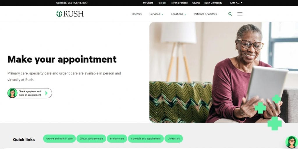
The header reinforces continuity of care by pairing scheduling with a visible “Pay Bill” option, allowing patients to manage visits and payments from the same entry point.
What Could Go Wrong
Scheduling tools that aren’t user-friendly, hide availability or fail to sync with internal systems can create duplicate work and patient frustration.
Payment portals that lack transparency around balances or insurance adjustments often lead to disputes, delayed payments and extra support requests.
Implications For Healthcare Providers
Online scheduling and payments reduce manual processing and billing delays but require reliable integration across scheduling, billing and EHR systems.
The most effective implementations align booking, reminders and payments within a single flow that mirrors how appointments and charges are handled after the visit.
4. Patient-Friendly Interface
Depending on your field of practice, consider incorporating relevant UI/UX features to improve navigation and boost engagement.
Interface design directly affects whether patients can find services, understand next steps and follow through online.
When Using This Strategy Works
Providers serving a wide age range benefit most from interfaces that account for different devices, reading comfort and digital habits.
It’s also particularly important for organizations that rely on online scheduling, portals or digital intake as primary access points.
For example, Kindbody’s interface uses generous spacing, clear content sections and a limited color palette that keeps attention on services and scheduling.
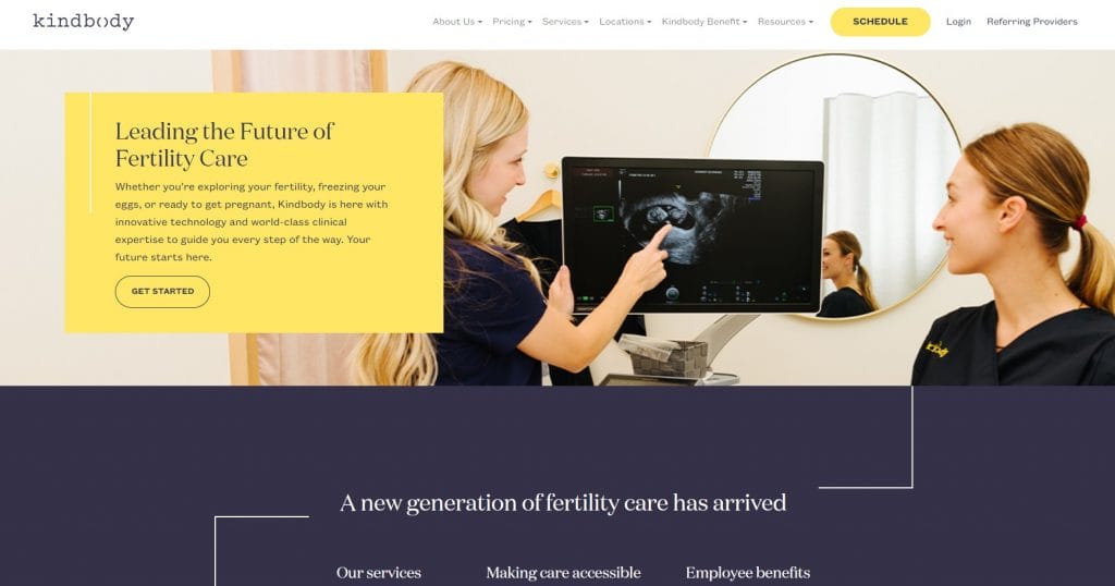
Persistent access to booking guides visitors from exploration to action without extra clicks.
What Could Go Wrong
Crowded pages, small text or unclear form steps can slow patients down and increase call volume.
Designs that focus on appearance over usability often lead to repeated errors and abandoned submissions.
Implications For Healthcare Providers
A patient-friendly interface reduces administrative load but requires regular review across devices and accessibility needs.
Navigation, forms and content structure should be tested against common patient actions such as booking appointments, submitting forms and accessing records.
5. Compelling Calls-To-Action
Strategically positioning (calls-to-action) CTAs in prominent areas, such as above the fold or within the content flow, ensures they’re easily visible and accessible.
Use clear and action-oriented language with contrasting colors as visual cues to guide visitors toward desired actions like booking appointments or contacting the practice.
When Using This Strategy Works
CTAs matter most on service pages, provider profiles and high-intent entry points where visitors arrive with a specific need.
They work best when positioned near relevant information, such as service descriptions, availability or insurance details.
For instance, Parsley Health places primary actions directly in the hero and repeats them in a sticky header, keeping entry points consistent as visitors explore care options.
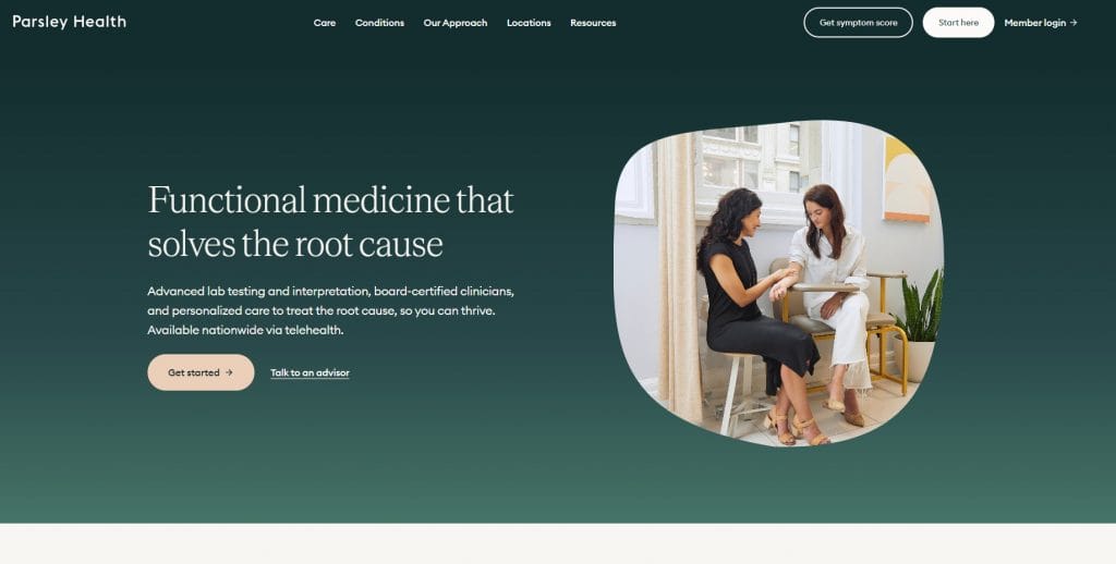
The combination of top navigation CTAs and in-page buttons supports both first-time visitors who want guidance and returning members who need quick access.
What Could Go Wrong
Labels that feel generic or buttons that blend into the page often result in missed appointments and unanswered inquiries.
Implications For Healthcare Providers
Well-designed CTAs translate interest into scheduled care but need coordination across design, content and operational processes.
Among healthcare website design examples that perform well, calls-to-action remain consistent, visible and tied to actions the organization can reliably support.
6. Emphasis On Accessibility
Accessibility determines whether patients can complete forms, schedule appointments and communicate without needing extra help.
With 18.6% of healthcare websites still using inaccessible forms and the average healthcare page showing 272 accessibility issues, many patients are blocked before intake or booking is complete.
When Using This Strategy Works
Accessibility matters across every provider type, especially for organizations serving older adults, patients with disabilities or those relying on assistive technology.
It becomes even more important when digital forms, portals and self-service tools replace phone-based workflows.
For example, NYU Langone Health integrates an on-screen accessibility menu that allows patients to adjust text size, contrast, animations and navigation behavior without leaving the page.
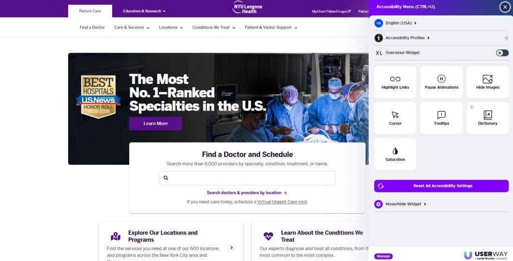
This level of control supports form completion, provider search and scheduling for users with different needs while keeping core actions visible and usable throughout the site.
What Could Go Wrong
Forms that can’t be completed with a keyboard, labels that screen readers can’t interpret or low-contrast text often stop patients mid-process.
As issues accumulate, patients leave the site and staff see an increase in avoidable calls and support requests.
Implications For Healthcare Providers
Improving accessibility leads to higher form completion and more reliable scheduling over time.
WCAG alignment, accessible form design and multiple contact options support intake and communication across patient populations without adding operational strain.
7. Testimonials And Patient Case Studies
77% of patients read online reviews when choosing a healthcare provider, which means you should include testimonials from satisfied patients to reflect your expertise, credibility and compassion.
It’s important to display the patient’s full name, photo and specific details about their experience so that it feels authentic and relatable.
When Using This Strategy Works
Testimonials work best on high-intent pages such as key service lines, specialty programs and provider pages where visitors are weighing options and looking for reassurance.
Case studies are especially effective for complex care, longer treatment timelines and premium services where patients want to understand the process, not just the claim.
For example, Teladoc Health presents patient testimonials as short video stories that open on click, giving visitors a direct view into care experiences.
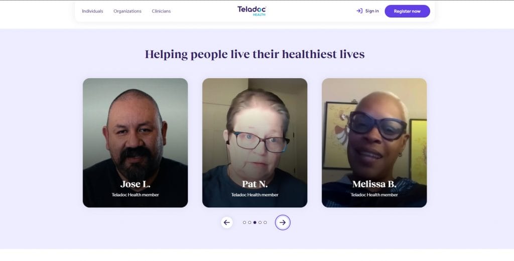
Names and faces are clearly identified, which adds credibility while keeping the focus on how care is delivered rather than scripted praise.
What Could Go Wrong
Anonymous quotes and broad statements like “great service” don’t give patients enough to trust, and they rarely answer the questions people actually have.
Privacy missteps, medical claims that sound absolute or stories that conflict with current operations can also create risk.
Implications For Healthcare Providers
Patient stories can improve conversion and trust but they need governance through consent, review and a clear publishing standard.
The most credible testimonials include real identifiers when permitted, specific context about the patient’s need and details that reflect your care model such as access, responsiveness, bedside manner and follow-up.
8. High-Quality Visuals And Infographics
Use educational images and infographics to break down complex medical information.
This way, patients can easily understand their condition, treatment options and expected outcomes.
When Using This Strategy Works
Visuals are especially effective on condition pages, treatment overviews and educational hubs where patients are trying to grasp unfamiliar information.
They also work well for practices offering specialized or multi-step care that benefits from visual explanation.
For example, American Family Care uses icon-led service categories to help patients quickly identify care types such as urgent care, labs and imaging without scanning long descriptions.
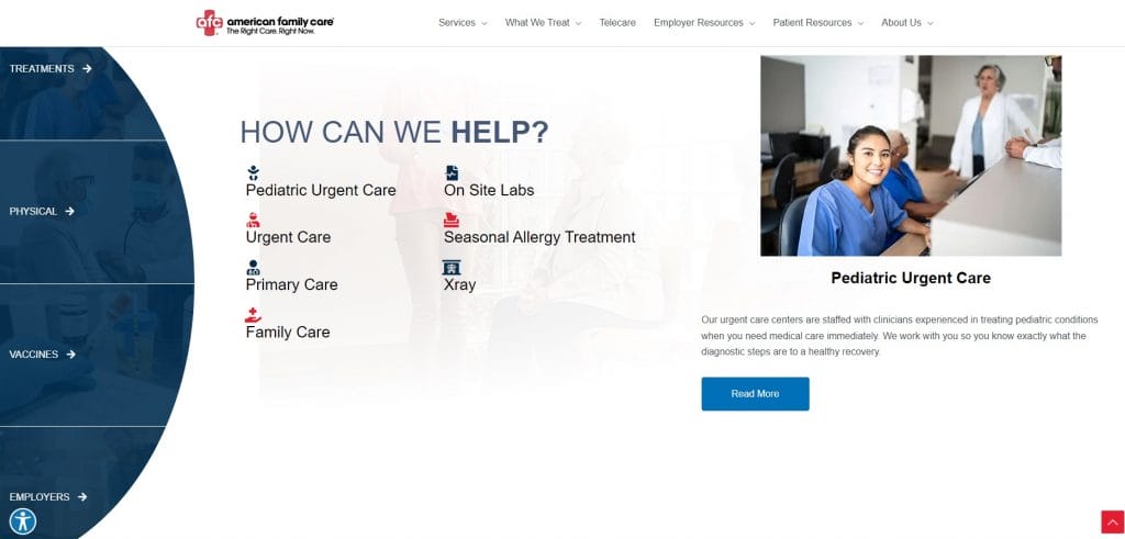
The layout pairs each category with supporting visuals and short explanations, making it easier to understand available services before clicking deeper.
What Could Go Wrong
Stock imagery, decorative graphics or diagrams without context or any perceived value can dilute credibility and distract from the message.
Poorly labeled visuals or oversimplified charts can also create confusion and lead to misinterpretation.
Implications For Healthcare Providers
Thoughtful visual content supports patient education and reduces repetitive questions, but it must align with clinical reality and written explanations.
Among the best healthcare website design examples, the visuals are accurate, easy to interpret and directly tied to the services and conditions being presented.
9. Compliance With Regulations
Compliance shapes how much trust patients place in your digital experience, especially as patient awareness around the use of personal data continues to grow.
Adhering to healthcare regulations like HIPAA (Health Insurance Portability and Accountability Act) or GDPR (General Data Protection Regulation) ensures secure data storage, encrypted communications and strict access management.
When Using This Strategy Works
Regulatory alignment becomes especially important for providers offering portals, digital intake, telehealth or online payments where personal data flows across multiple systems.
For instance, Northwestern Medicine makes privacy visible by pairing a detailed consent banner with clear options to accept or decline tracking before any interaction begins.
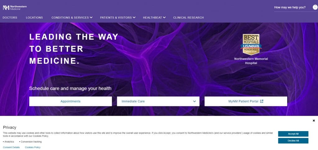
Data use is explained in plain language and surfaced alongside scheduling and portal access, reinforcing transparency without interrupting access to care.
What Could Go Wrong
Unclear consent language, hidden tracking tools or loosely governed third-party integrations can create legal exposure and erode patient trust.
Even compliant systems can raise concerns if patients don’t understand how their data is collected, stored or shared.
Implications For Healthcare Providers
Regulatory compliance protects patient data while adding operational complexity across marketing, analytics and clinical systems.
Among healthcare website design examples that handle this well, privacy policies are easy to find, consent mechanisms are explicit and data practices align with both legal standards and patient expectations.
10. Cross-Device Responsiveness
Mobile now accounts for 58.5% of total website traffic, so a healthcare site that performs poorly on a phone creates an access problem, not a design issue.
You should optimize website performance and loading speed across different devices by implementing responsive designs and adjusting the layout and content based on the screen size.
When Using This Strategy Works
This is most important for providers that rely on search and local discovery, especially urgent care, primary care and specialty clinics where patients often look up care on the go.
It also matters for organizations with portals, digital intake or online payments that patients revisit from multiple devices.
What Could Go Wrong
Slow mobile load times, unstable layouts or hard-to-tap elements can drive missed bookings and higher call volume.
Desktop-first designs often fail on smaller screens when menus expand awkwardly, forms become tedious and key actions drop below the fold.
Implications For Healthcare Providers
Cross-device responsiveness reduces barriers to scheduling and intake, but it needs ongoing performance monitoring as content and integrations change.
Prioritize mobile speed, simplify page weight and test high-impact actions like scheduling, registration, payments and portal login on common devices.
Why Good Healthcare Website Design Matters
A well-designed healthcare website is your digital front door that shapes how patients perceive and interact with medical practice or organization.
While not all searches may lead to an in-person appointment, your business can experience several benefits, including:
- Increased brand awareness: Your homepage is the central hub for your business where visitors can learn about your services, values and expertise in an otherwise saturated market.
- Improved audience trust and credibility: 75% of visitors judge a brand’s credibility based on its design. This is especially important for medical professionals as patients should feel confident and secure in their healthcare decisions.
- Better accessibility and convenience: A brand-specific and patient-centric website prioritizes user experience, easy access to information and cross-device compatibility. This way, patients can easily find and book appointments, access their medical records and receive personalized recommendations.
- Optimized for SEO: Custom websites can be specifically designed with SEO in mind, targeting keywords such as “healthcare website design examples” or “top healthcare website designs” to achieve higher search engine rankings. When you invest in a custom website, you enhance patient experiences and create a platform that can grow alongside your practice.
Design Your Healthcare Website With Digital Silk
The healthcare industry requires tactful, empathetic and expert communication with patients, regardless of their medical history.
Digital Silk’s experienced web designers and developers collaborate with your branding and digital strategists to create brand-aligned and user-oriented websites that cater to patients’ needs.
As a recognized web design agency, some of our services include:
Are you looking to design your healthcare website?
Contact our team, call us at (800) 206-9413 or fill in the Request a Quote form below to schedule a consultation.
"*" indicates required fields


