-
Where users get lost: Navigation often reflects internal structure rather than how buyers evaluate solutions, so key pages feel harder to find than they should.
-
Performance slowdowns: Lagging pages interrupt the natural rhythm of exploration and make it harder for users to continue evaluating your offering.
-
Buried proof signals: Testimonials, certifications and validation are often hidden below the fold, forcing visitors to dig for reassurance that should be immediate.
Most B2B websites are built with care and good intentions, as they include strong visuals, clear messaging and pages packed with information.
But even small UX mistakes can quietly block conversions.
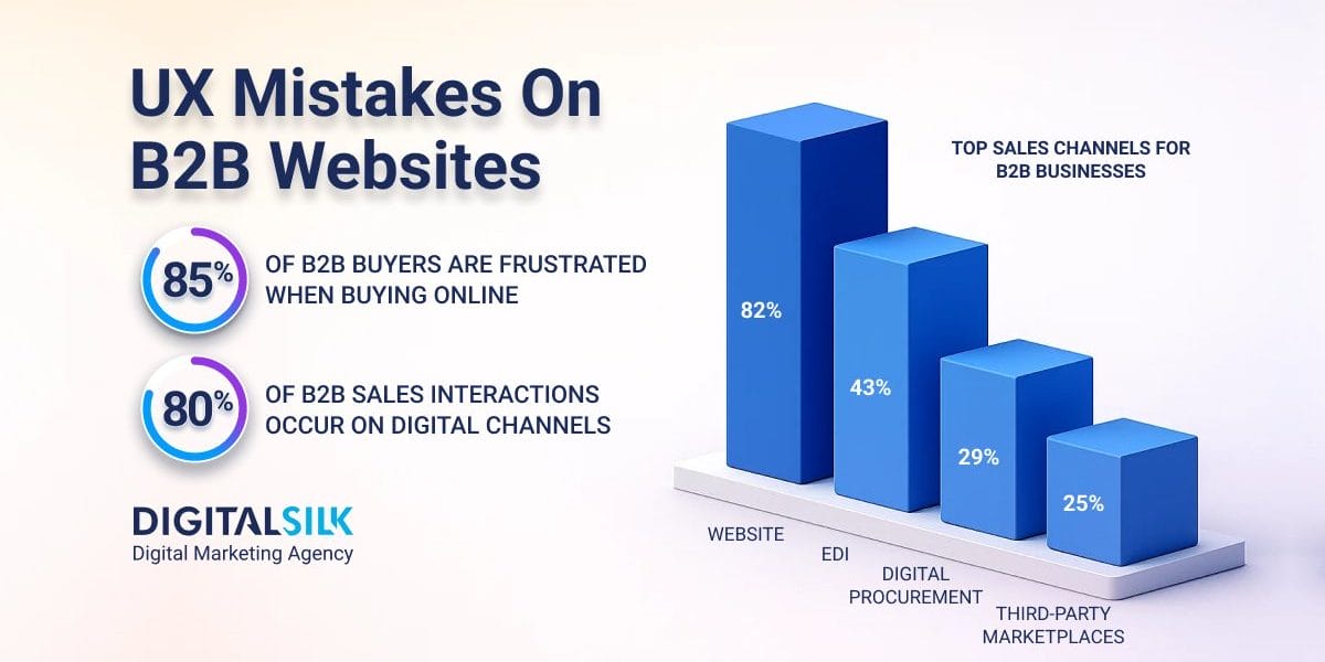
82% of B2B businesses rely on their websites as their main sales channels, but if the user experience doesn’t hold attention or guide decisions smoothly, potential clients will move on.
The gap lies in how a site helps visitors find what matters, compare options and decide on the next steps.
This guide breaks down seven UX mistakes that limit engagement and keep B2B websites from reaching their true potential.
7 Common UX Mistakes Big Companies Make In The B2B Sector
With 80% of B2B sales interactions taking place through digital channels, even established enterprises face pressure to deliver seamless, intuitive experiences.
Yet many businesses fall into the same UX design mistakes that make complex solutions harder to explore and trust, such as:
1. Confusing Navigation And Poor Information Architecture
When visitors land on a website, 38% of them focus on layout and navigation first, spending an average of 6.44 seconds evaluating the main menu before deciding whether to stay or leave.
Confusing navigation and poorly structured content are among the most common UX design mistakes in the United States, often leaving users unsure of where to start or how to find what they need.
As a general rule, if visitors can’t reach key information within three clicks, they tend to lose patience and look for a competitor that offers a smoother experience.
If you want to optimize your site’s navigation, focus on these strategies for effective implementation:
- Map your structure around real buyer journeys by identifying the key questions and steps visitors take before contacting sales, then build your menu and subpages to match that flow.
- Use clear, descriptive menu labels such as “Industries,” “Pricing,” or “Case Studies” instead of vague terms like “Explore” or “Learn More”.
- Keep navigation consistent across all pages, so users don’t have to relearn the layout as they move deeper into your site.
- Add breadcrumbs and highlight active sections to show users exactly where they are within the site’s structure.
- Limit dropdown menus to one level and space items so they are easy to click or tap on mobile devices.
- Include a visible search bar to help visitors find specific content quickly without scanning multiple pages.
- Regularly test navigation paths with real users and use analytics tools to track where they hesitate or drop off.
For instance, Lattice uses clear and structured navigation to make a complex B2B offering easy to explore, demonstrating how thoughtful design helps eliminate common UX mistakes.
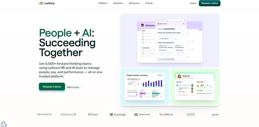
The main menu separates key areas like Platform, Solutions and Resources, with specific labels such as “Talent Suite” and “Innovation & Support” that set accurate expectations.
Each dropdown is organized logically, helping visitors understand what the platform offers and quickly find information that supports their evaluation process.
2. Cluttered Pages And Visual Overload
One of the most common B2B UX mistakes is overloading pages with visual, copy and interactive elements that compete for attention instead of supporting a clear flow.
Around 85% of B2B buyers experience frustration when ordering online, often because of cluttered layouts and disorganized website elements.
A lack of white space, inconsistent hierarchy and crowded layouts make it harder for buyers to scan, interpret and prioritize information efficienctly.
You can improve page design and steer clear of these UX mistakes with these strategies:
- Establish a clear visual hierarchy by defining one main focal point per page and supporting it with secondary elements that naturally guide the eye.
- Use white space deliberately to separate sections and make key information easier to process..
- Organize the layouts with a clear grid system so the on-page text and visuals follow a logical structure.
- Change the color of visited links to help users see where they’ve been and avoid revisiting the same pages.
- Break up long content with headings, bullets and concise paragraphs that make information easier to digest.
- Remove or minimize distractions like auto-playing videos, pop-ups and redundant visuals.
- Evaluate your pages with analytics and heatmaps to understand where attention lingers and where design adjustments are needed.
For example, Notion features a structured, minimal layout that makes its message easy to grasp at a glance.
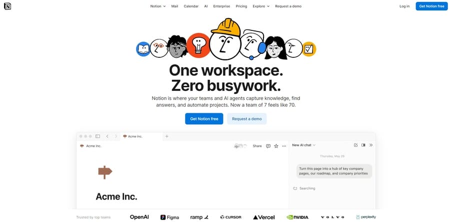
The homepage uses plenty of white space, simple typography and a limited color palette that draws attention to the brand’s main value proposition.
3. Weak Or Misaligned Calls-To-Action (CTAs)
75% of U.S. B2B buyers use a supplier’s website or app to research or make purchasing decisions, which makes every prompt on the page an opportunity to guide that momentum.
One of the most common UX design mistakes to avoid is relying on generic language like “Learn More” or “Submit”, which fail to connect with buyer intent or signal value.
Misaligned CTAs create friction in otherwise good experiences, which could in turn cost you leads and conversions.
You can make CTAs more effective and meaningful for your audience by applying these practical steps:
- Align CTAs with intent so each one reflects where the visitor is in their decision process.
- Use specific, purposeful language such as “View pricing,” “Start your free demo,” or “Download the report”.
- Place CTAs in high-visibility areas like above the fold and after key content sections where engagement peaks.
- Make buttons visually distinct through spacing, colors and sizing that feels consistent across devices.
- Repeat key CTAs on longer pages to catch attention as visitors scroll and absorb information.
- Run A/B tests regularly to refine placement, copy, and design choices based on real engagement data.
- Use click and scroll analytics to see how users interact with CTAs and identify where interest drops off.
Take Transpoco as an example, the brand uses clear and purposeful CTAs that align closely with what visitors come to the site to accomplish.
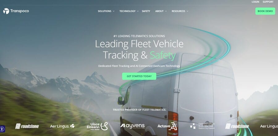
Each prompt reinforces the company’s goal of converting interest into engagement, without relying on vague or repetitive language.
The homepage avoids common UX mistakes by featuring the “Get Started Today” and “Book Demo” buttons, both placed above the fold with vibrant visual contrast that draws attention naturally and encourages immediate action.
4. Generic Messaging That Lacks Relevance
Many B2B websites focus too heavily on describing what they do instead of addressing what their audience actually needs.
Messaging that centers on company achievements or product features rather than buyer challenges falls among the most common UX mistakes that reduce conversion rates.
Customer-obsessed brands see 51% better retention, which makes relevance and understanding build long-term relationships better than generic marketing language.
When your copy sounds like everyone else’s, B2B buyers could struggle to see how your solution fits into their priorities or solves their specific problems.
You can create messaging that resonates with customer pain points by using these strategies:
- Base your messaging on buyer reach that uncovers actual motivations, pain points and consideration factors.
- Incorporate customer language by using the same words and phrasing your audience uses to describe their challenges and goals.
- Highlight your differentiators clearly through competitive analysis that identifies what matters most to buyers and where competitors overlook value.
- Develop a clear messaging hierarchy that prioritizes the most relevant value propositions at the top of each page.
- Tailor messaging for different customer segments so each audience sees its own needs reflected in your copy.
- Use emotional and visual cues intentionally to reinforce meaning and connect with both rational and instinctive decision drivers.
- Test and refine messaging regularly using feedback and data to ensure your website copy evolves with buyer expectations.
One example of effective, audience-centered messaging is Vanta’s homepage, which speaks directly to B2B buyer priorities with clear, outcome-driven language like “Automate compliance, manage risk and accelerate trust with AI.”
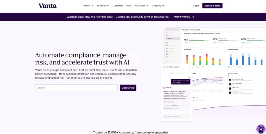
Instead of listing features, it connects product benefits to real business challenges, addressing presentation gaps that often lead to UX mistakes, so its core brand value is immediately visible and relevant.
5. Neglecting Page Speed
Few things impact user perception faster than how quickly a page loads.
Among the most common UX design mistakes to avoid in the United States is underestimating how much performance affects behavior.
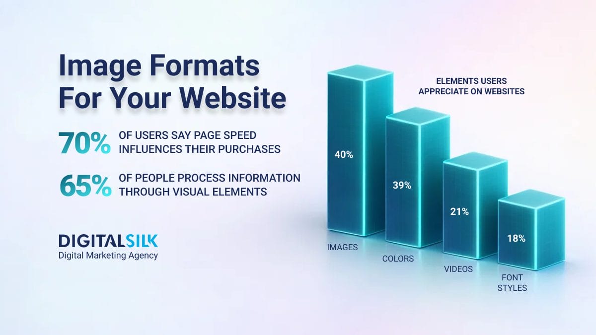
Most websites now load their main page content in 1.3 seconds and with 70% of users saying that page speed impacts their purchasing decisions, slow sites lose credibility before visitors even begin to engage.
Long load times interrupt the flow of exploration and signal inefficiency, which can make even the best-designed B2B platform feel outdated or unreliable.
To improve speed and keep users engaged, focus on optimizing every design and development element that affects how quickly your pages load:
- Compress and properly size images using modern formats like WebP or AVIF to reduce file weight without sacrificing quality.
- Implement a Content Delivery Network (CDN) to serve content faster to users across different regions.
- Minimize HTTP requests by combining CSS and JavaScript files where possible.
- Enable browser caching so returning visitors experience faster load times.
- Choose reliable, high-performance hosting that’s optimized for your CMS or framework.
- Compress site code using CSS, JavaScript and HTML to eliminate unnecessary data.
- Monitor performance regularly with tools like Google PageSpeed Insights or GTmetrix to identify and address slow-loading elements.
6. Not Prioritizing Mobile Optimization
71% of B2B buyers say they want a smoother, more convenient buying experience on mobile, yet many websites still treat the mobile experience as an afterthought.
Among the most common UX mistakes, neglecting mobile optimization disrupts the buyer journey and makes it harder for users to explore products, access information or complete key actions.
Among the most common UX mistakes, neglecting mobile optimization disrupts the buyer journey and makes it harder for users to explore products, access information or complete key actions.
Pinch-to-zoom text, misaligned buttons and hard-to-use forms send the message that convenience wasn’t considered, which can easily increase bounce rates.
Use these steps to improve cross-device usability and performance:
- Prioritize mobile-first designs to ensure key content and functionality work seamlessly on smaller screens
- Use flexible grids and responsive layouts that automatically adjust to different screen sizes.
- Include touch-friendly buttons and hamburger menus to make navigation smooth and intuitive.
- Test usability on multiple devices to identify issues and adjust before launch.
- Compress images and media for faster loading without compromising quality.
- Avoid cluttered layouts and long forms that make mobile browsing tedious.
- Regularly review analytics to see how mobile users interact and where drop-offs occur.
For example, UpKeep’s user interface features large, touch-friendly buttons and a streamlined layout to make navigation simple without crowding the screen.
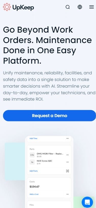
The hamburger menu organizes key actions efficiently, while clear typography and concise copy ensure users can quickly understand the value proposition.
7. Not Including Trust-Building Elements
Failing to build brand trust with your target audience is among the most common UI/UX mistakes and has a direct impact on conversions.
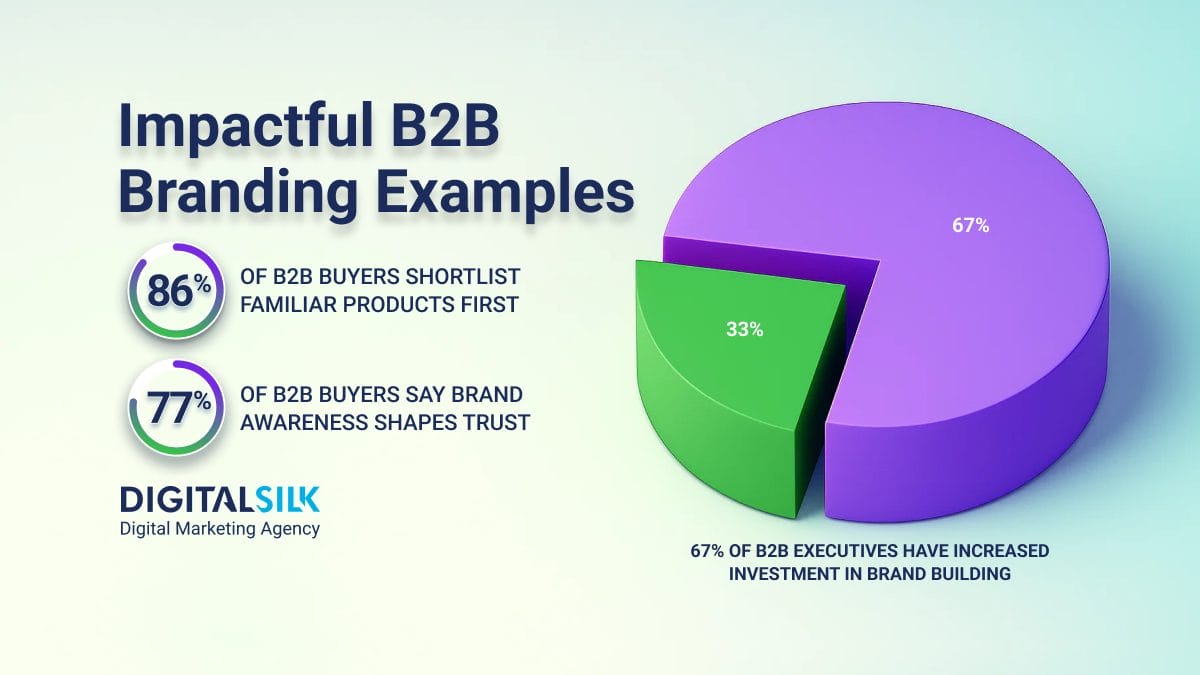
For 52% of B2B buyers, brand trust is the main reason their relationships with vendors grow stronger, but many sites fail to communicate reliability through thoughtful, consistent design.
When visitors can’t quickly confirm that a company is legitimate, secure and reliable, they become hesitant and cautious.
You should include the following elements to make your website feel more credible and avoid falling victim to the usual UX mistakes:
- Show up-to-date contact information, including a verified phone number, email address and physical location to signal legitimacy.
- Use SSL certificates and visible security badges to assure buyers that their data and transactions are protected.
- Include an About page or leadership section that humanizes your brand and gives visitors insight into who’s behind it.
- Display client logos, testimonials or case studies to reinforce credibility through social proof.
- Maintain consistent performance by eliminating glitches, broken links and slow load times that undermine credibility.
- Keep branding and visuals cohesive so the overall design looks professional and trustworthy.
For example, Winnow establishes credibility through transparency and recognizable partnerships.
The homepage features a “Trusted By” section with global brands such as Marriott, Hilton and Compass Group, immediately showing that major brands rely on its solutions.
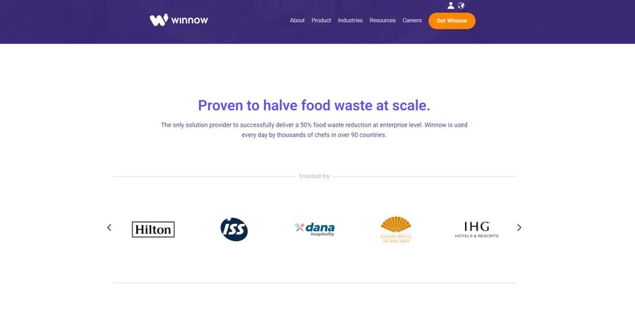
Its About page clearly outlines how Winnow uses smart systems to help commercial kitchens, hotels and retailers reduce food waste at scale, supported by data and tangible results.
Digital Silk’s B2B Website Design Examples
Digital Silk helps B2B businesses across industries avoid common UX mistakes by creating user-centric and conversion-focused user interfaces.
Each example shows how thoughtful design can translate complex offerings into engaging digital experiences that drive growth:
1. Picture Perfect Cleaning
Digital Silk redesigned Picture Perfect Cleaning’s website to deliver a smoother, more intuitive B2B experience focused on usability, trust and lead generation.
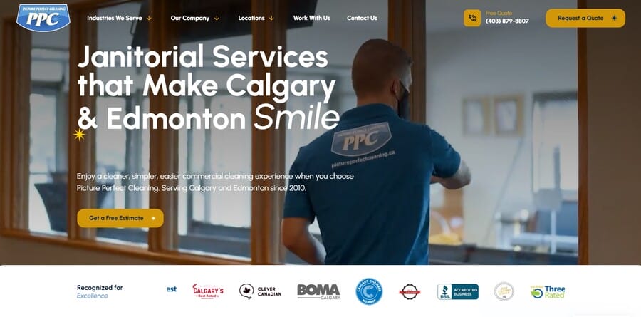
The updated UX introduced simplified navigation, service-specific landing pages and content tailored to industries like offices, schools and gyms.
A restructured site architecture, combined with HubSpot CRM integration, improved SEO visibility and streamlined the conversion process.
Within two months of launch, sessions increased by 47%, engaged sessions by 71% and average engagement time by 125%.
2. Beckway
Beckway‘s UX mistakes included an outdated website with no structure, clear navigation and a defined conversion path, which made it difficult for visitors to understand the firm’s value.
Long pages buried key information, while the absence of CTAs limited engagement and lead generation.
Digital Silk redesigned the site with a streamlined six-page structure, sticky mega menu and modular content blocks that made information easy to scan and act on.

The new user experience reflects Beckway’s professionalism, improves usability across devices and positions the firm for scalable B2B growth.
3. VarData
With a digital experience that no longer matched its reputation, VarData needed a website that reflected its two-decade-long B2B expertise and relationship-driven approach.
The old platform overemphasized products and lacked a clear path for engagement, reflecting common UX mistakes that made it difficult to convey value beyond price.
Digital Silk created a modern, lead-focused experience with defined service pathways, refined messaging and a flexible customer management system (CMS) that supports ongoing growth.

The redesigned UX helps VarData position itself as a strategic partner while improving conversion flow and long-term scalability.
How Avoiding UX Mistakes Impacts B2B Lead Generation And Conversion
Avoiding common website UX mistakes improves how visitors experience your brand and interact with your content, leading to noticeable improvements across key performance areas:
1. Higher Conversion Potential
With the average B2B eCommerce conversion rate at 2.7%, which is on the lower end of the scale, improving UX creates a smoother experience from first visit to conversion.
Clear page hierarchy, visible next steps and simplified forms help visitors complete actions without confusion or delay.
2. Increased Revenue Contribution
Since 56% of B2B revenue in the U.S. comes from digital channels, minimizing UX mistakes directly affects how efficiently those interactions turn into sales.
A well-structured site and intuitive navigation help buyers find information faster and progress through the journey with ease.
3. Improved Lead Quality
Effective UX aligns messaging, layout and calls-to-action with buyer intent, attracting prospects who are genuinely evaluating solutions.
This ensures that marketing efforts generate leads with a higher likelihood of conversion.
4. Enhanced Buyer Trust
Trust-focused elements such as security certificates, client testimonials and consistent design build confidence in your brand’s credibility.
When the digital experience feels dependable and professional, visitors are more inclined to engage meaningfully.
5. Better Decision-Making Through Data
An improved UX produces more relevant analytics that reveal where users spend time, what captures attention and where drop-offs occur.
Why The UX In B2B Is Different From B2C
While both models share the goal of driving engagement and conversion, there are distinct differences between how B2B and B2C users interact with websites.
Understanding these distinctions and addressing common UX design mistakes in the United States helps create experiences that match the expectations of each audience:
- Longer buyer journeys: B2B purchases involve extended research and comparison, so content and navigation should be structured to help visitors explore information efficiently.
- Multiple stakeholders: Buying decisions often involve several perspectives and priorities, which means UX must present information that speaks to varied needs within an organization.
- Greater need for trust signals: High-value engagements rely on visible proof and credibility through certifications, case studies and transparent communication.
- Emphasis on usability: Visitors expect straightforward navigation, consistent layouts and an accessible design that communicates professionalism and reliability.
- Support for complex decisions: B2B websites should enable deeper learning through detailed resources, product information and ROI-driven content that guide purchase alignment.
Design Your B2B Website With Digital Silk
A B2B website defines how effectively a company communicates expertise, builds confidence and supports buyer decisions.
When every element flows well together, it minimizes UX mistakes and creates a purposeful digital experience that drives measurable growth.
Digital Silk’s web designers and developers create B2B websites that combine strategy, UX, and technology to help businesses attract high-value clients and convert engagement into long-term results.
As a recognized web design company, our services include:
- Web design for B2B brands
- Custom web development
- B2B brand strategies
- B2B lead generation
- Digital marketing
Contact our team, call us at (800) 206-9413 or fill in the Request a Quote form below to schedule a consultation.
"*" indicates required fields


