
Creating a user-friendly website requires careful planning, design and development, as well as continuous optimization.
In this comprehensive expert guide, we will show you how to make a user-friendly website, including:
- The elements to focus on
- The steps to take, from planning to launch
- And the tools to use to continuously audit and optimize your website’s performance
Our professional web designers have compiled a wealth of insights, so let’s dig in.
Digital Silk builds custom websites. Request A Quote
What Is A User-Friendly Website?
A user-friendly website is designed to efficiently and intuitively connect visitors to the information they need and actions they wish to complete on your website.
If we are to compare a user-friendly website design process with other approaches, the core difference would be in the research and planning phase, i.e. UX design.
In a user-friendly website design, the target user is the (north) star of the show. Taking into account their needs, habits, preferences, and limitations, the website designer tailors the digital experience to engage and delight the user.
As a result, user-friendly websites do a great job of retaining and converting target audiences.
Here are more benefits of good, user-friendly web design.
How User-Friendly Are Themes vs. Custom Websites?
If you are designing (or redesigning) a website, you have probably weighed the options of buying a theme vs. designing a custom experience at some point.
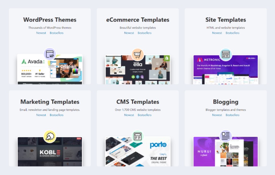
[Source: ThemeForest]
If you are prioritizing user experience (and results), you are probably Team Custom by now.
Why is that?
As affordable and —at times — pretty as they are, website themes are 1) generic and 2) notoriously difficult to customize.
What does this have to do with the website theme’s user-friendliness?
Let’s unpack!
- Generic design: We have already established that user-friendly website design is created to cater to the users’ needs — your users’ needs. Themes, on the other hand, are designed to cater to the masses, often disregarding the core principles of good UX design.
- Notoriously difficult to customize: Apart from changing colors, fonts, and images, making other changes to your theme such as customizing, scaling, and evolving the website is difficult at best. Tailoring your digital experience to your user’s needs and preferences requires more than a color change. However, each new feature, no matter how simple or complex, can hinder your website theme’s performance.
Now, full disclosure, we are custom web design experts, but not by accident. We chose to specialize in custom web design because it is the only way to make a website truly user-friendly.
The custom website design process begins with planning, which allows you to center your design, features and functionalities included, around your target users, as well as your brand. (Speaking of brands, as a full-service web design agency we specialize in branding as well.)
[Source: giphy]
User-Friendly Website Elements
Now that we have established that custom design is the best — if not the only — path to a user-friendly website, let’s see what elements to focus on.
These are the 8 elements that make a website user-friendly, according to web design experts in NYC, Miami, California, and other locations.
1. Loading Speed
One of the studies found that users want websites to load in under 2 seconds.
Subsequent studies have shown that users’ tolerance towards poor website performance, loading speed included, has been on a decline ever since. In other words, if your website fails to load in 2 seconds, most of your visitors will bounce and never return.
2. Responsiveness
We have a whole piece on responsive web design, but in a nutshell:
A user-friendly website is responsive, meaning it is optimized to display properly on all devices, including desktops, laptops, tablets, and smartphones. This ensures that visitors can easily access your website from any device, and can interact with your content without any issues.
3. Navigation
Often used synonymously with the website menu, navigation helps your user navigate the website in pursuit of particular information and/or activity.
As such, clean and intuitive navigation is key to frictionless user journeys and, as a result, higher conversion rates.
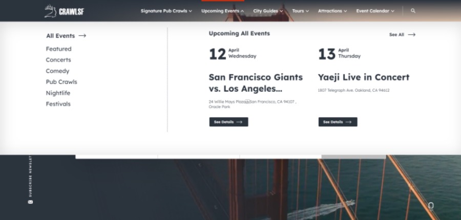
From our design portfolio: CrawlSF connects San Francisco residents and visitors with the latest events and signature pub crawls. Their clean and intuitive menu helps users quickly access the events they’re interested in.
For more useful insights, check out our website navigation guide.
4. Messaging
One of the most overlooked, yet crucial elements of user-friendly website design is messaging — think page names, page section headers and sub-headers, as well as copy.
Websites that place voice-over value can easily fail to communicate their main message. While brand voice is important, a user-friendly website will prioritize messaging that its audience will find clear and engaging.
Take one of the websites from our portfolio as an example: EV Universe. As soon as you land on their page, you see a simple H1 message: “Electric Cars for Sale.”
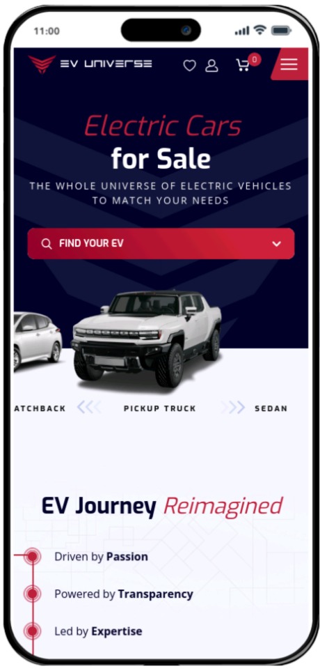
You understood what they offer almost instantly, right? That’s the value of clear and concise messaging.
5. Search Optimization
Yes, we do mean SEO, but in its most fundamental form.
Ever used those website search bars?
From our design portfolio: Ventura Foods is a large corporation with a robust website. The search functionality facilitates website navigation.

Much like search engines, these features scan content for keywords to deliver the best match to your query.
Optimizing your website’s messaging for keywords not only facilitates search within and outside the website but also helps clarify your messaging.
6. CTAs
Besides navigation, call-to-action (CTA) buttons help guide the user to relevant information and conversion points, making them another important element in creating frictionless user journeys.
We recommend using at least 3 relevant CTAs on landing pages, one of which would lead to the conversion page/point.
We also recommend using clear, actionable CTA messaging that sets the right expectations, i.e. tells the user exactly what is behind the click.
7. Intuitive Functionality
User-friendly websites offer easy-to-use features and functionalities, whether they are simple contact forms or complex tools.
What does easy-to-use mean?
Some of the universal qualities include:
- Clear prompts: From headers to form fields and progress bars, make sure your user knows exactly where they are and what action to perform.
- Minimal text: Avoid paragraphs of footnotes. No one reads them. Focus on headers, fields, and CTAs to educate your user.
- Feedback messages: “Has my order gone through?” “Where will I get the results of my quiz?” Provide the user with feedback messages on-screen, and ideally, via email as well, to inform them of the status of their activity.
- Intuitive CTAs: Instead of using vague CTAs like “Next,” tell the user exactly what’s behind the click. Think: “Health History,” “Billing Information,” “Pay Now”.
We recommend planning your more complex features and functionalities carefully and running them by test groups to select the most intuitive options.
8. Consistency In UI Design
Your user-friendly website will grow and evolve over time. Each new image, feature, and module creates a new opportunity to deviate from the current look and feel. After a while, you are likely to end up with a patchy and unprofessional-looking experience.
There’s a very simple solution to this!
We recommend developing a brand style guide or brand book before planning your website to ensure consistency in brand presentation across touchpoints.
As you may need to adjust some of your brand elements to the digital environment, primarily web-friendly fonts, we suggest developing a web style guide as well. A website style guide will tell anyone who ever touches your web design how to use the key elements, including:
- Fonts
- Palette
- Images
- Iconography
- CTA design
- Links
- And so on
9. Accessibility
The goal of accessible web design and development is to ensure that everyone, regardless of their abilities or disabilities, can access and use the web.
There are a number of guidelines and standards that web designers and developers can follow to ensure accessibility. Here are some of our guides to web accessibility:
How To Make A Website User-Friendly In 7 Steps
Incorporating these elements requires careful planning, as well as adhering to the UX/UI design and development best practices.
As we’ve already established, the key to creating a user-friendly website is planning, so we’ll break down the “proper” planning steps (the first 4 in our list) along with design and development best practices.
Request an audit. Request An Audit
1. Define The Target Audience
To create a user-friendly website, you need to know who your user is.
Professional web design agencies like ours will usually create user personas to identify and describe your target audience segments and their online behaviors.
The exercise of building user personas will help you design your website elements around your users’ unique expectations, habits, and limitations.
For instance, say you are launching a category of products or services your users are not familiar with yet. Identifying this possible challenge to your product/service adoption helps you devise web design solutions. In this case, you may want to create a page that educates the user on the product/service category, or even embed a short, educational video on the homepage itself.
2. Create Engaging Content
What are the information, resources and functionalities users need to:
- Understand who you are, what you offer and how it would bring them value (ex. H1 messaging)
- Develop interest in your offering (ex. Social proof)
- Help them discriminate your offering against competitors’ (ex. Pricing comparison charts)
- Build the trust they need to complete the desired action, i.e. convert (ex. Case studies and demos)
Et voila! You have your conversion funnel — content for the awareness, interest, consideration, and conversion phases of your users’ decision-making journey.
3. Map Out The User Journey
Now that you know the content your users expect and need to build trust, you need to map it on your user-friendly website.
You can start by listing all the pages you will need and then categorize them into sensible groups. This process of categorizing will slowly get you started on building your sitemap and navigation.
This resembles a web menu with drop-drown, doesn’t it?
It is intentionally so.
Your navigation should closely resemble your sitemap, providing your user with a birds-eye view of your website in intuitive clusters of content.
4. Plan Key Landing Pages
From a birds-eye view of your website, zoom in on your key landing pages.
Aside from Home, About, and Contact, most of your landing pages will have similar — if not the same — layouts. This is great for efficiency and scalability.
List your unique landing pages (i.e. pages with unique layouts) and define the messaging (a.k.a. the header structure), CTAs, and features and functionalities they should contain. You can use a simple Word or Google Doc to organize this content on your pages.
Then, hand them over to the designer for wireframing. Here’s a 101 guide to website wireframes to get you started.
Wireframing is the step where your planning starts to materialize in web design. When designing, be sure to follow the accessibility standards, specifically color contrasts and consistent navigation.
5. Add Design Elements
If your wireframes organize the bones and muscles of your website, UI design adds the skin and the pretty elements such as color, typography and images.
To keep your web design consistent with your brand’s look and feel across all touchpoints, we recommend developing a brand book or style guide first. These will guide your selection of:
- Fonts
- Color palettes
- Iconography
- Images
- And other visual elements
As you add these visual elements to your website, keep web accessibility best practices in mind.
A word of caution as you evaluate your UI design: Don’t let the visual (UI) elements seduce you into changing the flow of the content on your web page, i.e. the wireframe. We’ve established that wireframes are the bones and muscles of your web page. Take one of them out, and your user experience may collapse.
If you don’t like the design element, change the design element, not the module.
Otherwise, you are not designing a user-friendly website, you’re designing a brand-centric one.
6. Create A Spec Doc
A specification document (also known as a “spec doc”) outlines the technical requirements and specifications for a web development project.
It is a detailed document that serves as a roadmap for the development team, providing guidance on what needs to be built and how it should function.
Spec docs are more common in large and/or complex website projects. Nevertheless, they do bring value to all.
As you outline the technical requirements for your user-friendly website, including how your forms and features should work, focus on finessing these details of your user experience. And, depending on the skills and qualifications of your web development team, you may also want to outline some of the key web accessibility standards to follow such as:
- Web Content Accessibility Guidelines (WCAG)
- Americans with Disabilities Act (ADA)
- Section 508
- European Accessibility Act (EAA)
- Accessible Rich Internet Applications (ARIA)
7. Develop & Test
The development phase is where your user-friendly website truly comes to life. Skip or skew one element, and all your planning and design work goes to waste, so it is important to work with a highly skilled web development team.
Your team should be well-versed in all web accessibility standards, as well as follow rigorous pre-and post-launch quality assurance (QA) protocols. These should include:
- Security Testing
- Speed testing
- Functionality testing
- Compatibility testing
- User Interface and Design Testing
- Content Testing
- And more
Only once the website is thoroughly tested should you approve it for launch.
We do recommend letting it “simmer” online for a couple of days as a soft launch before driving traffic to it via marketing campaigns. This will allow you to identify and fix any post-launch issues to ensure you are delivering a truly user-friendly experience.
Our experts can help. Schedule A Consultation
How To Know If Your Website Is User-Friendly (Or Not)
Measuring the user-friendliness of your website boils down to evaluating its technical performance and user behavior.
Here are some of the key tools to use to evaluate how user-friendly your website is:
1. Website Analytics
Website analytics tools, most notably Google Analytics, help you track how well your website engages and converts its audiences. Some of the key insights you can gain are:
- Traffic: From volume to demographics, you can check how many visitors your website attracts and if they match your target audience profiles. If your traffic is too low, check the sources, i.e. marketing channels. If demographic data is off, check whether your marketing channels and website content speak to the needs of your audience.
- Engagement: Website analytics tools will tell you how long your users stay on your website and how much they interact with it. A user-friendly website will have a high time-on-site and click-through rates (i.e. low bounce rates).
- Conversions: You can set and track goals in your website analytics tools, be they newsletter subscriptions or successful checkouts. If your conversions are low, you’ll need to evaluate your website’s conversion funnel and overall UX design to identify obstacles to conversions.
How will you know what the “good” ranges are?
Use benchmarking and competitor analysis tools like SimilarWeb.
2. Loading Speed Tools
As we mentioned, users want your website to load in under 2 seconds. In fact, loading speed is one of Google’s Core Web Vitals factors, so slow-loading sites tend to get demoted in search engine results pages (SERPs).
Use tools like PageSpeed Insights and GTMetrix to test your website’s loading speed.
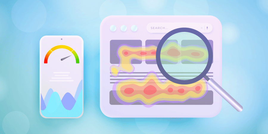
3. Heat Maps
Heat mapping tools track user behavior on a website and display that data in a visual format, typically in the form of a heat map — color-coded visualizations to show areas of a web page that receive the most user activity or attention.
Heat map tools like HotJar can provide valuable insights into how users interact with your website to help you optimize the user experience and improve website performance.
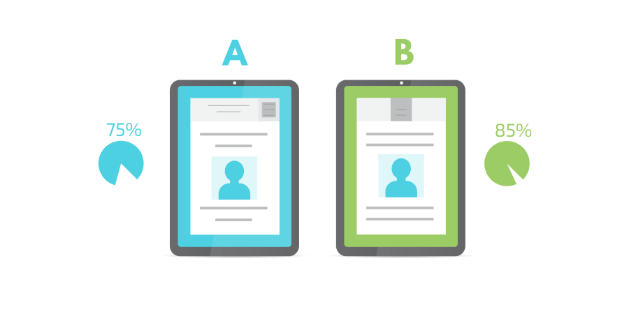
4. A/B Testing
Creating a user-friendly website is a journey, not a destination. It requires continuous performance tracking, troubleshooting, and testing to create a highly engaging digital environment.
It will often require testing (and abandoning) personal preferences and hypotheses.
A/B tests typically consist of two web page design variants with slight design tweaks (usually one element). These tools then help you deliver these pages to different user groups to get a read on their response and select the one that performs the best.
Create A User-Friendly Website With Digital Silk
As experts in user-friendly website planning, design, and development, we can guide and support you through the entire cycle of website development.
Contact us to request a free, custom proposal for your website project and we’ll get back to you promptly.
In the meantime, we recommend downloading our Digital Trends whitepaper for our experts’ insights on branding, design, and marketing trends to leverage this year.
"*" indicates required fields
