Scrolling Effects: Key Highlights
-
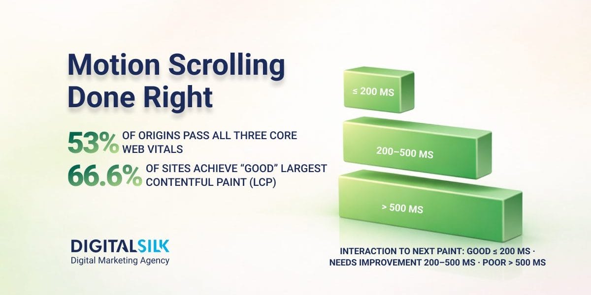
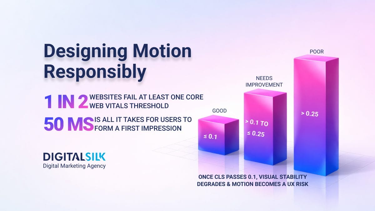
Scrolling effects now affect Core Web Vitals outcomes. With only 53% of websites meeting all “good” thresholds, added motion often pushes pages from usable to heavy.
-
Motion works only when structure comes first. Scrolling effects help when the page already makes sense and motion guides pacing, not meaning.
-
The real risk is how the page feels to use. Poor scrolling effects reduce responsiveness, blur orientation and erode trust early.
Scrolling effects shape how people experience a website before they decide whether to trust it, continue or leave.
Because motion affects pacing, attention and perceived effort, it’s one of the more sensitive tools in modern web design.
That sensitivity is now measurable.
According to Google, pages that meet Core Web Vitals thresholds: Largest Contentful Paint within 2.5 seconds, Interaction to Next Paint under 200 milliseconds and Cumulative Layout Shift below 0.1 are more likely to deliver a good user experience.
Yet Chrome UX Report data shows that as of July 2025, only 53.0% of websites and major subdomains met all three “good” thresholds.
This gap is why scrolling effects deserve closer scrutiny in 2026. Used with discipline, they can guide attention and support understanding. Used carelessly, they reduce performance margin, disrupt orientation and weaken credibility.
This article examines where scrolling effects work, where they fail and how to apply them with intent.
Types Of Scrolling Effects
When implemented well, scrolling effects create depth and make a website stand out.
They influence how information is revealed, how long users stay oriented and how much effort it takes to move forward.
While scrolling effects can take many visual forms, most fall into a small number of recognizable patterns.
Nine of the most common types of scrolling effects include:
- Parallax scrolling: This effect creates the illusion of depth by making the background content (usually an image) move at a different speed than the foreground content while scrolling.
- Fade-in or fade-out: Elements on a webpage can appear (fade-in) or disappear (fade-out) as a user scrolls down or up the page.
- Zoom in or out: Images or other elements can increase or decrease in size as a user scrolls.
- Sticky elements: As you scroll, certain elements, like a navigation bar, can stick to the top or side of a viewport, making them accessible from anywhere on the page.
- Reveal animations: As visitors scroll, elements can slide, rotate, bounce or employ other animations as they come into the viewport.
- Scroll-triggered background changes: The background color or image can change based on the scroll position.
- Scrolling progress bars: These indicate how much of an article or page the user has scrolled through.
- Multidirectional scrolling: Content can move both vertically and horizontally based on user interaction, offering a unique navigational experience.
- Pull-to-refresh scrolling: Common in mobile apps, pulling down at the top of the content refreshes it.
Why Scrolling Effects Can Add Value
When applied with clear intent, scrolling effects can make information easier to absorb rather than harder to follow.
Long pages benefit from pacing.
Progressive reveals prevent users from facing too much information at once, which can be especially helpful when explaining complex services or layered products.
Sticky navigation and progress indicators reduce uncertainty by answering a basic question every visitor asks, often subconsciously: Where am I and how much is left?
Motion can also support storytelling. When information must be understood in sequence, such as a product evolution, a historical timeline or a step-by-step process, scrolling effects can create a natural flow that mirrors how people read and absorb information.
This matters because attention is scarce in any digital environment.
Microsoft’s Work Trend Index research found that employees in the top 20% by “ping” volume are interrupted every two minutes during core work hours, up to 275 times a day, which is a useful proxy for how quickly focus is broken in modern digital experiences.
A scroll experience that adds friction tends to lose people fast.
The key point: these benefits come from structure and timing, not animation itself.
A Practical Decision Framework For 2026
Before introducing scrolling effects, teams should answer a small set of questions.
When Scrolling Effects Work
Scrolling effects are most effective when the page has a clear narrative and users benefit from guidance through it.
This is common on long-form editorial content, detailed product explanations and storytelling experiences where sequence matters.
A good sign: the page would still make sense as a static document and motion simply improves pacing and emphasis.
When Scrolling Effects Fail
Scrolling effects tend to fail when they interfere with early understanding, responsiveness or control.
They become a liability when:
- The first screen can’t stand on its own: If a page’s initial view does not clearly communicate purpose without motion, users are forced to wait, scroll or interact before they can decide whether the content is relevant. That adds friction at the exact moment attention is most fragile.
- Key content is delayed behind reveals or “cinematic” pacing: Scroll-triggered intros, long reveal sequences and scroll-jacking often gate meaning behind movement. If users must “earn” the message, many won’t.
- Performance margins are thin, especially on mobile: Scroll-based animations often run during interaction, which means they compete directly with input responsiveness. Google’s INP guidance makes the risk concrete: “good” ≤ 200 ms, “needs improvement” 200–500 ms and “poor” > 500 ms, measured at the 75th percentile of real-user page loads, so your slowest 25% matters.
- Motion tips a page over the edge on Core Web Vitals: Many sites are already operating without much margin for error. Chrome User Experience Report data from July 2025 shows that while 85.4% of websites delivered good interaction responsiveness and 79.6% maintained stable layouts, only 66.6% achieved fast enough largest content rendering. When heavier visuals and scrolling effects are added, that weakest metric is often the first to break.
- Orientation is fragile: Effects that obscure where users are, such as unclear section boundaries, sudden background shifts or transitions that don’t map to information hierarchy, make long pages feel harder to navigate.
- Control is overridden: Scroll-locking, forced snap points and hijacked scroll input remove a sense of control users rely on to navigate comfortably. What may feel cinematic to designers often feels obstructive to visitors.
What To Choose Instead
If the goal is clarity, static hierarchy often does more work than animation:
- Strong headings and section summaries
- “Jump to section” navigation
- Clear visual grouping and whitespace
- Persistent anchors for pricing, specs, or key CTAs
These patterns solve many of the same problems with far less risk to the Core Web Vitals outcomes Google measures.
Tradeoffs
Using scrolling effects buys control over pacing and emphasis. It costs performance headroom and implementation simplicity.
The risk isn’t how the page looks, but how it feels to use.
And with only 53% of origins passing all three CWV “good” thresholds as of July 2025, motion frequently becomes the difference between “works fine” and “feels heavy.”
| SIGNAL | WHAT IT TELLS YOU | SAFER DIRECTION |
| The page works without animation | Structure and hierarchy already do the job | Add motion only to guide pacing |
| The first screen explains itself | Users don’t need to wait to understand purpose | Introduce effects after intent is clear |
| Content depends on reveals to make sense | Meaning is delayed by motion | Surface key content immediately |
| Scroll effects run during interaction | Responsiveness is at risk | Reduce or defer animation |
| Performance margins are already tight | Motion may push the page over CWV limits | Simplify visuals first |
| Orientation relies on animation | Navigation becomes fragile | Reinforce structure with headings and anchors |
| Scroll behavior is overridden | Users lose control | Preserve native scrolling |
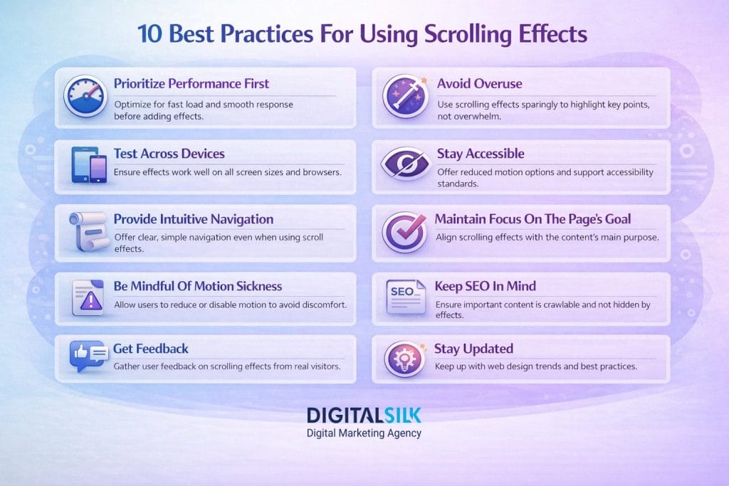
10 Best Practices For Using Scrolling Effects
Scrolling effects can breathe life into a website, but just like any powerful tool, they must be used wisely. Improper use can overwhelm visitors or even detract from the content you’re trying to emphasize.
The most common best practices for using scrolling effects include:
1. Prioritize Performance First
Scrolling effects should never be designed in isolation from performance.
Pages must load, render and respond cleanly before motion is added. Because scroll-based effects often execute during user interaction, they compete directly with responsiveness and can degrade experience even if initial load times are acceptable.
Tools like Google’s PageSpeed Insights can give insights into how well your site performs and offer suggestions for improvement.
If an effect causes lag, hesitation or layout instability, it fails regardless of how refined it looks.
2. Avoid Overuse
While scrolling effects can be captivating, using too many on one page can overwhelm visitors. It’s better to use them strategically to emphasize key points rather than making every element of the page interactive.
Before implementing any scrolling effect, ask, “What purpose does this serve?” If it doesn’t enhance the storytelling or user experience, reconsider its inclusion.
3. Test Across Devices
Always test scrolling effects on various devices and screen sizes. What looks good on a desktop might not translate as effectively on a mobile device.
For instance, parallax effects or animations might be misaligned or cropped on smaller or larger screens.
HTTP Archive’s 2024 Web Almanac reports “good” First Contentful Paint reached 68% on desktop vs 51% on mobile, which is a practical reminder that motion-heavy experiences need mobile-first testing, not desktop-first demos.
Tools like BrowserStack or the device emulation mode in Chrome DevTools can help simulate how a website looks and behaves on various devices and browsers.
4. Stay Accessible
Ensure that your website remains accessible to all visitors, including those with disabilities. Scrolling effects should not hinder the ability of screen readers or other assistive technologies to interpret and navigate your content.
A good solution is to allow visitors to turn off or reduce motion.
Support prefers-reduced-motion at the system level and ensure content remains fully usable without animation. Align implementation with guidance from the W3C guidance for WCAG 2.2 and WCAG criteria related to motion and interaction.
5. Provide Intuitive Navigation
If you’re using scroll effects to change content or move between sections, always provide an intuitive way for visitors to navigate. This can include visible navigation menus, scroll indicators, or arrows.
Conduct usability tests to see how real visitors navigate your site with the scrolling effects. Gather feedback and be prepared to make adjustments based on their experiences.
6. Maintain Focus On The Page’s Goal
The primary goal of your website is to convey information or encourage a specific action. Make sure that any scrolling effects support this goal and don’t distract from your primary message or call to action.
Always design with your content as the priority. Scrolling effects should be the icing on the cake, enhancing the user’s journey through your content, not replacing or overshadowing it.
7. Be Mindful Of Motion Sickness
Some visitors may experience motion sickness or discomfort from certain animations or parallax effects.
Whenever motion is non-essential, provide a way to reduce or disable it.
You can also consider informing visitors before they engage, allowing them to decide if they want to proceed.
8. Keep SEO In Mind
Scrolling effects don’t harm search visibility directly, but their side effects can.
If important content is delayed, hidden or only rendered after interaction, it may affect indexing and perceived page quality.
Heavily animated pages also tend to be more resource-intensive, increasing the risk of slower load times and weaker experience signals.
9. Get Feedback
Before finalizing your design, gather feedback.
This can be from colleagues, target audience members or usability testers. They can offer insights into how the effects are received and if they enhance or detract from the experience
Tools like UserVoice or Hotjar allow visitors to provide feedback directly on your site, sometimes even allowing them to highlight specific elements they’re referring to.
10. Stay Updated
Web design trends evolve and what’s trendy today might be outdated tomorrow.
Always stay updated with the latest in design and technology to ensure your scrolling effects remain relevant and effective.
For example, the evolution of CSS and JavaScript libraries has enabled more sophisticated animations and interactions.
Benefits Of Website Scrolling Effects
Scrolling, when executed well, can transform a routine content scroll into a journey of discovery, bringing many benefits to a website that can capture visitors’ attention.
Common benefits that these effects bring to the table are:
- Enhanced user engagement: By introducing movement and interactivity, scrolling effects can grip visitor’s attention, making them more likely to spend additional time exploring a site.
- Improved storytelling: Websites, especially those that aim to tell a story or present a narrative, can leverage scrolling effects to create a more compelling flow and progression, guiding visitors naturally from one section to another.
- Added depth and dimension: Techniques like parallax scrolling can introduce a sense of depth, making the webpage feel more like an interactive environment rather than a flat canvas.
- Highlights key content: Strategic use of scrolling effects can draw the eye to essential information, products or calls to action, ensuring that visitors don’t overlook crucial content.
- Improved aesthetics: A well-designed scroll effect can elevate the overall look and feel of a website, making it stand out in a sea of static pages.
- Boosted brand image: Innovative and sleek scrolling effects can position a brand as modern, forward-thinking and tech-savvy, appealing to a demographic that values design and functionality.
- Increased conversion rates: By guiding visitors through a seamless and interactive journey, scrolling effects can indirectly influence their behavior, potentially leading to higher conversion rates.
- Encouraged content exploration: Visitors are more likely to explore further down the page when captivated by engaging scrolling effects, ensuring that more of the site’s content gets seen.
10 Best Examples Of Scrolling Effects
Here are ten stunning examples of scrolling effects, including those from our Digital Silk portfolio, showcasing a range of techniques and styles that designers have used to enhance the user experience.
The goal here is not to celebrate visual execution, but to examine how motion impacts understanding, performance and orientation.
1. Apple’s AirPods Pro
Apple is known for its sleek designs, not just in products but also in its web presentations.
Their product pages are designed to explain physical features through progression.
Scrolling is used to introduce details gradually, allowing users to absorb information in stages rather than all at once.
Why scrolling effects work:
The motion is tied to comprehension. Transitions show one idea at a time and reinforce the product explanation rather than competing with it.
The page also establishes value early, so users understand what they’re looking at before heavier visuals appear.
2. Wodwo
We had the privilege of designing the digital presence for Wodwo, a revolutionary AI Audience Modeling Platform tailored specifically for marketers.
Our team crafted an engaging website for the brand, leveraging innovative scrolling effects to seamlessly guide visitors through the platform’s prowess and benefits.
Why scrolling effects work:
Scrolling effects help prevent cognitive overload.
Each section builds on the previous one, supporting comprehension for first-time visitors encountering an unfamiliar product category.
This site also uses motion as a pacing tool rather than a gate.
That reduces the risk of delaying the “what is this?” answer, i.e., the moment where users decide whether to continue.
3. Every Last Drop
This single-page website was crafted by Nice and Serious, a B Corp-certified creative agency dedicated to producing content and campaigns solely for impactful projects.
The Every Last Drop website takes visitors on a journey through a day in the life of an average person, revealing how much water is used in daily activities — from the morning routine to the end of the day. The purpose is to demonstrate that water consumption extends beyond just what we drink.
Why scrolling effects work:
Motion and scroll progression are inseparable from the story itself.
Visual changes reinforce each narrative moment, making abstract ideas feel tangible and memorable.
Because the page is story-first, motion doesn’t feel like a random layer, but the mechanism of understanding.
4. Tecnam
Digital Silk was honored to partner with Tecnam, a titan in the aviation industry with a fleet of over 7,500 airplanes worldwide.
We crafted a captivating, animated website journeying through the illustrious history of Tecnam and their deep-rooted aviation expertise.
Why scrolling effects work:
Sequential reveals align well with historical storytelling.
The site avoids overwhelming users and maintains a steady rhythm.
Scrolling effects keep visitors oriented through a long narrative, which is the core job of the page.
5. Porsche Evolution
Porsche is a renowned German automobile manufacturer that specializes in producing high-performance sports cars, SUVs, and sedans. They wanted their fans to learn more about the brand’s history through interactive design, so they created Porsche Evolution.
This microsite uses vertical scrolling to take visitors on a journey through the history and evolution of Porsche vehicles. The site also uses dynamic animations, such as the sound of engines or race visuals, activated by scrolling, to dive deep into the brand’s success in racing events.
Why scrolling effects work:
Scrolling mirrors chronology, which feels intuitive.
Motion reinforces the sense of progression and helps segment a long story.
It also reduces confusion by making “what changed?” obvious at each step.
6. Welch’s Fruit Snacks
For Welch’s Fruit Snacks, visitors are treated to a delightful experience where individual fruit snacks spring to life on-screen, dancing and moving about, only to eventually find their way into their iconic packaging.
Our collaboration with Welch’s aimed to capture the fun essence of the brand, merging it with a digital experience that’s as engaging and vibrant as the fruit snacks themselves.
Why scrolling effects work:
Animation aligns with tone and expectations.
Motion adds energy without fundamentally changing how content is accessed.
Scrolling effects keep the site approachable. Motion doesn’t block reading or navigation.
7. The Boat
The Boat website was made to commemorate the 40th year since the fall of Saigon and to mark four decades of Vietnamese integration in Australia.
They made an interactive novel, where scroll effects are used to navigate the story, with animations, shifts in perspective, and even ambient sound effects enhancing the reading experience.
As you journey through each section, the parallax effect enhances the sensation of flipping through the pages of a book.
Why scrolling effects work:
The experience is cohesive and intentional.
Motion supports immersion rather than distracting from it, making the story feel lived rather than consumed.
It further maintains a consistent “reading rhythm,” which is essential in long narrative experiences.
8. Venator Sales Group
One of our clients, Venator Sales Group, wanted to build a website that showcases their online platform and creates an engaging experience while scrolling.
As visitors scroll through the website, they’re met with subtle yet captivating image transitions, moving elements and simple animations.
This blend of simplicity and digital artistry perfectly complements Venator’s ethos, showcasing their services in a compelling and accessible manner.
Why scrolling effects work:
Motion remains understated and supportive.
Effects reinforce structure rather than replacing it, keeping the experience calm and predictable.
Subtlety preserves performance headroom and reduces the chance of interaction lag that would push INP toward “needs improvement” (200–500 ms).
9. Canals Amsterdam
The Canals Amsterdam website, a collaborative project by designers Marcus Brown from Amsterdam and Aristide Benoist from Malaga, leverages the history of Amsterdam’s canals to showcase a narrative through web-based storytelling
This site educates visitors about Amsterdam’s UNESCO-protected canal ring. As you scroll, you’re taken through different historical eras, with animations and facts popping up along the way.
Why scrolling effects work:
Information appears at moments when users are ready for it.
Motion supports learning and not spectacle.
It also keeps the page from feeling like a wall of text, without hiding meaning behind gimmicks.
10. Xceedance
Xceedance is a global provider of consulting, technology, and managed services for insurance organizations. They specialize in helping insurance companies with their operational, technology, and analytical needs.
We partnered with Xceedance to create a custom-designed website, enriched with immersive scrolling effects.
As visitors navigate through the site, they’re taken on a historical journey, starting with the pivotal Great Fire of London in 1666. This catastrophic event, while devastating, gave birth to the very concept of property insurance.
Why scrolling effects work:
The timeline approach makes abstract concepts easier to follow.
Motion helps segment a complex story into manageable parts.
Segmentation further supports understanding for first-time visitors.
Build A Custom Website With Digital Silk
At Digital Silk, we’re digital consultants, weaving together expertise in UX design, branding, content creation and web development.
Every pixel we craft is backed by thorough industry insights, competitor analysis and market research, ensuring a digital tapestry that vividly represents your brand and resonates with your audience.
As an award-winning digital marketing agency, our services include:
- Custom web design: Our expert team crafts unique websites, creating custom UX/UI designs with SEO to amplify visibility, engagement, and conversion rates.
- Custom redesign services: We use our expertise in revamping your online visibility, encompassing strategic direction, tailored UX/UI design, and SEO best practices to escalate your online position.
- Custom eCommerce design: Proficient in major eCommerce platforms, we create intuitive, enriched e-stores, extending consistent support from design inception to marketing and ongoing maintenance.
- Custom creative web design: Our designs transcend mere visuals. We strategically employ color, animation, typography, and visuals to align with specific website objectives.
- End-to-end custom development: We architect brand-cohesive websites on top-tier platforms, ensuring detailed planning, SEO, user-centric UX/UI design, development and a user-friendly CMS tailoring.
Call us at (800) 206-9413, contact us online or fill in the request a quote form below to get a custom proposal for your project.
"*" indicates required fields


