Web Design Mistakes In Miami: Key Highlights
-
Trust starts in seconds: Consumers spend 37% more with brands that deliver consistent, reliable experiences from the first page load.
-
Design for real Miami audiences: Fast mobile UX, Spanish-friendly content and clear value propositions convert better in a market where 75% speak a non-English language at home.
-
Performance never stops: Continuous testing, faster load times and user-driven improvements turn websites into revenue engines and not static brochures.
Before anyone reads a word or clicks a button, they’re already deciding whether your business feels credible.
As AI rises, 61% of customers say it’s even more important for companies to be trustworthy, yet less than half believe businesses will use AI ethically.
Adobe’s 2025 AI and Digital Trends Report echoes this shift. While 65% of senior executives credit AI and predictive analytics as key growth drivers, only 14% of practitioners say they deliver exceptional digital experiences.
The gap between expectations and execution shows that trust, personalization and speed are now the real differentiators.
For Miami’s CEOs and CMOs, this means design is about credibility.
And when leaders get it right, it pays. Customers spend 37% more with brands that offer consistent, positive experiences.
This article uncovers the 13 worst web design mistakes in Miami and what CEOs need to watch out for.
13 Web Design Mistakes In Miami
Even the strongest brands in Miami make simple website mistakes that quietly hurt credibility and conversions.
The good news is that each of them can be fixed with the right leadership focus and a clear strategy.
1. Designing For Internal Opinions, Not Visitors
This is one of the most common leadership mistakes.
Many websites end up reflecting what executives want to showcase rather than what customers actually need to find.
It usually happens during redesigns, where department heads compete for homepage space or when decisions are made by internal consensus instead of data.
The result is a site that looks busy, feels confusing and fails to convert.
Visitors don’t care about your internal structure. They want to solve their problem as quickly as possible.
If the navigation, messaging or layout make them work to find what they need, they’ll move on to a competitor who makes it easier.
The most effective website designs focus on the visitor’s intent, not corporate hierarchy.
A good example of a company designing for visitors is Royal Caribbean Group.
It prioritizes visitor intent, such as finding destinations, comparing ships, booking quickly instead of showcasing internal divisions.
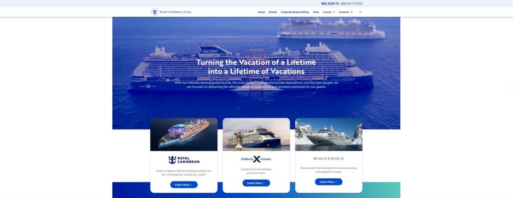
The homepage and navigation are structured around traveler goals, reinforcing trust and driving booking momentum.
Leadership Takeaway:
- Prioritize user research before approving any new layouts or redesigns.
- Test homepage wireframes with real users and gather feedback early.
- Align every design element with the customer journey, not internal departments.
- Review analytics quarterly to identify where users drop off or lose interest.
2. Slow Page Load Times
Speed is a trust signal.
In tourism-driven and mobile-dominant markets like Miami, even a brief delay can send potential bookings or inquiries to a competitor.
A Milliseconds Make Millions study found that even a 0.1-second improvement in mobile site speed can raise conversion rates by eight percent.
Slow pages not only frustrate visitors but also hurt SEO visibility and ad performance.
A sluggish website gives the impression of inefficiency, something no high-growth company wants to project.
On the other hand, fast websites, like Chewy’s, help build loyalty among pet parents who need to find what they need fast.
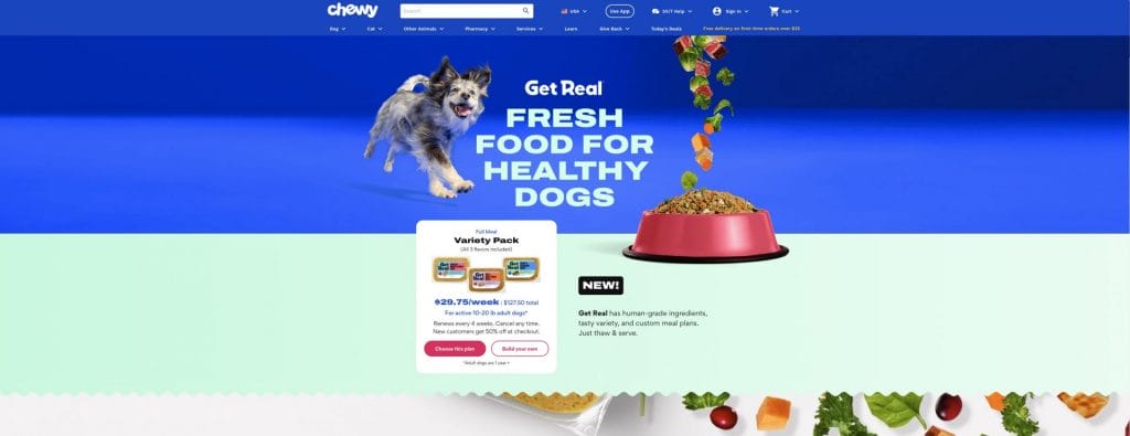
Products load instantly and checkout takes seconds.
That kind of speed feels good but it also signals “you and your time matter to us.”
Leadership Takeaway:
- Treat site performance as a revenue Key Performance Indicator (KPI) and include it in quarterly reports.
- Limit scripts that slow load times.
- Review Core Web Vitals every quarter and address failing metrics immediately.
- Use a content delivery network (CDN) to improve performance for mobile users across Florida.
3. Poor Mobile Responsiveness
Most people in Miami experience your brand for the first time on their phones.
It might be while they’re sitting in traffic, waiting for a meeting to start or scrolling through a link someone shared.
If your site loads slowly, text cuts off or buttons don’t work properly, they’ll leave and probably won’t come back.
A weak mobile experience doesn’t just frustrate visitors. It sends the message that your business is behind.
How your website performs on a smartphone says as much about your company’s professionalism as your office or your brand design.
For instance, sports fans are always on the move.
University of Miami Athletics’ site makes finding scores, schedules and tickets effortless on a phone. Nothing pinches, zooms or frustrates.

It meets fans where the excitement happens.
Leadership Takeaway:
- Test all key pages on multiple devices before every launch or update.
- Ensure tap-targets, menus and CTAs are thumb-friendly.
- Review analytics to identify which devices and viewports drive traffic and design accordingly.
- Prioritize mobile performance in both UX and SEO planning from day one.
4. Weak Or Vague Value Proposition (Especially For Miami’s Multilingual Audience)
In Miami, clarity isn’t just about plain language, but it’s also about the right language.
With 75.1% of Miami-Dade residents speaking a language other than English at home and 54.8% being foreign-born, neglecting Spanish-first or multicultural messaging creates an instant disconnect for a major share of your audience.
When someone lands on your site, they should understand who you are and what you do within a few seconds.
Too many companies in Miami still open with vague headlines or clever slogans that sound nice but say nothing.
Visitors shouldn’t have to guess what problem you solve or why you’re different.
Clarity is one of the simplest ways to build trust.
A clear value proposition gives your audience direction and confidence and it tells them that you understand their priorities.
In Miami’s fast-moving industries, people won’t stop to decode your message.
They’ll just move to a competitor who explains it better.
Baptist Health South Florida’s Spanish-language experience is not just translation. The site adapts care terminology and patient pathways to real community needs.
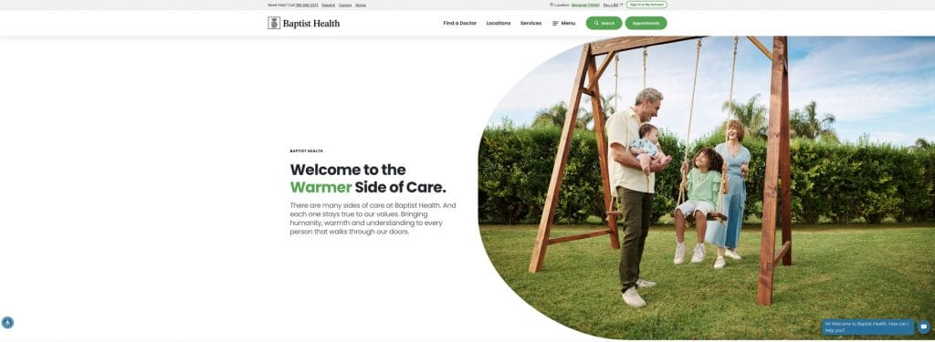
It shows respect for the audience and makes care feel more accessible.
Leadership Takeaway:
- Replace abstract taglines with plain, benefit-driven language that says what you do and who you help.
- If 15%+ of your traffic is Spanish-speaking, implement a language toggle and localize your value proposition. Don’t rely on direct translation.
- Ask someone outside your company to read your homepage. If they can’t describe your offer in one sentence, it’s not clear enough.
- Keep your main message above the fold so it’s visible right away on desktop and mobile.
- Support your statement with short proof points, such as data, awards or recognizable clients that add instant credibility.
5. Generic Calls To Action
Calls to action (CTAs) are where interest turns into opportunity, yet most websites still rely on the same tired phrases like “Learn more” or “Contact us.”
Those buttons don’t inspire anyone to act. Instead, they feel like placeholders.
A great CTA gives direction, sets expectation and removes hesitation.
Think of your CTA as a promise: what will happen when someone clicks? Will they book a consultation, get a quote or start a conversation?
The more specific you are, the more likely they’ll follow through.
On a Miami business website, clarity and immediacy win every time.
Norwegian Cruise Line, headquartered in Miami, uses action-specific CTAs tied to high-intent moments: “Find a Cruise,” “Plan Your Trip,” “Book Now.”
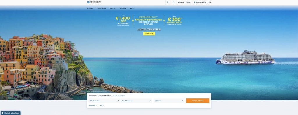
These promises reduce uncertainty and support revenue at every scroll depth.
Leadership Takeaway:
- Replace generic CTAs with precise, outcome-focused language such as “Book your strategy call” or “Get a custom quote today.”
- Keep one clear primary CTA per page and make it visually stand out from other CTAs on the page.
- Test wording, placement and color variations quarterly to see which drives the most action.
- Make sure your CTAs align with the buyer’s journey. Visitors at the awareness stage shouldn’t see the same prompt as ready-to-buy prospects.
6. Disorganized Navigation & Site Structure
Executives often assume visitors will explore their site the same way they think about their business.
But buyers rarely follow internal logic.
They arrive with a specific purpose and if the path isn’t obvious, they lose trust quickly.
A confusing navigation tells people you haven’t thought about their needs, which creates doubt about how you operate behind the scenes.
In Miami’s competitive sectors, from real estate to fintech, unclear navigation means missed revenue opportunities every day.
Clean navigation supports faster decisions, fewer drop-offs and stronger conversions.
Take Miami Country Day School’s website as an example.
Families aren’t browsing for fun; they’re making decisions about their child’s future.
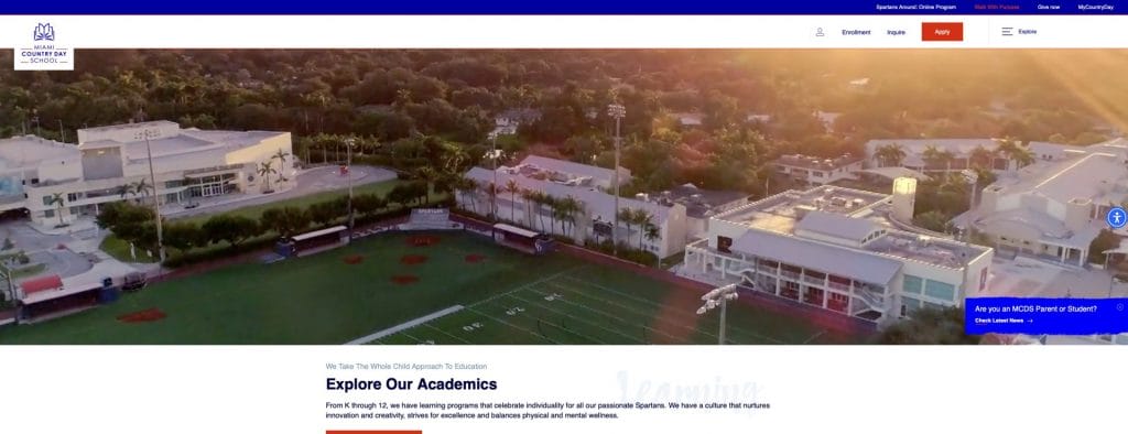
The redesigned site, led by Digital Silk, organizes everything around real user needs: prospective families, current parents and students.
Visitors can instantly choose the path that’s right for them, which makes the experience feel intuitive, supportive and professional.
The redesign led to a 32% decrease in bounce rates immediately after launch.
Leadership Takeaway:
- Structure your menu based on buyer questions, not department names.
- Keep top-level options focused on the most valuable paths: what you offer, who you serve, why you’re different.
- Remove any page that creates friction or duplicates information.
- Review user flows quarterly to ensure your site matches your sales motion.
7. Visual Clutter & Inconsistent Design
Some websites try to say everything at once: animations, sliders, bold graphics, multiple fonts, competing colors.
Instead of impressing visitors, it overwhelms them.
When a site lacks visual discipline, the brain works harder. People leave faster.
Poor design looks messy and it feels like disorganization at a leadership level.
A clean layout, clear hierarchy and smart spacing communicate restraint and confidence.
For instance, Brightline looks like how the brand feels: modern, streamlined and stress-free.
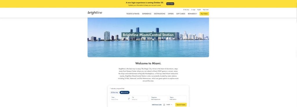
The design gets out of the way so you can do what you came to do — ride.
Leadership Takeaway:
- Limit fonts and colors to a defined brand system and use them consistently.
- Replace auto-rotating sliders with a single, strong message.
- Use whitespace intentionally to guide the eye toward your primary CTA.
- Audit visuals for brand alignment and remove anything that distracts from your value.
8. Ignoring Accessibility & Inclusive Design
Accessibility is often overlooked until it becomes a problem, and by then, the damage to reputation is done.
ADA Title III filings citing website accessibility accounted for 2,452 federal cases in 2024 (28% of all ADA Title III suits) and Florida remains one of the most active states.
Inaction is both a brand risk and a legal risk.
When a site isn’t usable for everyone, it sends a message that the brand didn’t consider the needs of all visitors.
For a multicultural and diverse city like Miami, inclusive design isn’t an optional enhancement. It is a reflection of how your organization prioritizes people.
Poor accessibility can also create legal exposure for companies working with government or enterprise clients who require compliance.
Jackson Health knows that people visit healthcare sites under stress, so they prioritize readability, legible type, intuitive wayfinding and support for Spanish-speaking patients.
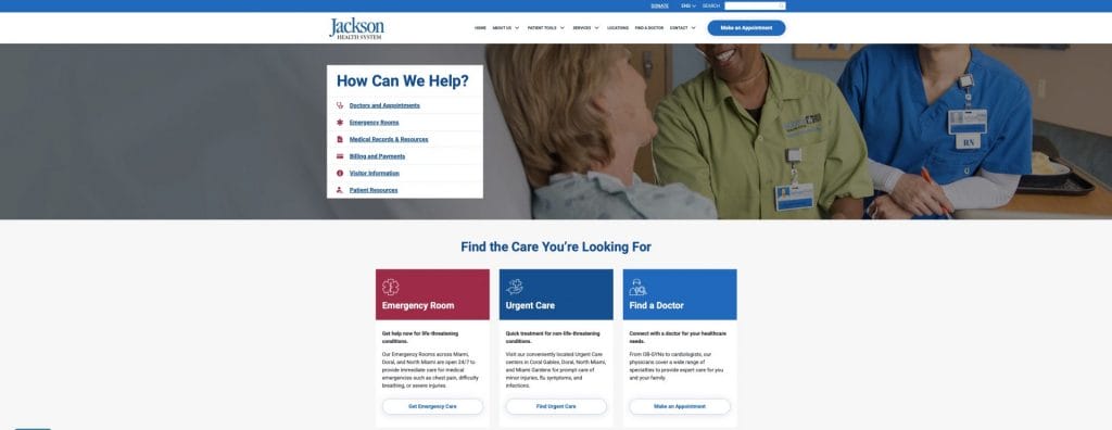
Making the experience easy to use isn’t just about compliance. It builds trust when it matters most.
Leadership Takeaway:
- Add an accessibility review to every design and content update.
- Ensure proper color contrast, readable typography and alt-text on all imagery.
- Build pages with logical heading structure, not visual guesswork.
- Test the site using a keyboard. If navigation breaks, accessibility is broken.
9. Weak or Inconsistent Branding
Brand trust comes from repetition and cohesion.
If your website uses different tones, colors or imagery styles across pages, visitors subconsciously question your professionalism.
It may seem like a small detail, but inconsistency signals a lack of alignment inside the company.
Miami executives often invest heavily in brand experiences offline.
Your website should reinforce that same attention to detail.
A strong brand system gives your company a recognizable identity and helps prospects feel confident choosing you.
The Salty Donut, for example, shows up the same everywhere.
The brand always looks fun, is craft-driven and wildly local.
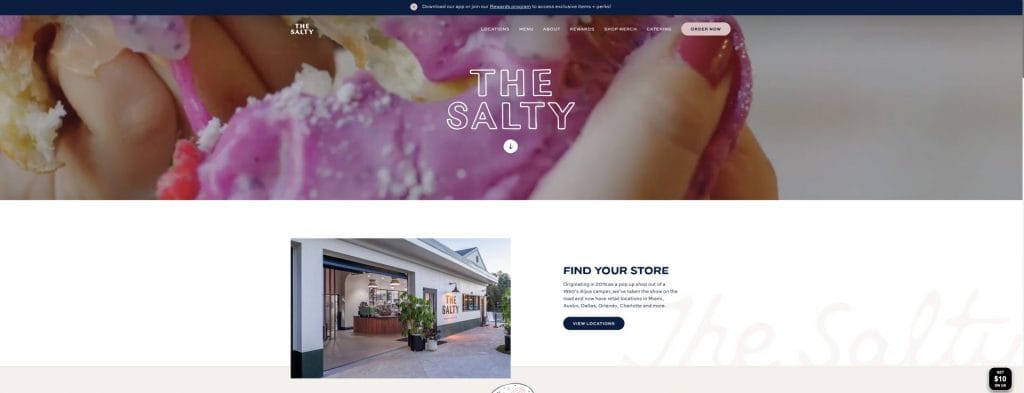
You recognize the vibe instantly, which is why people don’t just buy donuts. They also join a community.
Leadership Takeaway:
- Audit visuals regularly to ensure every page reflects your current brand.
- Use a centralized style guide that covers fonts, spacing, tone and imagery.
- Replace outdated pages or design elements instead of patching them over time.
- Make sure messaging stays consistent across channels, including social and email.
10. Neglecting SEO & Local Visibility Fundamentals
A stunning website can still fail if no one sees it.
Many Miami organizations underestimate the power of local search, where high-intent queries, especially “near me” and branded navigational terms convert at a much higher rate.
Moreover, technical considerations like structure, speed and metadata influence how easily your site appears in search.
If these fundamentals aren’t taken seriously from day one, you’ll have a brand that looks great but attracts little organic traffic.
For Miami companies in competitive industries, a findable website is a business requirement.
Technical SEO is part of the foundation and not a post-launch enhancement.
If you search “juice near me” in Miami, you’re bound to find Joe & The Juice.
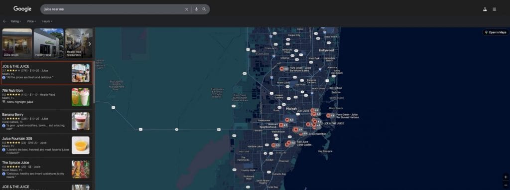
Every location is set up to show up.
Hours are right, menus are up-to-date and maps work. It’s the basics done really well.
Leadership Takeaway:
- Treat Google Business Profile as a primary traffic source and keep hours, services and attributes updated monthly.
- Review how each page supports topics that prospects actively search for.
- Ensure key pages are crawlable, properly indexed and fast across devices.
- Collaborate early with SEO specialists during redesign planning.
- Refresh pages quarterly to reflect evolving search intent and offerings.
11. Over-Reliance On Generic Stock Imagery
People can spot staged stock photos instantly.
When your visuals look like every other website, visitors assume the rest of your company will feel just as generic.
In a city known for personality and creative expression, generic imagery is a missed opportunity to differentiate.
Authentic visuals show confidence.
Prospects want to see your environment, your products, your people and not the same handshake image used by a thousand other businesses.
On Wynwood Walls’ website, every photo is unmistakably Miami.
The pages feature real artists, real murals, real energy.
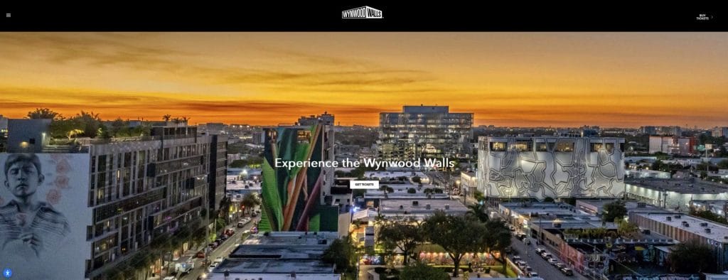
You can feel the neighborhood through the screen.
No stock image could do that.
Leadership Takeaway:
- Prioritize real photography wherever possible, especially on high-value pages.
- If stock is needed, select images that reflect the local Miami audience.
- Standardize image treatments so the brand looks cohesive across pages.
- Replace visuals that are outdated or do not reflect your market positioning.
12. Poor Typography, Readability & Spacing
If someone has to strain to read your content, they won’t.
Typography issues, such as tiny text, tight spacing and inconsistent sizes create unnecessary friction.
Readable design helps visitors absorb your message quickly and without frustration.
Especially in Miami’s mobile-first environment, typography can make the difference between someone staying and someone leaving.
For instance, when you’re buying tickets, you want clarity fast: what’s the show, when is it and how do I go?
Adrienne Arsht Center’s layout answers those questions immediately.
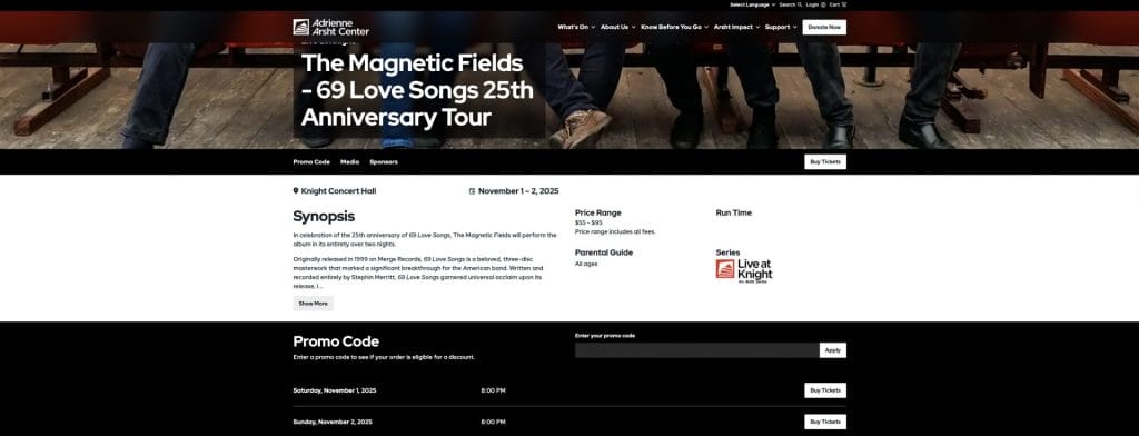
No squinting required.
Leadership Takeaway:
- Maintain a clear type hierarchy for headlines, subheads and body copy.
- Ensure spacing and contrast enhance readability across screens.
- Limit the number of font sizes used on a single page.
- Test legibility on the smallest devices your audience uses most.
13. Lack Of User Data, Testing & Iteration
Websites are often treated as projects that end at launch.
In reality, launch is the starting point.
Buyer behavior evolves over time and what worked last year may fail today.
Without regular testing and analysis, small conversion leaks become major missed opportunities.
Data-driven iteration is a leadership habit.
It keeps your experience aligned to how real visitors think and act, not how we hope they do.
Carvana never treats design like a “set it and forget it” launch.
They tweak constantly, including images, flows and tools based on what buyers actually do.
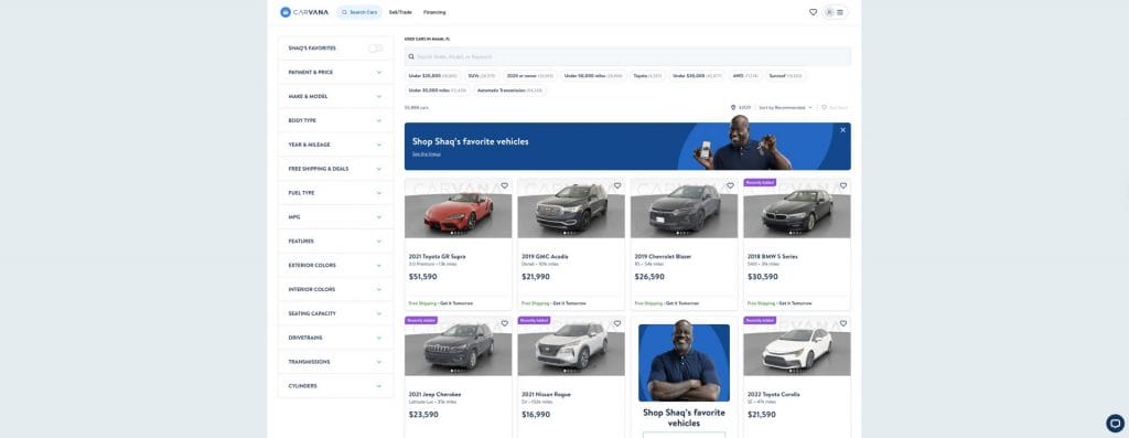
The company doesn’t rely on guesses.
It follows behavior.
Leadership Takeaway:
- Use analytics to uncover where visitors get stuck or hesitate.
- Review user behavior recordings quarterly to spot problem patterns.
- Test small improvements, like new headlines, button placements and form layouts.
- Treat continuous optimization like ongoing product development, not a one-off fix.
Digital Silk Website Redesigns That Delivered Results
These mistakes aren’t theoretical. When leadership prioritizes trust and performance, revenue results follow, as the case studies below show.
The Digital Silk client projects demonstrate how focused redesign and brand alignment can enhance engagement, visibility and user behavior, serving as benchmarks for CEOs in Miami to improve their digital strategies
1. OrthoEast
Following a merger of three orthopedic groups in New Jersey, OrthoEast needed a unified, high-performance website that could serve existing patients and attract new ones through organic search.
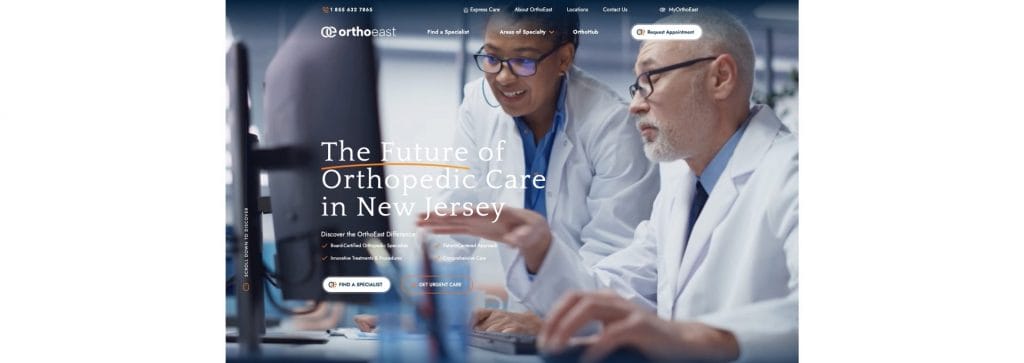
Digital Silk analyzed the pre-merger sites for structure and content, developed a targeted content and SEO strategy and built an integrated lead-generating platform.
Results:
- Users increased by 150% after the redesign.
- Organic clicks rose by 138%.
- Average session duration improved by 105%.
For Miami C-level leaders, this case shows how a website redesign focused on structure, messaging and SEO can dramatically increase both visibility and engagement in a competitive service market.
2. Unison Infrastructure
Unison Infrastructure struggled with disconnected branding across its U.S. and European operations, which hindered its online presence and visitor engagement.
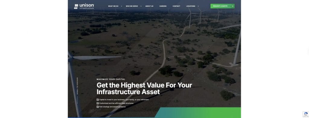
Digital Silk developed a cohesive brand architecture and built a web experience aligned to that identity.
Results:
- Engagement rate increased by 11.76% in six months.
- Session duration rose by 146.91%.
- User experience improved by 26.29% in the same period.
In Miami’s global business environment, brands operating across regions must present unified digital identities.
Unison’s results illustrate that consistent branding plus a high-performance website deliver measurable uplift.
3. BoldTek
BoldTek, an IT consulting firm, faced an outdated website that struggled with lead generation, lacked modern design and hindered brand credibility.
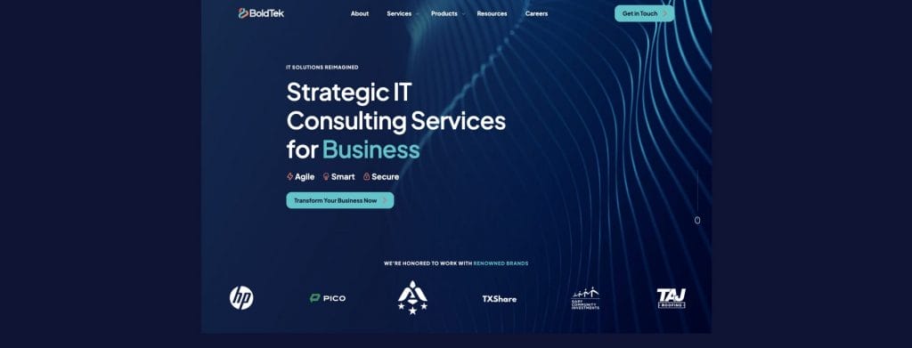
Digital Silk redesigned the site with a fresh brand identity, intuitive navigation and clear conversion pathways.
Results:
- Total users increased by 467.9% compared to the prior period.
- Engaged sessions rose by 359.02%.
- Average engagement time increased by 46.69%.
BoldTek’s results clearly show how modern UX, improved navigation and stronger visual identity can boost both traffic quality and engagement.
When website design reinforces brand credibility and guides visitors toward action, it becomes a direct growth driver, even in highly competitive B2B tech markets.
4. Vacation Homes Of Key West
Vacation Homes of Key West, a boutique vacation rental company in Florida, required a website that streamlined bookings and enhanced mobile engagement.
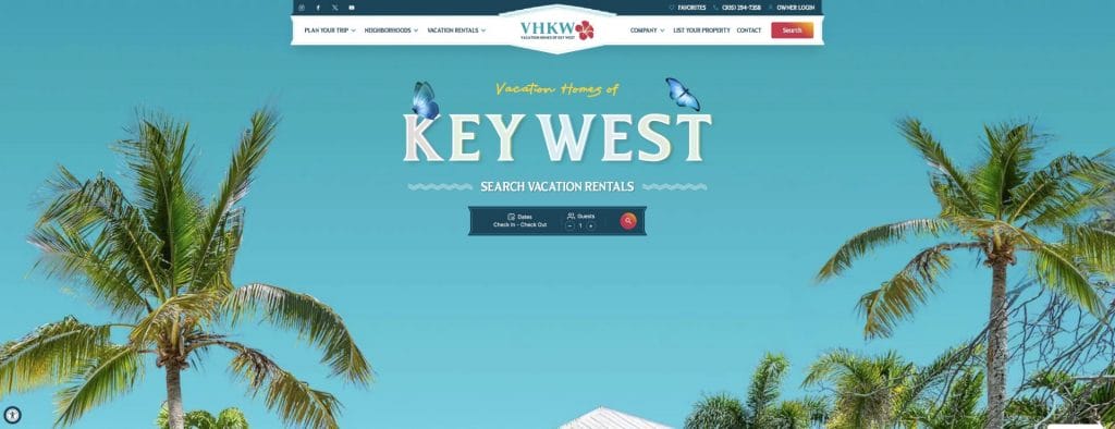
Digital Silk crafted a mobile-first UX, improved content clarity and introduced booking-centric design aligned with top travel platforms.
Results:
- Average engagement time increased by 1602%.
- Engagement rate improved by 17.47%.
- Engaged sessions rose by 5.18%.
This project highlights how a booking-focused mobile experience can dramatically increase time on site and visitor engagement.
For businesses in Miami’s hospitality and tourism sectors, a friction-free design that makes it easy to browse, trust and book can quickly translate into meaningful revenue gains.
5. Find The Plan
Insurance-broking business LIG Solutions needed a lead-generation website for its brand Find The Plan, operating in a crowded, keyword-heavy niche.
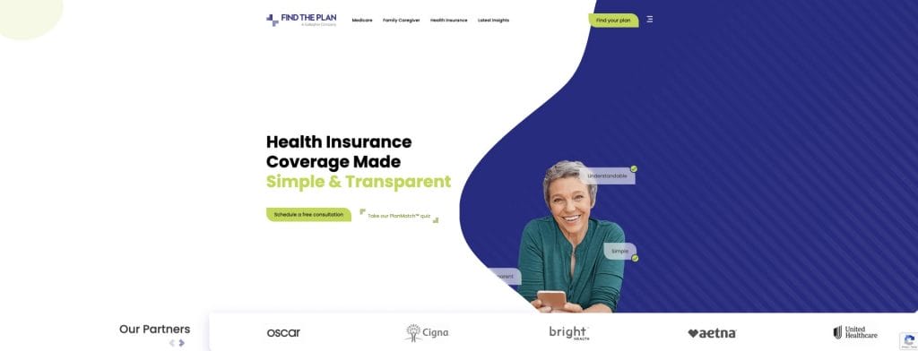
Digital Silk crafted targeted messaging, UX tailored to three distinct audience segments and an SEO strategy built for conversion.
Results:
- Achieved a 37% conversion rate in under one year through redesigned user flows and SEO alignment.
- Generated seven-figure top-line sales within the first year of launch.
For Miami-based leaders in competitive B2B or B2C markets, this case shows that ambitious conversion outcomes are realistic when design, messaging and SEO align with business goals.
Why These Web Design Mistakes Matter Specifically In Miami
Greater Miami welcomed 28.2 million visitors in 2024, a record year that poured $22 billion into the local economy.
Tourism, real estate, healthcare and fintech all compete for the same eyeballs, mostly on mobile, and first impressions happen fast.
Miami is also uniquely multilingual and international, with the majority of its residents speaking a language other than English at home.
If your site isn’t clear, fast and culturally inclusive, you’re leaving revenue on the table.
High mobile traffic + international audiences + tourism-driven expectations = low tolerance for slow, confusing or monolingual UX.
Build A Website Miami Businesses Trust With Digital Silk
Miami’s leaders compete in fast-moving industries, from real estate and healthcare to tourism and fintech, where credibility is earned in seconds.
A high-performance website is a trust engine that drives revenue, supports growth and differentiates your brand in a crowded market.
Digital Silk is a full-service premium digital marketing agency partnering with Miami organizations to design, develop and optimize websites that convert, combining strategic UX, brand clarity and technical excellence.
From mobile-first experiences to multilingual, conversion-driven journeys, we help Miami CEOs scale confidently and win the trust of the audiences who matter most.
Explore our relevant services:
- Custom Web Design
- Web Development & Platform Integration
- Branding Solutions & Digital Identity
- Technical SEO & Local Visibility
- Conversion Rate Optimization (CRO)
- Website Support & Ongoing Optimization
Let’s transform your website into a high-performance business asset.
Contact our team, call us at (800) 206-9413 , or fill in the Request a Quote form below to schedule a consultation and start building the next generation of fintech experiences.
"*" indicates required fields


