
-
Design affects discoverability: Page structure, hierarchy and performance influence whether search engines surface or ignore your content.
-
Device switching is part of the journey: A cohesive experience across mobile and desktop keeps interest intact as context changes.
-
Good design improves conversion efficiency: A straightforward page structure and consistent layouts help more visitors reach high-value content without increasing traffic.
In 2026, buyers arrive at your website with limited time and little patience for anything that feels outdated or hard to use.
The experience immediately signals how much you respect their time and expectations, long before they engage with sales.
When 66% of US users say they prefer browsing well-designed websites, that preference often determines whether visitors explore your offer and pricing or leave within seconds.
In this post, we’ll explain why good web design is important in 2026, the business value it creates and the best practices that keep your site aligned with how modern buyers evaluate vendors.
The Importance Of A Good Website
A well-designed website goes a long way in helping your brand establish an online presence and gain loyal customers.
Here are some of the key reasons why good website design matters:
1. Improved Brand Credibility
Your website becomes a proxy for how your company operates and buyers assume the experience reflects the way you work.
When 75% of users judge a company’s credibility based on web design alone, a site that feels current and easy to navigate raises expectations while a dated or disorganized experience introduces doubt.
When this works: During a first visit from search or a referral, while comparing vendors or when returning to confirm pricing and scope, the site makes the business easy to assess because the offer is clear on entry, services and proof are where buyers expect them.
Problems arise when the experience introduces uncertainty instead of removing it.
Craigslist is a clear example, where an outdated interface, dense text and minimal visual hierarchy make it harder for users to quickly assess legitimacy, safety and relevance.

While the platform still functions and has massive reach, the lack of modern design cues forces users to work harder to evaluate listings, which can create hesitation and mistrust, especially for first-time or higher-stakes transactions.
Executive implication: This approach forces you to give up some visual flexibility and trend-driven experimentation, but you reduce the risk of confusion, misinterpretation or a site that feels dated within a year.
To apply this, focus on the pages that receive the most traffic, make your positioning and social proof visible without scrolling, simplify navigation so it mirrors how buyers think and test common evaluation tasks like finding services or pricing across devices.
")
2. Better User Retention
User retention is shaped by how easy your website is to return to and continue using, especially when visitors come back to compare options, share a link internally or double-check details before reaching out.
When 88% of online consumers are unlikely to revisit a website after a poor experience, design becomes a deciding factor in whether interest carries over to a second or third visit.
When it works: People return because the experience feels familiar and easy to resume, with fast load times, consistent navigation and content structured so visitors can pick up where they left off without re-learning the site.
Problems surface when repeat visits require unnecessary effort, such as inconsistent navigation, unclear page structure or visual elements that slow load times and make previously seen content harder to find.
For instance, Headhunter Hairstyling shows how dated web design can hurt repeat visits even when the business itself is established.

The muted contrast, generic visuals and unclear hierarchy don’t guide returning visitors quickly to services, pricing or booking, which makes routine tasks take longer than they should.
Executive implication: Higher retention reduces wasted acquisition spend and increases the payoff from every visit, but it requires limiting unnecessary visual changes over time. You give up some creative flexibility so returning visitors can reach services, pricing or booking information quickly without having to re-learn where things are.
To improve retention, review whether key pages follow the same structure, whether important information appears in the same places across sections and whether common tasks can be completed just as easily on a return visit as on the first.
3. Higher SERP Rankings
Search visibility has become a business risk rather than a marketing metric, which is why 45.6% of businesses cite declining SERP visibility as a leading concern.
As search engines place more weight on site structure, performance and content organization, web design plays a direct role in whether your pages are understood, prioritized and ranked.
When it works: Good web design ensures your SERP rankings benefit from pages that are easy for search engines to interpret, with clean URLs, logical headings and crawlable navigation, plus fast load times and consistent templates that keep important content visible and indexable.
On the other hand, common problems surface when your design and SEO are treated as separate efforts.
Sites with heavy visuals, generic templates or unclear hierarchy often struggle to hold rankings even with solid content, because search engines can’t easily determine what matters or how your pages relate to one another.
Executive implication: Stronger SERP performance reduces your dependence on paid acquisition and helps protect demand capture over time, but it requires coordination across design, content and technical execution.
A practical next step is to look at how your site aligns with search intent, whether key pages are reachable within a few clicks and if heading structure and performance issues are limiting crawlability.
4. More Seamless User Experience
When 93% of businesses point to a seamless user experience as an important website function for staying competitive, consistency across screens becomes a business requirement rather than a nice-to-have.
When it works: your site feels continuous whether someone opens it on a phone between meetings, revisits it on a laptop later or shares it on a tablet internally. Content adjusts naturally to screen size, interactions feel familiar and nothing breaks, disappears or becomes harder to use simply because the device changed.
Issues surface when the experience breaks across devices, as sites that work well on desktop but become hard to read, slower to load or difficult to navigate on mobile tend to lose visitors when they’re trying to review services, check pricing or find contact details quickly.
Executive implication: A seamless experience keeps buyers engaged across touchpoints and reduces the risk of losing interest mid-evaluation, but it requires discipline in layout, content prioritization and performance.
From a practical standpoint, open your site on a phone and then on a desktop and check whether the same menu items are visible, services and pricing are reachable in the same number of clicks and forms can be completed without zooming, reloading or scrolling excessively.
")
9 Elements Of Good Web Design
Regardless of your industry, business model or target audience, these nine elements are crucial for web design that engages and converts:
1. Accessibility
Website accessibility involves a set of practices applied in web design to make the website easier to use for users with hearing, visual, cognitive, or motor limitations.
This isn’t a niche concern anymore, especially when 88% of websites still fail to meet current accessibility standards, leaving a large portion of potential users underserved.
When this works: Accessibility supports your business at key moments, such as when prospects are researching vendors under time pressure, reviewing content in less-than-ideal conditions or accessing your site through assistive tools.
Clear headings, readable contrast, logical navigation and properly labeled elements make information easier to scan, understand and act on, which improves engagement across a much wider audience than accessibility guidelines alone might suggest.
For instance, Clearstem shows how accessibility can be integrated without disrupting the shopping experience.

The site includes an accessibility panel that allows users to adjust contrast, enable keyboard navigation, optimize content for screen readers and reduce visual distractions, making core actions like browsing products or checking details easier for more users.
Failures in accessibility often come down to poor contrast, missing labels or poor navigation, which makes the site harder to use for people with disabilities and frustrating for everyone else.
Executive implication: A more effective approach is to build accessibility into the foundation of your design, which can widen your addressable audience and reduce usability issues that affect all users, but it requires upfront attention to structure, contrast and interaction patterns.
Review your site for contrast, heading structure and keyboard navigation, check screen reader compatibility and ensure forms, buttons and links are clearly labeled.
2. Intuitive Navigation
With 94% of users saying layout and navigation matter most when evaluating a website, the menu, page structure and wayfinding carry more weight than most design elements.
When this works: It helps during high-intent moments, like when someone lands from search looking for a specific service, when a prospect returns to confirm pricing or scope or when an internal stakeholder clicks through to validate credibility fast.
For instance, Sephora’s breadcrumb navigation keeps shoppers oriented by showing the exact category path at a glance and offering a quick way to jump back to broader results.

That’s especially useful when someone is comparing products across a category or narrowing options, because it reduces backtracking and keeps the browsing flow intact.
In contrast, some of the more common navigation failures include vague menu terms, hidden pathways to core pages or layouts that bury next steps, which can turn the user’s attention elsewhere.
Executive implication: Intuitive navigation increases the number of visitors who reach high-value pages like services, case studies and contact, which improves conversion efficiency without increasing traffic.
You trade clever naming and sprawling menus for a structure that supports evaluation, speed and repeat visits.
3. Impactful Visuals
An average user spends about 5.94 seconds looking at a website’s main image, which means your visuals have a narrow window to communicate what you offer and set expectations for quality.
When this works: Visuals support your business during first-touch moments like landing from search, opening a shared link or scanning your site before a meeting, because the imagery immediately signals what you offer and who it’s for.
Some of the more common issues include oversized imagery, excessive motion or too many competing elements, which slow pages down and overwhelm attention.
For instance, the Yale School of Art website uses vibrant colors, dense blocks and overlapping elements that make it hard to scan and prioritize information.
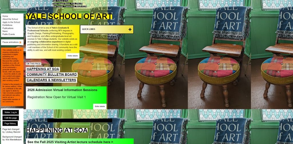
Instead of guiding visitors toward key information, the visuals demand effort to decode, which distracts from the content and undermines usability.
Executive implication: Well-chosen visuals increase engagement and comprehension early in the visit, but they require discipline around selection and performance.
Choose the ones that reinforce your positioning, guide the eye toward key content and load efficiently, then remove anything that exists purely to fill space
4. Benefits-Driven Copy
Buyers use website copy to decide whether they should keep reading or move on, often within a few seconds of landing on the page.
When this works: Benefits-driven copy supports users during their evaluation, such as reviewing a services page before a call, comparing vendors side by side or forwarding a link internally to justify next steps.
Clear, direct language that explains what changes for the buyer, what becomes easier and why it matters allows people to grasp the value without digging through paragraphs of explanation.
Take Jasper AI’s homepage as an example, which leads with a clear promise that immediately explains who the product is for and what problem it addresses, without forcing visitors to decode the value.

The supporting language reinforces that message by focusing on practical benefits like speed, scale and coordination, which helps prospects quickly decide whether it fits their needs before clicking deeper.
On the flip side, website copy falls short when it relies on buzzwords, abstract promises or terminology your audience doesn’t use.
Even well-designed pages lose momentum when readers can’t quickly tell how the offering applies to their situation or what makes it worth considering.
Executive implication: Use content that prioritizes buyer understanding over internal positioning, even when it means cutting language that sounds impressive but adds little meaning.
You trade brand-heavy phrasing and broad claims for specificity and usefulness, accepting that the copy may feel less expansive internally while becoming far more effective externally.
5. Specific Calls To Action
Call-to-action (CTA) buttons help facilitate the user journey and invite the user to interact with the website.
When buttons say too little or appear too late, visitors hesitate, second-guess or leave without taking the next step.
When this works: specific CTAs help at moments when buyers are validating fit, such as reviewing a service page before a call, scanning pricing or returning to confirm scope.
Labels like “View Pricing,” “See Case Studies,” or “Book a Demo” remove guesswork by setting clear expectations about what happens after the click, which keeps the momentum intact.
For example, Procurify’s CTAs separate intent by offering “Book a demo” for buyers ready to talk and “Take a tour” for those who want to see the product first.

That separation reduces misclicks, filters inquiries earlier and keeps visitors moving forward instead of pausing to figure out which action fits them.
Issues arise once CTAs stop communicating value. Repeating the same label across the site or letting buttons visually disappear into the layout makes it harder for users to understand where to go next or whether clicking is worth their time.
Executive implication: Commit to fewer CTAs that clearly state what happens next, even if that means removing buttons that stakeholders are used to seeing.
You gain a more direct path for buyers while giving up vague labels and secondary actions, accepting that specificity guides action better than offering multiple, loosely defined options.
6. Fast Page Loading Speed
Speed is where user experience and revenue meet, especially on mobile and during high-intent visits when buyers are trying to move quickly.
With 70% of consumers saying page speed affects their purchasing decisions, slow pages don’t just irritate visitors, they change behavior in ways that can damage your pipeline.
When this works: Fast load times protect key moments like landing from paid search, opening a link from email, switching from product pages to pricing and completing a form on mobile.
Slow sites usually have predictable causes, including oversized images, heavy scripts, too many third-party trackers, bloated page builders and videos that load before they’re needed.
Executive implication: Set a performance standard that design and marketing can’t override, even if it means saying no to certain visuals, plugins or tracking tools.
You gain a faster buying journey, but you accept tradeoffs around aesthetics, tooling and “nice-to-have” add-ons that slow the site down.
You can use Browser Stack to check your page load speed. If your website loads too slowly, try reducing the size of your images and/or cleaning up your media library.
7. Responsive Design
Responsive design reflects how people move between devices throughout the day as they research, revisit and share information.
Buyers expect the experience to feel consistent across a phone, laptop or tablet, without extra effort to read, navigate or complete a task.
When this works: It supports everyday use cases like checking details on a phone between meetings, revisiting pricing later on desktop or sharing a link internally from a tablet.
For instance. Magic Leap’s desktop website uses a clear hero image and a simplified navigation bar that keeps primary sections easy to find while the headline remains front and center

On mobile, the layout transitions into a hamburger menu that keeps the same structure and services order, so users can navigate the site without adjusting how they use it.

Issues appear when responsive layouts hide navigation, reduce readability or change content order on smaller screens, which makes common tasks slower and more frustrating, particularly for returning visitors who expect the same structure each time.
Executive implication: Commit to a single experience that works everywhere rather than device-specific compromises. You give up pixel-perfect control on every screen in exchange for continuity, accepting that consistency across devices matters more than optimizing for one ideal view.
8. Social Proof
Social proof is evidence that supports your claim and increases your brand’s credibility, such as customer reviews, testimonials, awards, and recommendations.
91% of users trust online reviews and recommendations as much as their friends.
When this works: Reviews and testimonials from your previous customers help showcase your trustworthiness and can help nudge users toward conversion.
For example, Casper Sleep places social proof front and center by highlighting a large volume of five-star reviews alongside a specific customer quote, which immediately frames the product as widely trusted.

The mistake many sites make is treating social proof as a decorative section or a long scroll at the bottom of a page. Generic testimonials, vague quotes or logos without context feel easy to ignore and do little to support real scrutiny.
Executive implication: Invest in fewer, more relevant proof points and be willing to retire testimonials that no longer reflect your current positioning.
You gain credibility where it matters most, while accepting that this requires ongoing curation and regular pruning of anything generic.
9. Brand Consistency
Brand consistency is how buyers recognize they’re in the right place as they move through your site, especially when attention is limited and comparisons are quick.
It’s also why 92% of consumers say consistency is the type of brand messaging they value most, because it reduces uncertainty and makes information easier to process.
When this works: Repeated use of the same colors, typography, layout patterns and voice reduces cognitive effort and keeps attention on what you offer rather than how the site is put together.
For instance, Kraken uses its distinctive purple consistently across navigation, CTAs and interface elements, which makes the brand immediately recognizable as users move through the site.

That repeated use of color reinforces trust and familiarity while keeping the experience cohesive, even as visitors move through product information, sign-up flows and platform previews.
Inconsistent tone, layout or visual language across pages can create hesitation, even when visitors can’t immediately explain what feels off.
That hesitation often slows evaluation and reduces follow-through, especially when buyers are comparing options or revisiting the site after time away.
Executive implication: Set and enforce brand guidelines across your site, even when it limits variation between pages or campaigns. You gain long-term recognition and credibility while accepting the tradeoff of less visual experimentation as content scales.
")
How To Find An Agency That Delivers Great Web Design
When choosing a web design agency, it is important to do your homework to ensure you are hiring the best experts for your website project.
1. List Your Website Requirements & Goals
The first thing you need to do is think about your business needs and ask the following questions when deciding on your website needs and goals:
- What are the goals that my website should support?
- Do I need an educational website or an eCommerce store?
- Do I want a website to generate leads or to integrate with the platform I use?
Once you know what you need and have a list of website requirements, you now have the brief that will help you jump-start your search for the ideal web design agency.
2. Set A Budget
It is important to decide on your budget for the project, so you can later align with the right agency.
While the cost of web design services varies greatly depending on the complexity of the project, defining a ballpark and asking the web design agency you’re considering for an estimate will help you manage your expectations and find the right fit.
3. Review The Agency’s Portfolio
Most professional web design agencies will have a portfolio of their projects that you can review to see past examples of their work.
When reaching out to agencies, ask what similar projects they have completed in the past.
For example, if you’re looking to build an eCommerce store, ask what eCommerce projects they have worked on in the past. Or if you’re a B2B brand, seek previous samples in this domain.
Look for an established agency with years of experience in web design and development, proven expertise, and an impressive portfolio of designs.
4. Ask About The Agency’s Web Design Process
When you reach out to a web design agency of your choice, be sure to inquire about their web design process.
Professional agencies that create industry-leading websites typically follow an established set of steps in web design and development.
They should implement the latest digital trends and best practices, and be able to offer professional recommendations throughout your project.
At Digital Silk, we start each project by researching your business, industry landscape, competitors, and target audience. The insights we gather here later inform the decisions regarding your web design.
5. Always Explore Reviews & Testinomials
When exploring agencies for web design, it’s important to consider the rankings, testimonials and reviews of the local agency.
For example, if you live in Miami, FL, and want to boost your brand’s performance, have a look at the Designrush reviews.
So always keep in mind to:
- Look for agencies that have high rankings on search engines like Google or Bing. This can indicate that they have a good reputation and are well-regarded in the industry.
- Check out their portfolio to see examples of their work. This can give you an idea of their design style and whether it aligns with your vision for your website.
- Read testimonials and reviews from previous clients. This can give you insight into their experience working with the agency and whether they were satisfied with the results.
- Consider the agency’s experience and expertise. Look for agencies that have experience working with businesses in your industry or that have expertise in the specific type of website you need.
Create User-Friendly Web Design With Digital Silk
Knowing why good web design is important is only the tip of the iceberg, but applying the key strategies in practice requires a strategic approach.
When you partner with Digital Silk for custom web design services, you get access to a full team of in-house design experts, insights into new web design trends and best practices, and state-of-the-art tools
We specialize in creating responsive, engaging, and optimized website designs that drive on-site engagement and conversions.
As a full-service web design agency, our deliverables include:
- Custom web design
- eCommerce web design
- Redesign services
- Custom web development
- Branding services
- Digital marketing
Contact our team, call us at (800) 206-9413 or fill in the Request a Quote form below to schedule a free, custom consultation.
"*" indicates required fields


