
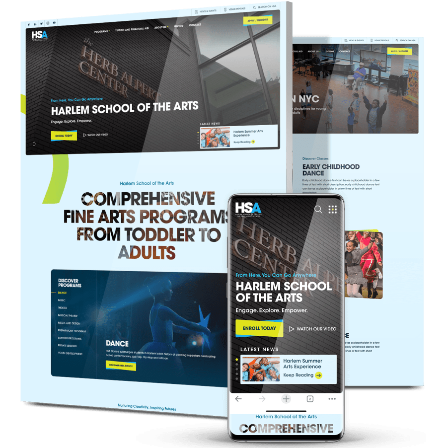
Harlem School Of The Arts
A Digital Platform That Inspires Artistic Growth
-
Harlem School of the Arts aimed to modernize its digital marketing presence to reflect its legacy better, engage a diverse audience and drive key actions like registration and donations.
-
We delivered a vibrant, mobile-first web design with optimized user flows, SEO-driven architecture and an elevated brand experience that celebrates HSA’s creative spirit.
-
In the first 90 days post-launch, the site reached 13K+ new users, boosted engagement by 3x and drove a 43% increase in organic traffic.

The Challenge
HSA needed a website that matched the energy and impact of its
programs while removing barriers for students, parents and donors.
programs while removing barriers for students, parents and donors.
Outdated Design & UX
The old site didn’t reflect HSA’s vibrancy and lacked mobile responsiveness, making it hard to register for classes or find key information.
Limited Organic Reach
Weak SEO performance held back visibility, reducing the school’s ability to attract new audiences and drive online engagement.
Missing Conversion Paths
No clear funnels for registration, donations or event signups led to missed opportunities and lower community participation.
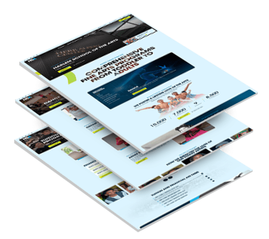

The Solution
To reposition HSA as a leader in arts education, we combined unique,
custom design, intuitive UX and strategic SEO enhancements.
custom design, intuitive UX and strategic SEO enhancements.
-
Visual Identity Refresh
A clean, contemporary design brought HSA’s mission to life through bold photography, vibrant color palettes and dynamic typography.
The aesthetic strikes a balance between creative energy and institutional credibility. -
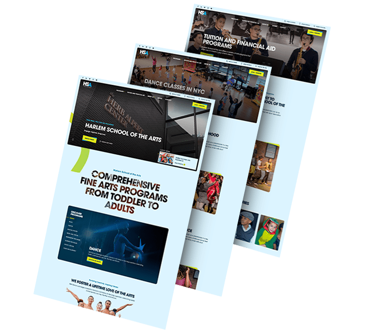
User Experience Overhaul
Navigation was restructured around HSA’s core offerings, making it easier for users to explore programs, events and community initiatives.
Prominent CTAs guided students, parents and donors toward key actions like registrations and donations. A mobile-first layout ensured seamless access across all devices. -
SEO Optimization
Technical SEO best practices were applied, including optimized metadata, alt text and faster load times.
Content was aligned with high-value search terms to grow organic visibility, while backlink and referring domain strategies strengthened domain authority. -
Conversion Funnel Refinement
Clear, intuitive user journeys supported conversions across multiple touchpoints, from class registrations and ticket sales to inquiries and donations. Interactive content and improved structure encouraged exploration and extended time on site. -
Collaboration & Technical Enhancements
In close collaboration with HSA’s team, the new platform highlighted the school’s impact and values.
The development included ADA compliance, performance enhancements and improved security to ensure a reliable, inclusive user experience.
The Results
The redesigned platform drove meaningful growth across visibility, engagement and conversion in the first 90 days post-launch.
-
New users reached over13Kdriven by a modern UX and mobile-optimized design
-
Organic search traffic share43%with engagement times 3x higher than direct traffic
-
SEO performance improved43%in organic traffic, +16% in organic keywords and +759 backlinks
-
Traffic from program pages30%of total visits, supporting higher registration and inquiries
-
Event interaction growth5,4% week-over-weekdriven by easier access
and stronger CTAs -
Broader audience reachwith significant engagement from NYC and other major U.S. metros
Featured Case Studies
Explore our case studies and see how we grow brands online.
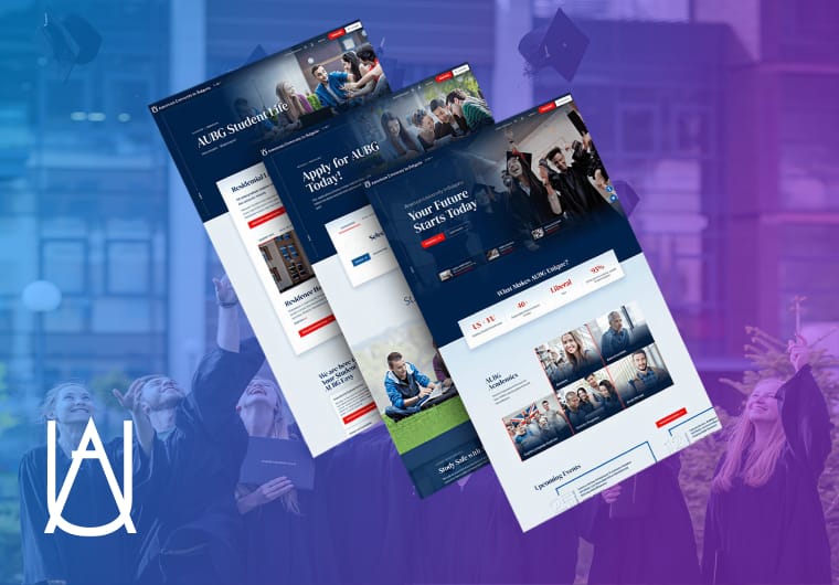
New University Website For AUBG
Our award-winning design team developed a modern, fully optimized custom website for the American University in Bulgaria (AUBG).
The new design delivered a more intuitive user experience and helped drive an increase in university applications.
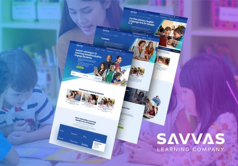
Savvas’ Smarter Support Through Education Web Design
Savvas Learning Company needed a complete rethink of their online customer and technical support experience. The old flow was built around user roles, which meant visitors had to identify themselves before they could get anything done.
We flipped that. We restructured the architecture around tasks instead of titles, so the first question became “What do you want to do?” instead of “Who are you?”
We built an interactive prototype, tested it remotely with 11 teachers and school administrators across six real scenarios and refined the experience before anything went live. The result was a faster, more intuitive support platform where users completed most tasks without getting stuck.
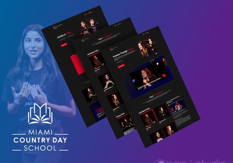
Miami Country Day School’s Education Website Design
MCDS is a top private school in Miami that needed a site redesign across 60+ pages, built on Blackbaud and designed to serve parents, students, faculty and alumni all at once.
We worked with over 5,000 images to capture the real feel of campus life and wrote custom copy for every audience segment.
The site launched in three months and the numbers spoke for themselves, with a 15% increase in organic traffic and a 32% drop in bounce rate.
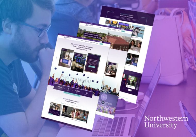
Northwestern University Responsive Education Website Design
Northwestern University needed a site that worked for students, faculty and prospective applicants without feeling like three different websites stitched together.
We unified the messaging, rebuilt the architecture to be fully responsive and designed user flows with micro-animations that move people through content quickly.
Usability scores went up after launch and so did conversions, with users spending more time on site and taking more meaningful actions like submitting applications and requesting information.
Get The Latest Web Design
Insights Delivered To Your Inbox
Insights Delivered To Your Inbox
"*" indicates required fields
Take The Smart Road To
Digitizing your Business Growth
Start a conversation with us
"*" indicates required fields